Rekicks
Re-kicks is a recycled sneakers store that sells vintage-inspired trainers as a more sustainable solution for sneakerheads worldwide.
This project was motivated and impacted by my undergraduate dissertation, which was aimed at investigating how consumer psychology and psychological design principles could be utilised to inform and improve the UX/UI design of web and mobile applications.
As I have a passion for both branding and UX/UI design, I chose to use my final university project to combine the two to create a sneaker brand in addition to creating prototype app interfaces for its e-commerce store based on my dissertation study.
-
DM3103: Negotiated Design Final Project A Module
-
University Project
-
13 Weeks
-
Illustrator
Figma
Photoshop
Procreate
Below you will find my process, analysis, and reflection on the project.
Design Thinking
Similarly to my second-year university work, I wanted to make sure that I incorporated the Design Thinking principle into my third and final year of university. I have created the diagram above as a guide to refer to while I complete all my design work to ensure that I complete each stage of the design process.
Empathise & Define
For the empathising and defining stage, I researched the target audience by creating a persona I could refer back to throughout the decision-making process of the project. Additionally, I explored the project goals and analysed the time management of the project, as this was my final university project and it was important to me that I reached the goals I set out to achieve in a timely manner.
Research
The research stage is where I conduct, analyse and summarise all my research on the 10 most important psychological design principles and their impact on the e-commerce user. Since this design project was inspired by my university dissertation, I addressed the research I conducted while completing my thesis. The research will then be used to determine which interfaces of an e-commerce app might incorporate which principles, which I will later prototype.
Ideate
During the ideation stage, I started working on the design aspect of the project. I started formulating my ideas by creating a mind map and mood board for the brand's aesthetic. I then began the logo and brand design process for Rekcicks and finished it off by creating brand mockups to bring the brand to life.
Prototype
Perhaps the most important part of the project, the prototype stage is where I began building each of the interfaces for the e-commerce app that would utilise the design principles established during the research section of the project. My goal was to discover how many psychological design principles I could apply to one user interface at a time.
Test / Feedback
The final stage of the project was to test out whether the interfaces I designed to test out the design principles were effective or not on the user. In this part of the project, I analysed the results I received from testing out the app design on friends and peers, while also reflecting on the outcome of the project by looking at the challenges and, most importantly, the things I learned.
Emphasise & Define
For the empathising and defining stage, I researched the target audience by creating a persona I could refer back to throughout the decision-making process of the project. Additionally, I explored the project goals and analysed the time management of the project, as this was my final university project and it was important to me that I reached the goals I set out to achieve in a timely manner.
Target Audience
Rekicks' target demographic consists of teenagers, young adults, and anyone else who has a love for sneakers but wishes to be more environmentally conscious in their purchases.
With Rekick's goal of reducing waste caused from throwing away outdated or old trainers by collecting, repairing, and reselling them, this company will appeal to those who still enjoy buying sneakers but want to do so in a more sustainable way.
Persona
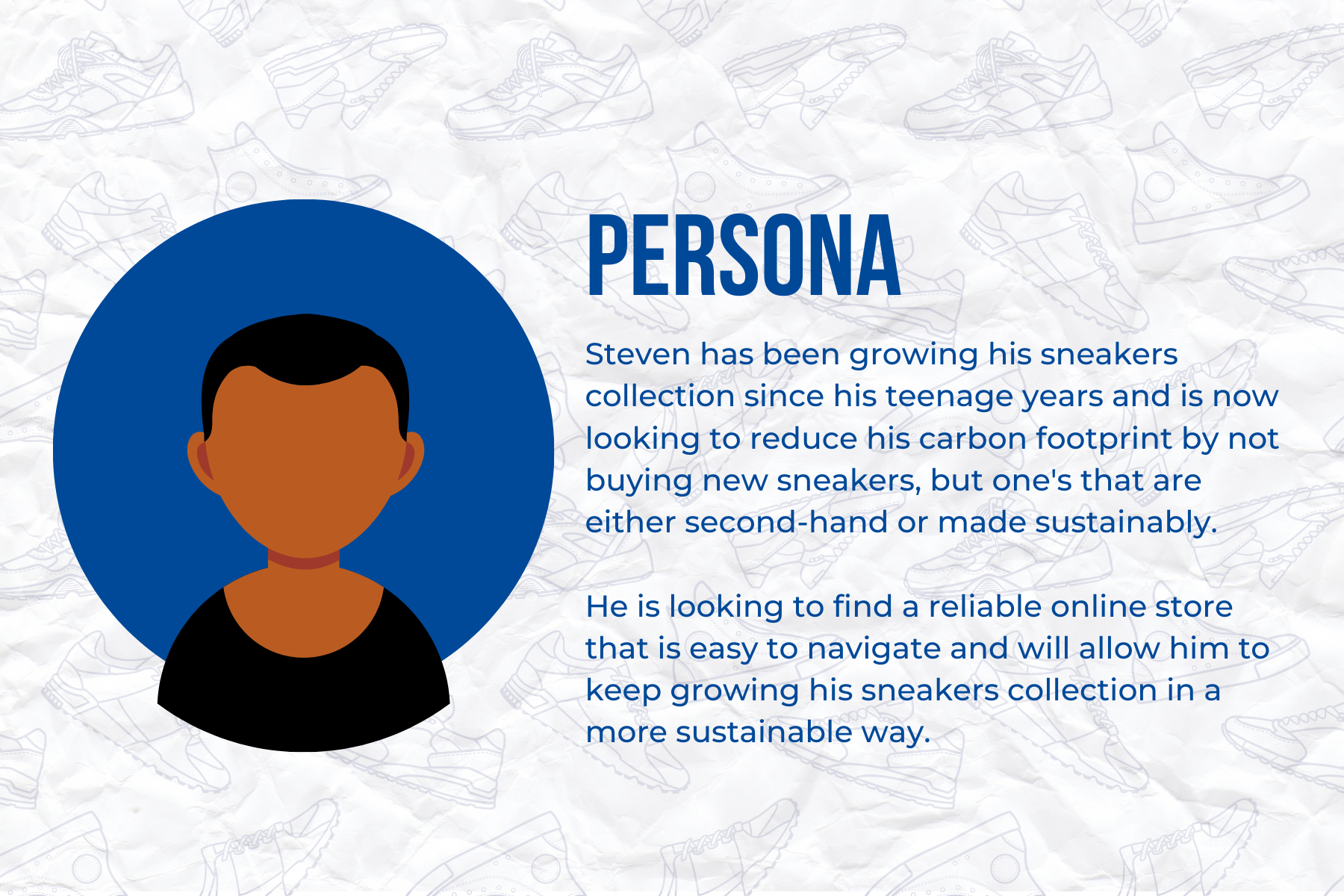
To better understand my target audience, I decided to create a persona that embodied all the key characteristics and preferences my target audience of young adult sneakerheads have. This allowed me to design the e-commerce application most suitable and accessible for the chosen target audience.
Steven has been growing his sneaker collection since his teenage years and is now looking to reduce his carbon footprint by not buying new sneakers, but ones that are either second-hand or made sustainably.
He is looking to find a reliable online store that is easy to navigate and will allow him to keep growing his sneaker collection in a more sustainable way.
Project Goals
Implement my dissertation research into a design project to back up my primary research.
Develop my branding skills and portfolio.
Prototype e-commerce app interfaces on Figma.
Timeline
As this was an individual project in the final semester of my university career, I understood the importance of having a timeline that I followed to make sure I not only met the course deadline but also balanced out my university workload, as the final few months of the university were guaranteed to be hectic, especially since I was also working part-time as a graphic designer while this project was taking place.
In saying so, even though I created this timeline at the beginning of the project, around week 4 was when I lost track of all the work I had to do, started working longer hours at my job, and took up multiple freelance jobs, which all led me to lose track of the timeline and fall behind on the project.
Fortunately, by week 8, I had figured out a better system for my work and found some extra time to work on Rekick’s project. This allowed me to slowly but surely get back to the planned project timeline and finish the project on time.
The lesson was learned to not bite off more than I can chew and to choose the projects I spend the most time on more wisely. Looking back at the project timeline, I now realize that I had too many things on my plate and could not find the right balance between them all. I have now learned that I need to consider my workload, and prioritise the most important and time-sensitive projects first, and then see if I still have the capacity to work on other secondary projects such as freelance work.
SDG’s
When given the opportunity and resources to complete a major university project of this magnitude, it is critical that I recognise the privileges and opportunities available to me. Education is becoming increasingly important as more people recognise the value and impact that quality education and learning opportunities such as this, have on society. Education will inevitably lead to a more sustainable, opportunistic, and brighter future for us all.
The Rekicks initiative also fits SDG 12 criteria, as the establishment of an e-commerce application eliminates the necessity for the business to have a physical store. This decreases the resources required to establish the brand's store and allows them to sell their trainers in a more sustainable manner.
Furthermore, Rekick's major goal is to reduce waste generated by throwing away outdated or old trainers by collecting, fixing, and reselling them. In addition, the brand intends to obtain entirely recycled and decomposable materials for all of its packaging. Both of these contribute to SDG 12's goal of encouraging companies to adopt more sustainable practices and integrate sustainability into their daily operations.
Research
Since this project coincided with and was related to my undergraduate university dissertation, the majority of the research done for the Reckick’s project was inspired and influenced by the research done for the dissertation project.
The main aim of the study was to understand the ways in which consumer psychology and design principles can be used to inform and enhance the UX/UI design of web and mobile applications. This is with the goal of creating a better and more intuitive experience for the user.
Defining UX & UI design
The distinction between UX and UI design has to be made before any project-related design work could begin. Since UX and UI design are related and interconnected but still have distinctions, having a deeper understanding of both will help me better develop the abilities required for each notion. A good designer should be aware of these differences in order to take the appropriate approach to each.
According to Nielson Norman Group, the user's experience with a product or service is referred to as UX design. It must be able to satisfy all of the user's requirements and needs without getting in the way of simplicity in order to qualify as an excellent user experience. (2022, Nielsen Norman Group, [online]) As the user is the most crucial component of UX design, it is imperative that the functionality and usability of an app are simple, logical, and intuitive for the user.
On the other hand, UI design refers to “the user-centered approach to designing the aesthetics of a digital product” (Oppliger, 2021, [online]). It focuses on the user's visual experience and is generally how a website or application looks and is laid out. Similar to UX design, a good user interface is one that is reliable, usable, and functional.
Consumer psychology is the field of research that analyzes how people behave in terms of their preferences, buying habits, and purchase decisions. The goal of consumer psychology is to assess and understand the consumer and how they make decisions (EMOTIV, 2022, [online]).
Recognizing the importance of consumer psychology to the UX/UI design of e-commerce applications is crucial since it will significantly affect the interface and user experience of any app whose primary goal is to sell a user a product or service.
What is Consumer psychology?
10 Psychological design principals
Hick's Law states that the length of time required for a user to make a decision increases with the number of options provided. To reduce the consumer's decision-making time, UX/UI designers must make the user's choice as simple as possible. It is critical not to overwhelm the customer with unrelated links and buttons, as this may result in them abandoning the purchase they came for in the first place (Reading, 2021, [online]).
1. Hick’s Law
The visual perception principle, also known as the Gestalt Theory, suggests that humans group similar elements and create structures that are orderly and recognisable. There are six essential elements of Gestalt's Theory that, when used appropriately by a UX/UI designer, can influence the user's visual perception, allowing them to direct the user to a specific focus point or even encourage the user to do a specific action (UserTesting, 2022, [online]).
2. Visual Perception (Gestalt Theory)
Cognitive load is a concept introduced by John Sweller in 1988, and is defined as the “amount of information that our working memory can hold at one time” (Mindtools.com, 2022, [online]). It all comes down to how much cognitive effort a person's working memory requires at any given time. Therefore if the cognitive load in an e-commerce app is high, for example, if the page is cluttered with text, photos, and other content that isn't directly related to the consumer's search, it might distract or overwhelm the user. One way a UX and UI designer can decrease the cognitive load in their designs is by making sure each element used has a purpose.
3. Cognitive Load
The Von Restorff Effect, often known as the isolation effect, is a notion that explains how, in a group of similar things, the one that looks different is more likely to stand out and be remembered by the user (Yablonski, 2022d, [online]).
As seen by the image, the triangle is the most likely to be noticed first due to its larger size and different shape and colour compared to the other shapes.
This principle is more commonly used for call-to-action (CTA) buttons as designers want the user to differentiate between a simple button in the interface and a CTA one. This can be done by altering either the size, shape, colour, or spacing of the element.
4. Von Restorff Effect (Isolation Effect)
5. Fitt’s law
According to Fitts’ Law, “the time to acquire a target is a function of the distance to and size of the target” (Yablonski, 2022b, [online]). This can be translated into UX/UI design by adding larger target buttons, or CTA, to expectant mouse or hand reach comfront zones on a mobile screen. As a result, the user's interaction time with the target buttons will be reduced.
6. Serial-Position Effect
The "serial position effect” states that humans have a tendency to “best remember the first and last items in a series” (Yablonski, 2022c, [online]). This theory is based on two main concepts: the primary effect and the recency effect.
The primary effect states that an item shown at the start of a series is remembered more accurately by the user than items shown in the middle of the series. The recency effect is the same, except the items more accurately remembered by the user are placed at the end of a series rather than in the middle (Green, 2019, [online]).
This effect can be particularly effective for a UX/UI designer to apply when placing the most desirable or best-selling products at the beginning or end of a carousel in order for the user to remember them more easily (Appnova.com, 2016, [online]).
7. Millers Law
Miller's law is another psychological design principle that can be used to the UX/UI design of e-commerce platforms, as the theory explains how a human can only retain up to 7 items in their working memory on average. Any more information that the brain will find difficult to recall (4. Miller's Law, 2019, [online]).
Because e-commerce applications are so content-rich, this is a critical principle for a UX/UI designer to remember because it will strongly influence the layout of the application. If the app gives the user too many options, the large volume of information may result in cognitive overload, causing the user to feel overwhelmed and abandon the app (Fazmeena, 2022, [online]). Splitting the information into lists of 5 to 7 items will help the user's working memory and result in a more satisfying user experience.
8. Peak-End Rule
The peak-end rule characterizes how people recall experiences based on how they felt at its most extreme (its peak) and at its end (Doll, 2019, [online]). This effectively means that instead of recalling their user experience minute by minute, they will remember it based on the best or worst point (peak) and the ending. As a result, the designer must create positive peaks throughout the user's experience with an e-commerce app if they want to leave a positive, lasting impression.
The aesthetic usability effect is all about people's perceptions of interfaces, as the principle outlines how people assume an aesthetically beautiful interface will also be more usable (Yablonski, 2022a, [online]). This theory essentially claims that the appearance of an e-commerce application is linked to its usability based on the user's previous interactions with other apps.
9. Aesthetic Usability Effect
10. Jakob’s Law
The final fundamental psychological principle for UX/UI design is Jakob’s Law which states that due to the fact that users spend the majority of their time on other websites, they tend to prefer all sites to look and function the same way (Yablonski, 2017, [online]). This is because it provides the user with familiarity and meets their preconceived expectations when using websites.
Jakob Nielsen created the law after noticing that people have developed a desire for and expectation of familiarity in their lives, which is reflected in what they expect from apps and websites. (1. Jakob's Law, [online] 2018).
Analysis of the principles
While researching and understanding these key psychological design principles is crucial when developing a user-friendly and intuitive e-commerce app, the question remains whether all of these principles must be employed in order to enhance the user's experience or whether designers can pick and choose those that best suit their designs.
In theory, the perfect e-commerce application would incorporate all of the UX/UI design principles to achieve the most intuitive app design; but, in practice, a designer may find it difficult to integrate all of them in their designs if some are irrelevant. It is important to keep in mind that each app design will have its own set of objectives and goals; therefore, the designer may not feel it appropriate to implement all of the psychological design concepts.
All designers need to understand and apply psychological design principles; nonetheless, they should not feel obligated to conform to them and should keep testing the boundaries of innovative design. After all, a good designer is always encouraged to think outside the box, in this scenario, the box is the design principles set by the industry.
Summary of research
According to most psychological principles, a great deal of user biases are influenced by the aesthetics and appearance of an interface. Whether it's the colours used or simply how visually appealing the app is, aspects like these can have a big impact on how a user perceives and interacts with an e-commerce app.
However, as noted previously, a UX/UI designer should not feel obliged to include all ten psychological principles on every page of an e-commerce application. It is possible to establish a balance between when and where the principles should be applied during the design process, and it is up to the designer to determine which principles they believe will best enhance the user's experience.
Infographic for dissertation (scholars poster)
I was fortunate enough to be able to join the Scholars Program at the University of Winchester as a recognition of receiving a first during my second year of university.
Part of the program was to present our research project either in the form of a presentation or a poster. As a design student, I felt more comfortable presenting a poster.
I decided to make a poster summarizing my dissertation, which, as explained previously, is very much connected to the Rekicks Project.
Ideate & Develop
During the ideation stage, I started working on the design aspect of the project. I started formulating my ideas by creating a mind map and mood board for the brand's aesthetic. I then began the logo and brand design process for Rekcicks and finished it off by creating brand mockups to bring the brand to life.
Mind Map
I wanted to make sure I had properly thought through and finalised my project idea before I started developing anything for the brand and app. As seen above, I used a mind map to help me plan the projects' future phases.
Mood Board
After completing the mind map and finalizing the details of the project, I continued the ideation stage by creating a mood board of images that had a retro aesthetic, as that was my plan for the brand design. My goal was to build a new and current brand while incorporating nostalgic and retro features throughout the design as a homage to old-school trainers that have recently resurfaced in popularity.
Logo Sketches
Once I had a solid notion of the aesthetic I wanted to incorporate into the brand design, I began sketching and brainstorming concepts for the logo design. If I wanted to stay true to the retro style, I knew I had to utilise a square and structural typeface like the ones in the mood board. However, while sketching my logo concepts, I thought I could use a shoelace motif in the logo to emphasize that Rekicks is a shoe brand. I could then also use the shoelace design in the branding and app design and utilize it as a brand component.
I started developing that idea and realized that I would need to use a calligraphy font that I could manipulate and join the letters together to make it seem like it was written with a shoelace. Though to do so, I would have to change the retro aesthetic of the brand.
Fonts
To start off the logo design process, I began by choosing four fonts that I believed could work with both the retro aesthetic and the shoelace idea. The top two fonts, “American Captain” and “Kardust”, are the fonts I chose for the retro theme, as they both remind me of the fonts of other well-known sneaker brands such as Nike, Puma, and Reebok. I believed that choosing a font that was similar in aesthetic to other major sneaker brands, would help the Rekicks logo be recognised as a sneaker store.
The two bottom fonts are the ones I chose for the shoelace logo idea I mentioned previously. As seen from the rough sketches of the design, I would need a calligraphy font to achieve the effect I was looking for, and both the “Bomber Dreams” and “Billion Dreams” fonts would allow me to do that.
The “Bomber Dreams” font looks more graffiti and street art style than the “Billion Dreams” font, but the latter seems to me to be an easier font to edit and make all the letters join together. Additionally, it looked more like a shoelace design than the “Bomber Dreams” font.
Initial Logo Design
Above is the digitally developed shoelace logo idea. I chose to use the font “Billion Dreams” and used Adobe Illustrator to manipulate and join the letters together to make them look like one long shoelace. To complete the design, I added the “aglet” of the shoelace, which is what revealed that the logo is meant to resemble a shoelace.
While I like how the logo design turned out, the longer I used it in the project, the less appealing it looked for the specific design aesthetic I hoped to achieve. The logo looked more childish and hand-drawn than I would have liked. I aimed to create a retro-inspired sneaker store, and the above logo design was not convincing enough.
That is why I chose to change the logo and design to one that suited the brand's aesthetic better.
Final Brand Logo
Once I decided to redesign the logo, I returned to the fonts I had chosen in the previous stage and used the font “American Captain.” It looked and felt like the most authentic retro font of all the options, and as mentioned previously, it reminded me of the fonts other sneaker brands use.
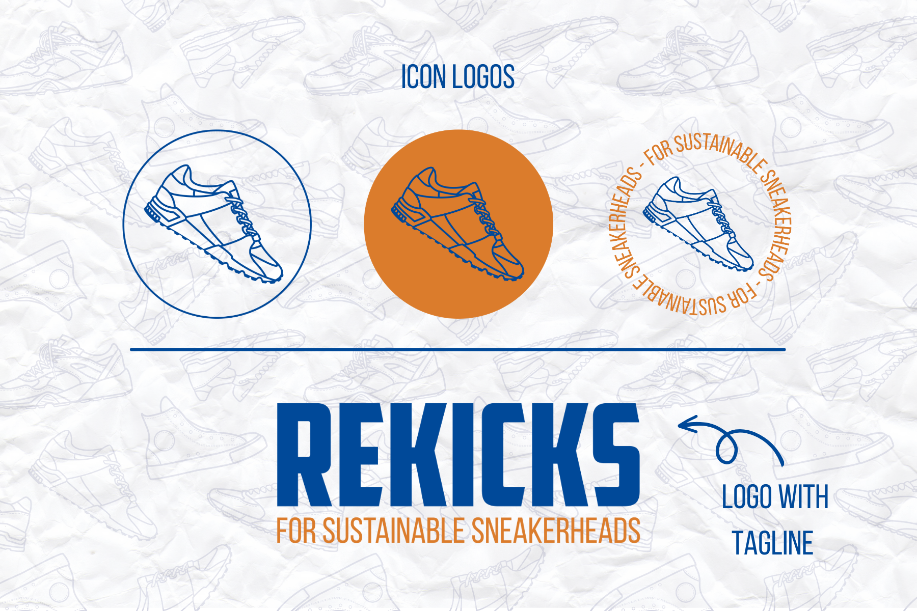
Above is the final logo I designed for the project. The one on the right is the logo, with the brand tagline added beneath. I like how simple it is, keeping the logo clean and minimal, yet the typeface still gives character to the design, capturing the desired look while also appealing to the target audience.
Overall, I am pleased I updated the logo design, as the final logo is much more appropriate for use in an e-commerce app, which is the purpose of this project.
These are the icon logos for the brand. Similar to the sub-logos, they too can be utilised on promotional materials or packaging. I chose to include a design of a shoe to the logo to emphasise to the target demographic that Rekicks is a sneaker store.
These are the sub-logos I designed to go with the main logo. These should be utilised anytime the primary logo is too large or unnecessary. For example, promotional materials or packaging.
Additionally, when scaled down, the main logo may lose some of its legibility; so, these variations, particularly the 'RK' option, would allow for a clearer and cleaner logo on small photos.
Final Fonts and Colours
The font I used for the logo, as noted above, is called "American Captain." I chose it because I liked how much cleaner and more readable it was than the initial font I used for the logo. It also better complements the retro sneaker style than the old font.
As for the secondary font, I chose to go for the clean and simplistic non-serif font, Bebas Neue. Since the primary font is bold and more eye-catching, I wanted the secondary font to match the aesthetic of the primary font but also be more subtle to read.
After I completed the logo design, I went on to create a colour palette for the project. Given that the general style of the brand's design is inspired by classic sneaker designs, I thought the colour palette should follow suit, but I also wanted to bring a modern touch to the design. The colour palette seen above is heavily influenced by retro colours, however, they have been made bolder to make them feel more contemporary.
Pattern
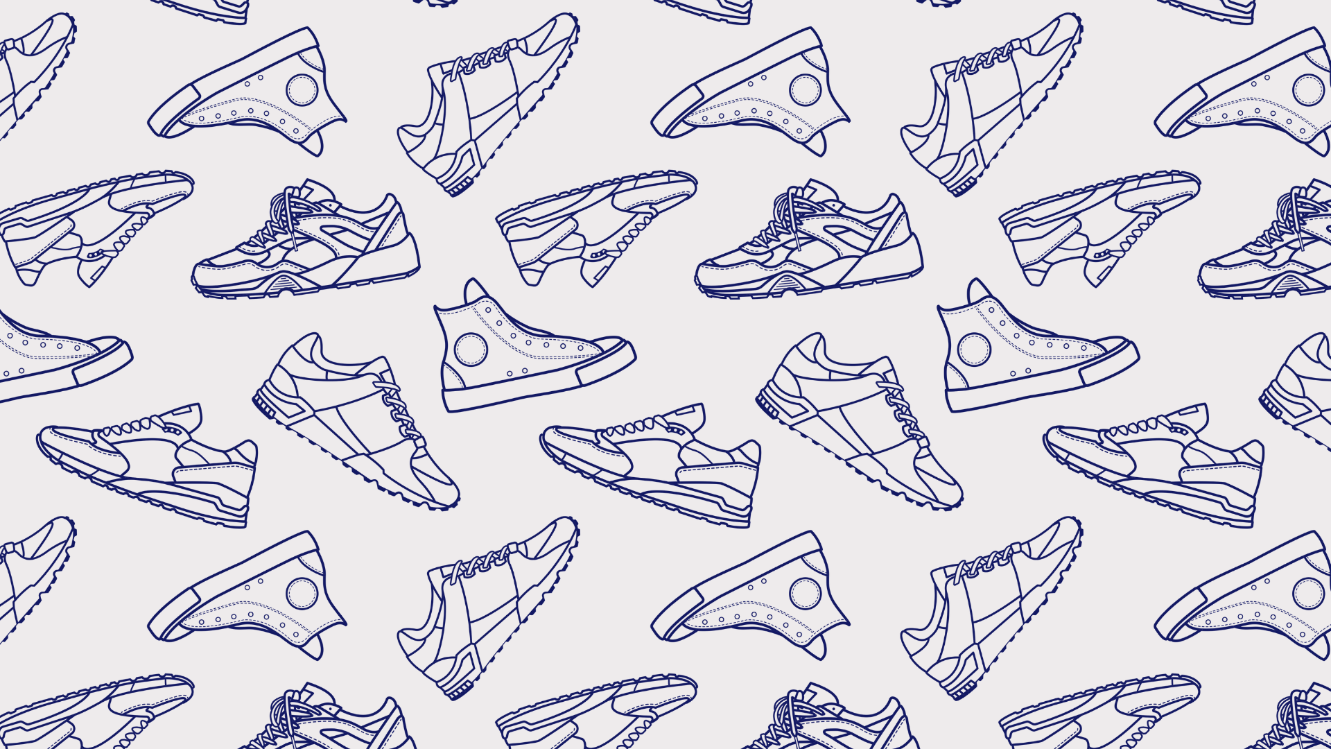
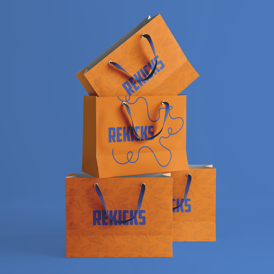
While making the icon logo with the shoe design, as seen previously, I was inspired to create a pattern based on the shapes of famous trainers, thereby creating the pattern seen above. The pattern proved to be an excellent addition to all of the branding concepts created for the project. It was a great finishing touch to the branding, making it more eye-catching and adding a distinctive feature to the brand since patterns are not a common design element found in other e-commerce shoe applications.
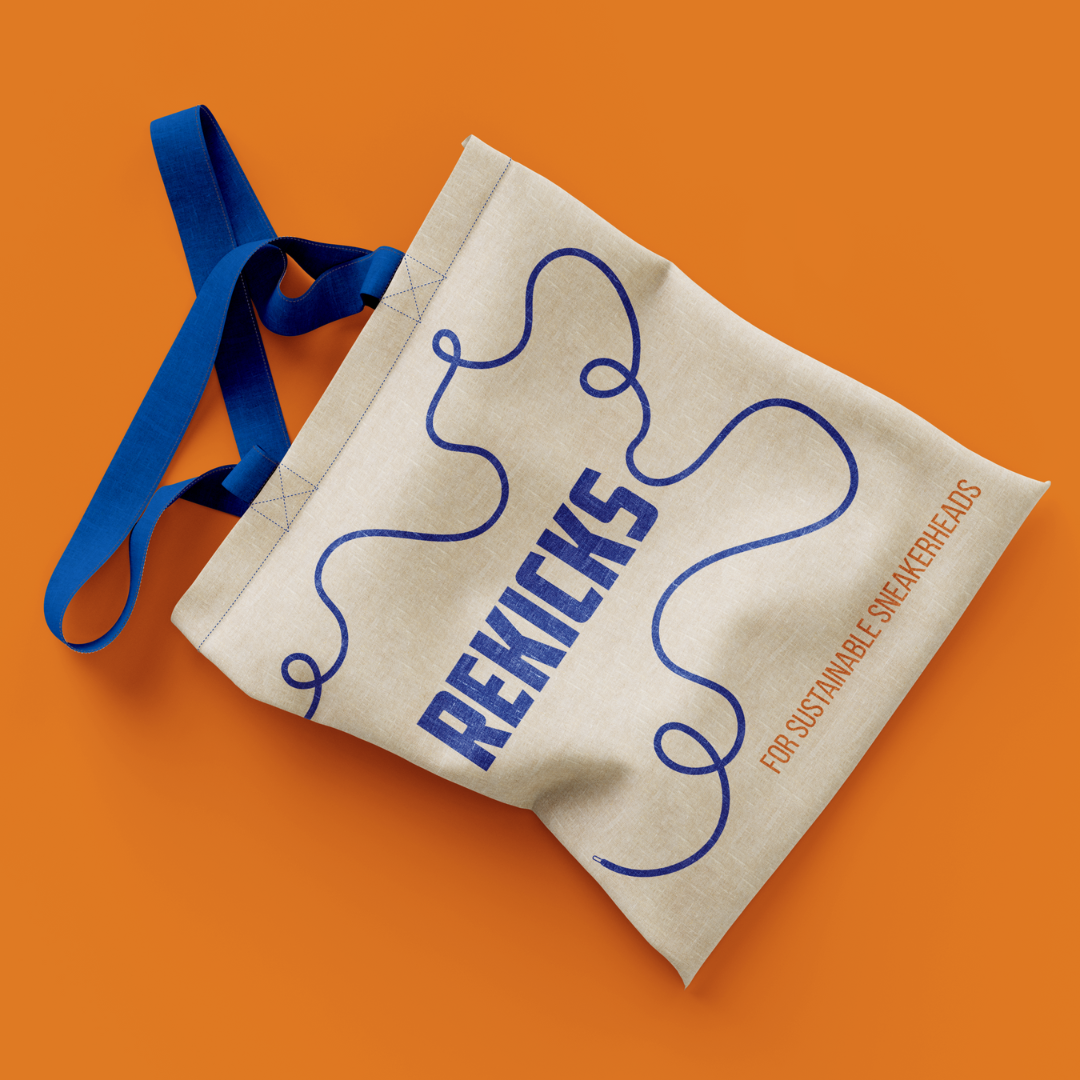
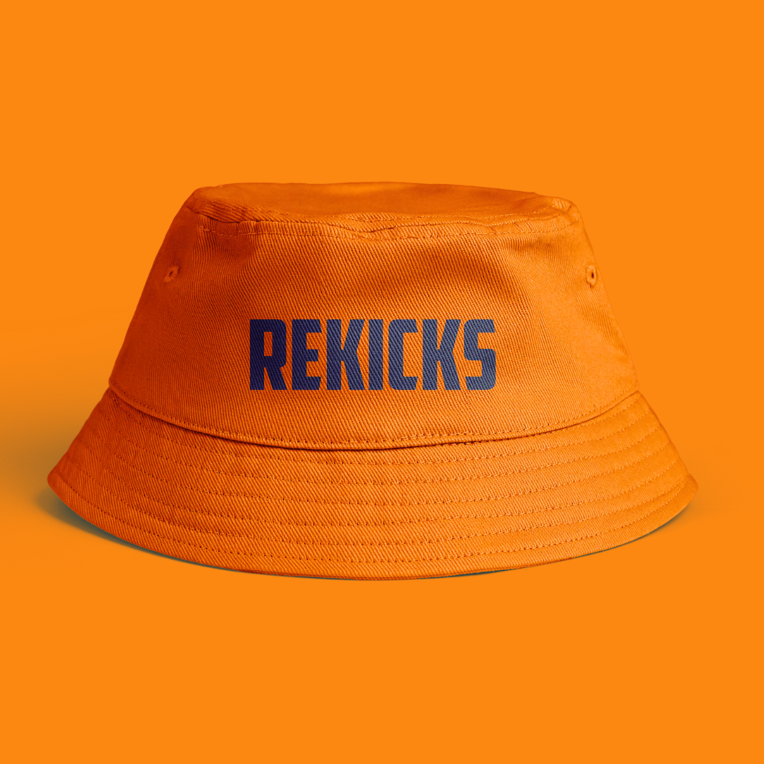
Branding Mockups
Brand Guidelines
Prototype and Testing
Perhaps the most important part of the project, the prototype stage is where I began building each of the interfaces for the e-commerce app that would utilise the design principles established during the research section of the project. My goal was to discover how many psychological design principles I could apply to one user interface at a time.
Mood Board
I wanted to develop a mood board for the app design portion of the project, similar to how I did for the branding, to act as inspiration for the interface design. Because the objective of the app prototypes is to apply and assess the psychological design concepts outlined in the research section, the app design should be as realistic and practical as possible.
User Flow Chart
The first step in developing any UX/UI software is to construct a user flow chart, which illustrates all conceivable paths a user could take while using the app. It also serves as a guide for the designer to know all of the interfaces that must be designed for the app to be fully functional. Because the purpose of this project's app prototype is to test the specific psychological design principles mentioned in the research, I will not be designing every single interface shown in the user flow chart, but rather the ones where I can apply the principles most effectively for the purpose of testing them.
Wireframe Sketches
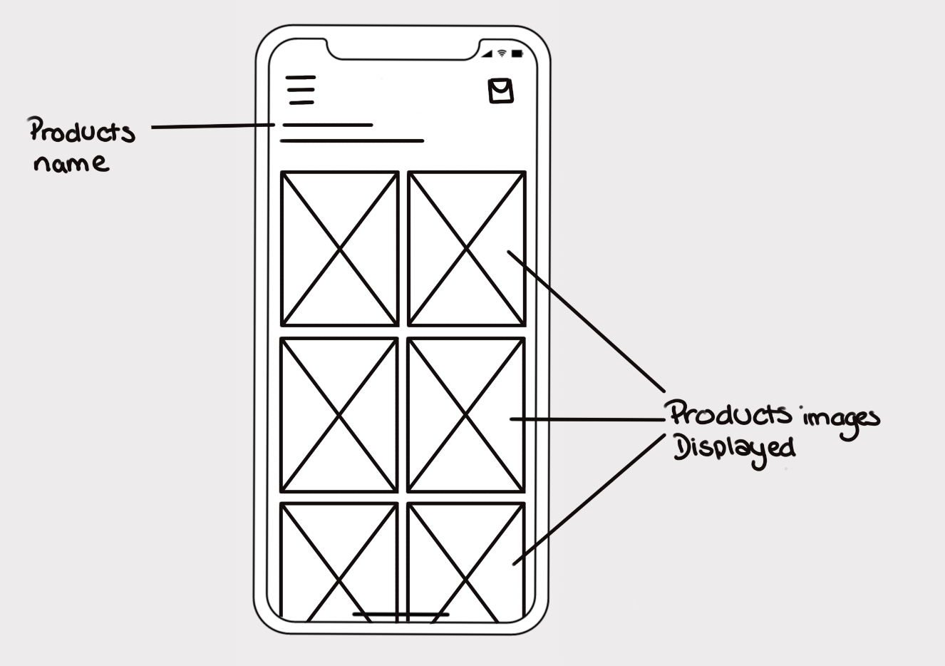
Before I started designing the user interfaces of the e-commerce app, I drew out wireframes of the design I was planning on prototyping. This allowed me to plan ahead for how I would implement the design principles into the interface.
The first wireframe is for the home page. At the very top of the interface, there will be a search bar that is easily visible and accessible to the user. This allows users who enter the app with a specific product in mind to quickly search for it, reducing search time and providing a more seamless user experience.
The sneaker brand logos will also be displayed on the front page, just beneath the search box. This is for the user who knows what brand of sneakers they want but does not know the precise model name. This wireframe supports Hick’s law as it decreases the time it takes for the user to make.
The second wireframe shows the product page of the e-commerce app. It starts with an image of the sneaker at the top, followed by a description, customer ratings, and a size picker in the latter half of the page.
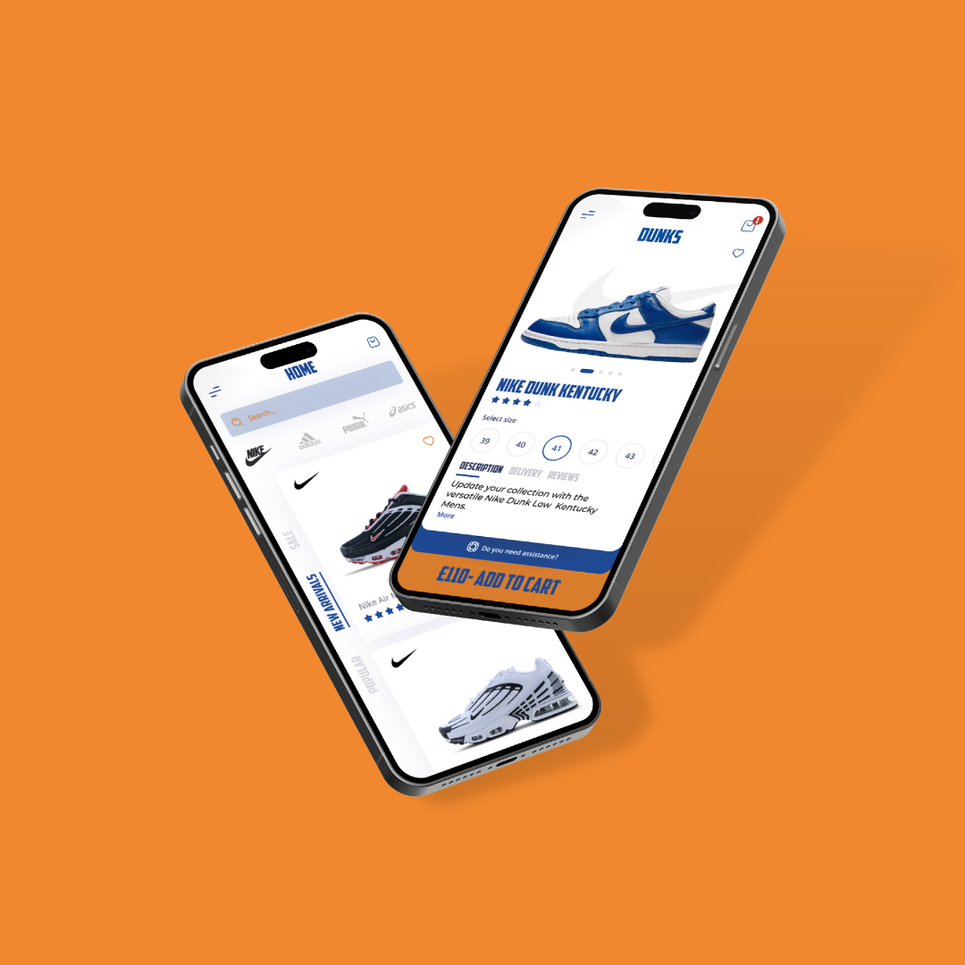
Two key design principles are being tested here. The first is Fitt's law, which can be seen by the large "add to cart" button at the bottom of the page, which places the CTA in an easy-to-reach spot for a user holding their phone. The second principle is the isolation effect, as the CTA button on the bottom of the screen will be a different colour than the rest of the page, which will grab the user’s attention.
This next wireframe shows the results after a user searches for a product or brand. It will be a scroll-down list of items that will be colour-coded and organised depending on the search criteria.
This supports Gestalt’s theory, which suggests that humans group similar elements together and create structures that are orderly and recognisable.
The following wireframe shows what the menu will look like for the e-commerce app.
The design will employ Hick's law, which argues that the more options a person has, the longer it takes them to make a decision. As a result, rather than having a large menu list of all the products Rekicks offers, the menu will be divided into categories based on the brands of sneakers. When the user finds the brand they're looking for, they can click on it to get a more detailed list of products.
This enables the interface to hide the majority of the information in the menu bar that is irrelevant until the user makes a selection.
This wireframe is another product listing interface, this one testing out the cognitive load principle, which states that the amount of mental effort required by the user should be as minimal as possible. This is to avoid overwhelming them, which could cause them to abandon the task.
This wireframe will seek to reduce cognitive load by displaying only the most important information to the user and not overstimulating them.
Prototyping Each Psychological Principle
When the client came to us for this project one of the goals she had was to prototype the product so that she could have something to show to the investors when pitching the idea.
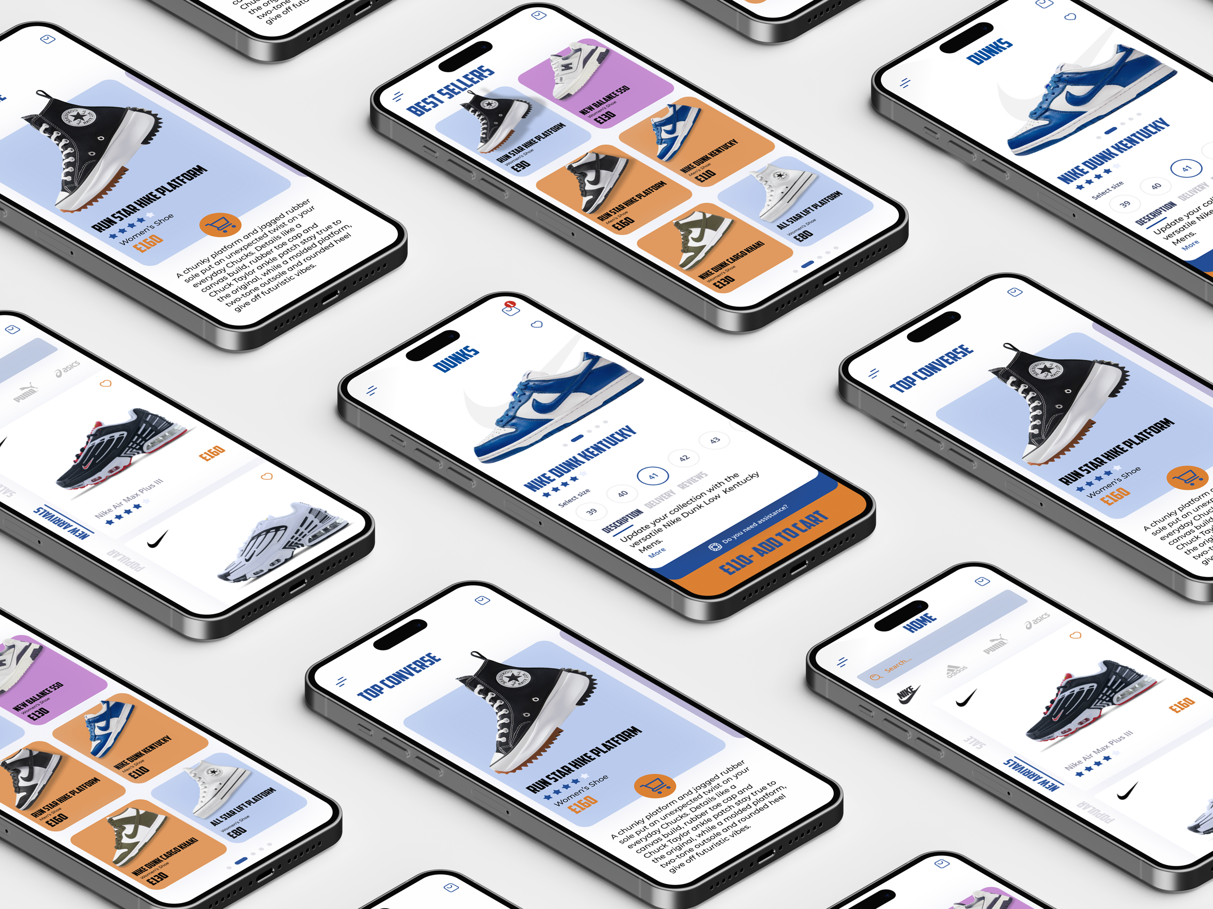
In order to achieve the prototype, I asked a fellow 3D visualisation student, Saaya Sekiguchi, to model my 2D designs into 3D. We worked together for the last 6 weeks of the project to achieve the 3D prototypes you see below.
Choosing a Design Program
The application used to design the e-commerce application for this project was Figma. I chose it due to the fact that it has now become an industry standard program in the UX/UI design profession, with most, if not all, companies wanting employees to be familiar with it. Since I intend to apply for UX/UI positions as well as branding positions after graduating from university, it seems most logical to me to complete the project in Figma and make good use of this opportunity to learn the program as best as possible.
Overall, I found Figma to be a highly user-friendly and intuitive design program, with many parallels to Adobe XD, with which I am already extremely familiar. I personally enjoyed learning Figma, and while I still have a lot left to learn, I look forward to further exploring its capabilities while also improving my UI skills.
Feedback & Final Thoughts
The final stage of the project was to test out whether the interfaces I designed to test out the design principles were effective or not on the user. In this part of the project, I analysed the results I received from testing out the app design on friends and peers, while also reflecting on the outcome of the project by looking at the challenges and, most importantly, the things I learned.
Feedback from peers
The main goal of this project was to utilise the research I conducted for my university dissertation and use it in a prototype e-commerce app as a way to test out if the psychological principles could enhance the user experience. The way I achieved this goal is by giving the prototype interfaces I designed to peers and friends to test out and give feedback on.
A majority of the feedback was supportive of the psychological design principles, as they agreed that the design elements such as the larger “Add to Cart” button and the colour-coded search list made the interface easier to use and more intuitive. Another element that was widely commented on is the overall aesthetic of the app design, as many said it was “visually pleasing to look at” and that the colours complemented each other well.”
The responses were overwhelmingly positive, demonstrating that consumer psychology, in the form of the psychological design principle, can really improve the user experience when used in an e-commerce application. Even so, this was to be expected, given that the psychological design principles were designed with the intention of enhancing rather than detracting from the user's experience.
Reflection
Looking back at my final university project, I can say that I am proud of not only what I was able to achieve with this project but also of what I was able to achieve in my overall time at the University of Winchester. The skills and knowledge I have gained in the past three years have been very valuable.
This project was a success in that I was able to complete what I set out to do, which was to use my dissertation research in a real e-commerce design. This enabled me to not only understand the research I was undertaking but also how to apply it, which was really beneficial.
Through this project, I was also able to learn a completely new program, Figma, and how to design user interfaces. This will prove very useful for me in the future, as I hope to be able to apply to UX and UI design positions as well as branding. As mentioned above, because Figma has now become an industry standard for UX and UI designers, I was very important to me that I got an opportunity to learn it while I was still in university. However, that being said, I am still nowhere close to mastering the program as I was not able to fully turn my designs into interactive prototypes. That is still a skill I will need to develop in the near future to ensure I know the full capabilities of Figma.
Even though the project was a success overall, there were a few things I would have changed if given the chance, the first of which was my time management. As previously said, I found myself with far too many responsibilities this semester, which was entirely my fault. I was trying to juggle my time between university, a graphic design job, and freelance projects. It was a challenge for me to handle, but I slowly started regaining control of my time after I stopped the freelance jobs and quit my graphic design job. I realised that I needed to focus my energy on my last few remaining weeks of university and not let this time slip away, as I would never be able to get it back.
The second challenge for me was very much influenced by the first one, and that was not learning Figma to the full extent. If I had managed my time better from the beginning of the semester, I would have had much more time to learn Figma. Even though I was still able to achieve my goals for this project, I would have liked to be able to turn the interface design into fully interactive prototypes.


