
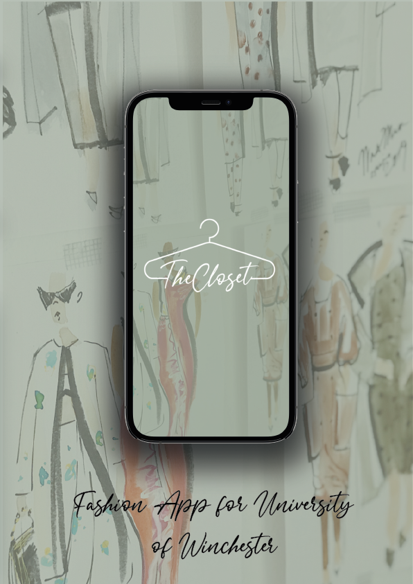
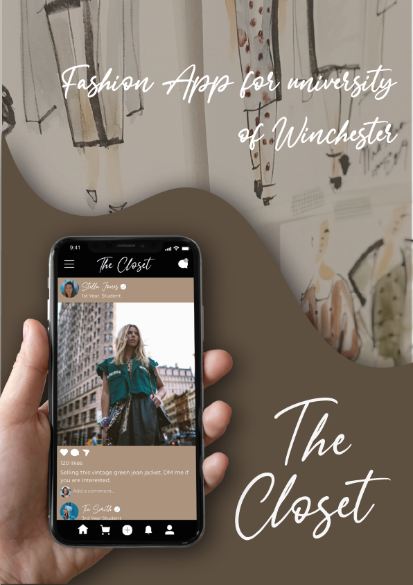
The Closet
Year 2: University Client Project
The Closet Brief
To create a fun, attractive, and enjoyable online community for UoW Fashion Marketing students to bring them together as a whole program cohort. It needs to bring together social media functionality with other knowledge-sharing and communication capabilities.
-
University of Winchester Fashion Department
-
13 Weeks
-
Illustrator
InDesign
XD
Photoshop
Procreate

The closet is the client project for the DM2110: Design Focus A module. The client was the UoW Fashion Program. They wanted to create an online platform for the UoW Fashion Marketing students to bring them together as a whole program cohort.
The app needed to bring together social media functionality and other sharing and communication capabilities to allow students and staff to celebrate success, connect around their topics of interest, chat and network, and lastly, showcase any creative work done.
Design Thinking
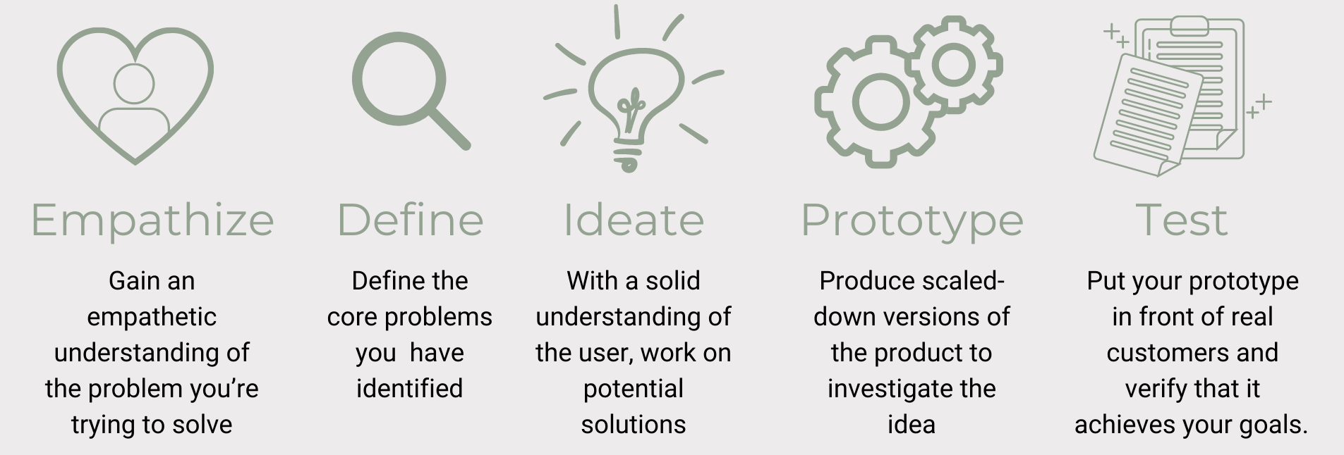
Before starting any project for year 2, I wanted to make sure that I incorporated the Design Thinking principle into my work. This was one of the main comments for improvement that I got last year and therefore, thought it would be good to have this diagram above as a guide while I did all my design work from now on.
Empathise
For the empathising stage, I created personas to make sure I understood what each user needed and was looking for from the app. This gave me an insight as to how each user would interact with the app, allowing me to design the prototype with each persona in mind.
Ideate
The ideate stage came in with my research, mood board, colour pallet, logo development, final logo and wireframes as this is what helped me generate the idea for the prototype.
Define
For defining the problem, I looked at the brief in detail and made sure to highlight the key points and problems that the clients wanted to solve. As mentioned above the most important problem I found from the brief was solving the lack of communication and interaction between the year groups in the fashion courses at the university
Prototype
The most important part of this project was the prototyping stage as that was what the client asked for, to create a prototype of an app. This was the stage that took the longest and the one that I believe turned out the best.
Test
For this particular project, I found that the last step of ‘testing’ could not be applied as we did not have an actual developer in the team to create the final product and give it to people to test, but by having the prototype I created in XD, I thought that it came as close as possible to the testing stage.
Persona

To understand the brief and make sure we meet the needs of all users of the app I created personas for each of the different users. This made it easier for me to design for each user. As seen above, there will be four users in total: students, staff, alumni and professionals from the field looking for potential interns or employees.
Checkmarks

The way each of these users will be differentiated on the app will be through different coloured checkmarks as seen above, similar to verified checkmarks from other similar social media apps.
Timeline

As this was a group project with a real-life client, we understood the importance of having a timeline that we stuck to. As the project manager, it was one of my duties to make sure all group members followed the timeline to make sure we not only meet the course deadline but also the client’s deadline. The timeline starts at the third week of the first semester as that was when the group projects were chosen and the groups were formed.
We also had bi-weekly meetings with the client that I organised to ensure that we stayed on track with the project and that the client was happy with the work being produced.
Mood Board

This is the mood board I created to inspire me and give me a feel of the aesthetics I wanted to include in my logo designs. There is the imagery of different items associated with fashion such as a needle, clothes hanger and a pin. This was something that I wanted to include in my logo designs, as I knew by this point that I wanted the logo to be simple and sophisticated but still have an association to fashion.
Colours

For the aesthetic of the app, the client wanted it to feel friendly, inclusive and contemporary, as the fashion students at the university for which this app will be created, tend to have fairly sophisticated taste and a preference for neutral colours, according to the clients.
Even though the Fashion Marketing cohort is 99 per cent female, as stated in the brief, as a group we agreed that we wanted to have a gender natural palette to make the app feel more sophisticated and not gender-biased. We did not want to fall into the stereotypical colours associated with the female gender such as pink and purple.
Font
For the font of the logo, the client had a specific request that we use the ‘Signatria’ font,, as they have already created some marketing flyers and keychains which already contained this font.


Primary Font

Secondary Font
As for the secondary font, I chose to go for the clean and simple font, Montserrat. Since the primary font picked by the client is a calligraphy font and a little less legible than I would like, I knew the secondary font needed to be readable, clean and simple to create a nice contrast.
Initial Logo Ideas
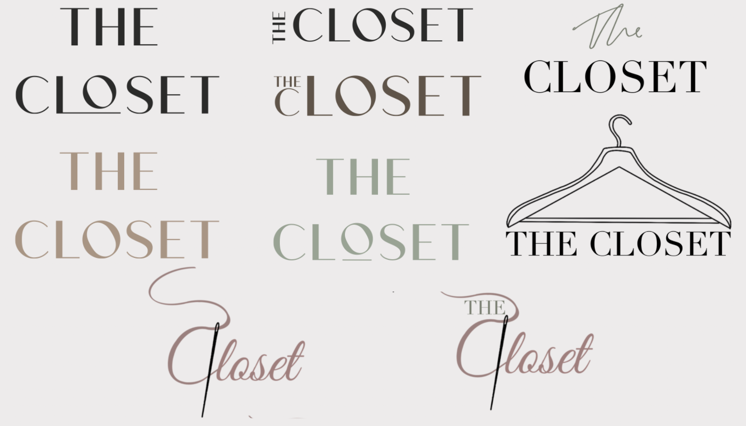
For my initial logo designs, I wanted to go for a more minimal, sophisticated look, similar to the vogue logo aesthetic, to fit in with the calm and neutral colour palette. When I showed the client these logos, the one that they preferred was the logo with the hanger on the right. Once they agreed on the logo. I went back and developed that idea further, as, in my opinion, the design of the hanger did not match the aesthetic I was going for.
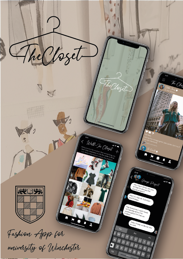
Logo
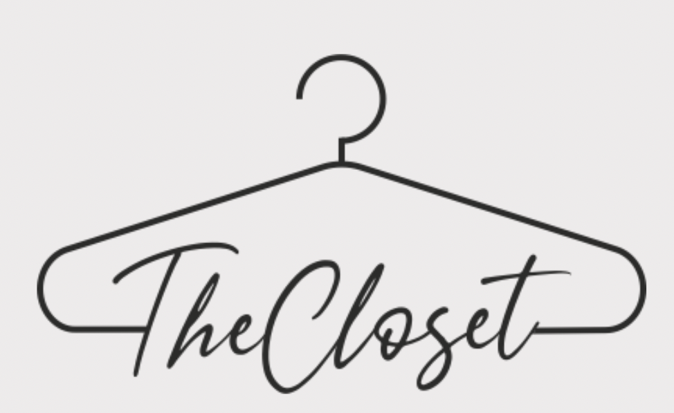


There are three final logos, each for different use.
The primary logo is the developed idea from the previous hanger logo that the client liked. By making the lines cleaner and adding the font the client requested, the final logo matches the aesthetic of the app much better.
The typeface logo will be used mostly on the app interface, whenever the primary logo is too large to use.
Lastly, the icon logo was created for the app icon, as the other logos lose their legibility when scaled-down therefore, this option will allow for a clearer app icon.
App Icon

To create the app icon, I used all three logo variations I designed to create three different options the client could choose from.
I suggested to the client that it would be in their best interest to choose the design on the right with the icon logo, as that will be the option with the best legibility when the icon gets small.
On the right, I created a simple mockup of the app icons using photoshop to show the client what each icon could look like on the home screen of an iPhone.

Poster & Flyers
Even though this was not mentioned in the brief, I wanted to provide some designs to the client for posters or flyers just in case they wanted to use them to promote the app around the University or to the Fashion cohort. I created eight posters/ flyers following a similar aesthetic to the app design for consistency.


Mobile App Wireframes
I created wireframes sketches for the mobile app. This would allow all group members to create a design that is similar and consistent to each other and not too differentiated so that the client feels like they are seeing two completely different app designs.

For the wireframes, I took a lot of inspiration from social media apps such as Instagram, Twitter and Pinterest, as these are the apps that the students will be most familiar with using. This allows the interface to be familiar to the user and not too overwhelming so that they feel intimidated to use an app they don’t know how to navigate. By creating that familiarity in the app it allows the user to feel comfortable using it, therefore they would use it more often.
Web App Wireframes


Similarly to the app wireframes, I created the web wireframes as well as this would create consistency between the mobile app and the web app.
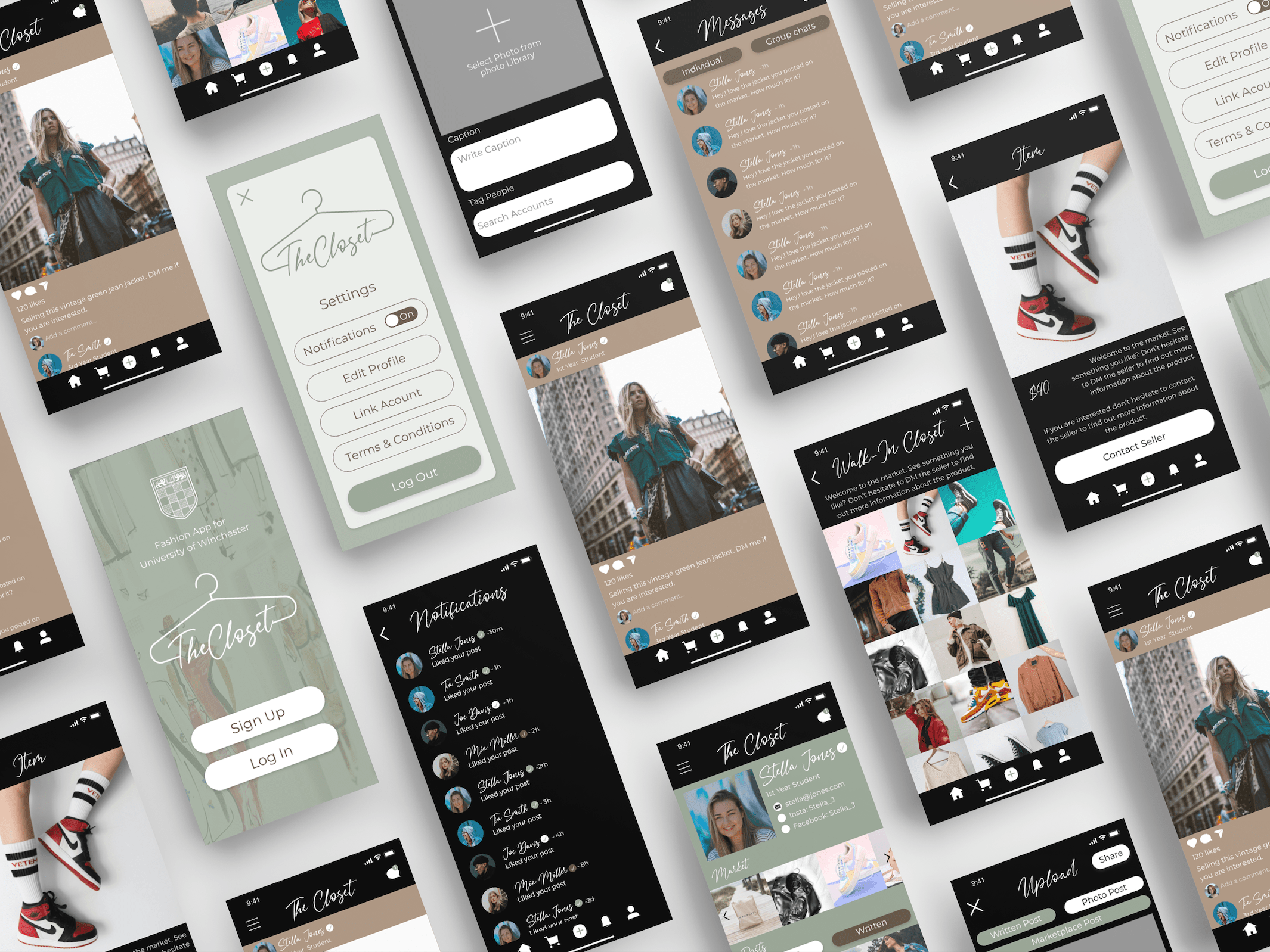
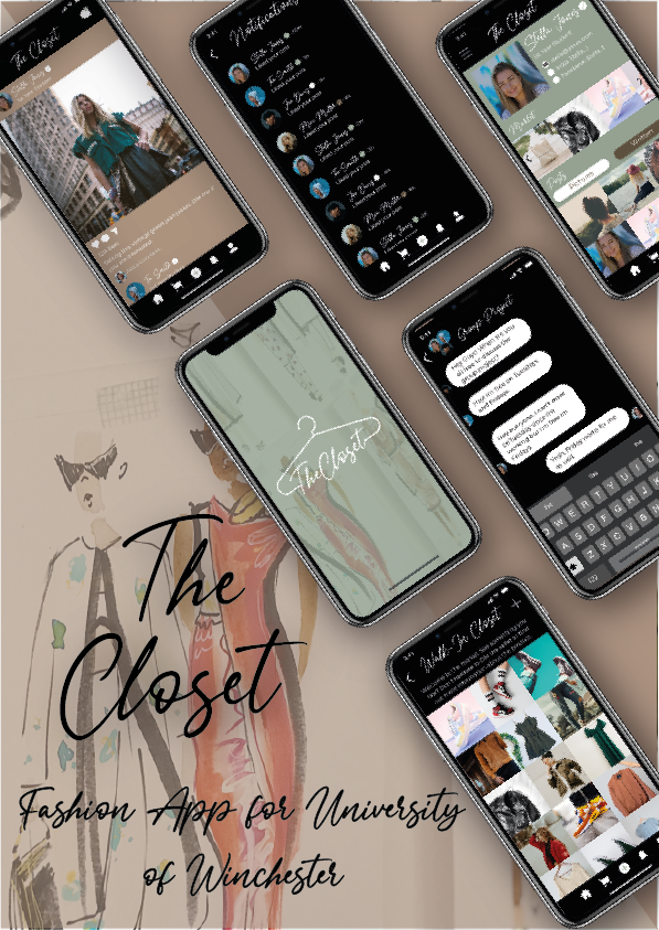
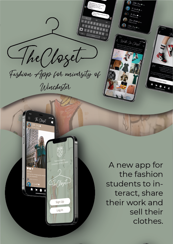
App Prototype
Once the wireframes were done and agreed upon by the client, I started creating the app prototype using Adobe XD. This was my first time using XD, however, I found that the program was very easy to use and navigate. It was very similar to illustrator, a program I am familiar with, therefore I did not find it a hard program to learn. I like that this project allowed me to grow my skills, not only in design but also in Adobe programs. Below you can see the prototype I designed and below on the right, is the video showing how the app would function.


Limitations
Once the project started coming together, we realised that there would be some limitations concerning the development of the app as a university application. Since the app will start off being associated with the University of Winchester, there were some guidelines and policies we needed to meet.
The first limitation we encountered was the messages section of the app. This was mainly a concern as there would be no way for the university to monitor the messages being sent by the users. If bullying or explicit content was being sent through the app the university would be at fault. Understandably they did not want to take that risk. To solve that problem, we decided that the messaging function would not be included in the initial version of the app. Instead, if the users wanted to contact someone else on the app they would do that by linking their other social media accounts on their profiles, allowing the other users to send them a message through those apps.
As a designer, I still provided the design to the client in case they wanted to use them in the future when the app would be independent of the university.
Another policy we had to follow is including the terms and conditions that the user would have to agree to when they sign onto the app. This essentially tells the user that it is the user’s responsibility for what they write and post on the app.
Lastly, there had to be a privacy policy added to the app for similar reasons as the terms and conditions. Both documents were provided to us by Melanie Short: the information compliance officer at the university. You can find both the privacy policy and the terms and conditions in the download file below.
Brand Guidlines


As with all client projects, I needed to create brand guidelines that I could give to the client and developer once the project was passed on to them.
I created the brand guidelines using Abode XD. It was my first time using the program and even though it took some time to get used to it, I enjoyed using it and I am glad that I made myself use not one but two new programs to me during this project. It helped me further develop my design skills and forced me to leave my comfort zone of just using illustrator.
You can view the brand guidelines in full down below in the ‘download files’ link.
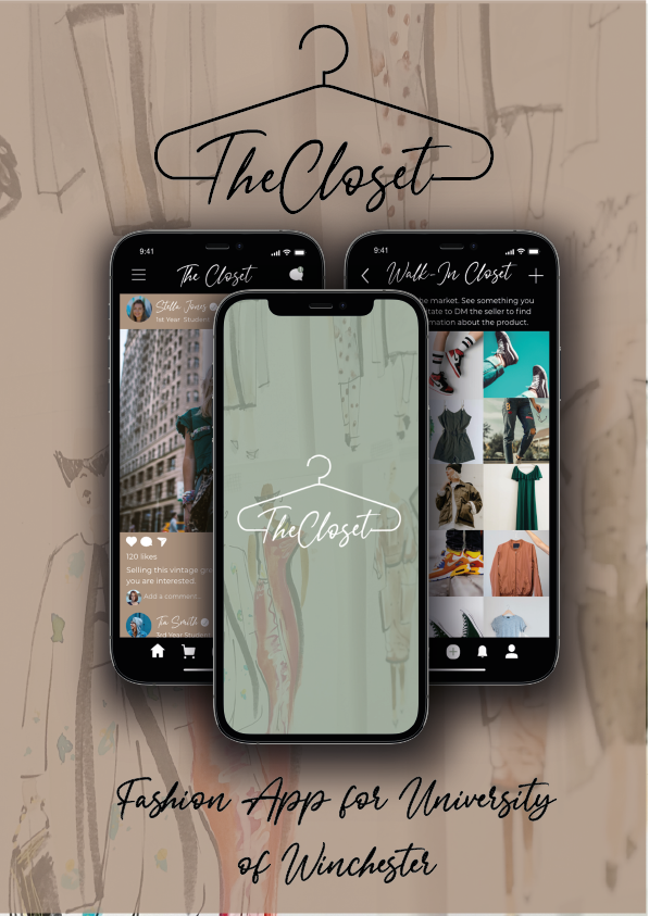
Exhibition Poster
At the end of the semester, the cohort had an exhibition where all students on the course throughout the year groups were asked to create an A3 poster summarising a project they did from the semester. I chose to create a poster showcasing the development of ‘The Closet’ app. Below is my exhibition poster.

My poster won the award for best-designed poster at the exhibition. It felt so rewarding to see my fellow cohort appreciating my design skills and recognising the effort I put into my work.
Moving Forward
Moving forward with this project, Ian asked me to keep in touch with both clients, Maria and Sarah, in case they need any further work done when it comes to design, which I am more than happy to do.
A developer has also been found who is happy to take on the project and bring it to life. I will also stay in contact with him in case he needs anything or wants help with the design aspect of the app.