
Bar Box
Year 2: Group Client Project
Bar Box Brief
To create a brand and product that allows users to transport 3 or more shampoo/wash soap bars conveniently.
-
University client project
-
13 Weeks
-
Illustrator
Photoshop
Procreate
Canva
Bar Box was a client project for the DM2113: Design Practise A module. The brief required us to create a brand and product that allows a user to transport up to 5 soap bars conveniently while travelling.
Below you will find my process, analysis and reflection on the project.
Design Thinking
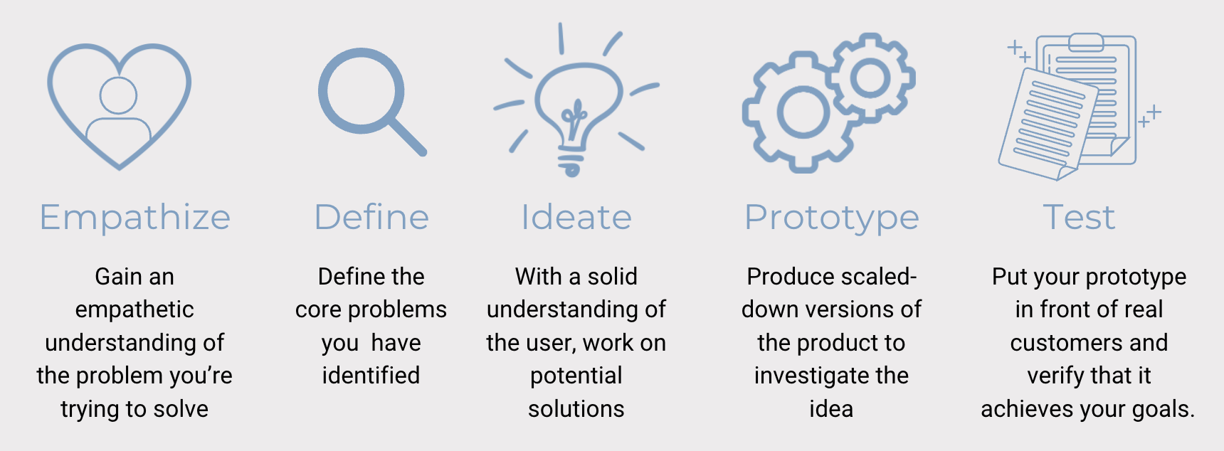
Before starting any project for year 2, I wanted to make sure that I incorporated the Design Thinking principle into my work. This was one of the main comments for improvement that I got last year and therefore, thought it would be good to have this diagram above as a guide while I did all my design work from now on.
Empathise
For the empathising stage, I created personas to make sure I understood what the client was looking for from the product and which functionality I would have to consider.
Ideate
The ideate stage came in with my research, mood board, colour palette, logo development, final logo and product designs as this is what helped me generate the idea for the prototype.
Define
For defining the problem, I looked at the brief in detail and made sure to highlight the key points and problems that the clients wanted to solve and discussed it with them.
Prototype
The most important part of this project was the prototyping stage as that was what the client asked for, to create a prototype of the soap container. For this stage, I asked a 3D student on the course for her help as I do not obtain the skills to 3D model the product.
Test
For this particular project, I found the last step of ‘testing’ to be the most important as this is what the client was specifically asking for. She wanted a physical prototype that she could show to potential investors to show how the product actually functioned.
Emphasise &Define
For the empathising stage, I created personas to make sure I understood what the client was looking for from the product and which functionality I would have to consider.
Client & Persona

To understand the brief and make sure I meet the needs of both the client and the user, I decided to make the persona to be the actual client, Sam. This made sense as the client herself is part of the target audience and a future user of the product. This made it easier for me to design with both the client and user in mind as they were one.
Project Goals
Create a brand for this product.
Design a product that allows for the transportation of 5 soap bars.
3D print the prototype.
Purpose of the product
To be an environmentally friendly and sustainable soap bar container that provides an easy solution to travelling with multiple bar soaps.
Timeline
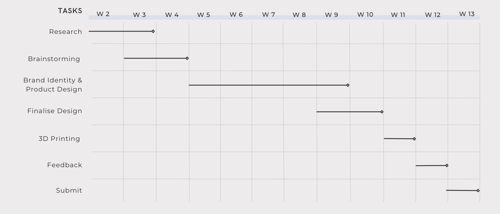
As this was a group project with a real-life client, I understood the importance of having a timeline that I followed to make sure I not only meet the course deadline but also the client’s deadline. The timeline starts in the third week of the second semester as that was when the group projects were chosen and the groups were formed.
We also had bi-weekly meetings with the client to ensure that we stayed on track with the project and that the client was happy with the work being produced.
Research
Since we were designing a product that did not exist in the market so far, it was very important that we did the right research to ensure that we created a product that was functional and that would appeal to the target audience.
Existing Products

One of the first things I did once I chose this project was go online and search for existing soap containers that could hold multiple soap bars. To my surprise, they weren’t any. At least not any eco-friendly and travel-friendly options.
The majority of my research into existing products resulted in containers as pictured above where they were mostly single soap containers, or if they were pictured with multiple soaps, it would be all in one container without any separation between the soaps. This gave me the idea that the container I created needed to separate each soap from the other to not mix and confuse them.
Market Research
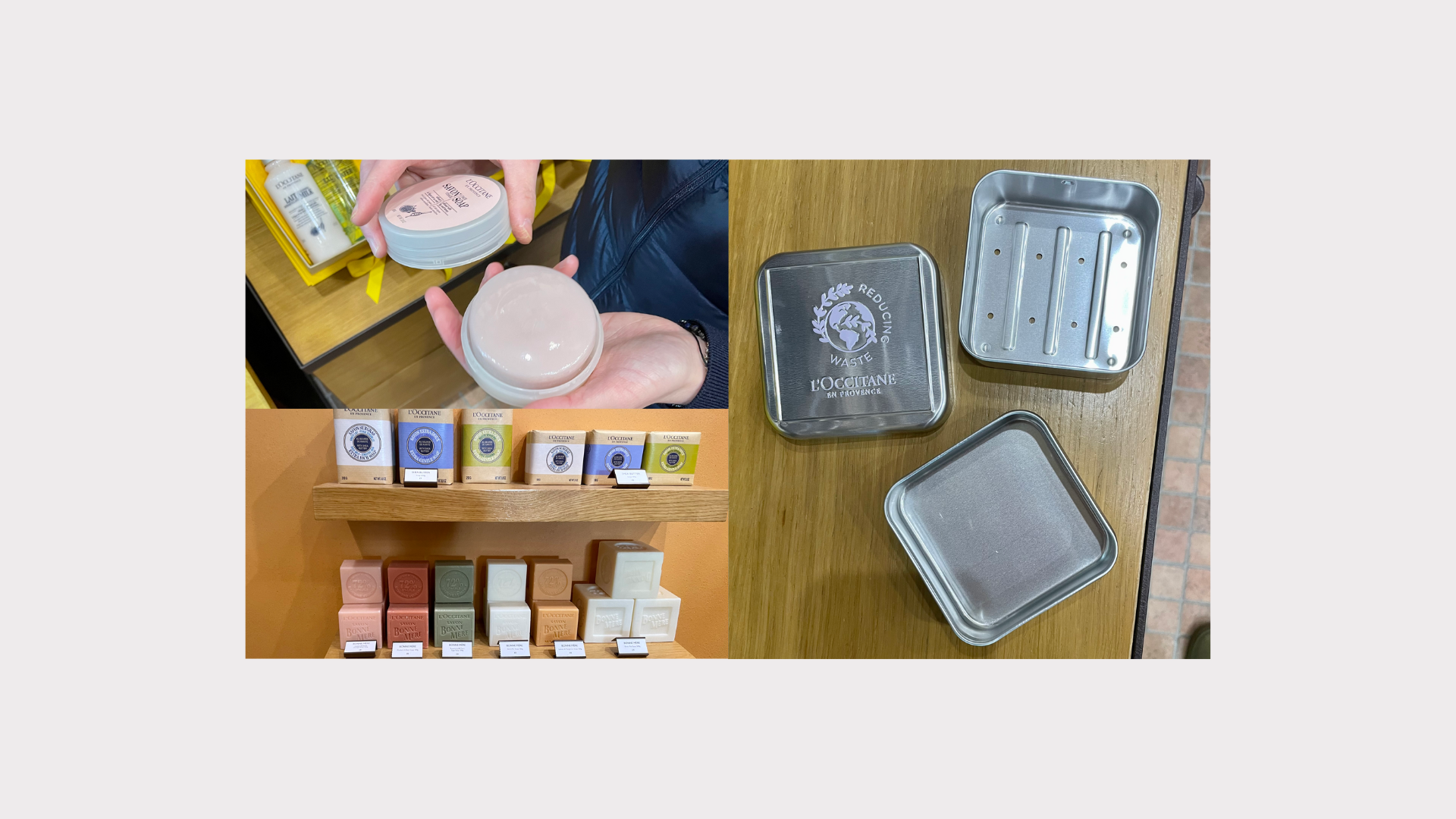
My next step after my online research was to go into town with my group and look at stores that stocked bar soaps and ask them if they sold travel soap containers. Over the 5 stores we visited, only two had a soap container, however non were travel friendly or leakproof. The first one was L'occitane (pictured above) and when we asked to see the soap containers they presented us with a small and flimsy tin container with small holes in the bottom as its drainage. This was definitely now a travel-friendly container considering that when the customer placed a wet bar of soap inside, the water would drain right out of it.
It is important to also mention that when the staff at L'occitane were asked if they believed our product had potential in their market and if a store like theirs would supply it, their response was “That would be amazing!”


We also visited some high-end stores such as Anthropologie, the Consortium and Holland & Barrett. There we found an abundance of soap bars being sold but no actual soap containers. This further proved to us that there definitely was a gap in the market for our product.
I also had a look at the branding and packaging of the bar soaps in these stores and noticed a reoccurring theme of natural and calming colours as well as organic fonts and patterns. This was something I wanted to implement in my own designs as well.
Target Audience
When Sam came to us with the project, she was not certain about a target audience, as she wanted to sell this product to everyone. As a team, we convinced her that this would not be ideal for either us as designers or for her since she was hoping to pitch this idea to investors.
After looking at our market research, we agreed that the best target audience for the product would be women between the ages of 20 and 55.
SDG 17

Since the purpose of the product was to be an environmentally friendly and sustainable soap bar container it was important to keep in mind the UN Sustainable Development Goals.
SDG 3 was very important to consider for this project as the main purpose of the product was to provide soap users with the opportunity to transport their soap which would lead to a positive impact on their health and wellbeing.
SDG 12 is also important in the production of the ‘Bar Box’, as the client is considering producing the product with a sustainable material made from recycled chewing gum. This would ensure responsible production with very little waste.
Ideate & Develop
The ideate stage came in with my research, mood board, colour pallet, logo development, final logo and product designs as this is what helped me generate the idea for the prototype.
Mood Board

This is the mood board I created to inspire me and give me a feel of the aesthetics I wanted to include in my brand design. Keeping in mind the branding and packaging of the bar soaps from the stores I visited during my research, I initially thought that I wanted my branding to focus on natural and calming colours, but when I started looking on Pinterest for inspiration, I was seeing a lot of bolder and brighter colours, as well as patterns that I particularly liked.
I decided to give the client two options for colour pallets to pick from. The one on the left with bolder and brighter colours and the one on the right with softer and more muted colours.
Fonts & Name Ideas

When it came to naming the brand, our entire team had difficulties coming up with an original, relevant and useable name. The team came up with many names while we were brainstorming, some of them as seen above, but then the client informed us how she wasn’t sure if she wanted the brand name to be associated with soap as she hoped that she could expand the brand beyond just that.
After many discussions with the team members and professors, the client decided on the name ‘Bar Box’.
Initial Logo Ideas

Since the client did not give us much guidance on what design styles she preferred or wanted for the project, I decided that I would experiment with different fonts and design styles and show her during our bi-weekly meetings for her to choose from.
I played around with the theme of bubbles in some of my more playful and youthful logos and tried a cleaner, more sophisticated look for the more serious logos.
When these initial logos were shown to the client, she mentioned how she preferred the cleaner logos and I agreed as I also thought those logos would work better for our target audience.
Taking the feedback from the client meeting, I started experimenting with different fonts and found the font “Brasika” that I particularly liked for the cleaner more sophisticated aesthetic I was trying to achieve. Once I found the font that I liked, I decided to pick one brand name and focus on creating variations of logos that I liked.
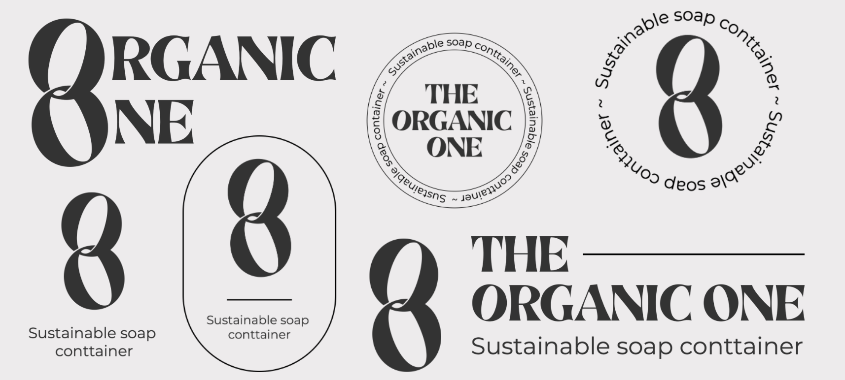
Even though I knew that ‘The organic one’ would probably not be the name the client would choose, having one name to focus on while creating the logos helped me focus on the design rather than the name. Once the client would pick a name, if she liked the designs above, then I would just alter my designs to include the chosen name. This helped me make my design process much more efficient.
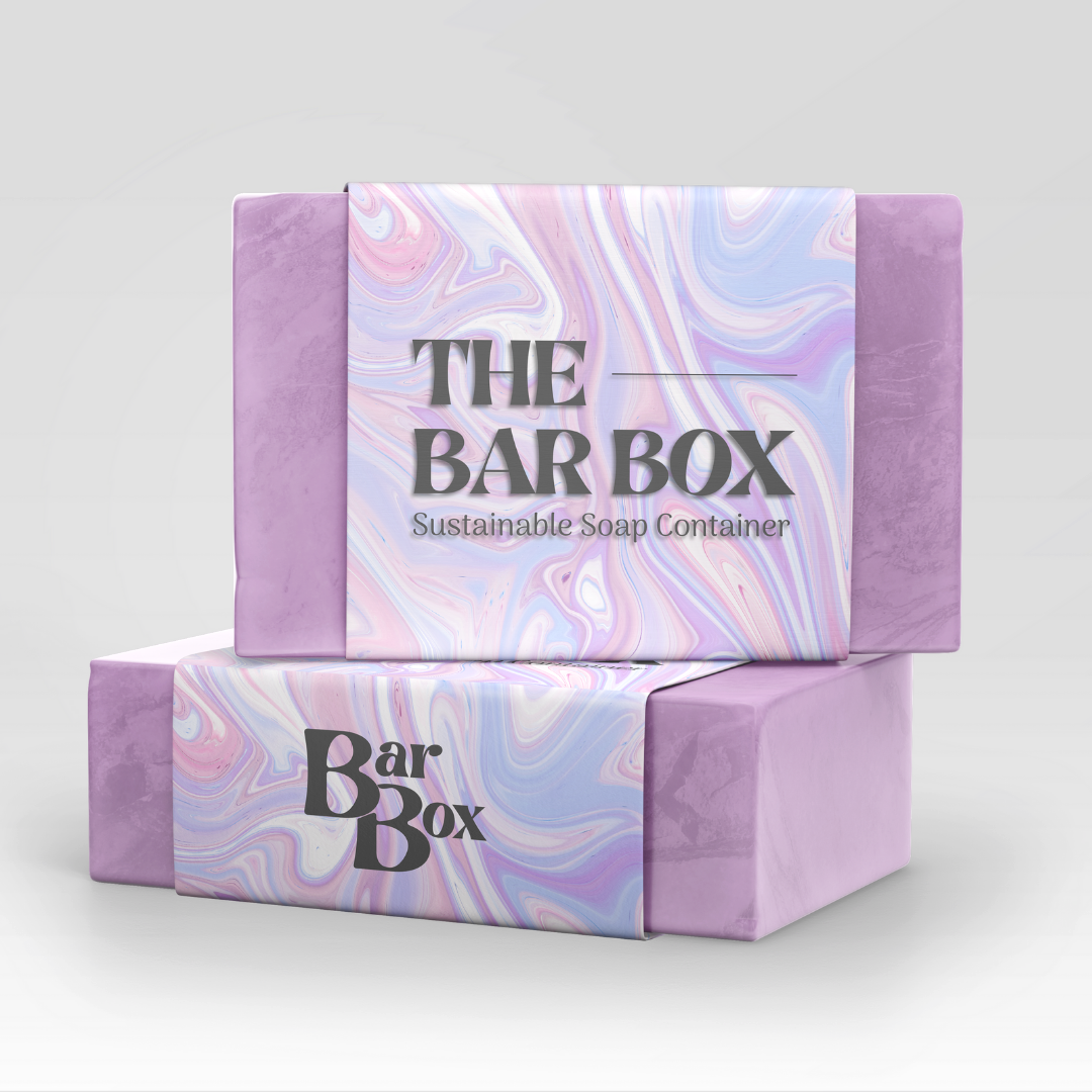
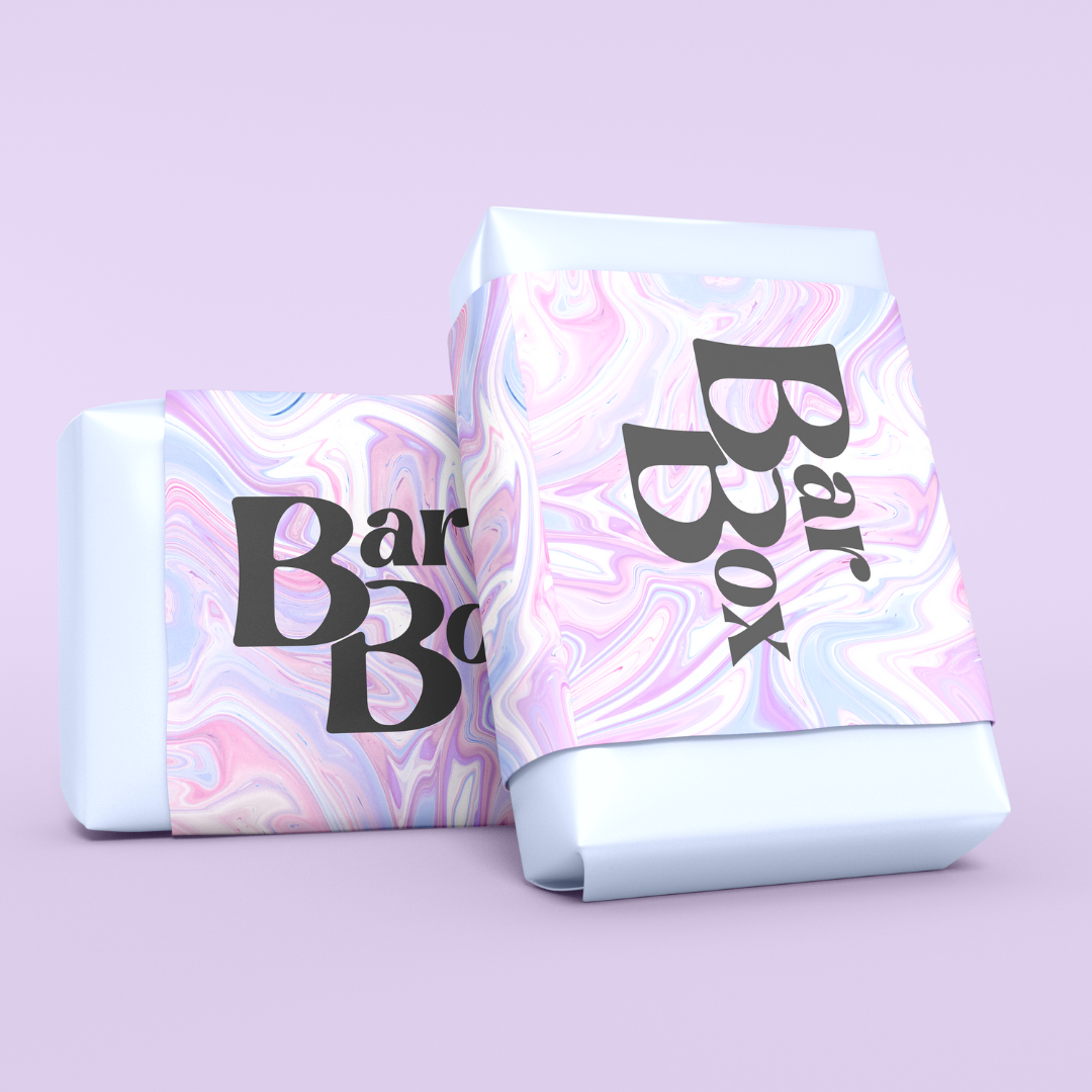
Final Brand Logo
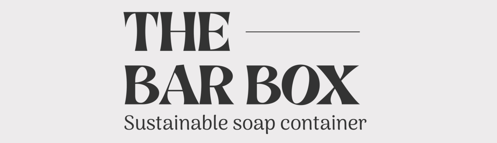
When I showed the client the logos I made for the ‘Organic One’, she loved them and was happy to use those for the final brand made that was decided, ‘Bar box'.
Above is the final main logo I designed for the project. I love the simplicity of it, which keeps the logo clean and sophisticated as the client asked for. I believe the font really captured that aesthetic and would appeal to the target audience.

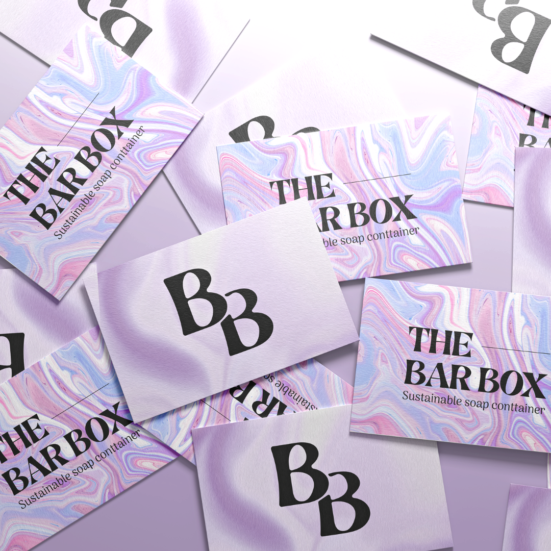
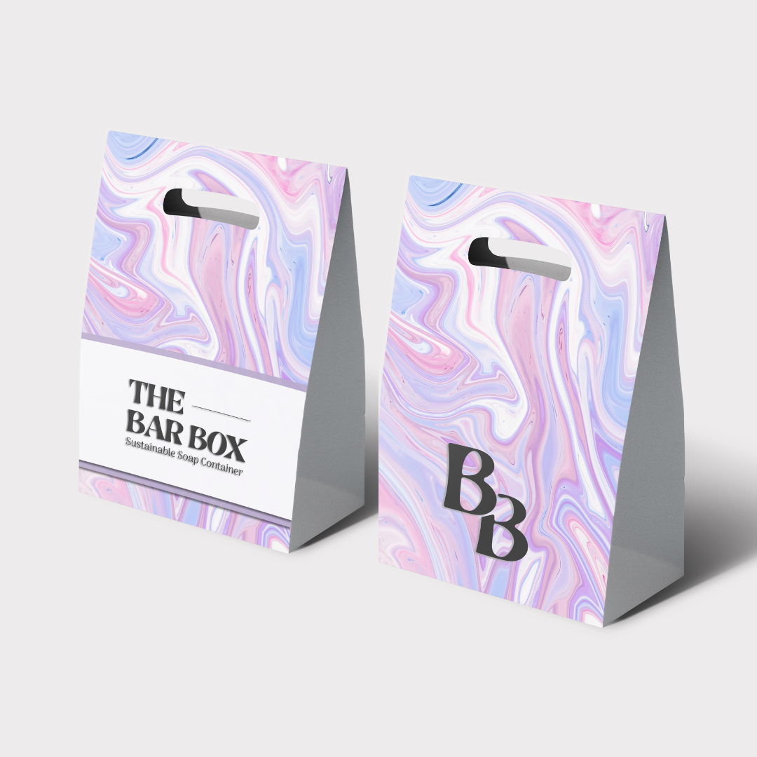
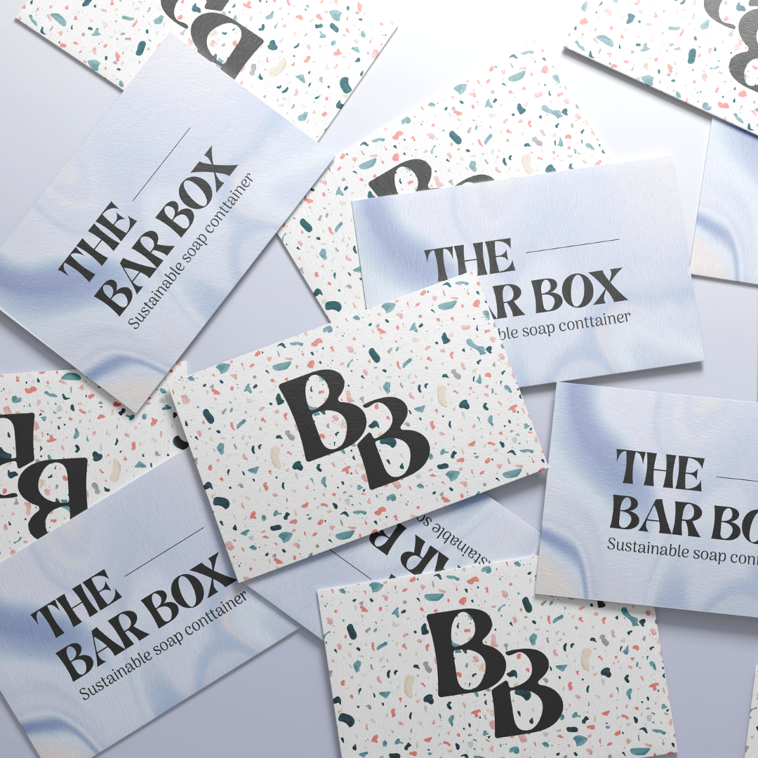
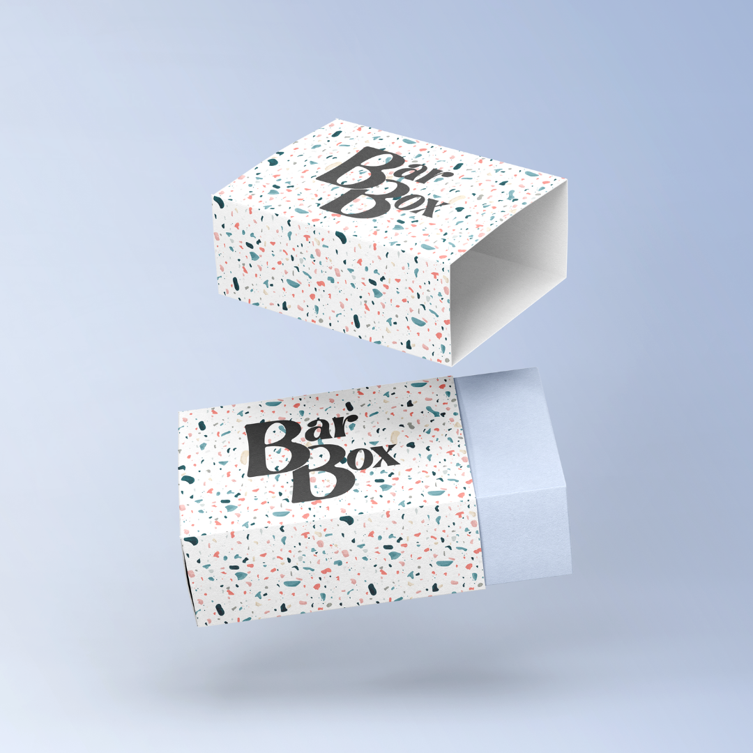
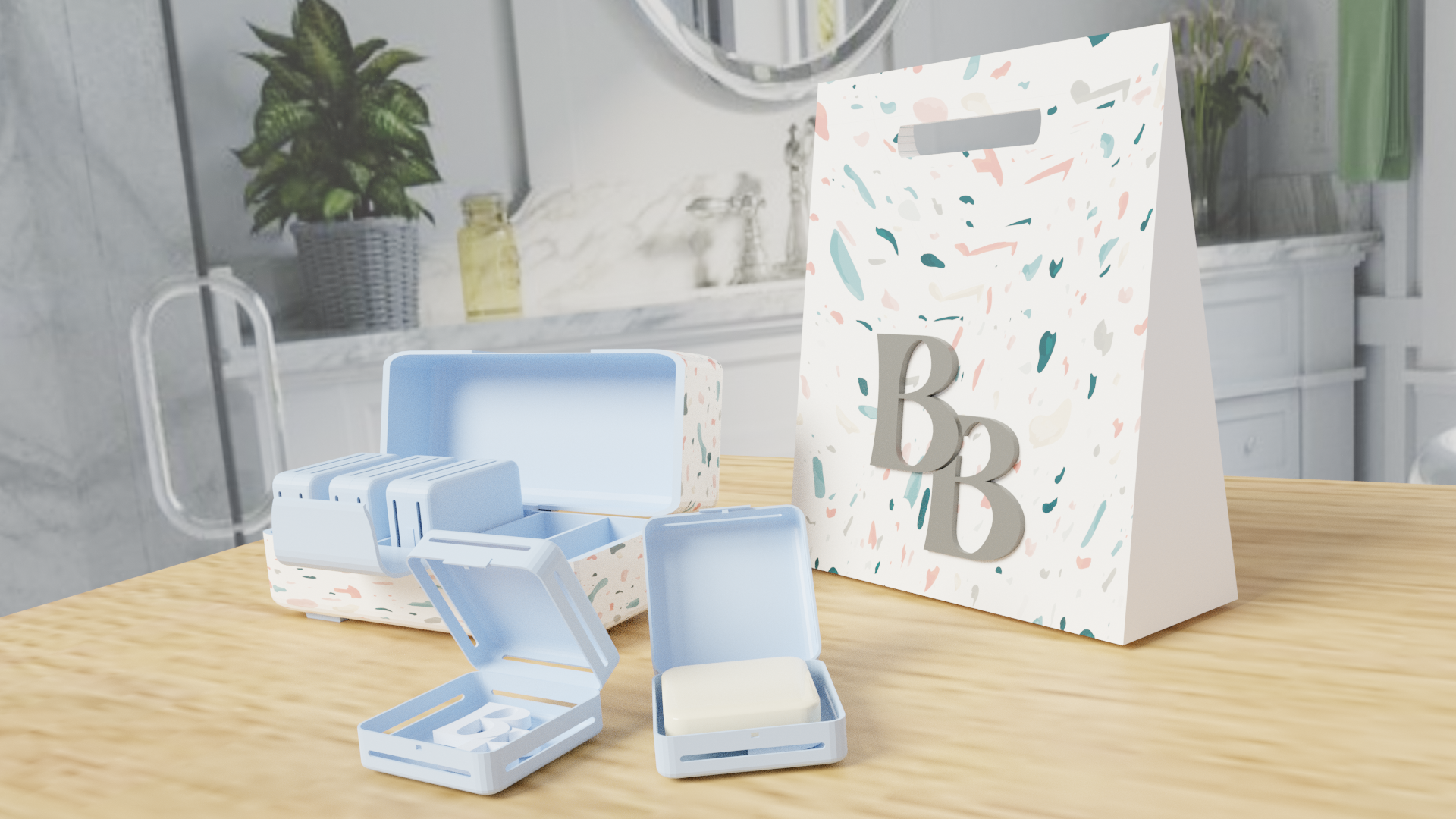
Above are the sub-logos I made to match the main logo. These are to be used whenever the main logo is too big or not needed. For example on promotional material or packaging.
The main logo could also lose its legibility when scaled-down therefore, these options, especially the ‘BB’ option, would allow for a clearer and cleaner logo on small images.
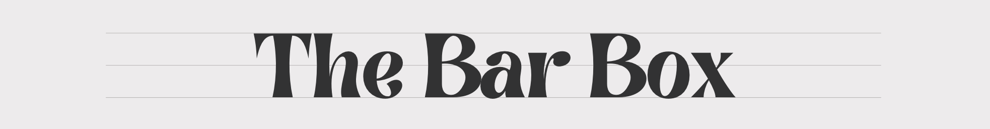
Font
As mentioned above, the font I used for the logo is called ‘Brasika’. I chose it as I particularly liked how it was clean and sophisticated but still had an organic look to it.

Primary Font
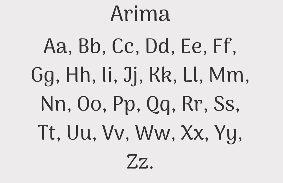
Secondary Font
As for the secondary font, I chose to go for the clean and simple font, Arima. Since the primary font is more bold and eye-catching, I wanted the secondary font to be more subtle and simple to create a nice contrast.
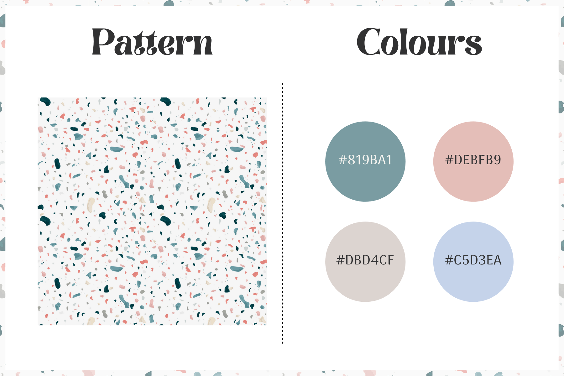
Patterns

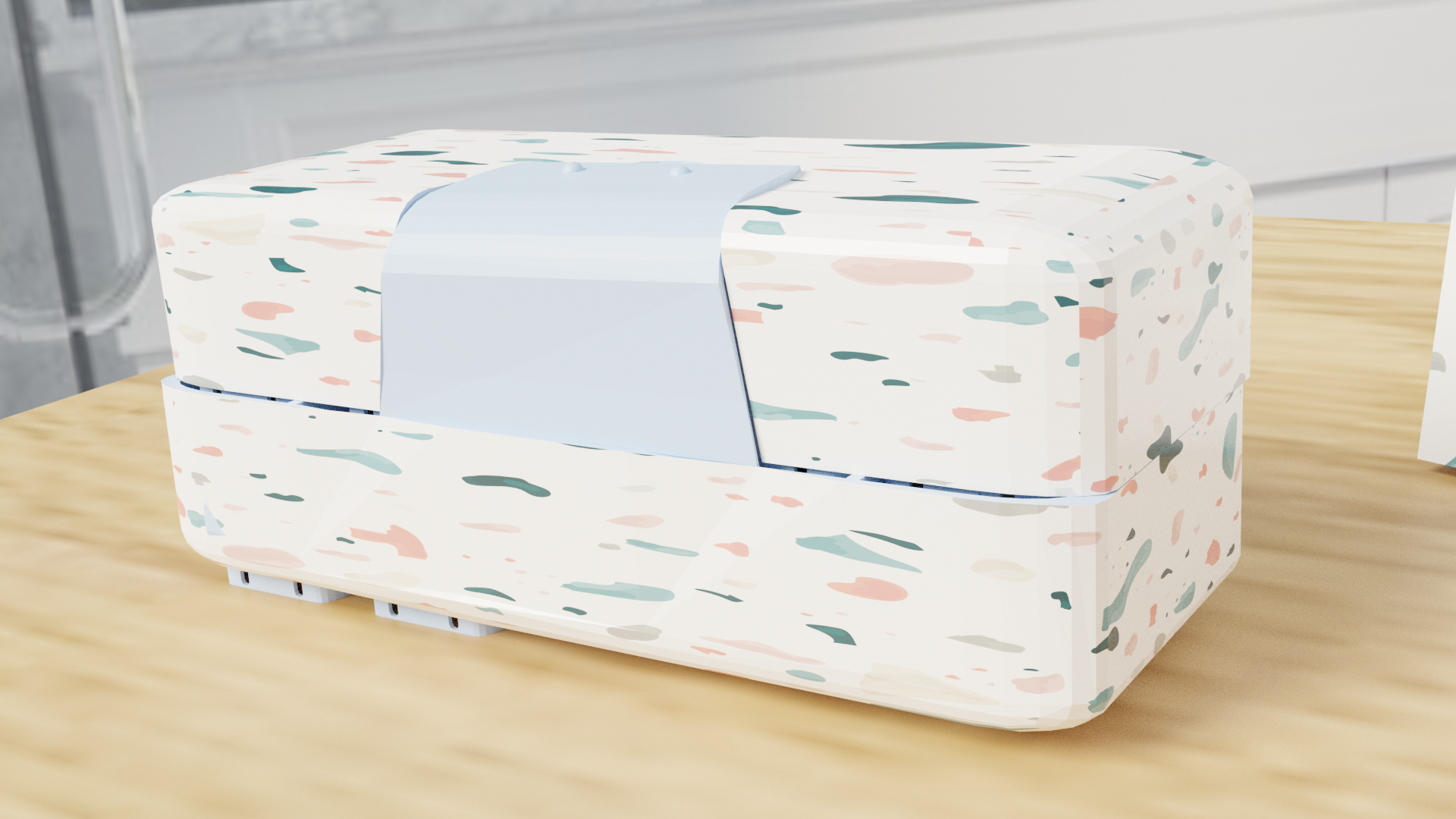
Through my research, I noticed that the existing soap products had calm and natural colours but they also had patterns and gradients on their packaging and I wanted to try them out as well for my branding. Above are the 6 patterns and gradients I created. The top three were created in illustrator and the bottom 3 were made in photoshop.
Patterns 1 and 2 were inspired by terrazzo bathroom tiles as I wanted the imagery of a bathroom product but did not want to go with the obvious imagery of bubbles. I also loved the colours in number 5 and how number 6 looks like silky soap.
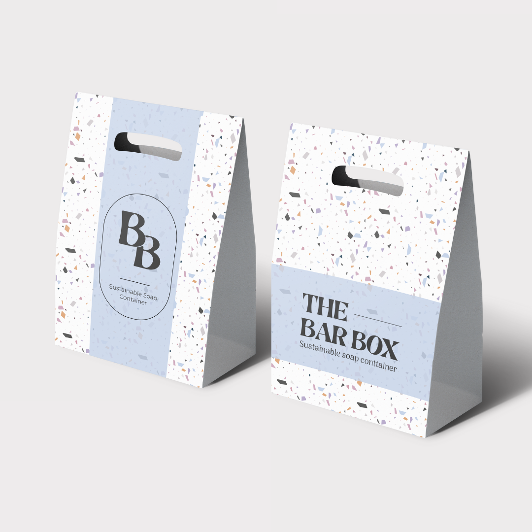
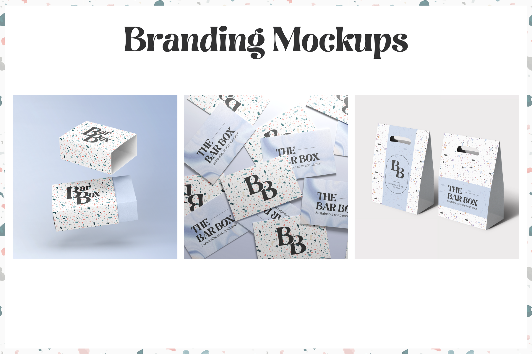
Mockups
Below are the mockups I made to help me decide which pattern I wanted to use for the branding. I decided instead of making mockups for all 6 options to choose my top three favourite ones. I chose numbers 1, 2 and 5.
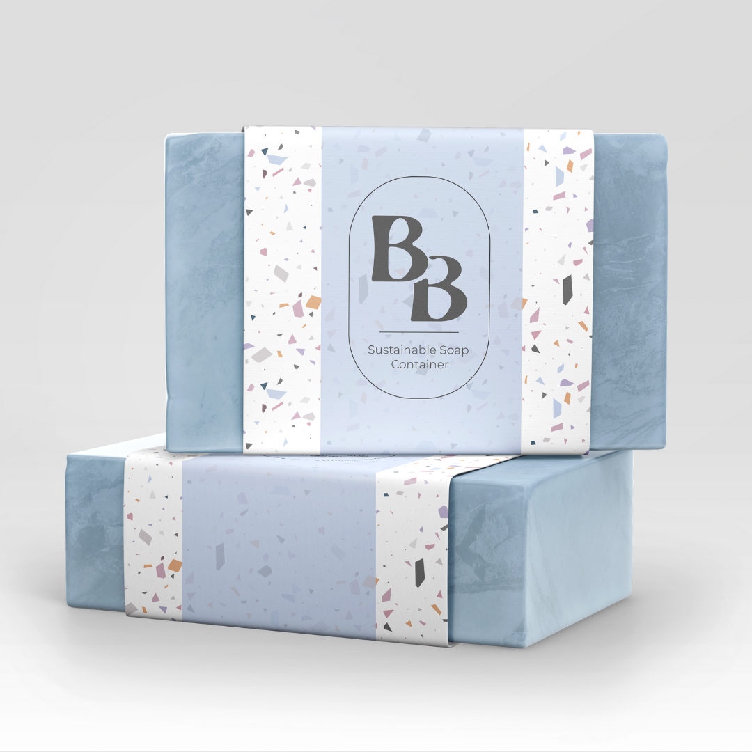
After making the mockups, my favourite was pattern 5, however, the client chose pattern 2, the terrazzo pattern.
Product Inspiration
During my research stage, I quickly realised that I was not going to get much inspiration from other soap containers, especially since I was designing a travel-friendly container. That’s when I expanded my research into looking at general containers with the capacity to hold multiple products in one and came across pillbox organisers.

Although soap and pills could not be further apart as products, the theory behind the pillbox organisers could work well with soaps with some alterations to the design. In one of our bi-weekly meetings with the client, I presented this idea to her and she liked it and told me that it could work. Since I got approval from the client, I went ahead and started sketching my ideas.
2D Product Design
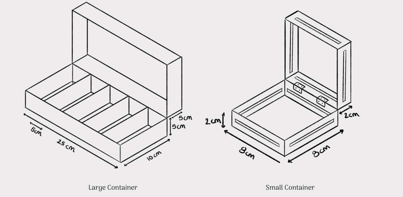
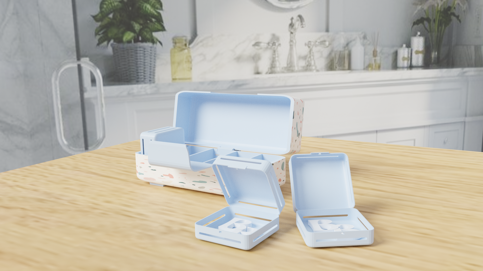
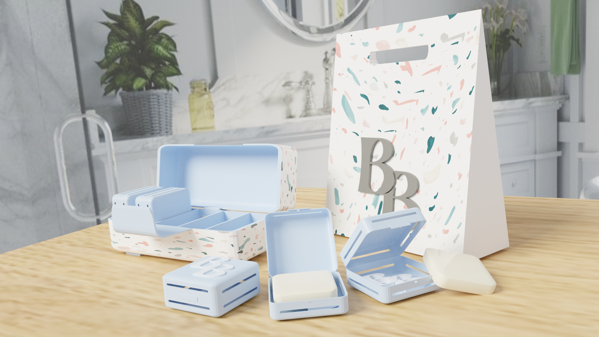
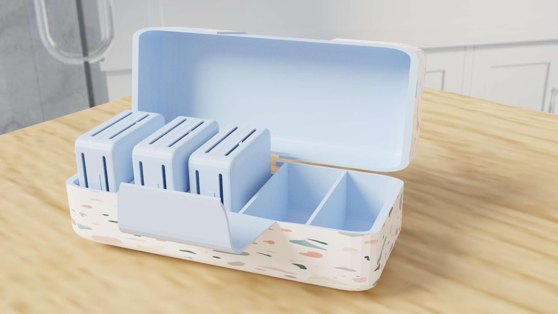
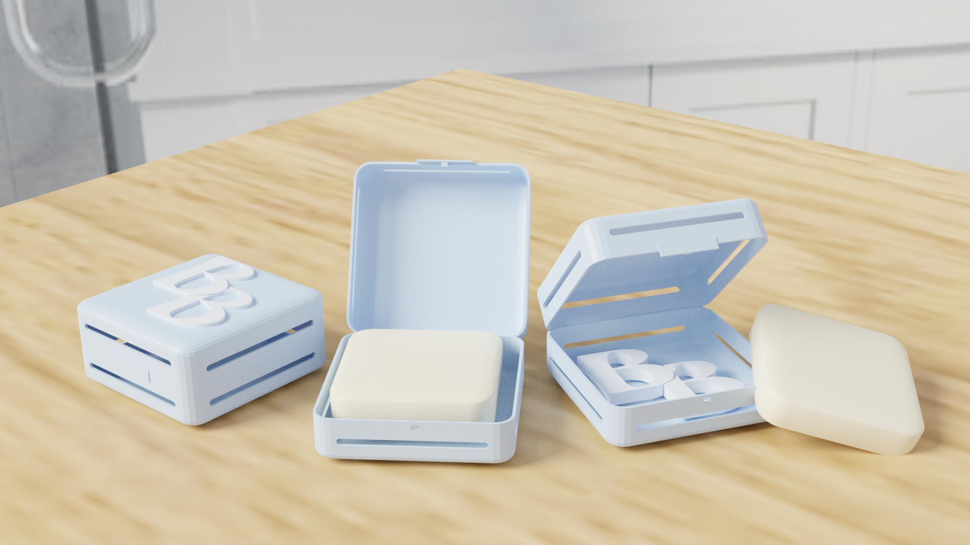
Keeping in mind the pillbox organisers, I sketched out the above design for the ‘Bar Box.’ The large container on the left will act as the main part of my design as it will fit up to 5 smaller boxes, like the one on the right.
The soaps that I am designing the container for are travel-friendly soaps which means that they are really small and thin in size as they are 6x6 cm and 1 cm thick.
The smaller boxes are for one soap each, which will separate them and make it easier for the user to differentiate between them. This was important for me to consider as it was one of the biggest problems our client faced when travelling with soaps.
The smaller box will also have small gaps on the sides to act as the drainage for when soap is placed inside while wet. The water will be able to leak into the bigger container no matter what side the user places back into the larger box as the gaps are on all four sides. Then all the user has to do is clean the larger container to clear out the water.
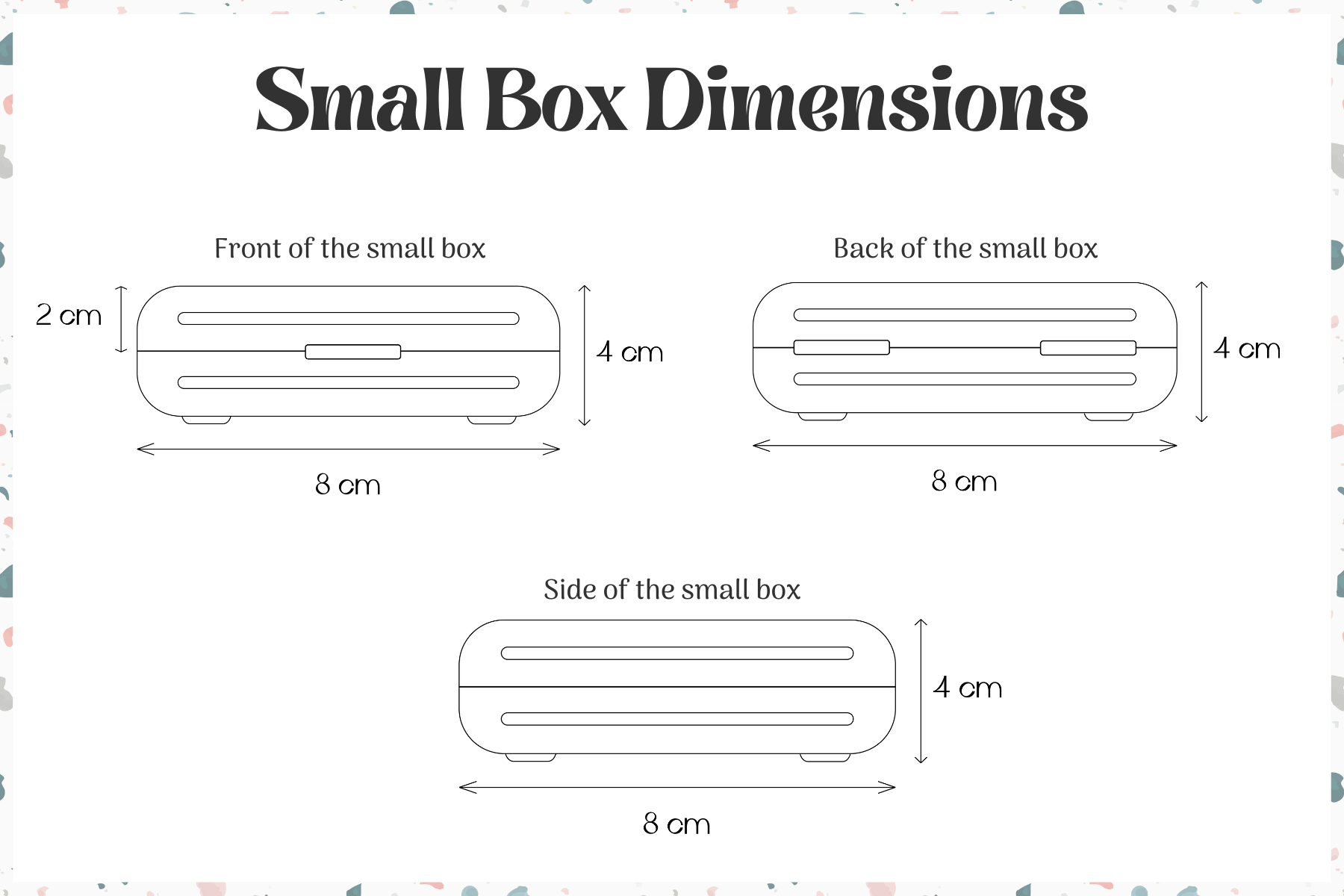
Small Box Product Design

Large Box Design
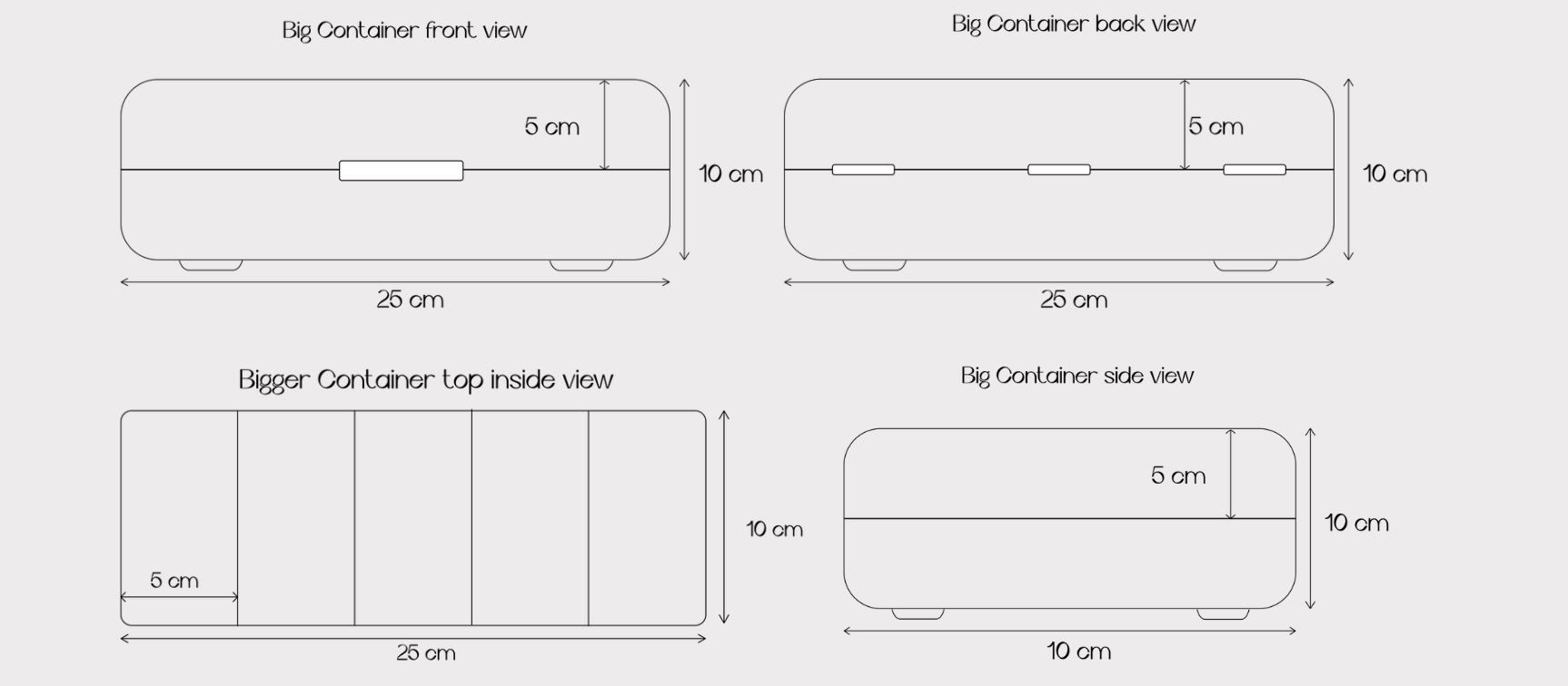
These are my digitized designs for the small and big soap containers with measurements. These were sent to the 3D visualisation student that I partnered up with for this project, Saaya Sekiguchi, where she took my 2D designs and modeled them in 3D.
Brand Guidelines
As with all client projects, I needed to create brand guidelines that I could give to the client once the project was done and passed on to the manufacturers of the ‘Bar Box’.


Prototype & Test
The most important part of this project was the prototyping stage as that was what the client asked for, to create a prototype of the soap container. For this stage, I asked a 3D student on the course for her help as I do not obtain the skills to 3D model the product.
3D Modeling

When the client came to us for this project one of the goals she had was to prototype the product so that she could have something to show to the investors when pitching the idea.
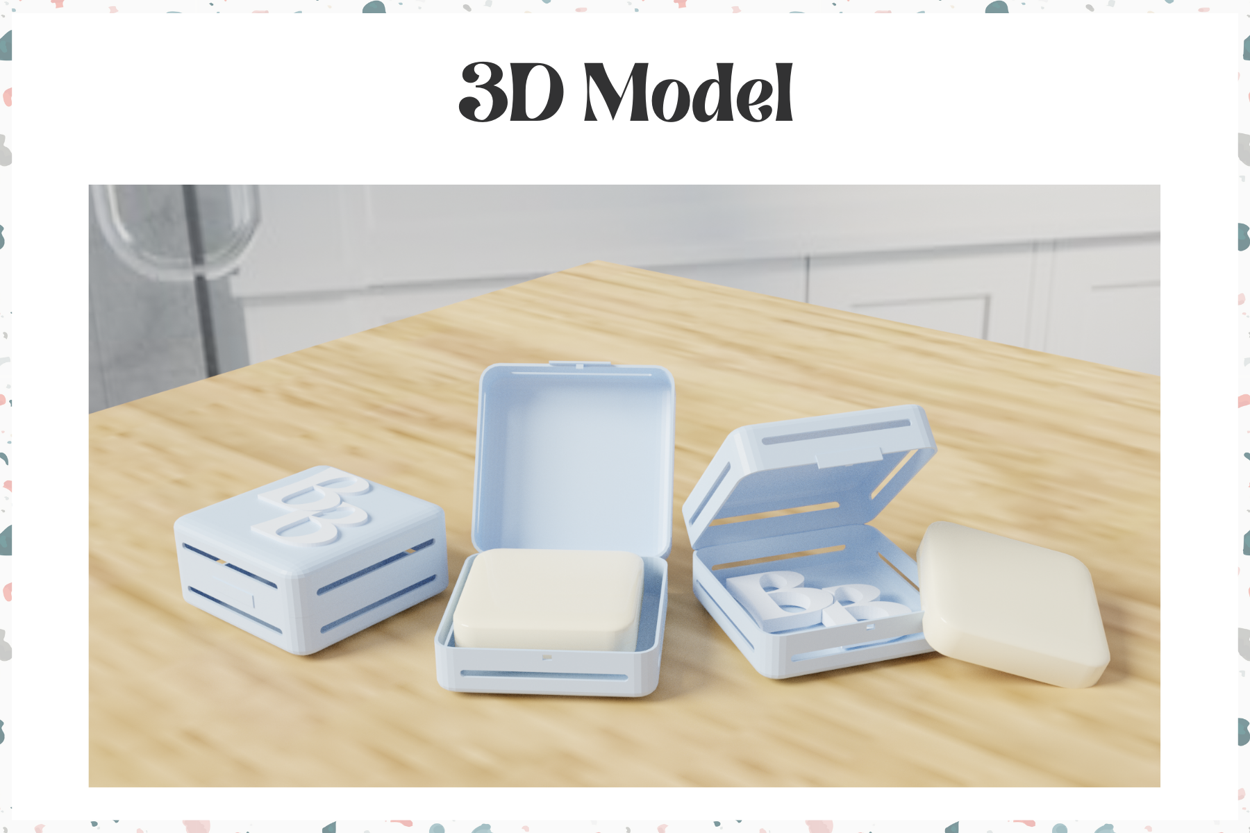
In order to achieve the prototype, I asked a fellow 3D visualisation student, Saaya Sekiguchi, to model my 2D designs into 3D. We worked together for the last 6 weeks of the project to achieve the 3D prototypes you see below.

3D Printing

I worked along with Saaya and our 3D visualization professor, Rob, to figure out a simplified solution for the hinges for the 3D printing.
After many hours of contemplating the best plan forward, we decided that it was not worth the trouble to add the hinges on a prototype product. We will simply print it as we did the test print without any hinges. It will still be able to demonstrate how the product should work, which is what is important.
There will obviously be hinges on the actually manufactured box, they are just simply too hard to 3D print as a 3D printed cannot create the hinges I design for the product.
The final 3D printed prototype is not actually printed at the time of writing, as we planned to have it printed during the Transmedia Exhibition as we thought it would be cool for the visitors to see the prototype begin printed in real-time. The client will also be there that day so she will also get to see it being printed live.
The next step after 3D modelling the prototype was to 3D print it. I started the process by doing a test print of a simplified and scaled-down version of one of the small boxes.
This was done because we needed to figure out how the hinges on the boxes would work once we 3D printed the final prototype to scale.
Since 3D printing is not as flexible when it comes to the way the prototype is produced since it can only print upwards, adding hinges to the prototype proved to be much more difficult than I anticipated.

This is the first print of the scaled down and simplified small box.
Final Thoughts
Wrapping up the project by reflecting on the process so far and my key takeaways from working on the ‘Bar Box’ client project.
Feedback
Having bi-weekly meetings with the client was a great way to consistently get feedback on the progress of the project. It really helped me throughout the design process, having consistent communication and input from the client, especially since she was also our target audience. I knew that if Sam liked it and approved of it, so would the target audience.
The client seemed to be very happy with my outcome for the project especially when I showed her Saaya’s 3D models of the product since she could finally visualise it. Now it’s up to the client and the manufacturing company to decide which product design they will proceed with since my teammates and I each produced a different branding and product design for the client to pick from.
Reflection
Overall this was a successful client project as both the client and I are happy with the final results. Even though the client did not choose my prefered design for the branding, I grew to love it over the course of working on the project and now understand why she chose it, as it definitely suits the product much better.
I initially chose this project for the challenge it presented with the product design as that was not an area of design that I was familiar with at all. I liked the opportunity to design not only a product but also its branding from scratch since this was just a concept product before we started working on it. The idea of starting fresh on a branding project on a product that did not even exist in the market was very exciting to me and I can now say that I am glad to have chosen it, and am happy with the outcome.
If I could do something differently, it would be to start the 3D printing process a lot earlier than the last week of the project. That would have given me the opportunity to figure out all the problems we had with 3D printing and produce a better prototype for the client.