Work Placement
For over a year, I completed my work placement at a Greek online magazine called ‘Estella’. My role as a graphic designer and social media content creator was to design all hero and thumbnail images for each article uploaded on the website and to create content for their Instagram.
-
Estella
-
February 2022- March 2023
-
Illustrator
Photoshop
Canva
Procreate
The Work Placement for DM3108: Negotiated Design Placement A module is a University module where we are required to successfully obtain a work placement as a way for us to build our portfolio, CV and connections in the industry.
Below you will find my process, research, work and reflection on my work placement at Estella.
Design Thinking
Similarly to my second-year university work, I wanted to make sure that I incorporated the Design Thinking principle into my third and final year of university. I have created the diagram above as a guide to refer to while I completed all my design work to ensure that I completed each stage of the design process.
While the typical Design Thinking Principles include prototype and test as the last two stages since Estella is an online magazine that publishes new articles daily, a very important part of the process for me was publishing. Therefore, I found it much more suitable to replace the last two stages to publish and feedback.
Empathise & Define
For the empathising and defining stage, I explore my responsibilities as the graphic designer at Estella and created a persona to make sure I understood Estella’s target audience and their wants and needs. This helped me stay consistent and focused and gave me insight as to what type of content to create.
Ideate
The ideate/ research stage contains all my social media research that I did when I initially started my work placement. My research includes social media strategy, competitor analysis, grid layout, the best time to post, hashtag research and creating templates for Instagram posts and stories.
Publish
Since Estella is an online magazine the Publish stage of the design process is perhaps the most important one. In this stage of the process, I explain of publishing schedule, describe what a typical day at Estella looks like for me and link the two main publishing platforms for Estella, their website and their Instagram.
Feedback
The final stage of the design process was collecting feedback from my co-workers on my perforce and reflecting on my time at Estella by looking back at what I learned, the challenges I faced and how sustainable my design process was.
Emphasise &Define
For the empathising and defining stage, I explore my responsibilities as the graphic designer at Estella and created a persona to make sure I understood Estella’s target audience and their wants and needs. This helped me stay consistent and focused and gave me insight as to what type of content to create.
Getting the Internship
Estella is a greek online magazine, with the priority of creating a fun, fresh and innovative platform where all stories are relevant, inclusive and empowering. With the motto “Bold, Modern and Inclusive,” Estella’s goal is to create a safe online community for all.
The opportunity for a work placement presented itself when one of my family members wanted to create an online magazine. This was very much a passion project for her and she asked me to join her team and help bring the vision she had for the magazine to life.
I initially started as a freelancer, in February 2021, where I was paid per hero and thumbnail image I created for the website, but as time progressed and the website launched, they offered me a part-time position and for me to do my work placement with them. It was a part-time position as it was important to me to balance my university life while I was working at Estella, as I did not want to lose focus on my university work.
Today, almost one year later, I am still working at Estella as their graphic designer and hopefully, I still will for the foreseeable future.
My roles and responsibilities
My role in Estella is as a Graphic designer and content creator for Instagram.
As a graphic designer, I create the hero image and thumbnail for every article uploaded on the website. I am also in charge of creating any other graphical content needed for the website.
As a Content Creator for their Instagram, I am in charge of creating Instagram posts, stories and reels and any other additional content they may require.
My personal Goals
My personal goals for taking the internship at Estella were to:
Gain workplace experience that can be added to my CV
Learn to collaborate and communicate with co-workers
Improve my time management skills
Learn to receive feedback
Build my portfolio
Build connections in the Industry
What is Estella’s Aesthetic?
Estella is a magazine that prioritises a fun, fresh and innovative aesthetic. Its goal is to stand out and differentiate itself from other similar online magazines and its way of doing that visually is through its use of bold and bright colours. After all, with the motto “Bold, Modern and Inclusive,” one would only expect so much.
Below is a preview of the aesthetic Estella was going for, which was given to me on my first day on the job. These graphics were created by the website developers and were given to me as a guide as to what the general aesthetic of the website would be.
This was a great starting point for me as it clearly showed the aesthetic and vibe that the team of Estella were striving for, not only for their website design but for their social media as well, which I would be creating content for.
Fonts and Colours
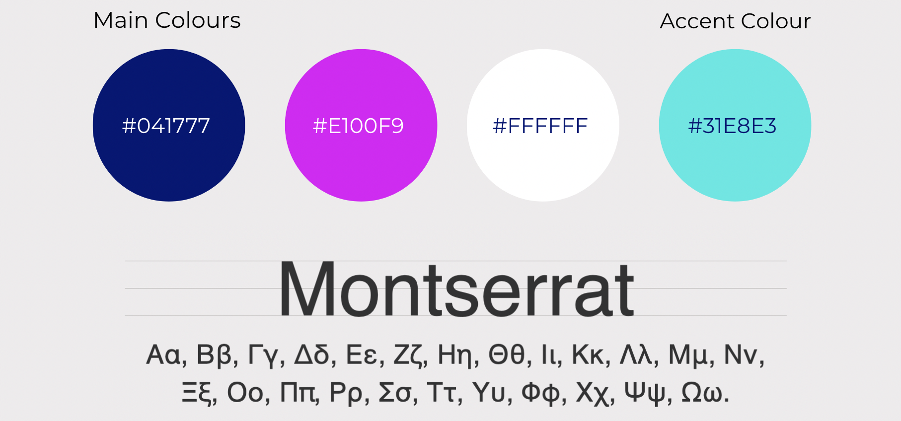
Along with the above graphics, I was also given a small brand guideline for Estella, which included their brand colours and fonts, as seen below.
However, the more I started using their chosen font ‘Montserrat’, the more I noticed that the font on greek characters was not cohesive and had a weird spacing problem with specific greek characters. Since the entire website and social media content would be in greek, I made sure to discuss this with the rest of the team, and we came to a unanimous decision that the font would have to change.
Primary Font
Secondary Font
I suggested the font ‘Open Sans’ as an alternative to ‘Montserrat’, as I found the two fonts to be of similar style as they were both sans serif with a clean and readable look. I also suggested the font ‘Noto Serif’ as an accent font that could be used for more formal use. The CEO of Estella liked this font so much that she told me she would prefer it if I used this font for the social media content as well, especially the Instagram carousels I create.
Target Audience
Another aspect I made sure to familiarise myself with when first starting at Estella was their target audience as defining this would influence the way I designed my social media content and hero images.
Estella’s target audience is both young males and females, from ages 16-45, living in Greece and Cyprus who are looking to be informed about relevant, inclusive and empowering stories.
Personas
As a way to keep the target audience in mind while creating content at Estella, I created two personas that represent their target audience. These personas helped keep me focused on creating content that they would enjoy seeing and interacting with and reminded me to keep my designs fun, young and bold to fit the Estella aesthetic.
Ideate/Research
The ideation/research stage contains all my social media research that I did when I initially started my work placement at Estella. My research includes social media strategy, competitor analysis, grid layout, the best time to post, hashtag research, and creating templates for Instagram posts and stories.
Social Media Research
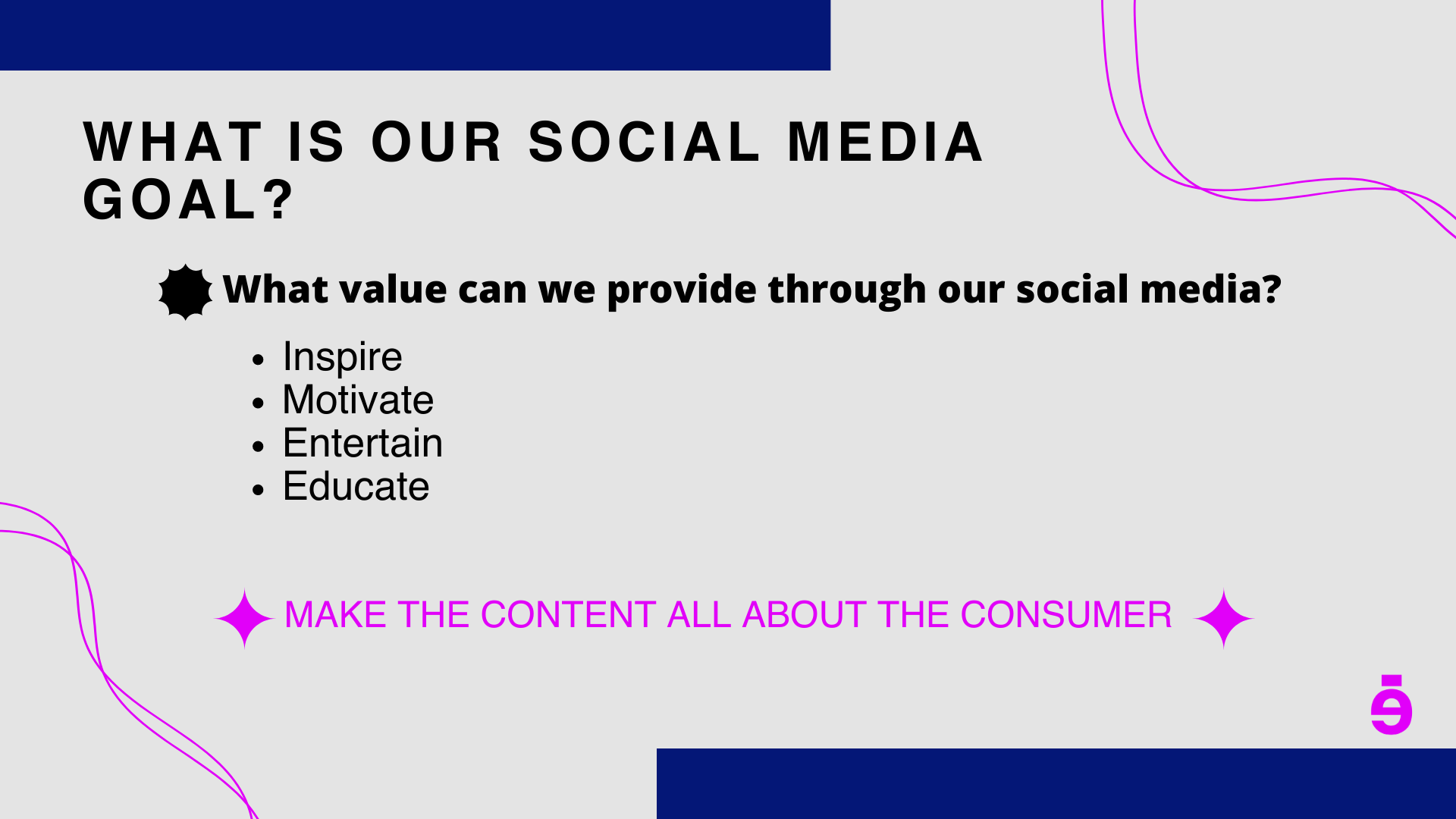
When I first joined Estella, I was asked to present a social media strategy to the team. They wanted me to research competitors, the best times to post and hashtags. While doing my research and preparing the presentation I also found some more useful information that I wanted to include such as social media goals, post templates for the articles, grid layout and applications that can help with scheduling and posting on social media.
Since I already had experience with running a social media account from my semester two social media project, where I created my own Instagram page and grew it to over 1,000 followers, I already have a good understanding of what I needed to research and present to the Estella Team.
Below is the presentation I prepared for them on my first week on the job. Further down I will break down each section of my research and thought process as the presentation has limited words on the slides since most of my research points were presented verbally.
Social Media Strategy
The Social Media Strategy I presented to Estella is to:
Post relevant content, in order to stay up to date with the events happening in Greece and around the world
Use relevant hashtags that will help get the articles and post to our target audience faster
Actively engage with our audience, reply to comments and dm’s
Actively engage with other accounts
Make consistency a priority and have a posting schedule to allow us to have the post ready beforehand
Make our feed as aesthetically pleasing and bold as possible to fit in with the Estella aesthetic and differentiate us from our competitors
Post at the best times for each day
Competitor Analysis
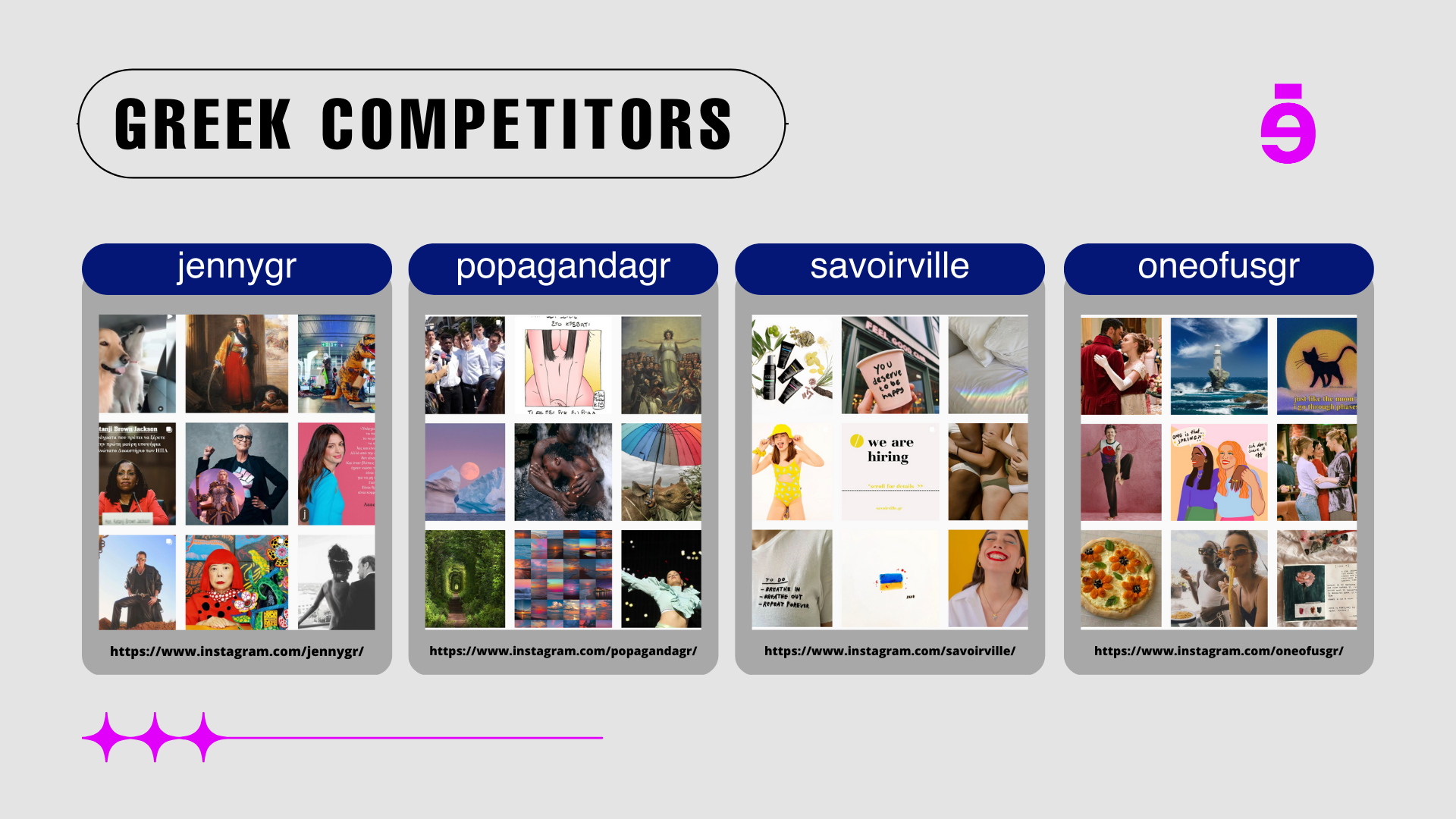
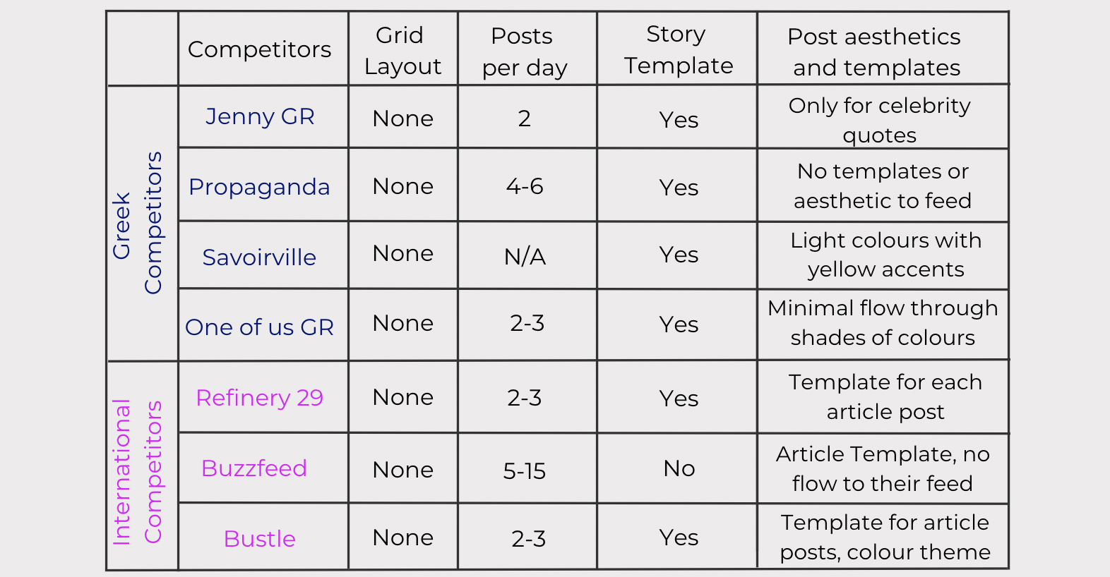
I started my competitor analysis by looking at their social media accounts, focusing on Instagram as that is its main social media account for Estella at the moment. The key points I was looking for were grid layout, posts per day, story layouts/templates, post aesthetics and templates. Looking at all these, allowed me to compare all the competitors to the same standard and create a cohesive comparison between them all.
Who are the competitors?
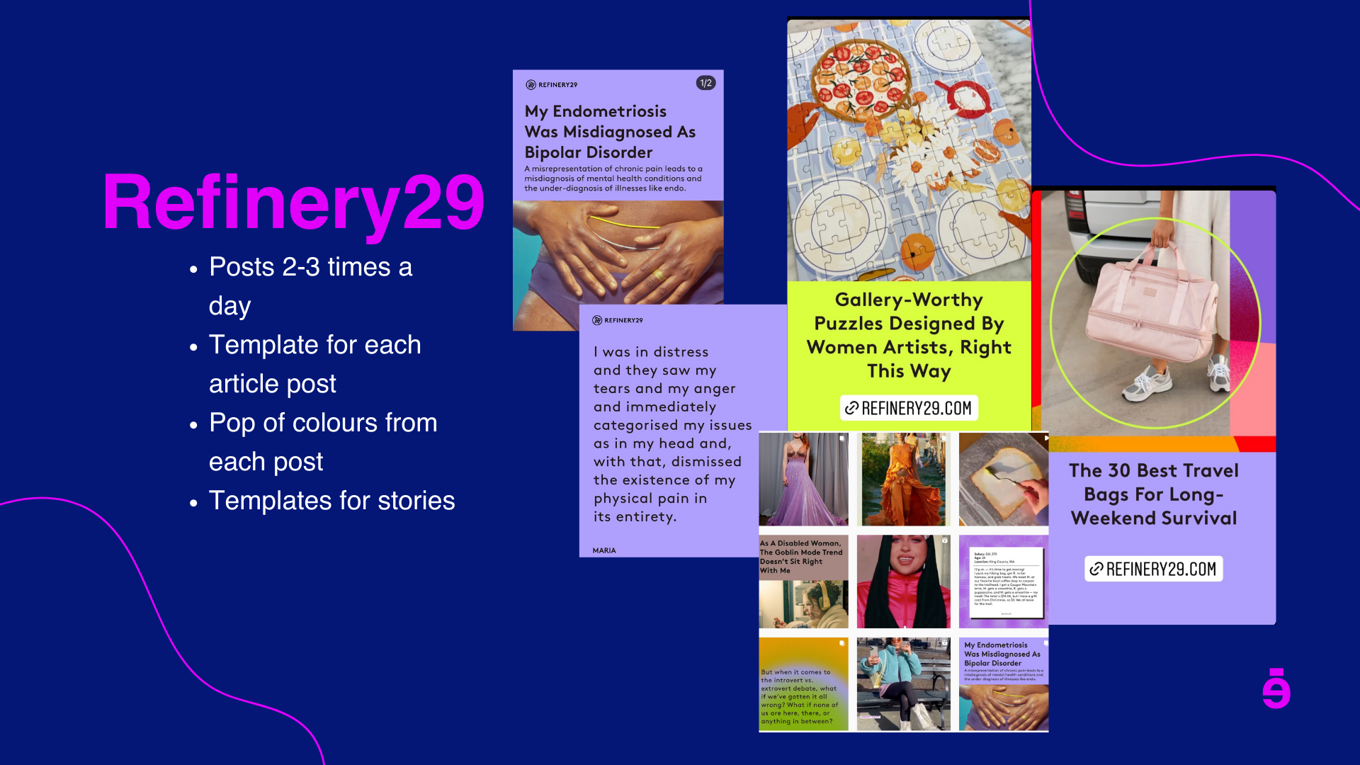
Estella has 4 main competitors in Greece who publish similar articles to Estella: Jenny GR, Popaganda, Savoirville and One of us GR. There are also three international online magazines, which could be considered competitors, but since their content is all in English, I used the international competitors more for inspiration rather than comparison. The three international competitors are Refinery 29, Buzzfeed and Bustle.
Key takeaways from the competitor analysis
Grid layout: No competitor had a grid layout, making this a good option to look into for differentiating Estella from the competitors and creating a unique feed that will be recognisable to our followers.
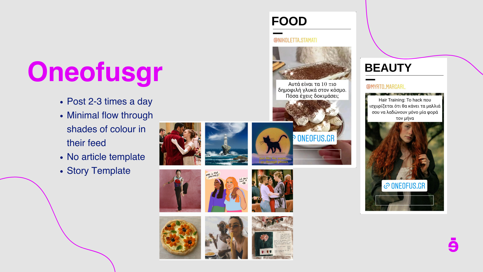
Posts per day: Most of the competitors, especially the greek ones who were also Estella’s direct competition, seemed to be posting 2-3 times per day. Since Estella was a start-up with a small team of four people at the time, we did not have the resources or time to be posting more than 3 times a day as we also did not have enough content built up on the website to allow for more posts. I suggested that to begin with, we stick to 2 daily posts and if there was an urgent post that need to be uploaded or breaking news, that could be our third post for the day.
Story template: All competitors except one (Buzzfeed) are utilising Instagram story templates for the articles. The templates are used as a way to show all the new articles of the day in a cohesive manner, where all the Instagram stories have the same layout. Making use of this would help Estella build a recognisable brand, as while a user is scrolling through their Instagram stories, the story templates will immediately inform the user what account they are viewing without having to press on the account feed.
Post aesthetics and templates: While researching the competitor accounts, I noticed some of the international competitors had a set template that they would use when posting about a specific article. The template would typically include the title of the article, a photo that was relevant and on occasion a quote. After noticing this, I went back to check all the other competitor accounts and found out that no other greek competitor did this, which lead to my suggestion to consider having a template specifically for article posts as it could set up apart.
What will set Estella apart from the competitors?
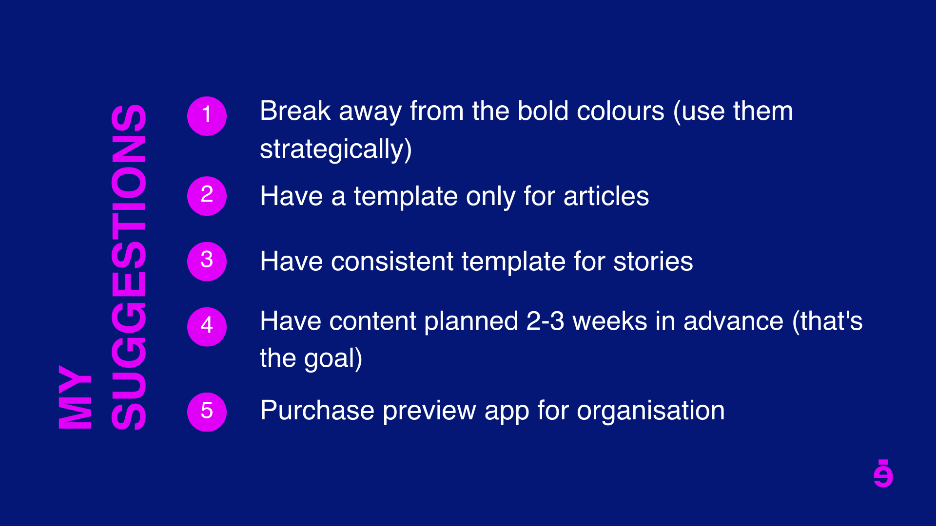
The first suggestion I had for Estella to differentiate themselves from their competitors is to stick to their design aesthetic as much as possible as it is something that no other competitor has done.
It is understandable though, why no competitor has stuck to one design aesthetic or colour palette, since posting on social media when trying to be revenant and up to date on the events occurring can significantly limit how much control you have over the aesthetic and colours of your Instagram grid.
I suggested that instead of only using their branding colours, which was how they were posting until I joined the team, we start using different hues of their brand colours, as this would give us more flexibility when creating content as not all posts would be able to match with their vibrant and bold colouring. Using hues would also allow us to create a semi-cohesive Instagram grid, while not completely separating from the brand colours and aesthetic.
The second suggestion I presented for setting Estella apart from the competitors had to do with their article posts. I suggested that they should not just repost or find stock images that relate to an article as most of their competitors were doing but make the article posts more informative, giving the audience a taste of what they might find if they read the entire article.
I believed this would be important for a start-up online magazine like Estella, as they did not have thousands or hundreds of thousands of followers like their competitors had on their Instagram accounts. Estella needed to build brand loyalty and grow their social media presence first to establish that strong customer loyalty that the other competitors, which were years in the market, already had.
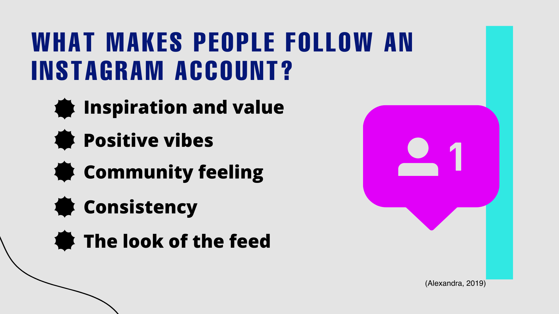
By posting more informative Instagram carousels with quotes or small summaries of the article, the more people interact with the post, the more traffic the website would gain.
Grid layout
While completing the competitor analysis, I noticed how none of our competitors had a grid layout for their Instagram. When I mentioned this to the team and asked if they would like for me to present them with some ideas for a grid layout as a way to further differentiate ourselves from the other similar account to ours, they all agreed that it would be a good idea.
Since I also used a grid layout for my own design Instagram account, I was already familiar with the pros and cons of having a layout and was happy to pass that knowledge on to the Estella team.
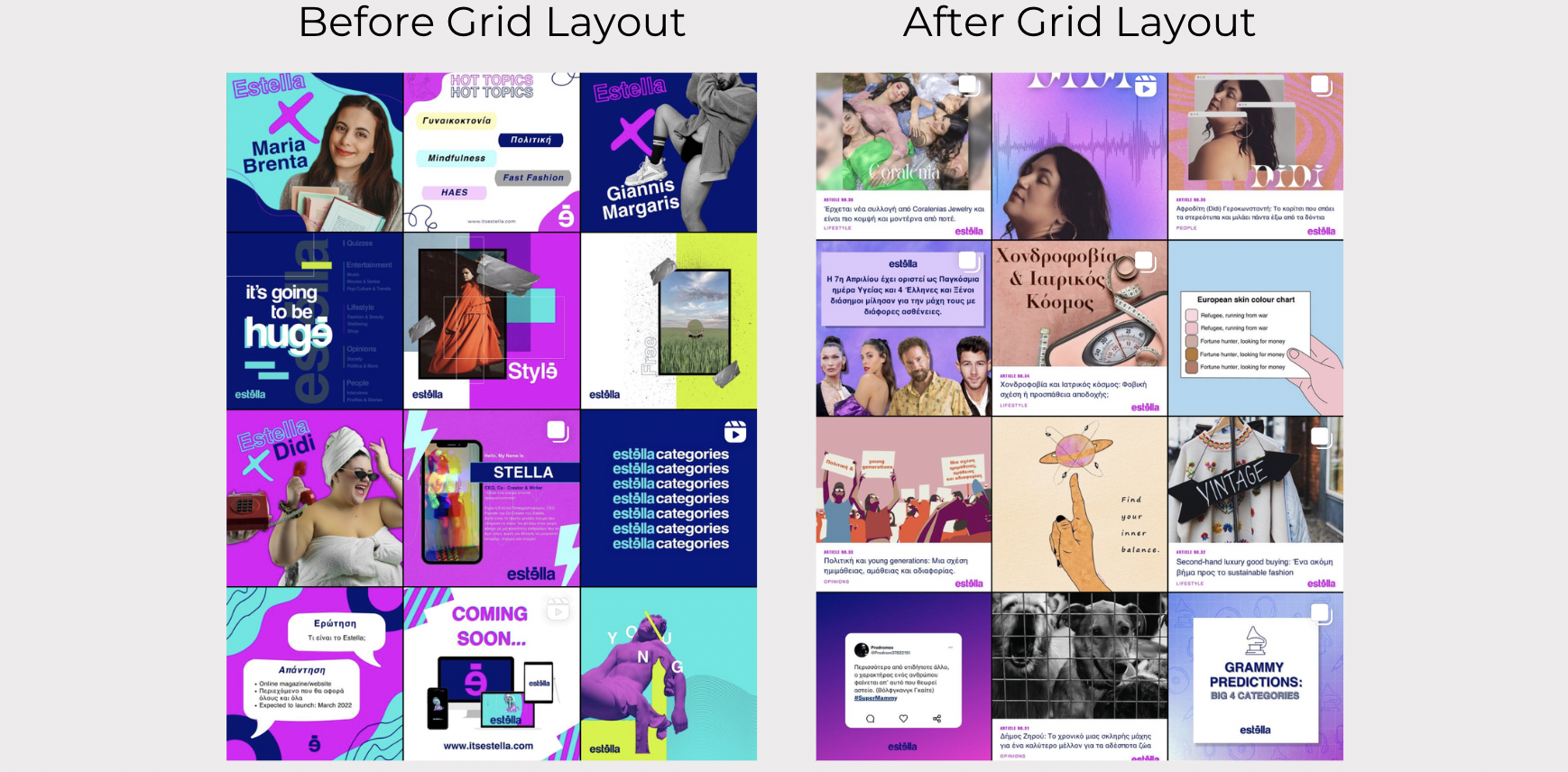
I first presented to them the types of grid layouts we could follow (as seen on the left) and suggested that the checkerboard pattern would be the easiest and most aesthetically pleasing layout to follow. Since we had already agreed that I would be creating a template for all the articles that would be posted on Instagram, that made it easier for us to apply the checkered board grid, as the template would act as the filler post.
Below is a screenshot of what our feed looked like before and after implementing the checkered pattern along with the article template.
For the first few months after Estella launched, the checkered board grid layout worked very well for us as it did everything we wanted it to do. It balanced out the colours, moved us away from the bold brand colours, which was one of the main reasons they brought me on to the social media team, and it created an aesthetically pleasing feed that was instantly recognisable to our followers and separated us from the other similar accounts.
However as time went on, we started noticing the limitations that the checkered board grid created for us when it came to posting relevant and up-to-date content.
For example, one day there was a celebrity that went viral for a comment they made publicly and on the same day a politician was accused of fraud and was the hot topic of the day. Seeing as Estella is a magazine that covers both of these topics on their website, the team wanted me to create and upload posts for both of these events on the same day.
Nevertheless, the checkered grid would not permit me to post these posts right after the others like all the other news and magazine accounts were doing. I would need to ensure to have an article post ready to post in between the two other posts, which after a while became quite frustrating.
That was when I went to the team and told them that the grid layout was no longer needed. We had already established a specific aesthetic, we had already grown our followers to over 500 and we had successfully integrated new colours into our feed.
The team agreed with me and also admitted that they thought the grid layout was starting to limit us a lot on not only the type of content we posted but also on how many times a day we posted. That is when we stopped having a grid layout and stop using a template for each article post.
Looking back on this decision, I am glad that I was able to confidently talk to the Estella team and inform them that an idea I previously thought was the best direction for our social media account, is no longer working for us and that we needed to change it.
Best times to post
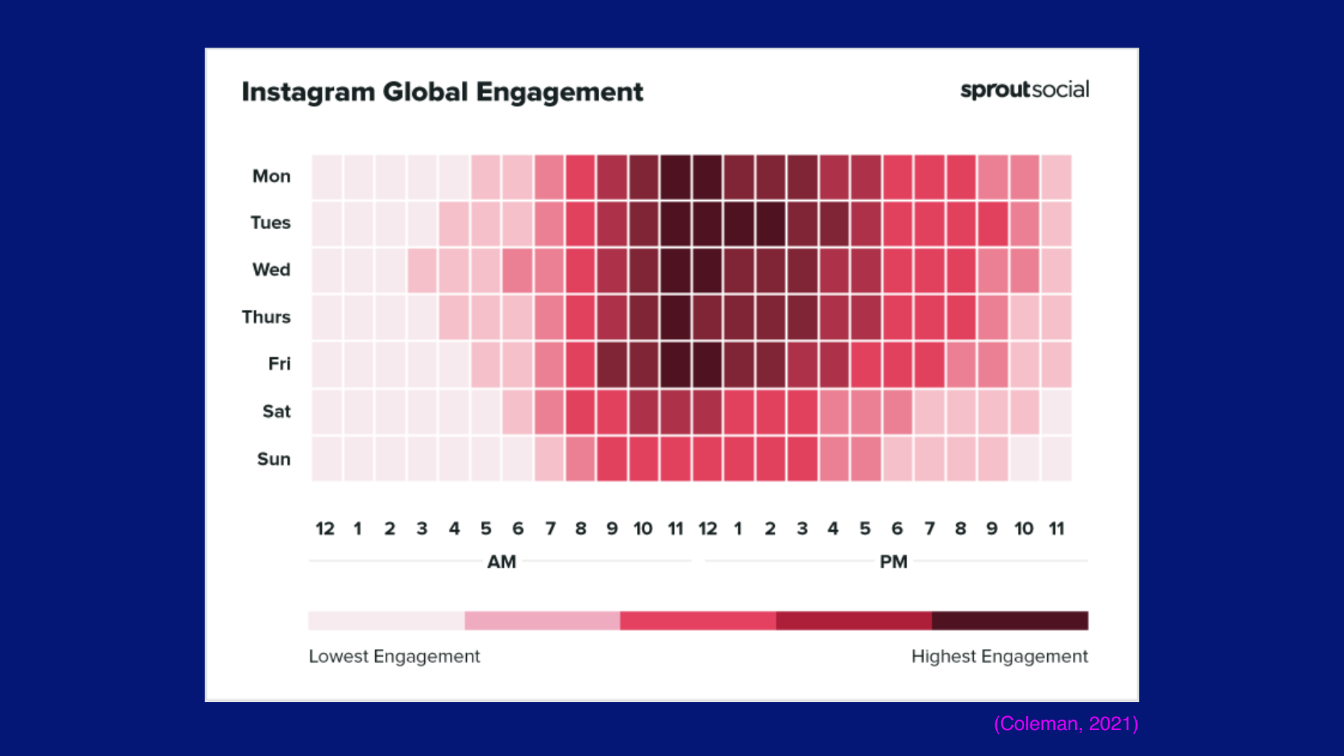
A major research point for me to look into for the social media strategy was finding the best times to post in order to reach our target audience the most. The times below are a combination of the times our competitors post, what online research suggested and what our Instagram analytics say it the best times for us to post according to our followers.
7am – 9am (morning commute)
12 pm – 2 pm (lunch hours)
5 pm – 6 pm (end of the workday)
The morning time of 7-9 am is to capitalise on the morning user that is online during their commute. Such as Maria’s commute to university on a bus or George’s commute to work in the morning in a taxi.
The 12-2 pm time slot is for when our target audience is on a lunch break, while the 5-6 pm time slot is for when our target audience is done with work/school or university and is scrolling on Instagram as a way to catch up on the events of the day.
Hashtags
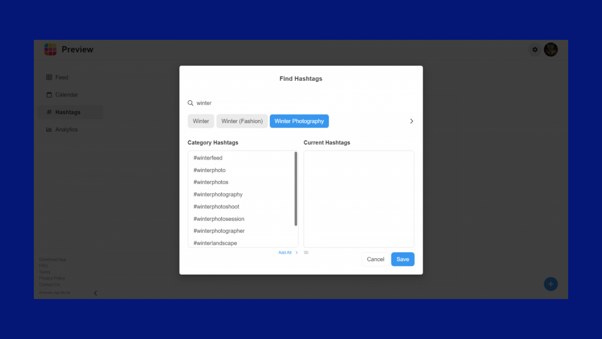
Another key research point for the social media strategy was to find the right hashtags to use in order to reach our target audience. The hashtags seen below are a combination of the hashtags I found during research and what our competitors use.
I noticed while looking at our competitor's Instagram accounts, that they rarely use hashtags and if they do, it's not more than 15. Since they all have a big following, this definitely affected their use of hashtags since their content was already reaching their target audience. However, as a start-up magazine, we do not have the luxury of not using hashtags and instead need to be smart with the hashtags we do end up using.
Instagram Post Templates
While conducting my competitor analysis research, I noticed a trend that the majority of our competitors had a set template for their article posts which they would use interchangeably and would only alter the image and image caption/article title.
Having this reappear so many times in my research proved to me that having a template for articles that would be posted on social media was a common practice for online magazine accounts.
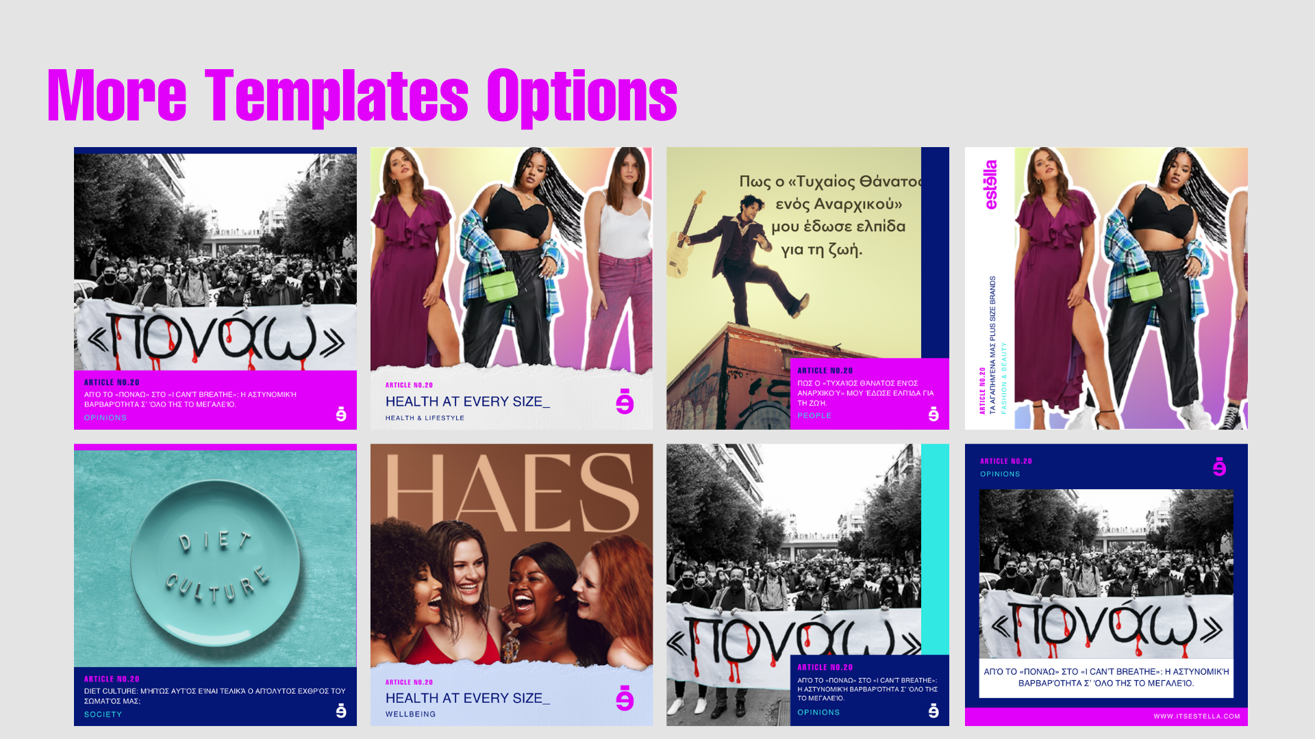
So while I was preparing my social media presentation, I also created options for article templates to show to the team, as I would already be suggesting that we created one, and wanted to have options ready to show them.
I made sure to create a variety of different options in different styles using both their brand colours and different hues and shades of their brand colours.
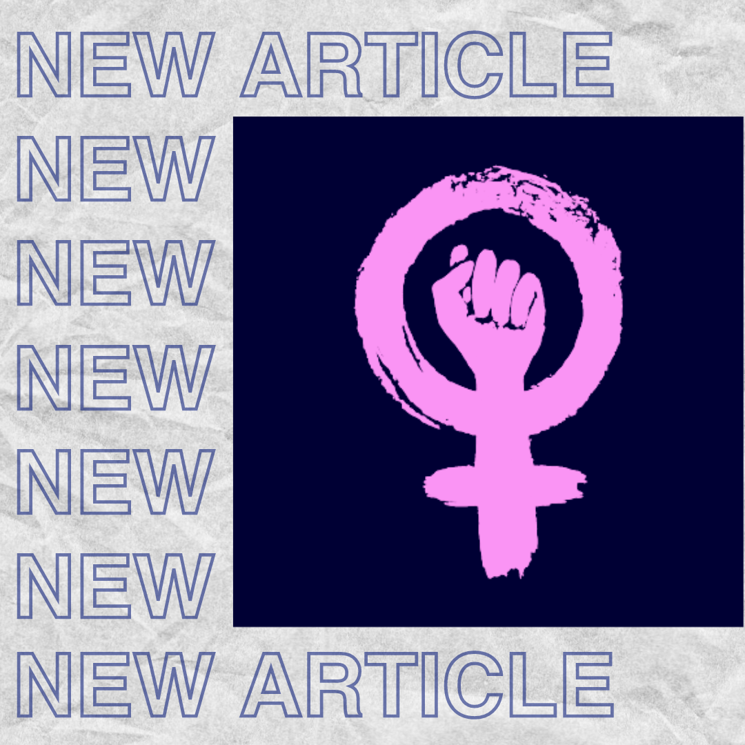
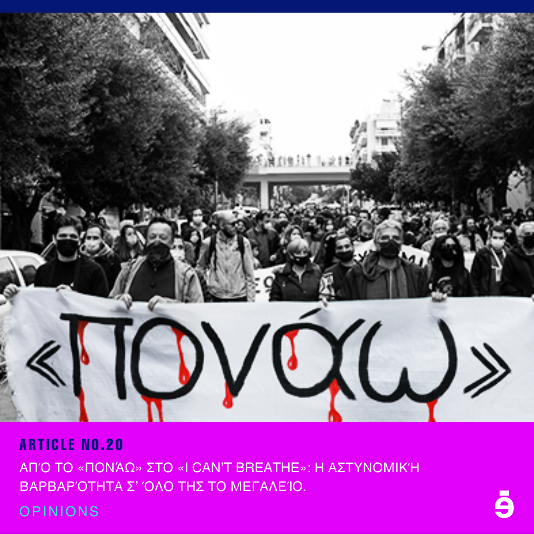
Below you will find the 10 different options I created.
Instagram Story Templates
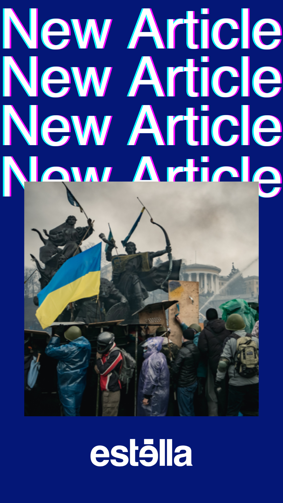
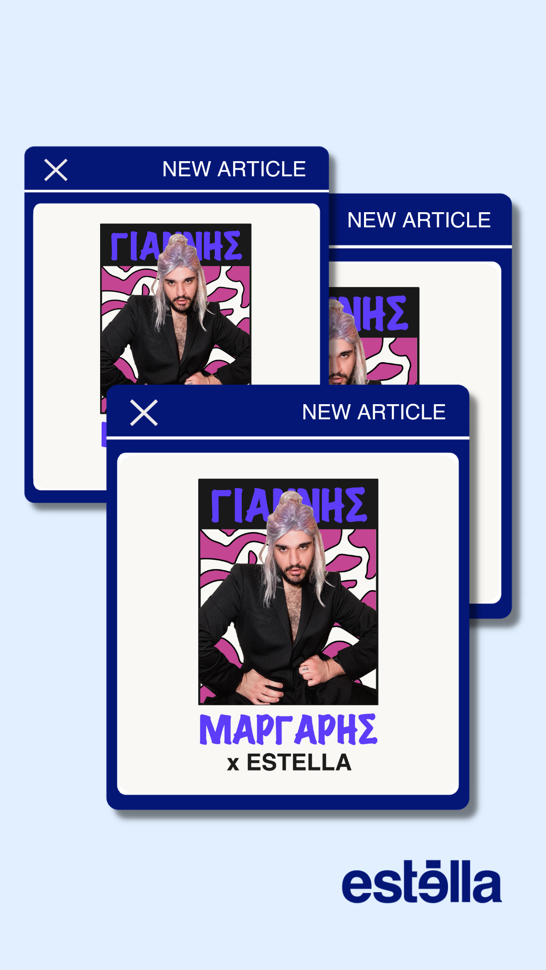
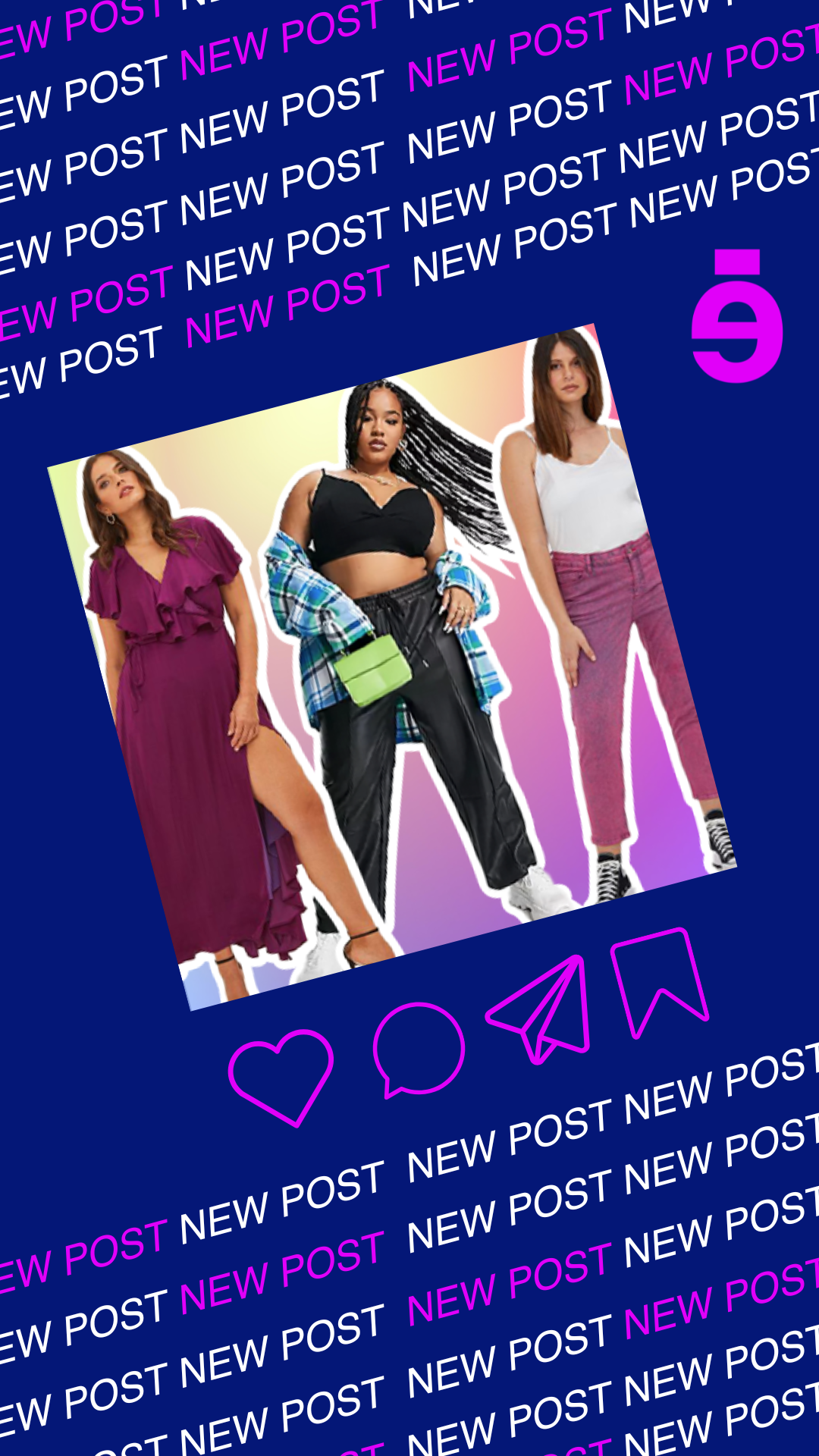
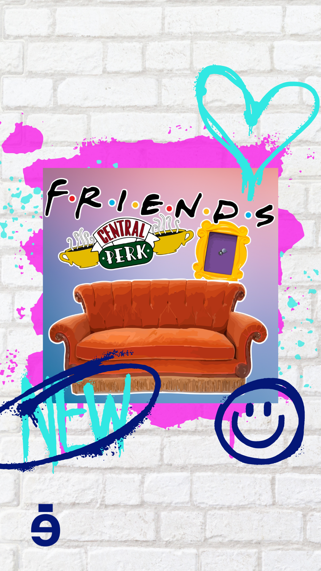
Very similar to the Instagram post templates I also noticed in my competitor analysis research, that all of our competitors also had a template for the articles they posted on their Instagram stories. This also proved to me that this was another common practice for online magazine accounts.
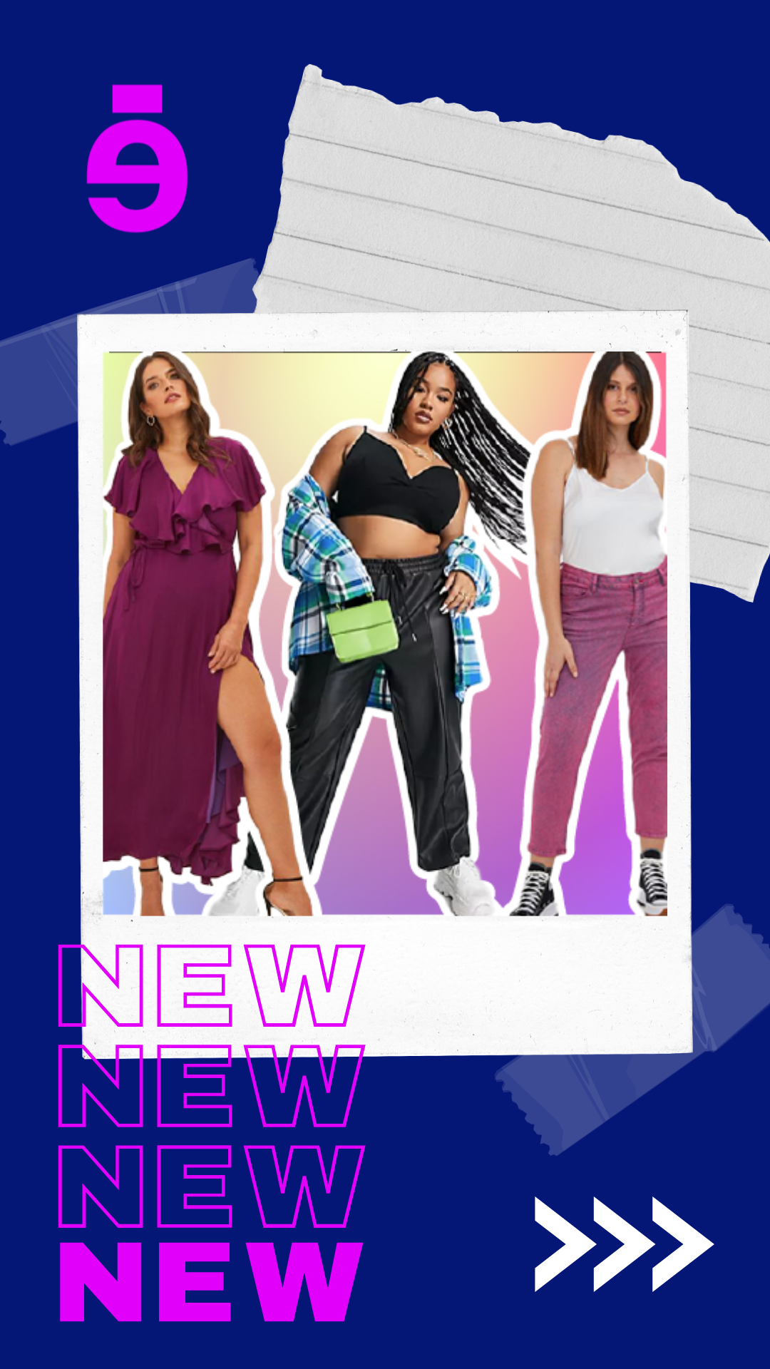
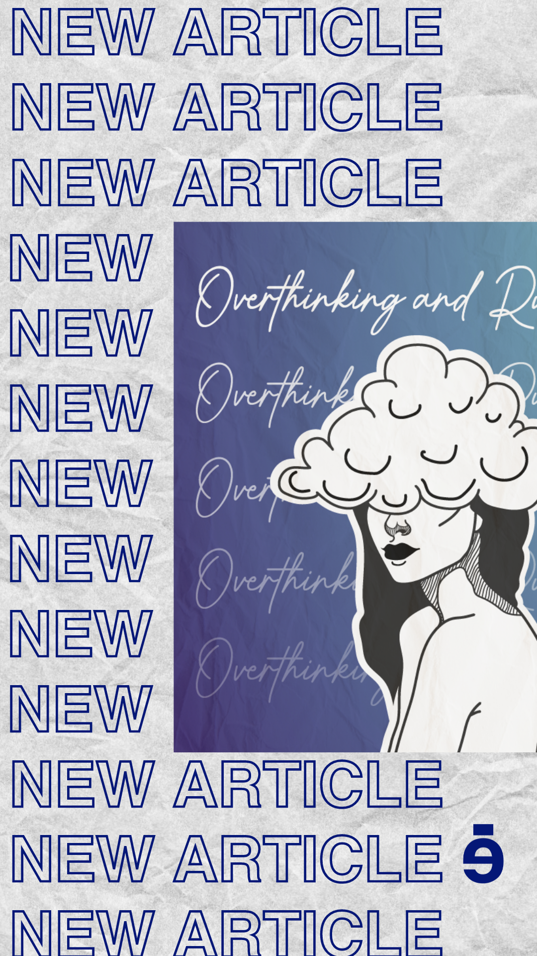
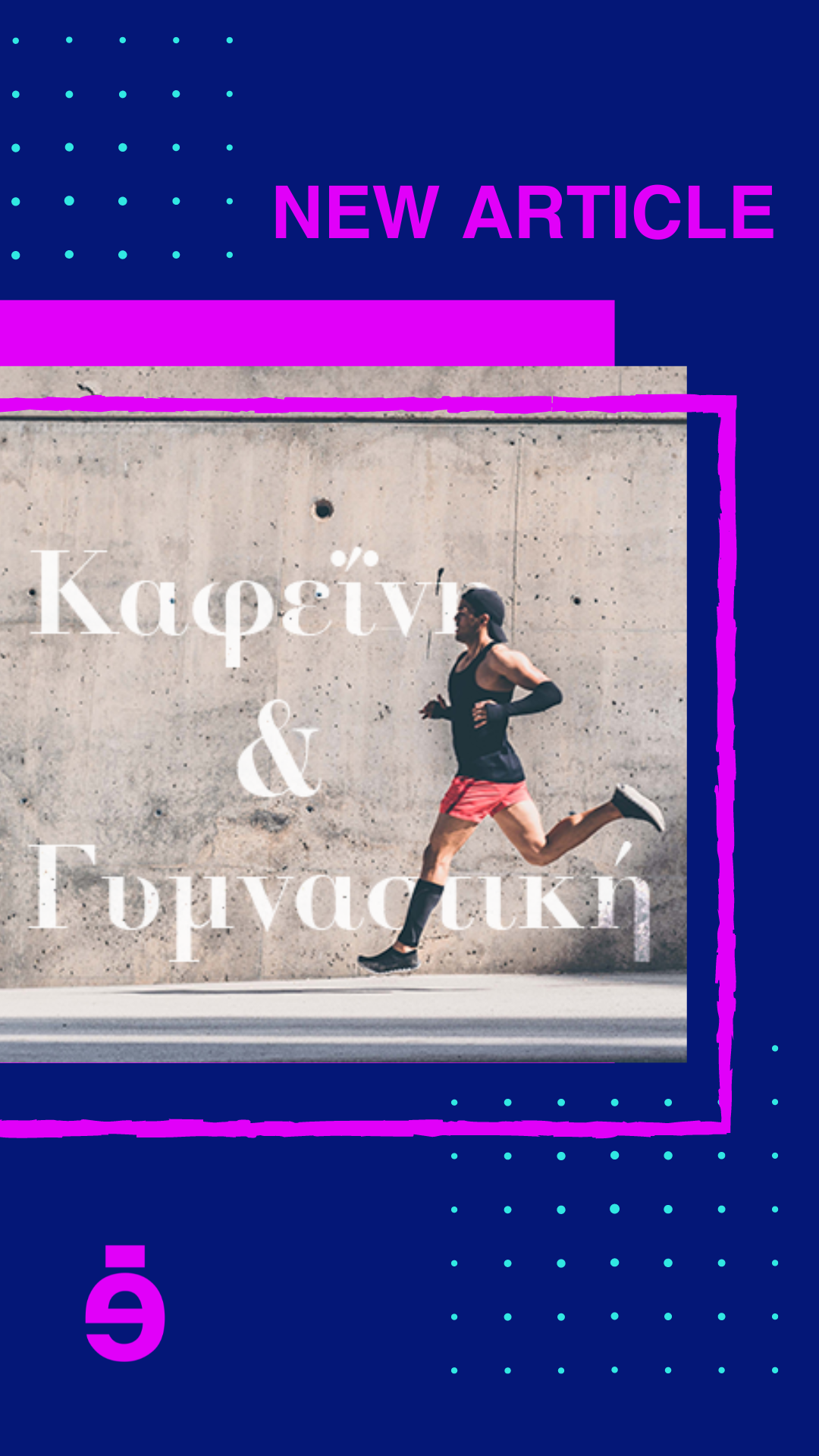
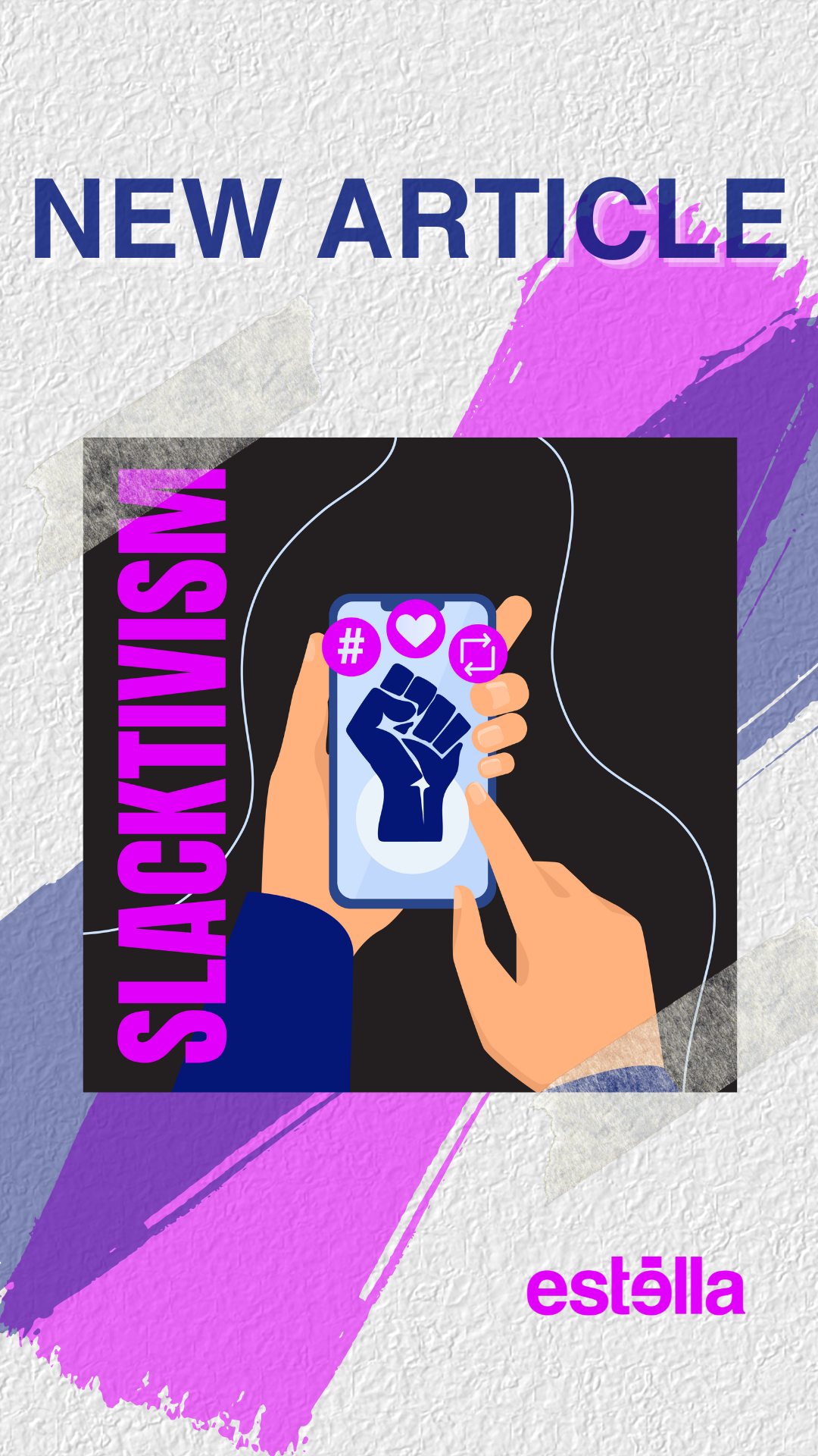
Therefore, I also made sure to create and present a variety of different story templates for the team to choose from, once again using both their brand colours and different hues and shades of their brand colours to make them cohesive with the post templates I created.
Below you will find the 8 different options I created.
Social Media Scheduling Applications
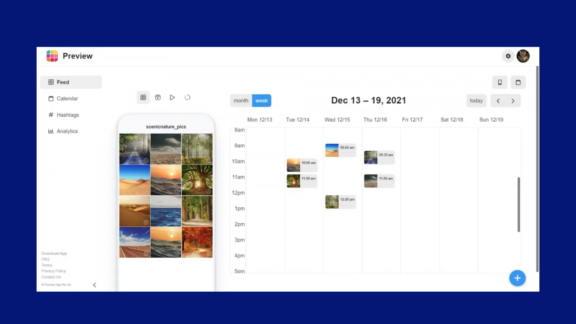
My final topic of research regarding our social media strategy was all about finding the best social media scheduling application. Such an app would allow us to plan, schedule and publish our content on multiple social media platforms. Essentially it makes it much easier and stress-free for us to be posting content, as we can simply pre-make all our weekly posts, schedule them on the app and let it upload them itself.
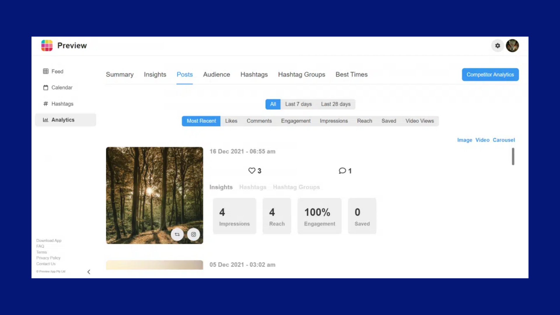
Two main applications stood out to me during my research. The first is called 'Preview' and the second is called ‘Later’. Initially, I was keener to use preview as I had already been using it before this for my own design Instagram account and was already familiar with it. It has great features for Instagram such as planning and scheduling posts, stories, reels and videos but unfortunately, it only supports Instagram.
Even though our main social media platform was Instagram, we knew that in the future we would want to expand our social media reach and start posting on other platforms as well. This meant that ‘Preview’ was not suitable for us.
This left us with ‘Later’. A very similar social media scheduling app to ‘Preview' but with the added benefit of it being supported by all major social media platforms such as Instagram, Facebook, Twitter, TikTok and LinkedIn.
After reviewing both applications with the team we all came to a unanimous decision that ‘Later’ was the best social media scheduling application for us.
Development
The development stage of the design process is where I create all the content for Estella. Since I am their graphic designer, this section contains a look at the graphic design content I made for them throughout the months of working there, including Instagram templates and posts as well as hero and thumbnail images.
Content I Created
Once all the research and planning were done, it was time to start creating social media content and hero and thumbnail images for the website.
Here is a list of the content I created during my work placement at ‘Estella' so far:
Post templates
Story template
Instagram Highlights covers
Shop Items templates
Generic posts
Article posts
Informative carousel post
Reels
Facebook Cover Image
Hero and Thumbnails for Quizzes
Hero and Thumbnails for Articles
Post Templates
I started my development by creating all the templates Estella needed, such as the post templates, the story templates and the shop templates.
For the post templates, as mentioned previously, I created a variety for the team to choose what they liked the best. After some consideration and alterations, the final article template for the Instagram grid is seen below. (Checkered grid template)
The template includes the thumbnail image, title and category of the article, and what number article it is in the order of publication.

Checkered Grid Template
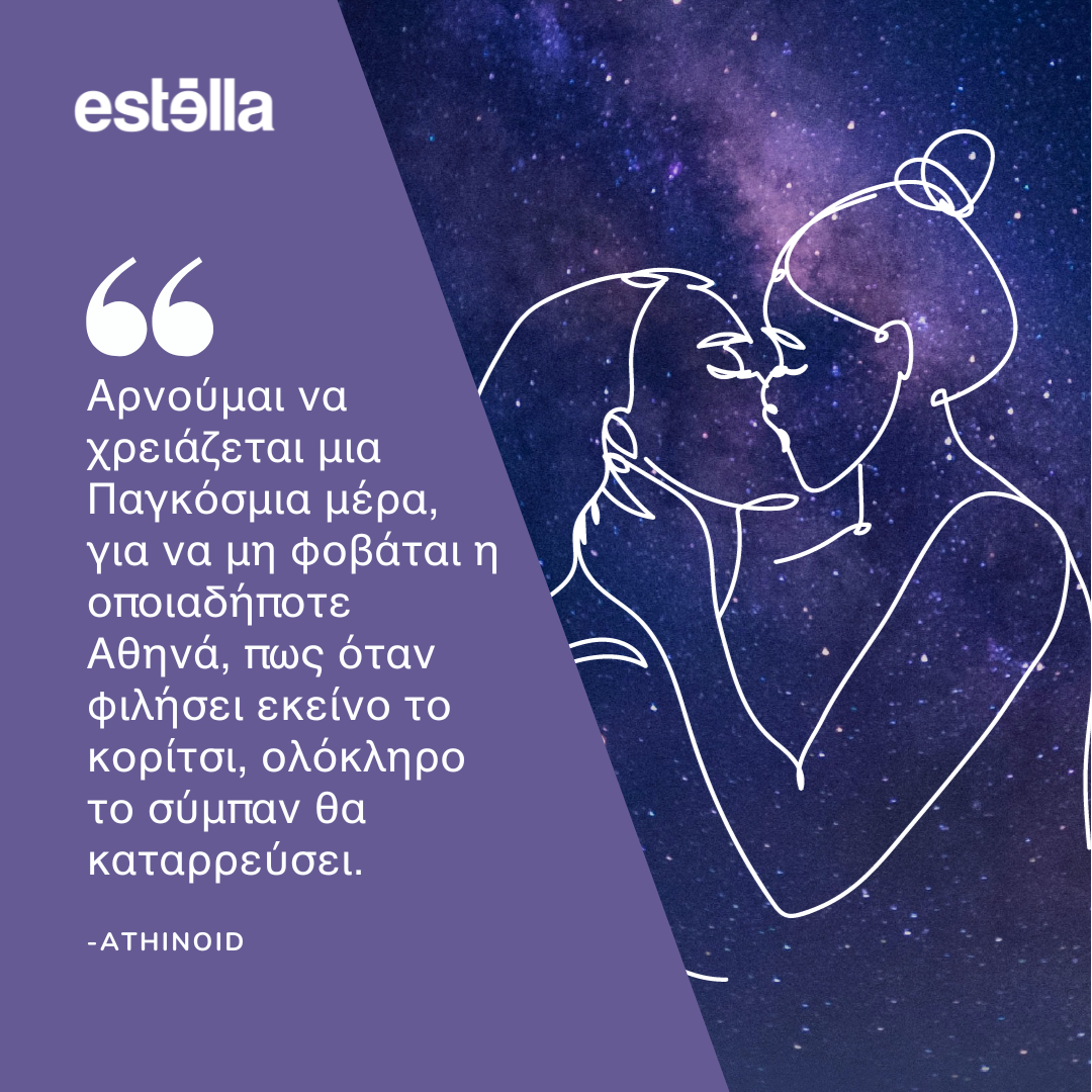
Template for Quotes
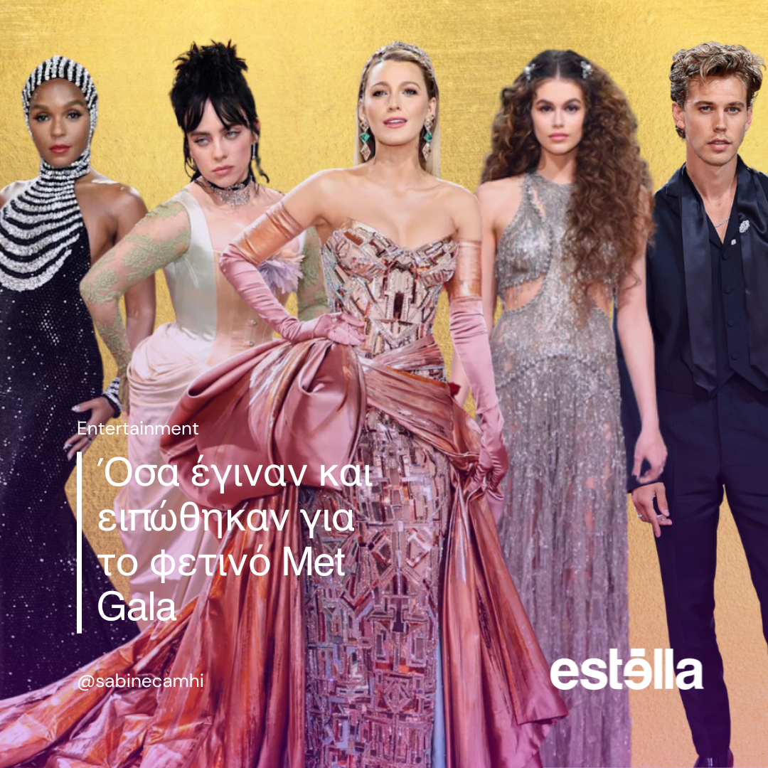
News Template
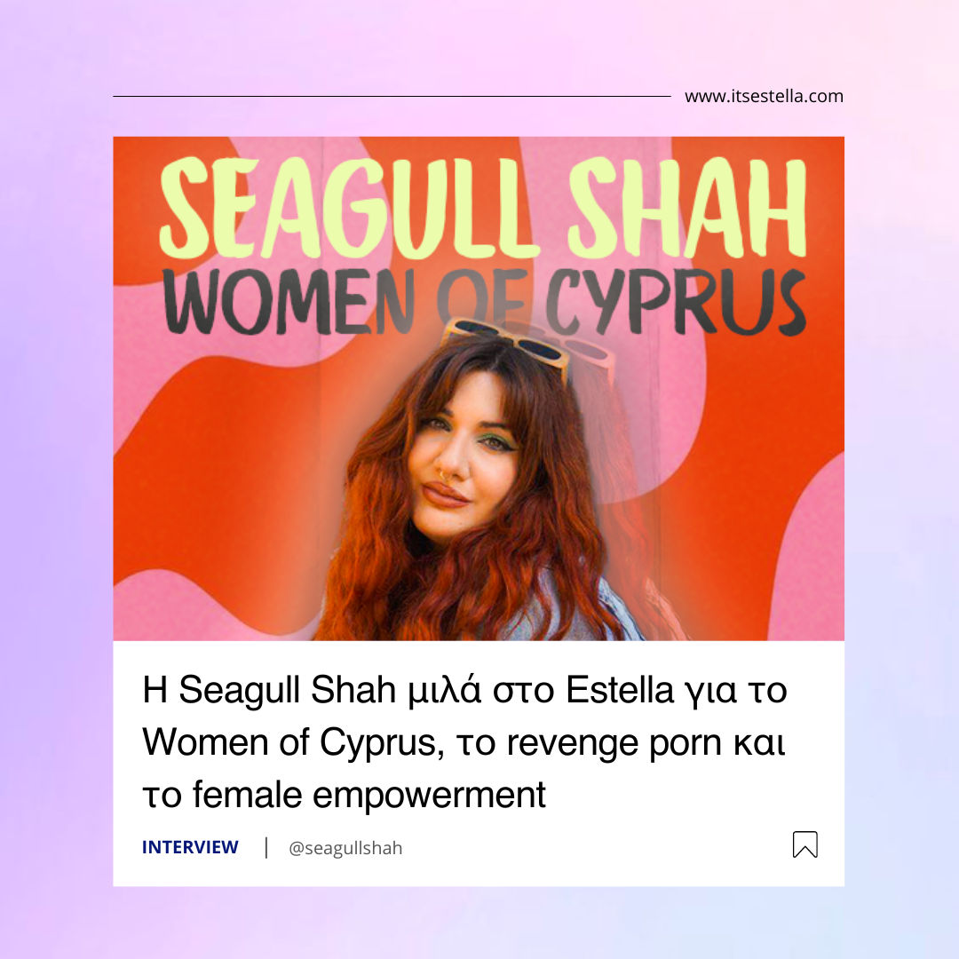
Interview template
Once we were done using the article template for our Instagram grid, I was asked to create some other templates that we could use for important articles such as interviews or news articles. These would be used throughout the grid with no specific pattern like the checkered grid template, but whenever we thought an article needed a template to stand out to our target audience.
Above you can see the three other template posts I create, one for quotes, one for news and one for interviews or other important articles.
Instagram Story Templates for Article
As seen from the research, I also needed to create a template for the article stories that would be posted every day on our Instagram as a way to inform our followers of the day's new articles.
We wanted something more minimal so as to not distract from the actual content of the story but we also wanted to be able to differentiate the 5 categories of articles, which we did by assigning a colour to each one.
The categories are Opinions, Quizzes, Entertainment, Lifestyle and People. Below are the final templates we agreed upon.
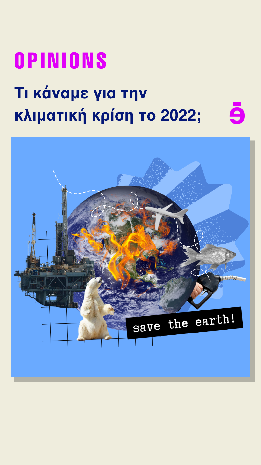
Article Category: Opinions
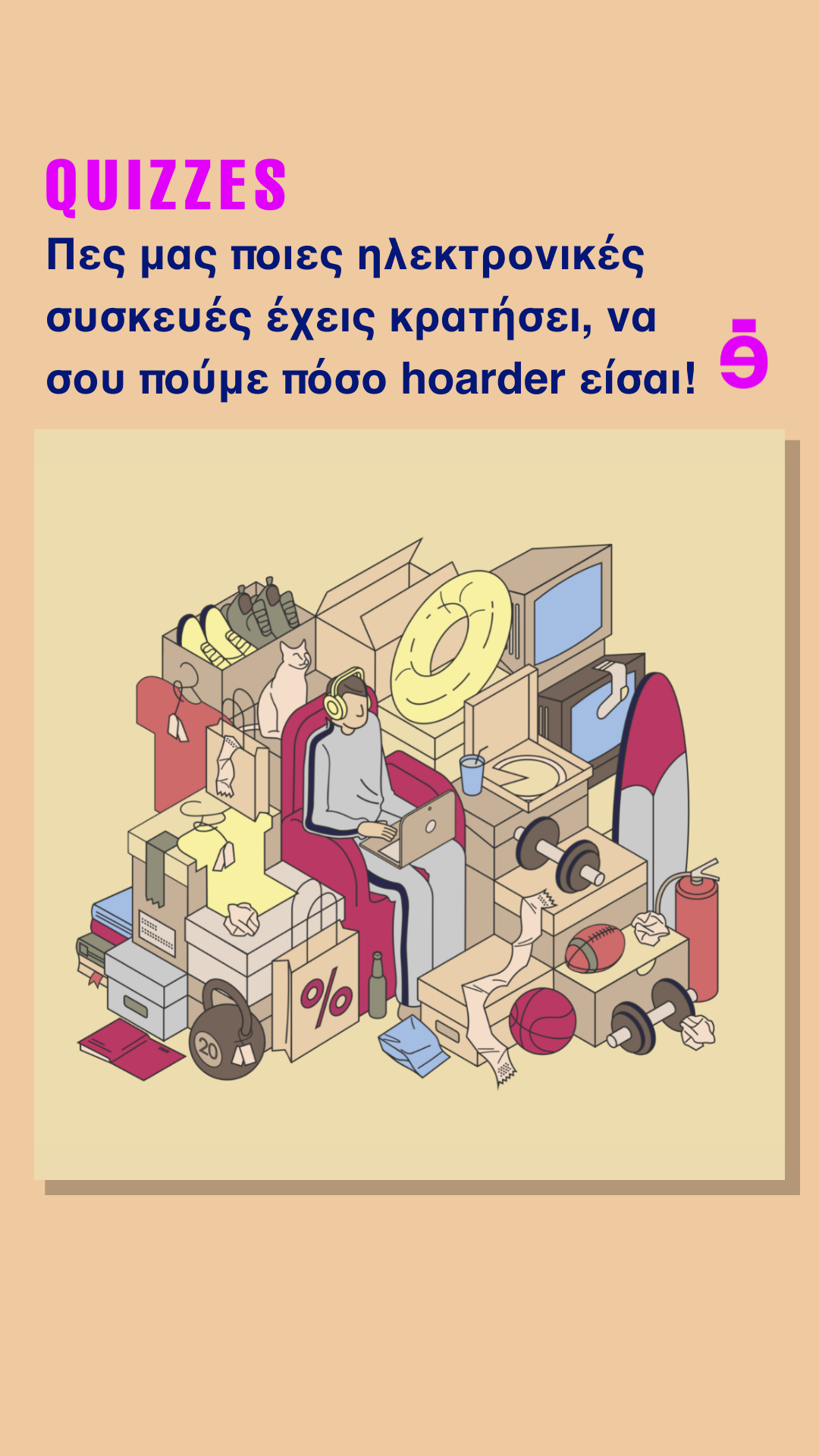
Article Category: Quizzes
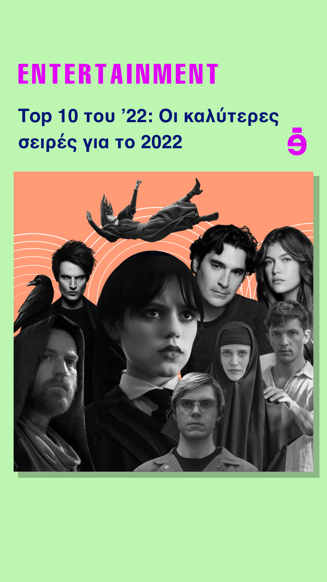
Article Category: Entertainment
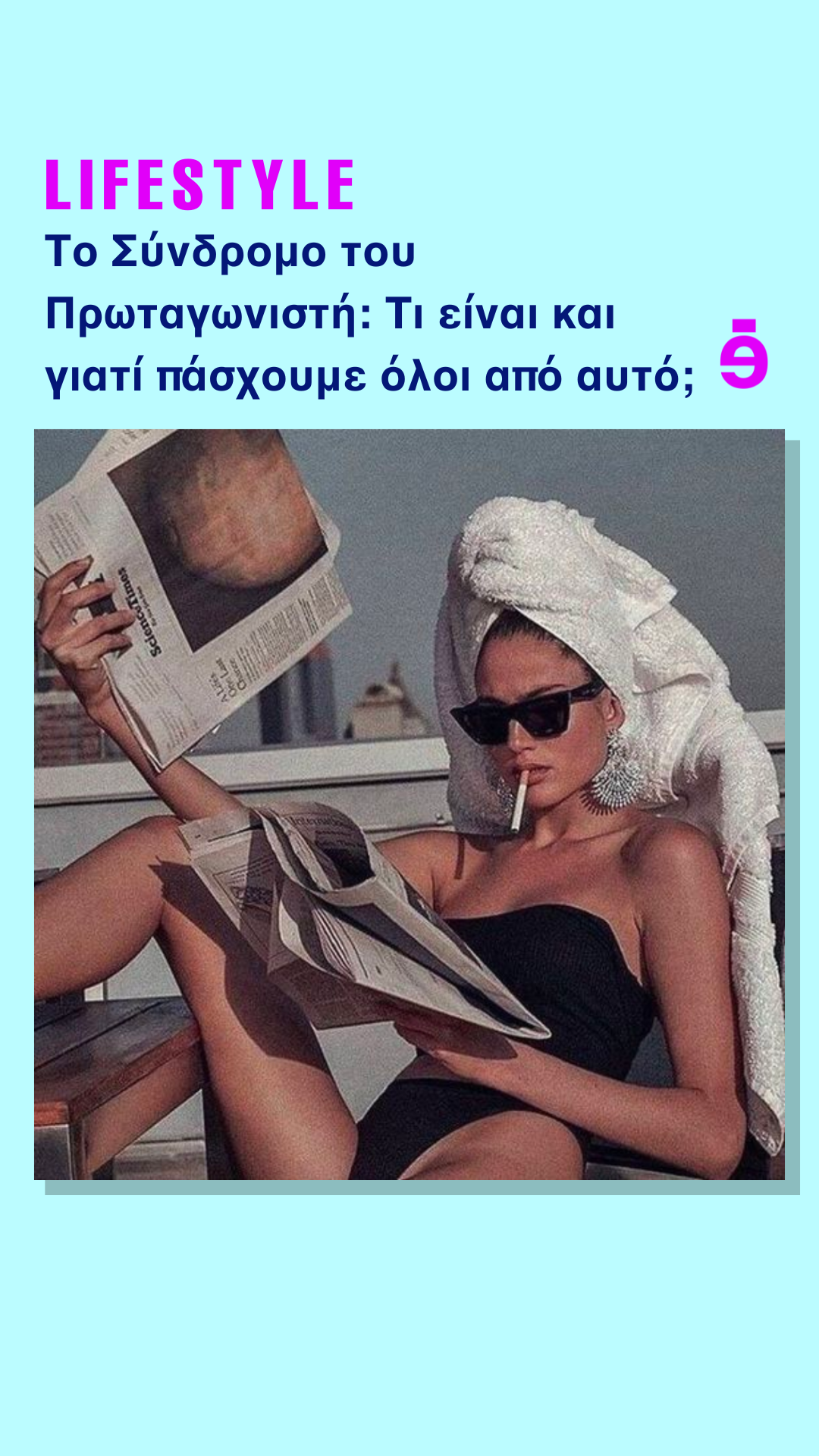
Article Category: Lifestyle
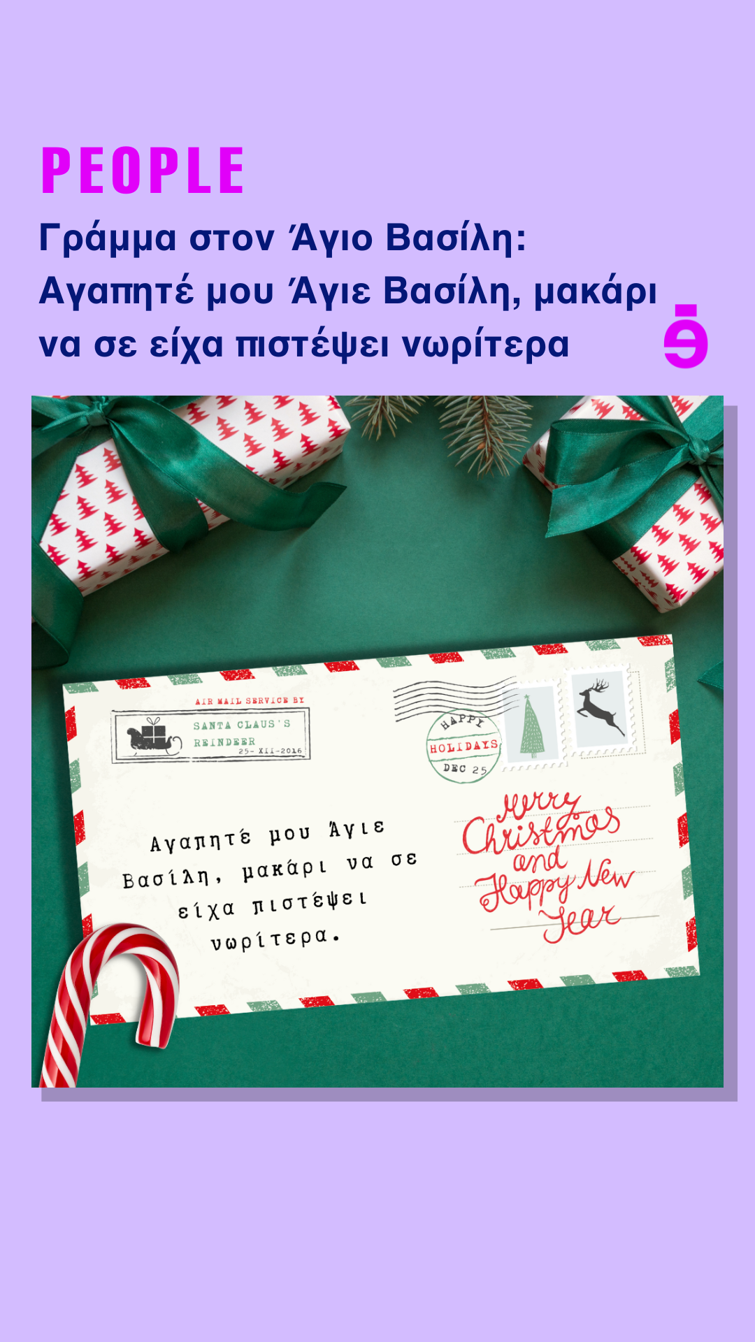
Article Category: People
Daily Instagram Story Templates
The daily morning Instagram stories came in a few months after launch as a way to bring more fun content to our Instagram page. Since stories disappear after 24 hours, this was a great way to create fun content without compromising the look of our Instagram feed or aesthetic.
Each weekday has a theme. Monday, we share a meme of the day/ Monday mood story. Tuesday is ‘did you know’, and Wednesday is 'artist shoutout’ where we find an artist we love and share their work as a way for them to gain more exposure. Thursday is a ‘fun fact of the day’ and to end the work week on a happy note we have ‘good news of the day’ where we share something uplifting that happened from anywhere around the world in the past week.
On Saturday we either have ‘this or that’ where we post items from our shop section on the website as a way for us to showcase them to our audience more. Or at the end of each month, we have a section called favourites of the month where we post the best-performing articles of the month.
Finally, Sunday we have the recap of the week, where we post all the articles that were published in the past week.
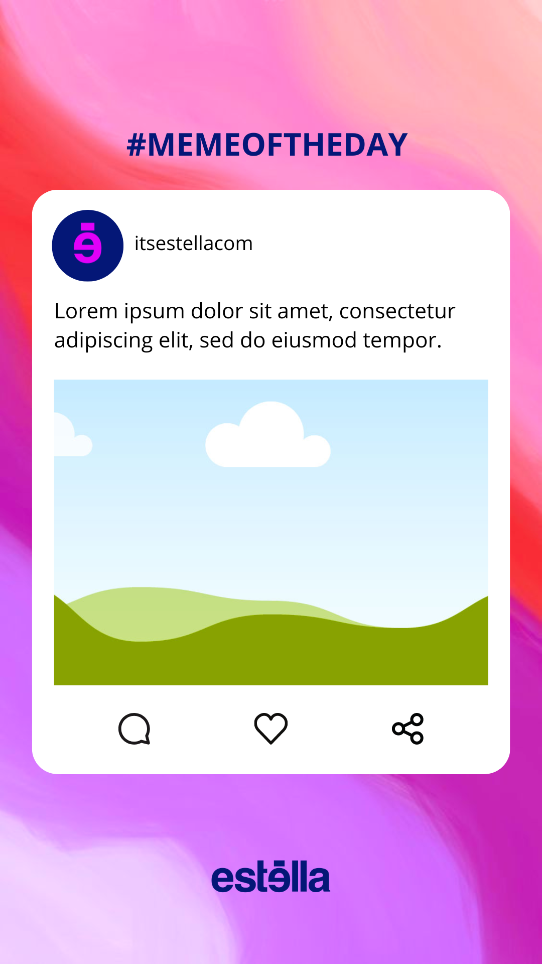
Meme of the Day
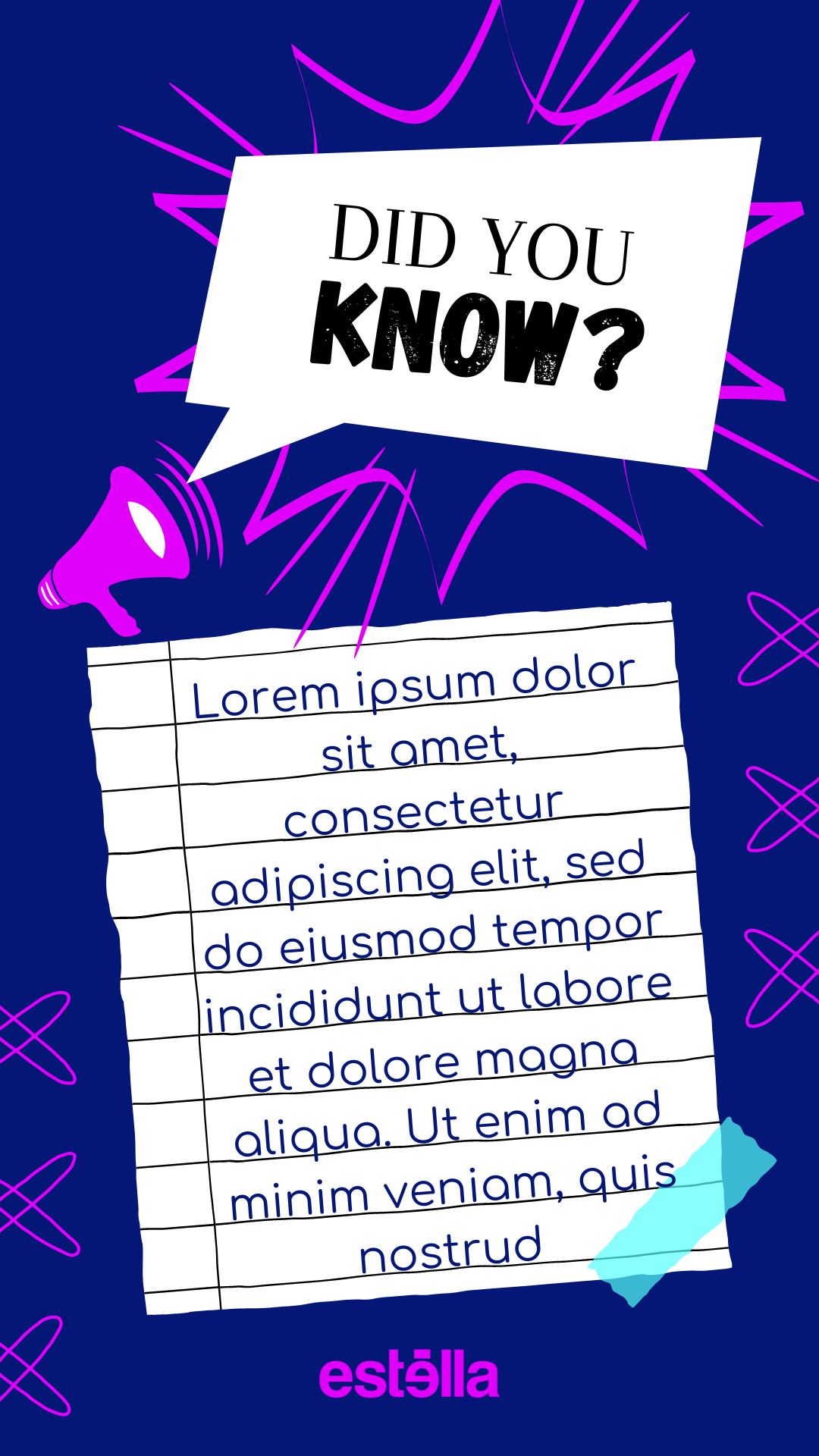
Did You Know?
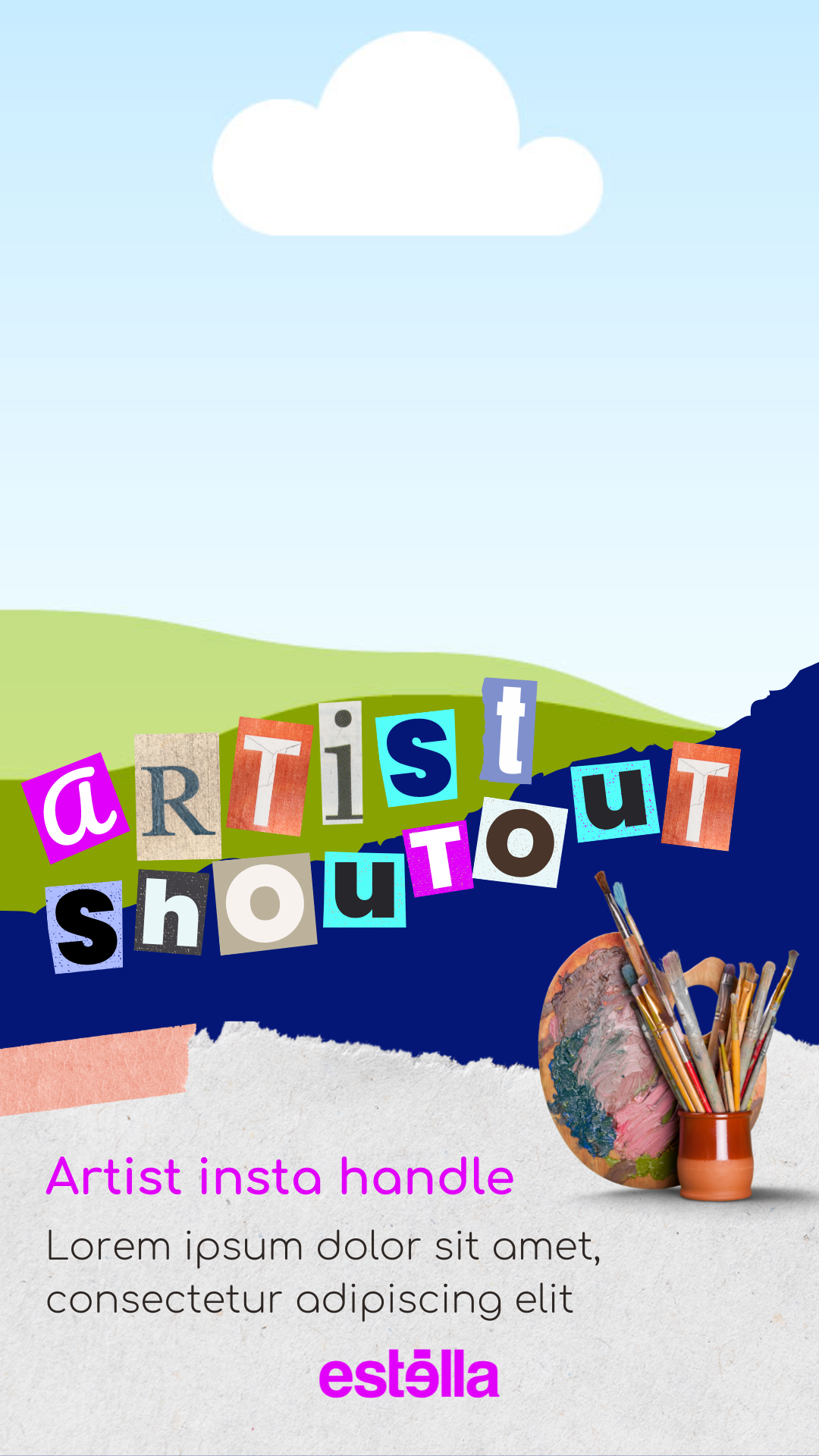
Artist Shoutout
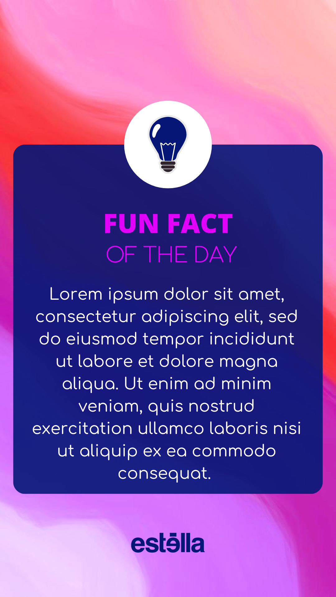
Fun Fact of the Day
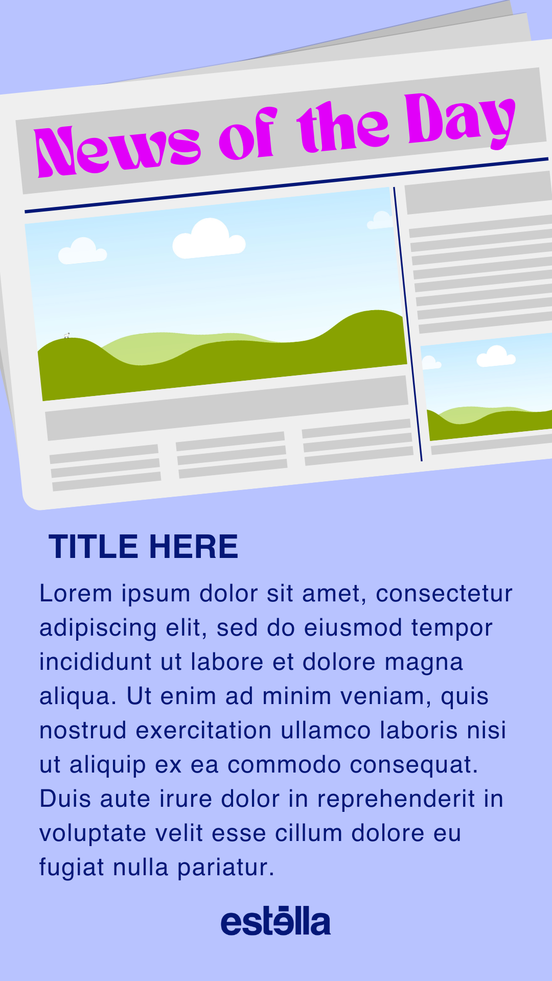
Good news of the Day
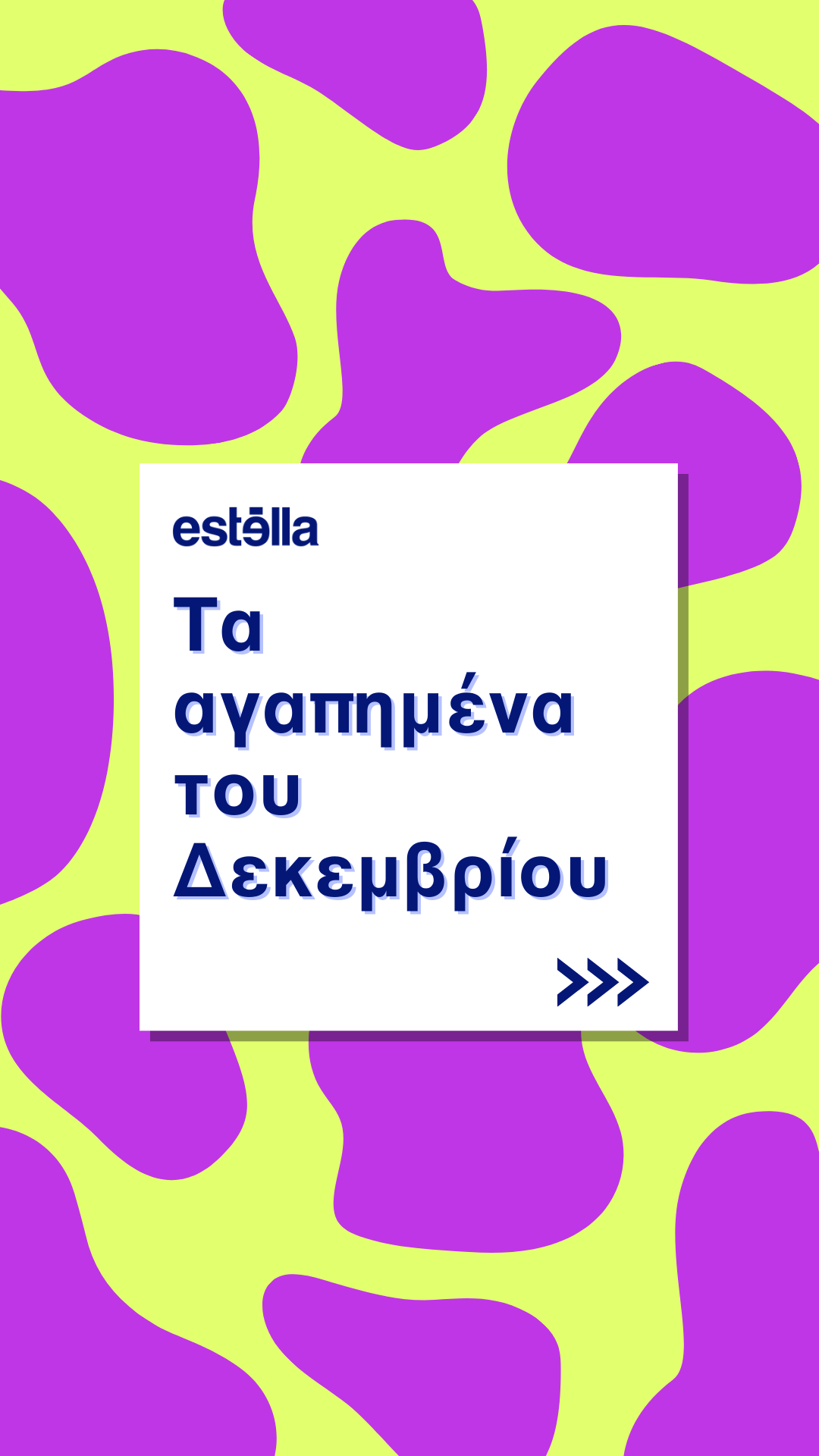
Favourites of the month
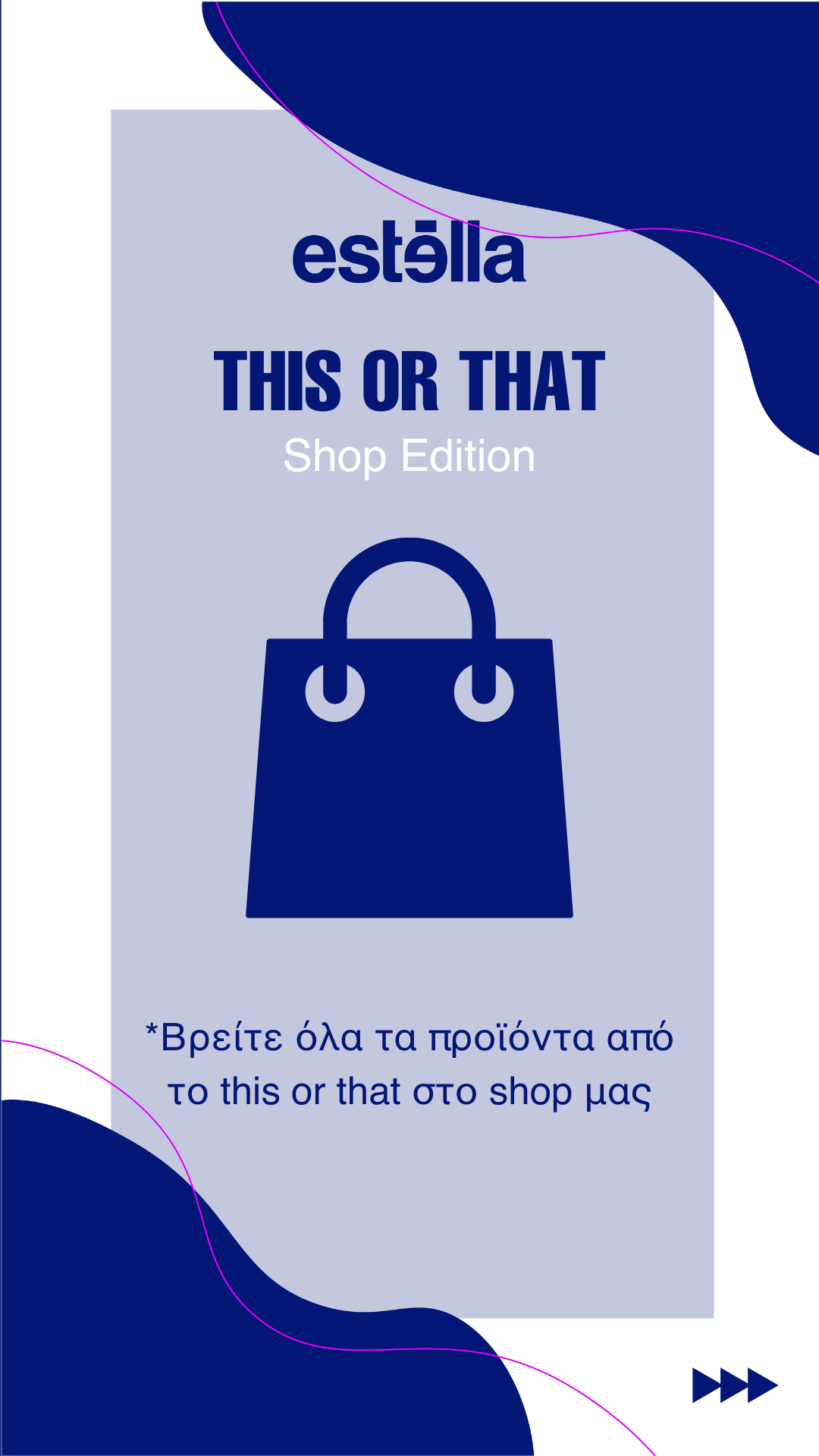
This or That
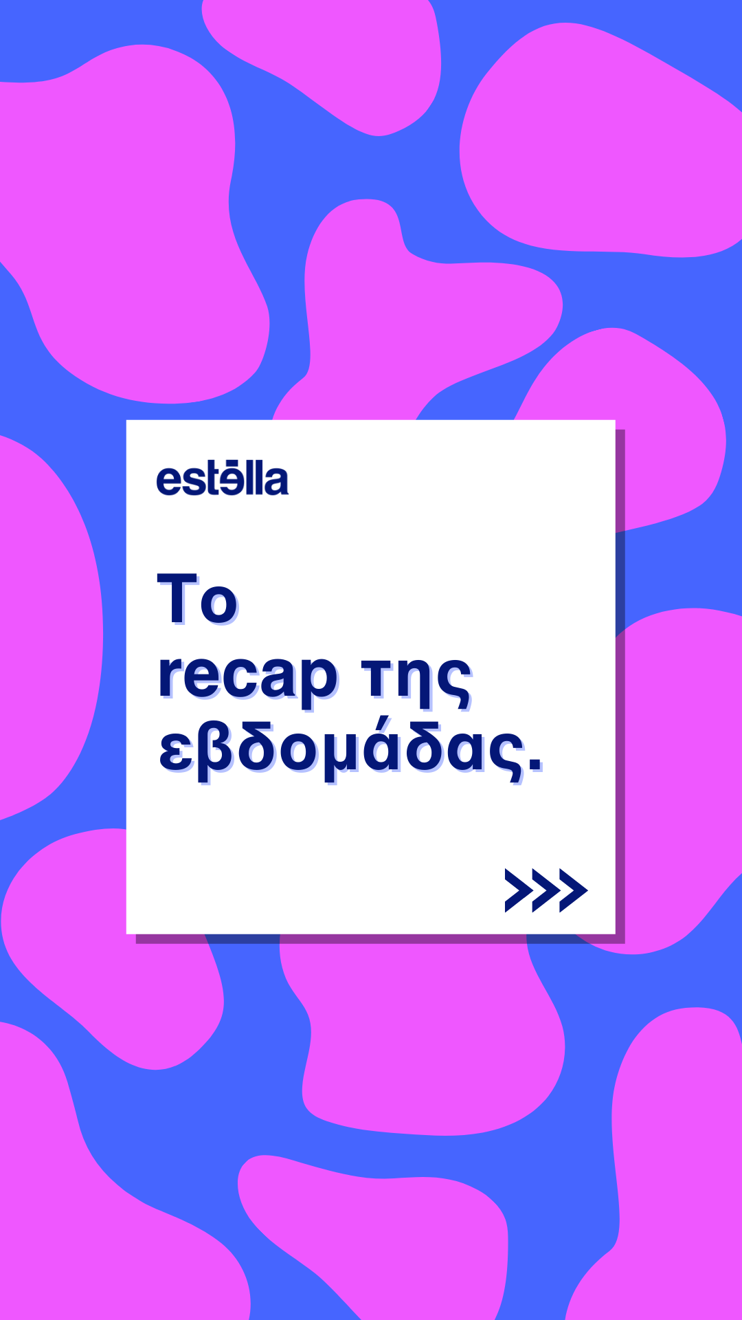
Recap of the week
Shop Templates
The Estella website has a dedicated shop section where we upload a variety of items with affiliate links. There are 4 main categories in the shop section: Gadgets, Beauty, Books and Fashion.
Below are the four different templates I created for each shop category as a way to make the products look more aesthetically pleasing and match the aesthetics and colours of the rest of the website.
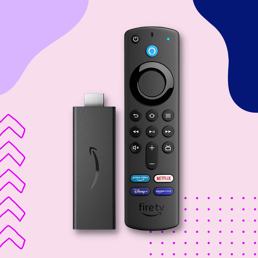
Template for Gadgets
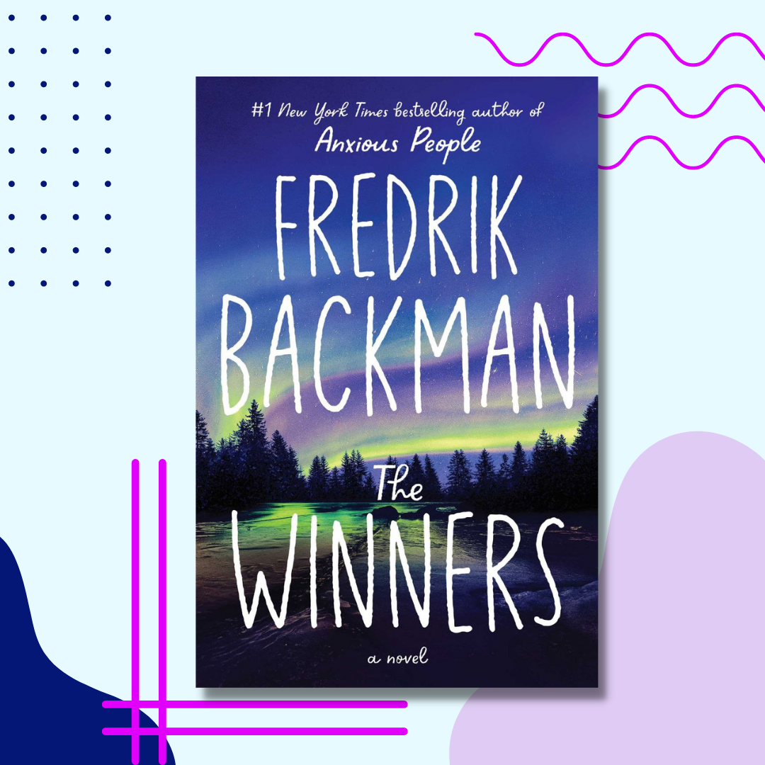
Template for Books
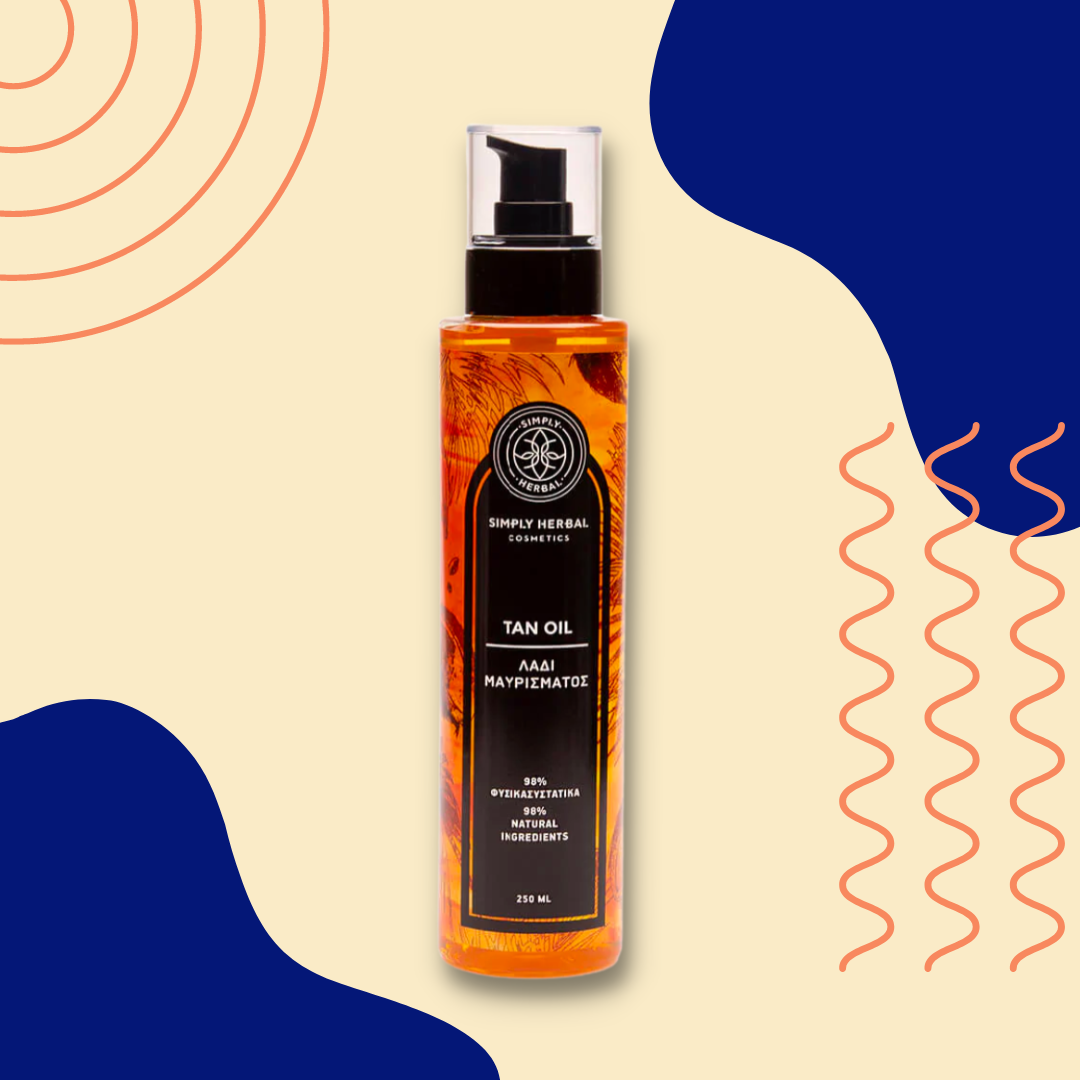
Template for Beauty Products
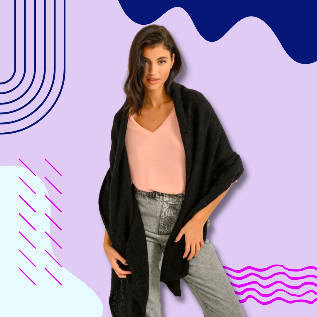
Template for Fashion
Creating Instagram posts
As a content creator for Estella’s Instagram account, I was in charge of creating the majority of their Instagram posts. Most of the posts I created were informative article posts or collaboration posts we had with other creators and writers. Since I have created over 300 posts, I could not possibly share them all here, so I have chosen my 8 favourites.
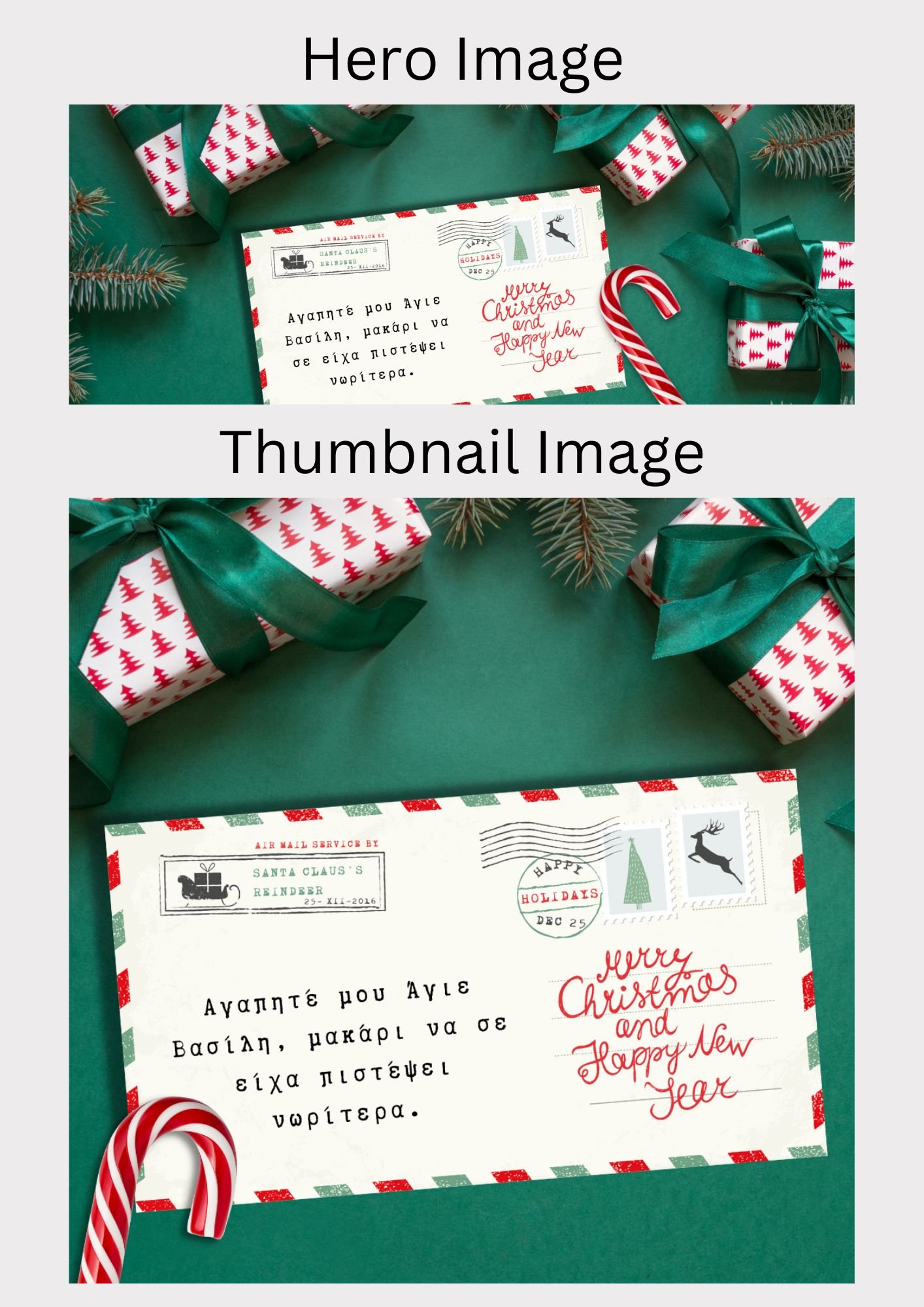
The carousel post below is a collaboration post with the writer. The article was a note to Santa reflecting back on the year and what happened around the world, so I chose to lead into the Christmas letter theme and made the post look like a written letter to Santa.
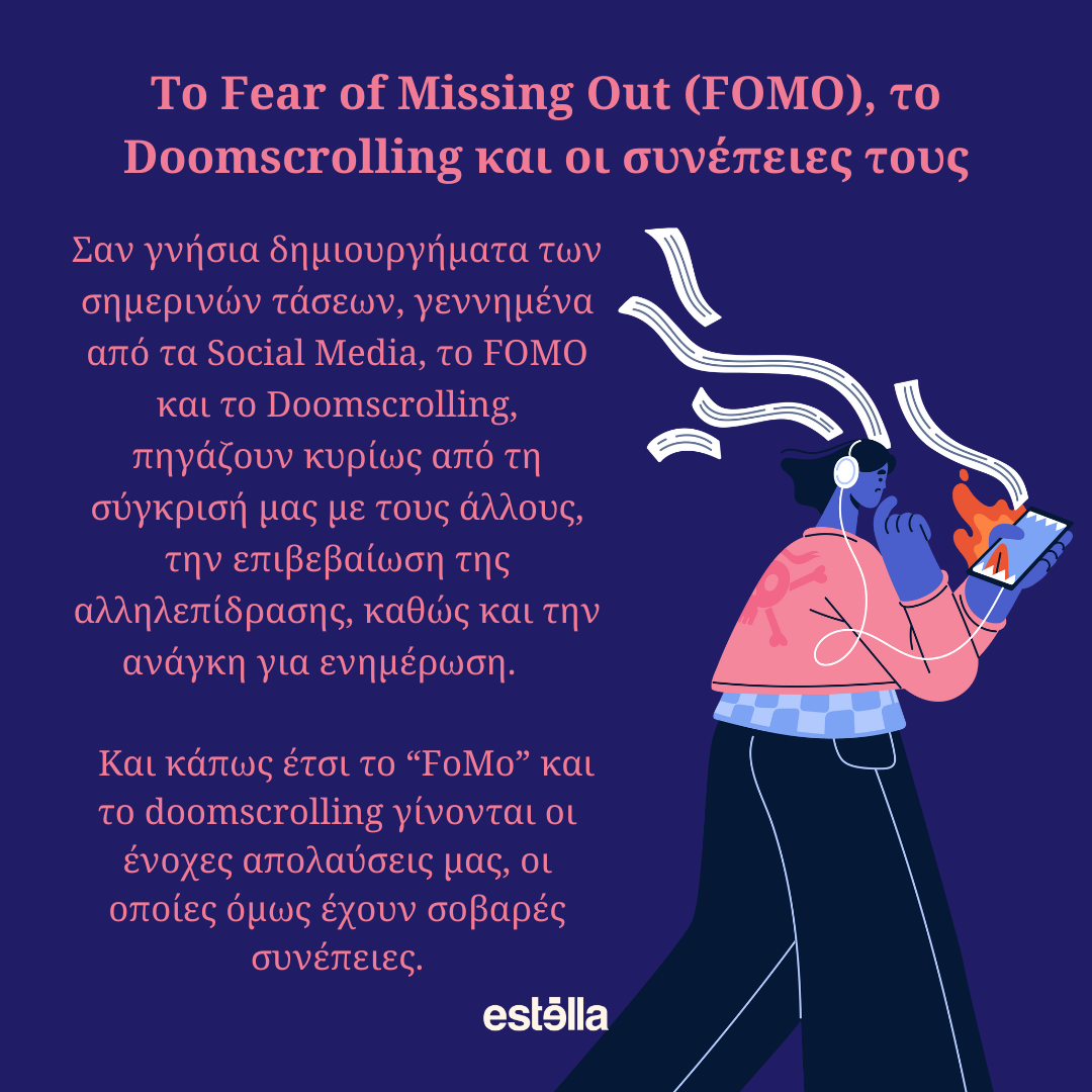
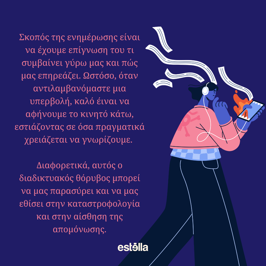
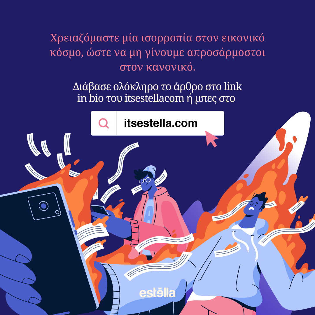
The next carousel post was for an article on ‘Doomscrolling’ and the effects it has on us and society in general.
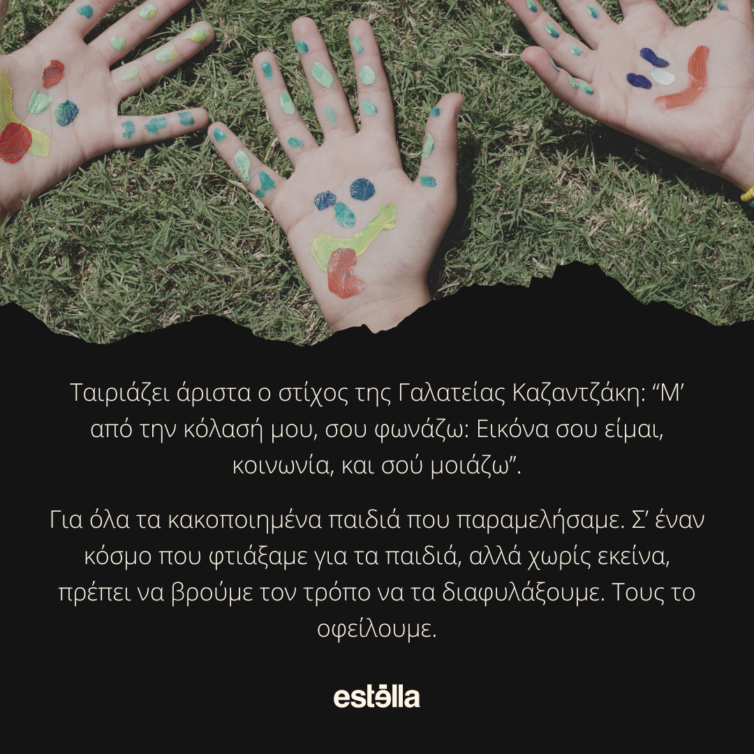
This next carousel post was dealing with a much heavier and darker topic which was ‘why do we not take better care of the children in the world.’
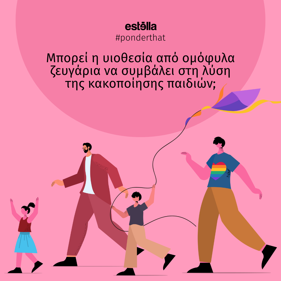
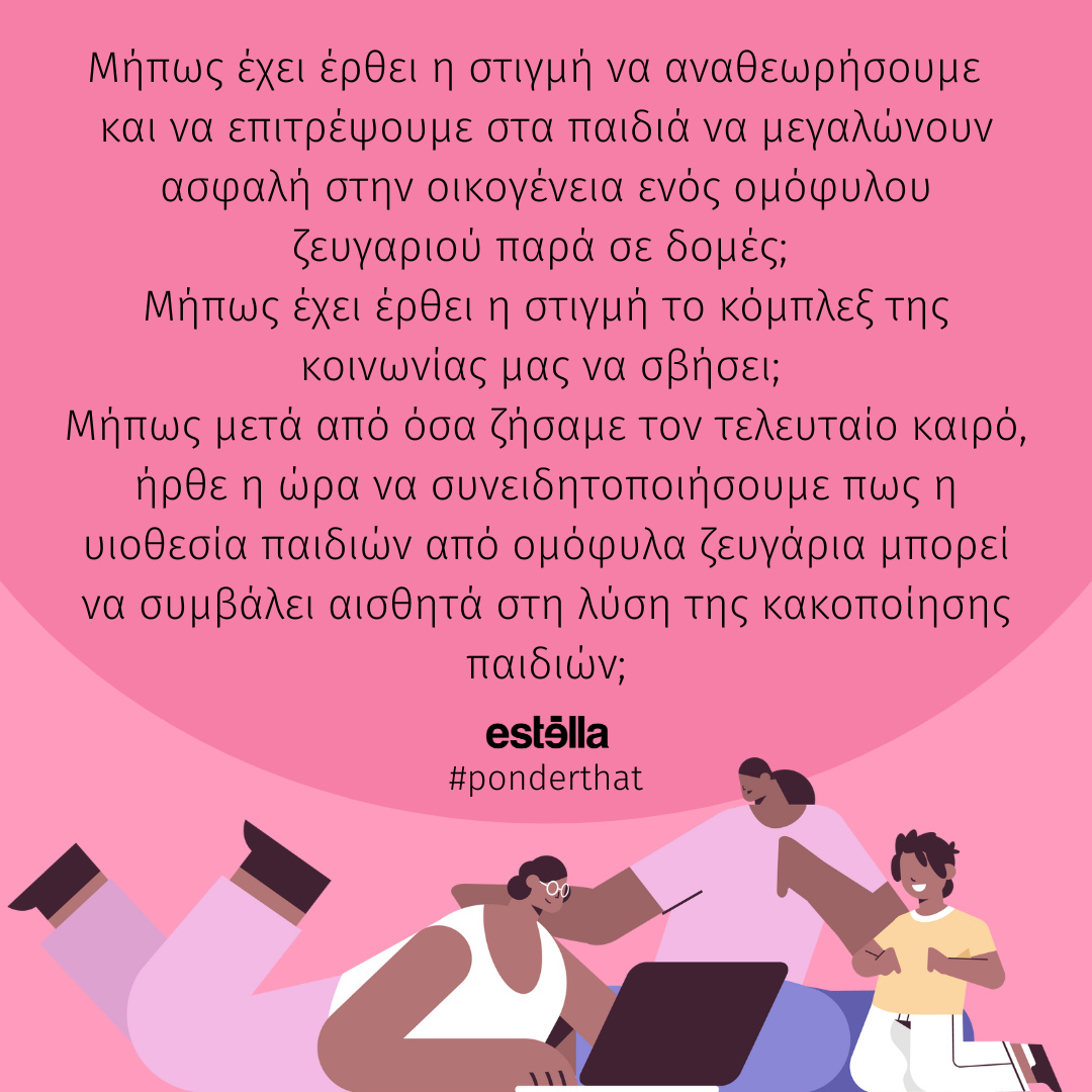
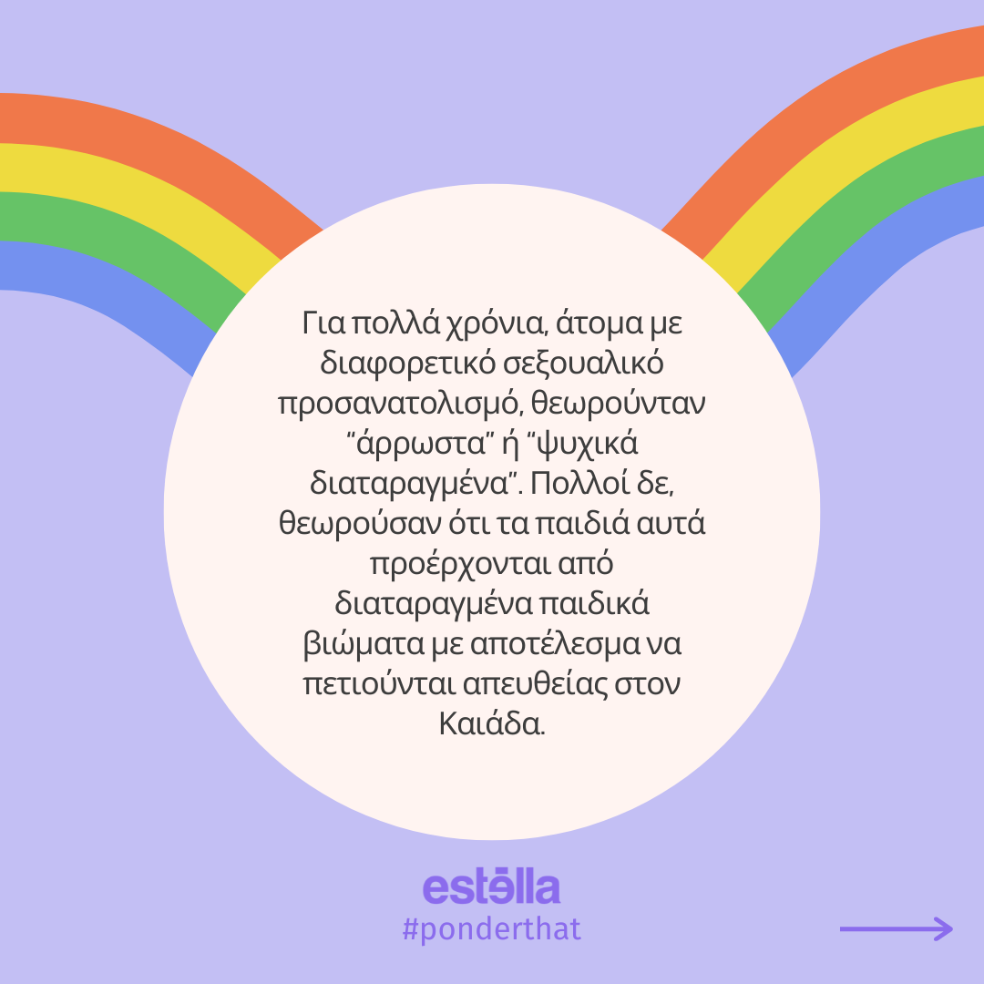
The carousel post below is another collaboration we had with another writer. The topic was about how if we allowed LGBTQ+ couples to adopt, it would reduce the number of children in abusive families or situations.
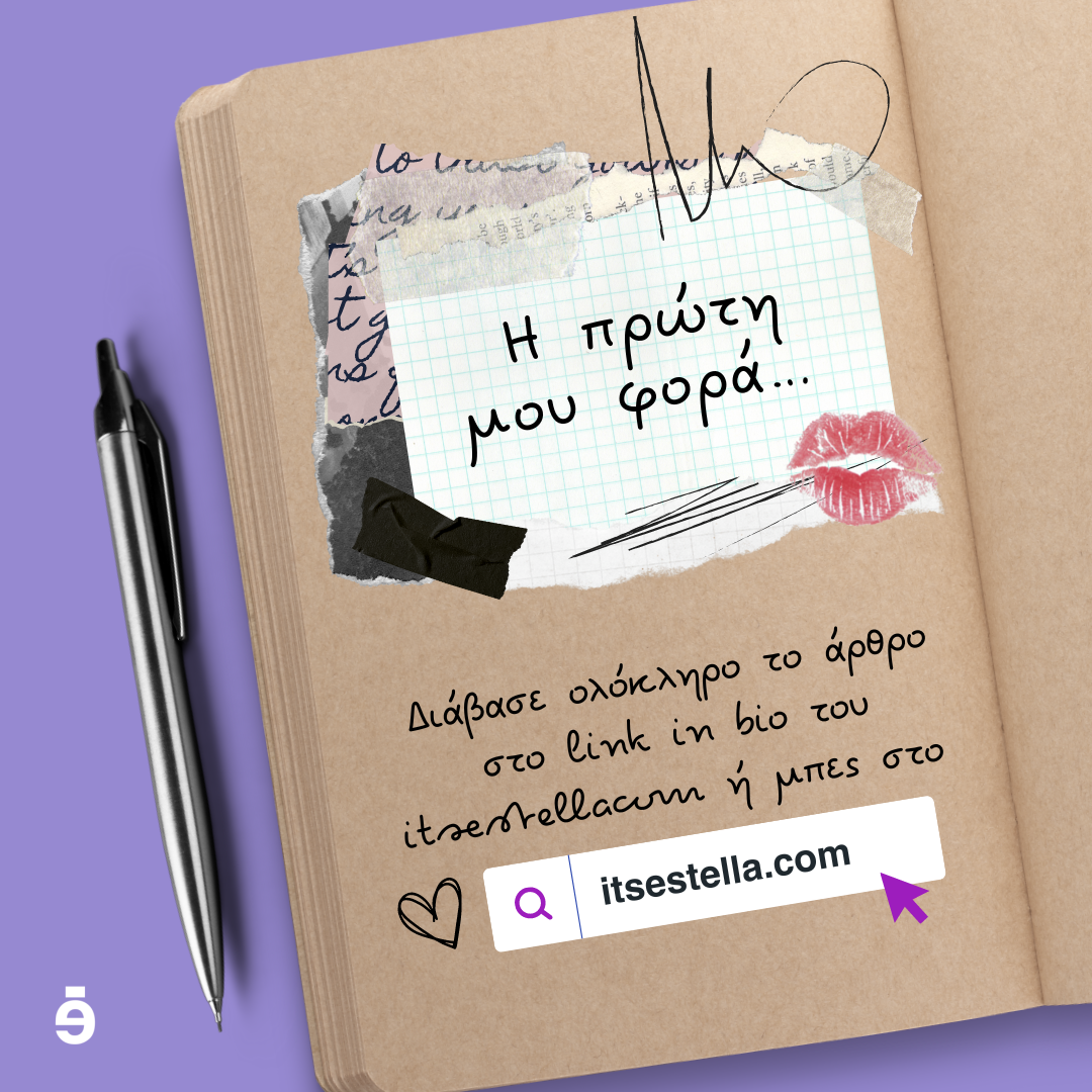
The next post is along similar lines as the first one which was the letter to Santa, but this article was about the writer’s experience during her first time. The article was written in the style of a diary entry, which lead to my decision to make it look like it was actually written in a diary.
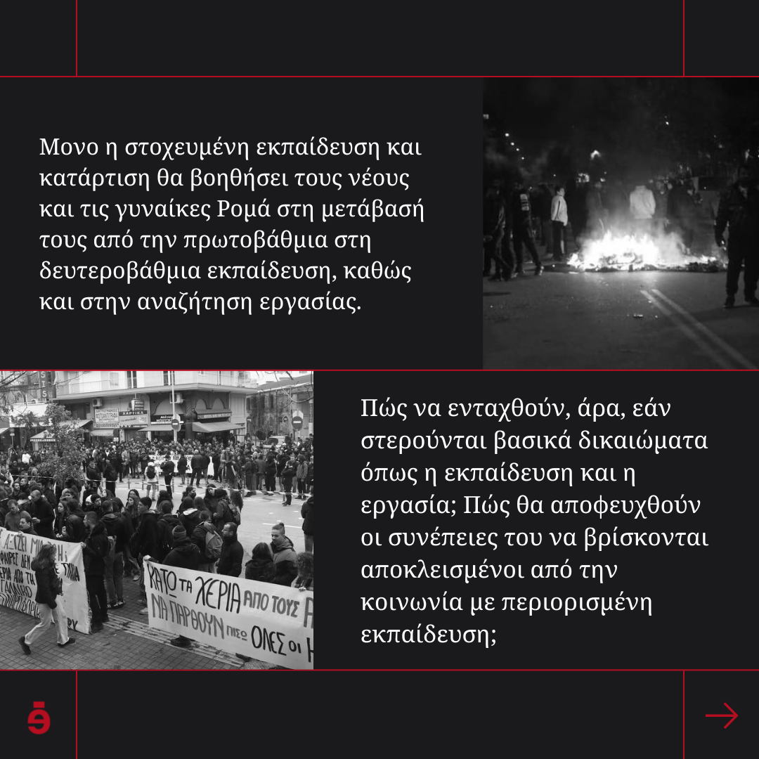
This next carousel post was about a 16-year-old boy who was killed by a greek police officer for not paying 20 euros for the petrol he put in his motorbike.
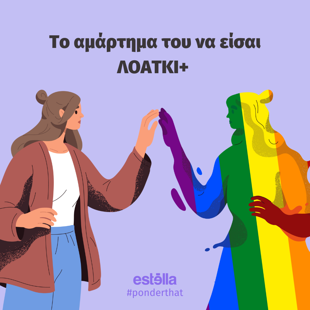
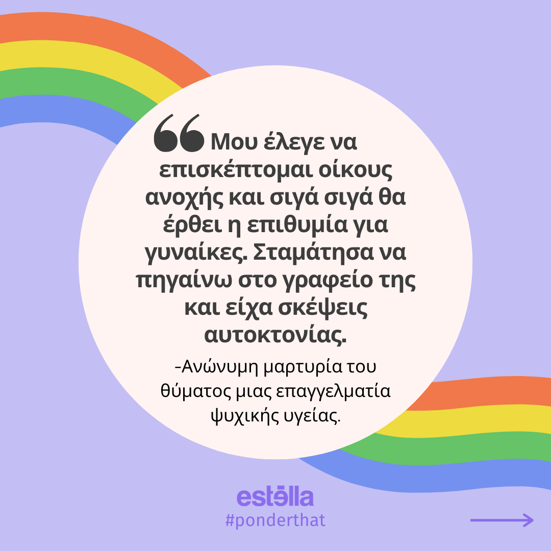
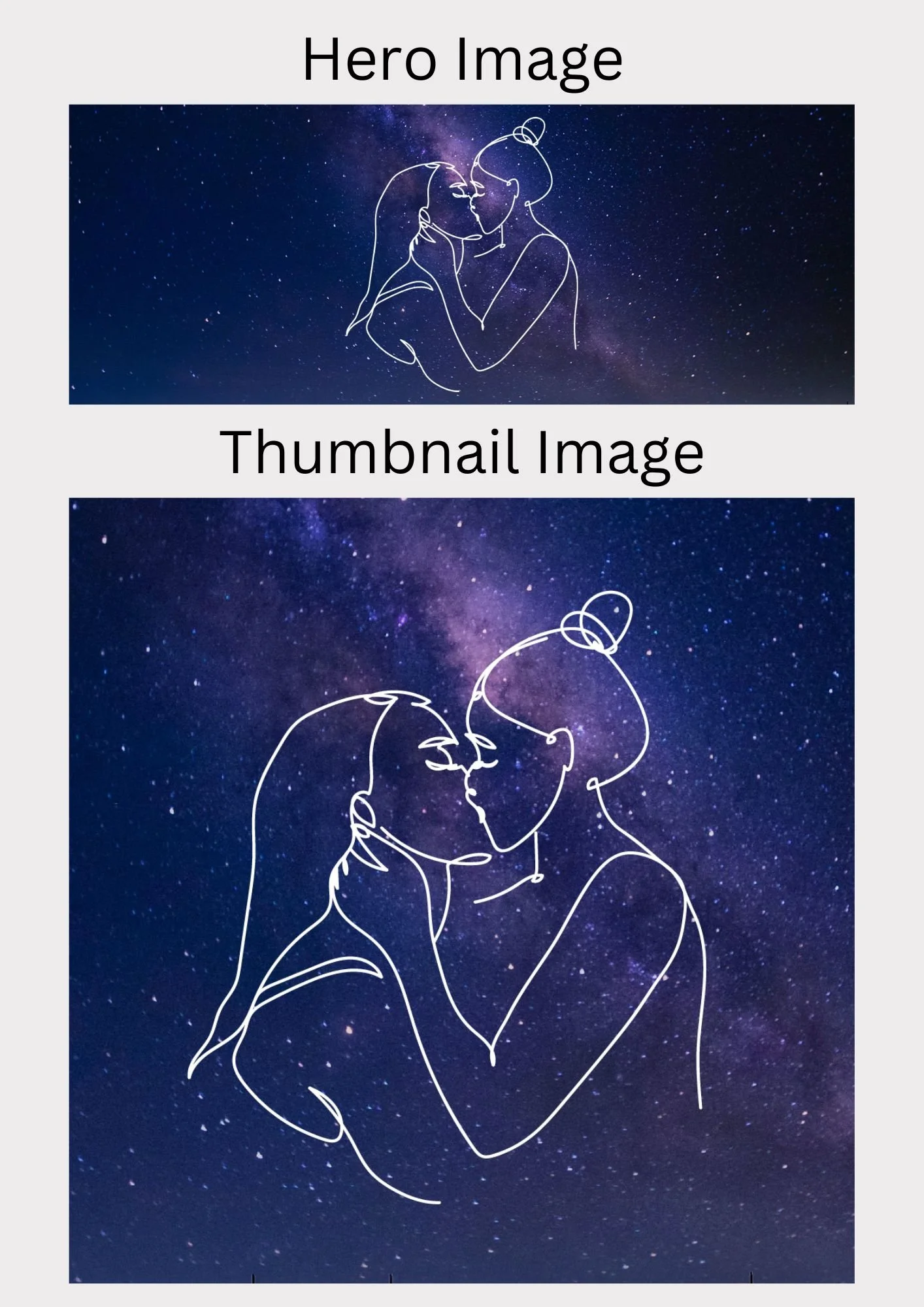
The next carousel post was also a collaboration post with the writer of the article. This one was all about coming to terms with being LGBTQ+
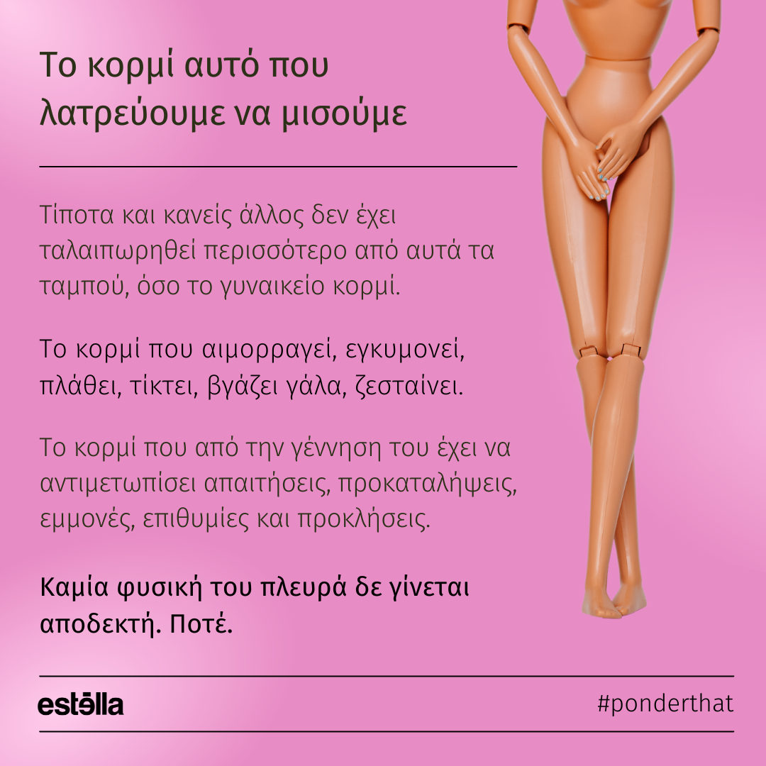
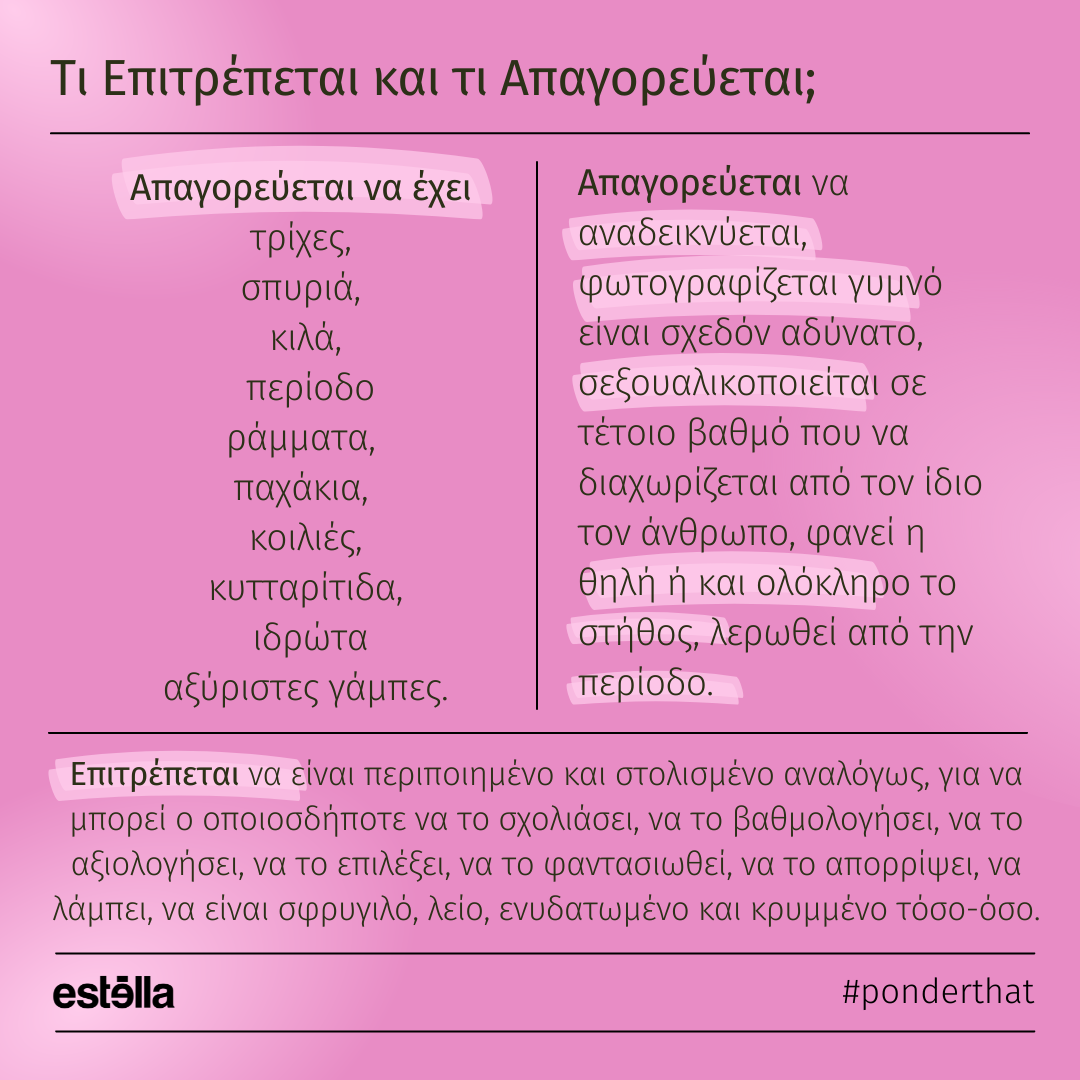
The final post is all about the social image society has constructed for women’s bodies and how society taught women that if they did not look a certain way, then they were not beautiful.
As seen above, I had to adapt my design style to accommodate the aesthetic each article required in order for it to be coherent with the content. This taught me to be adaptable and experiment with different design styles and layouts which I really enjoyed.
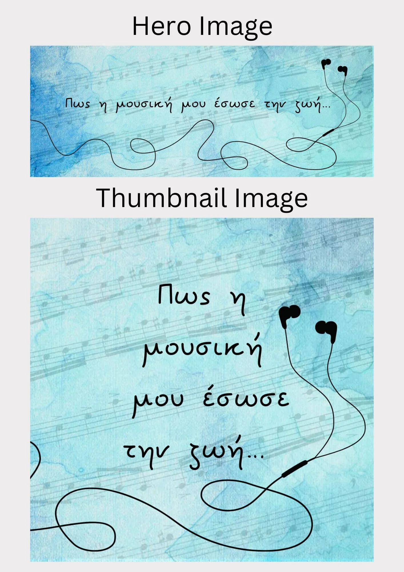
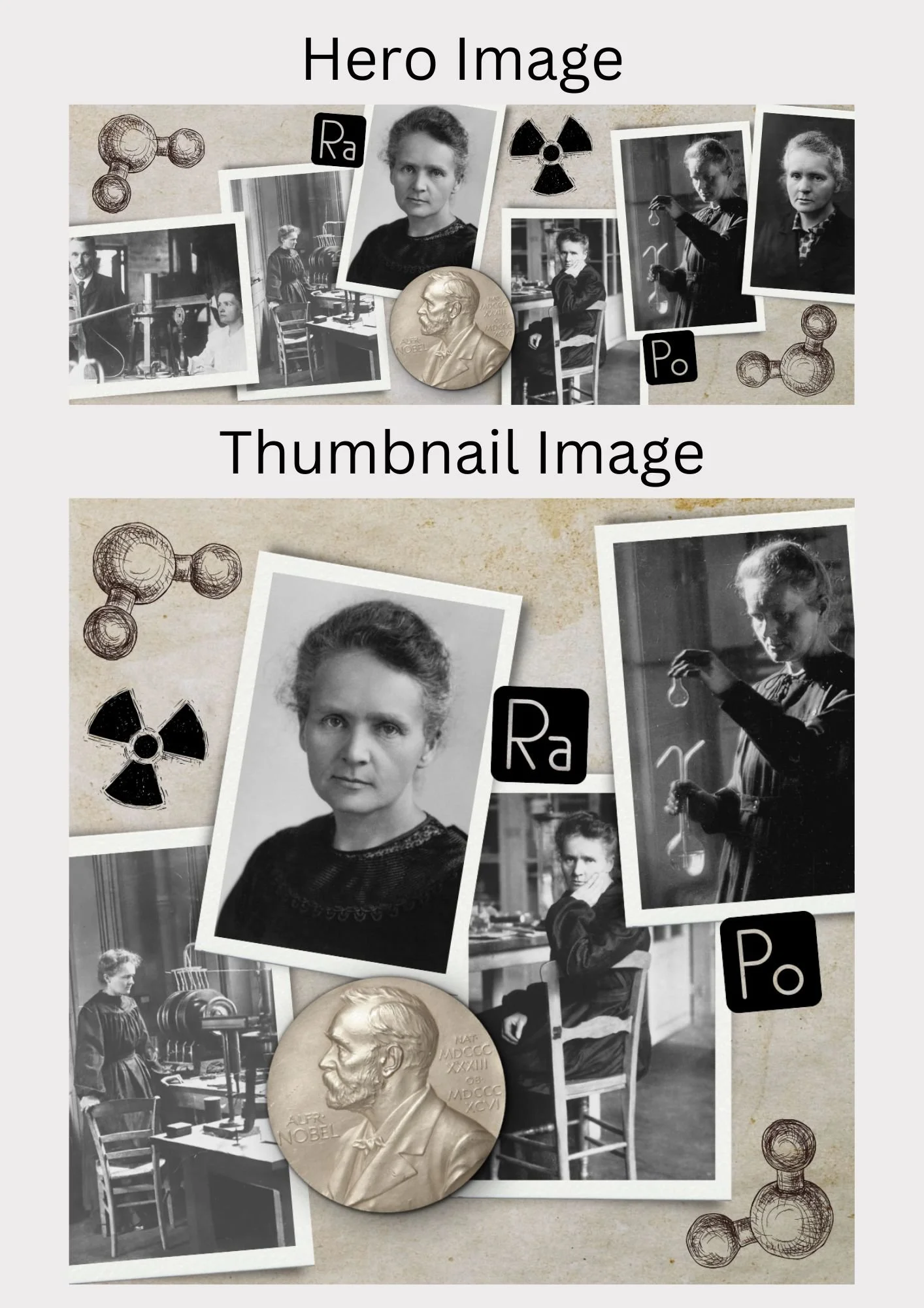
Hero and Thumbnail Images
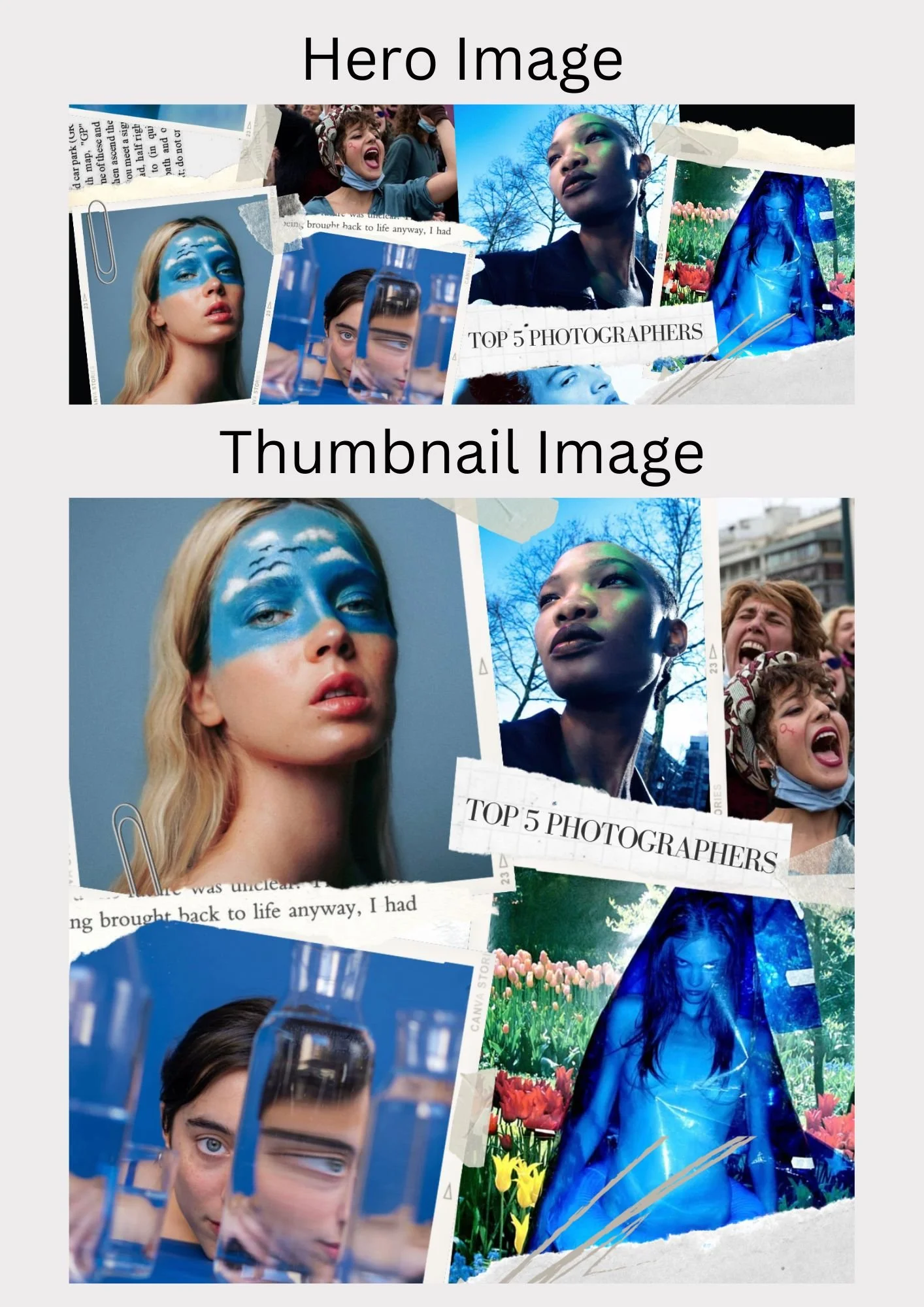
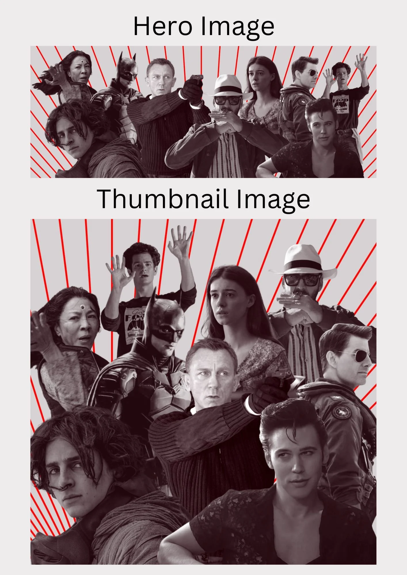
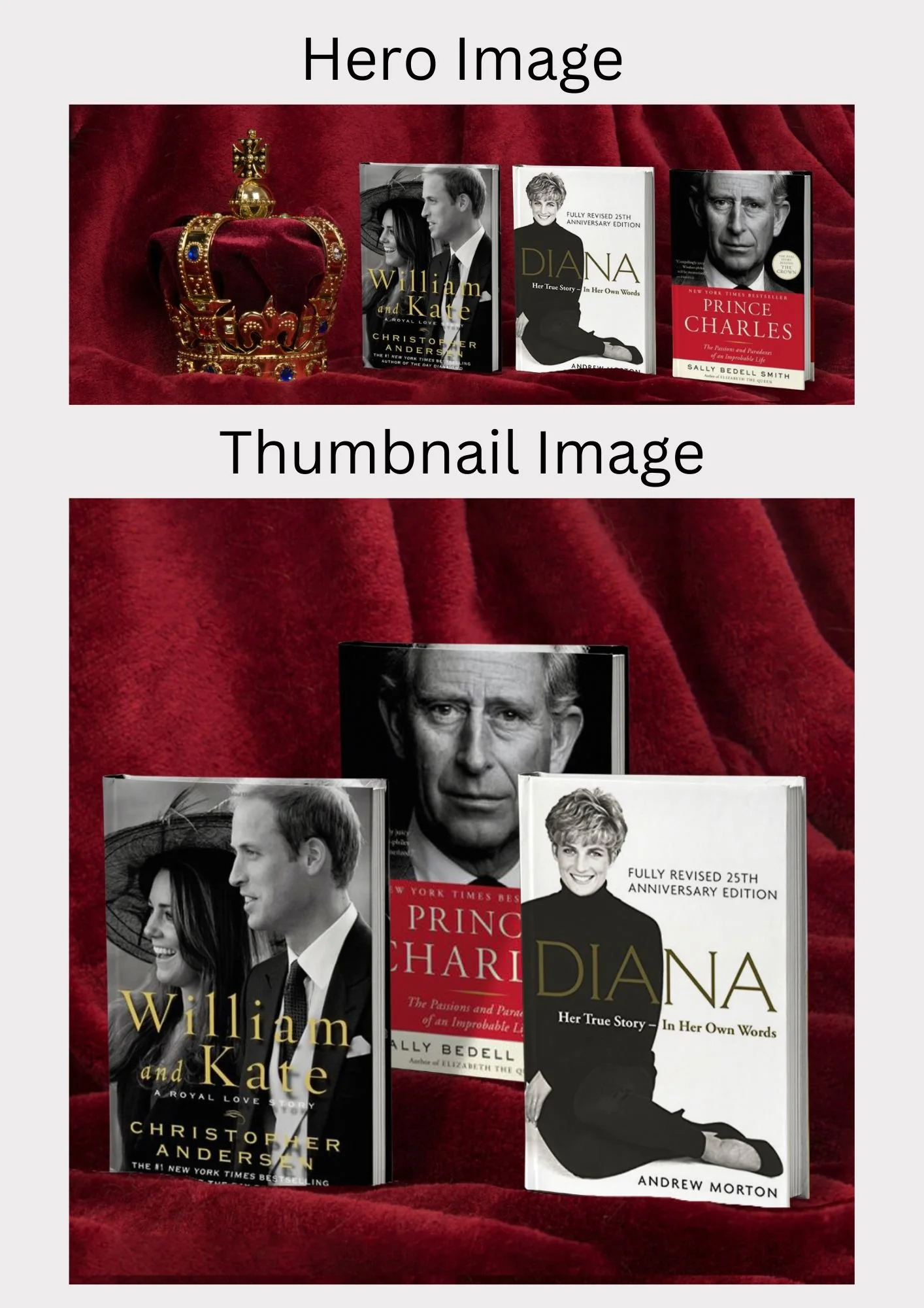
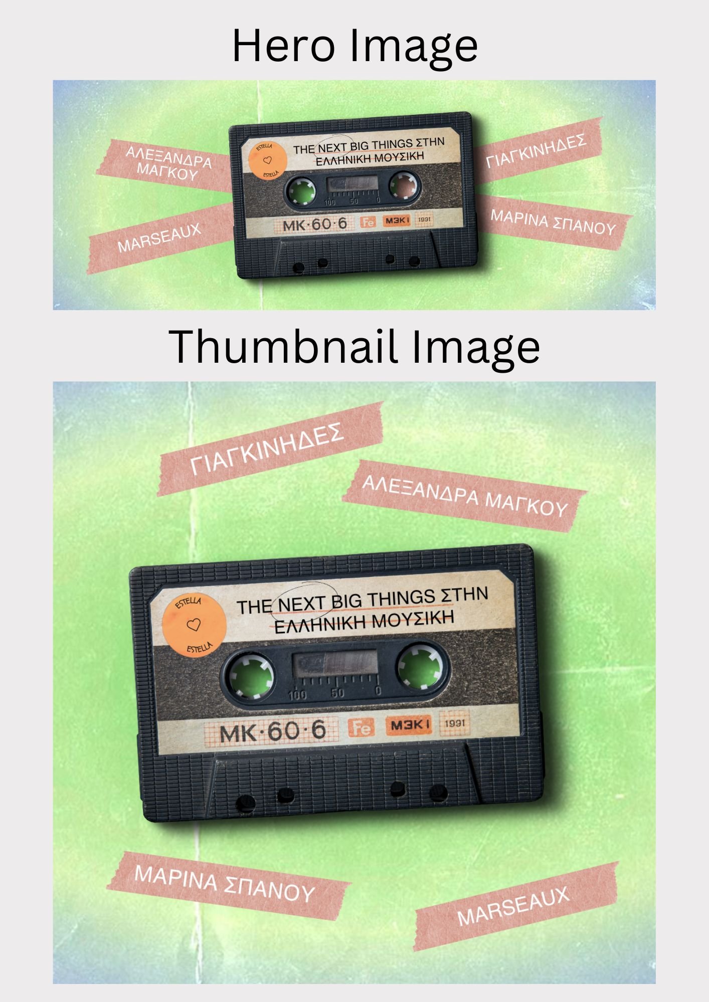
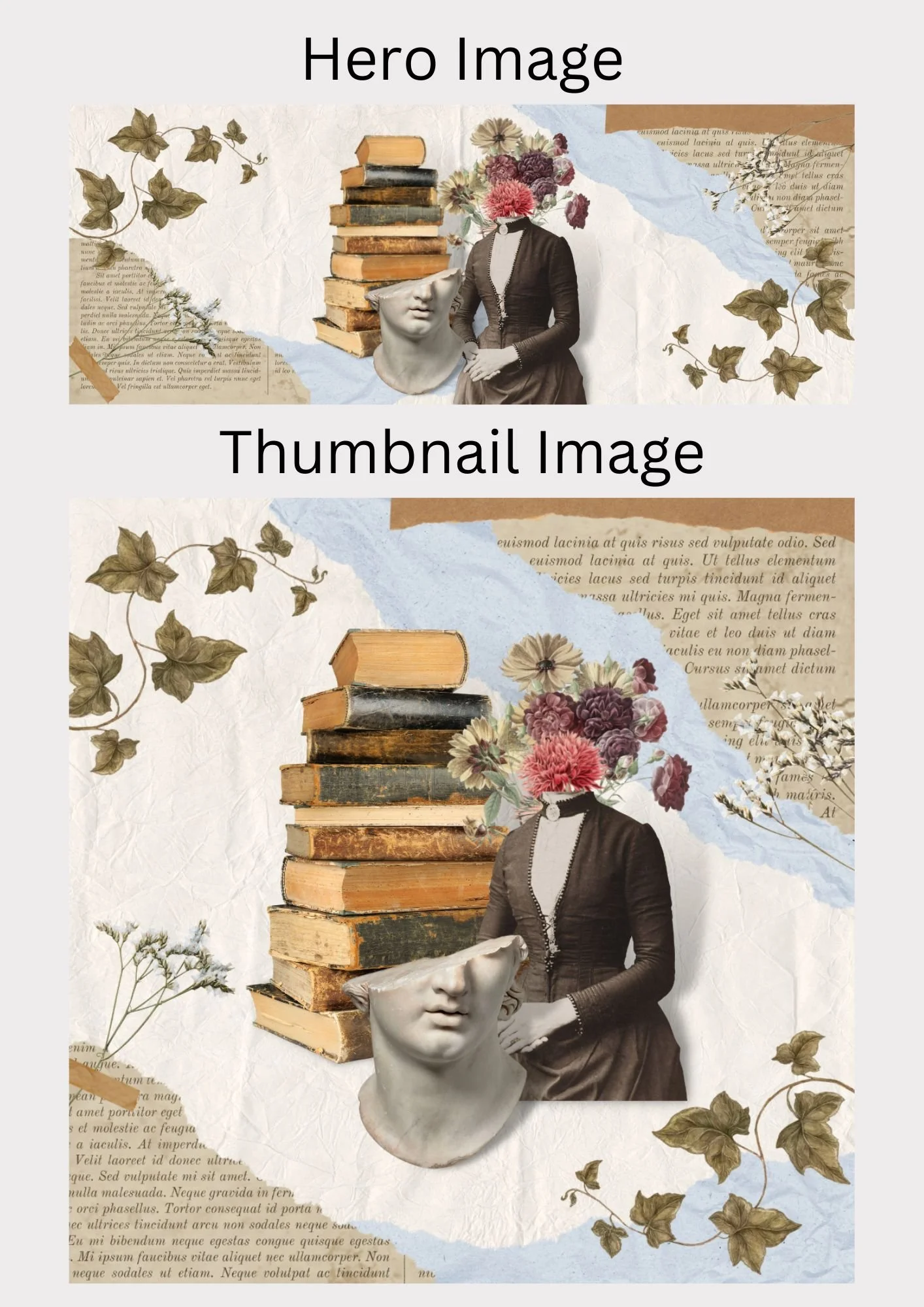
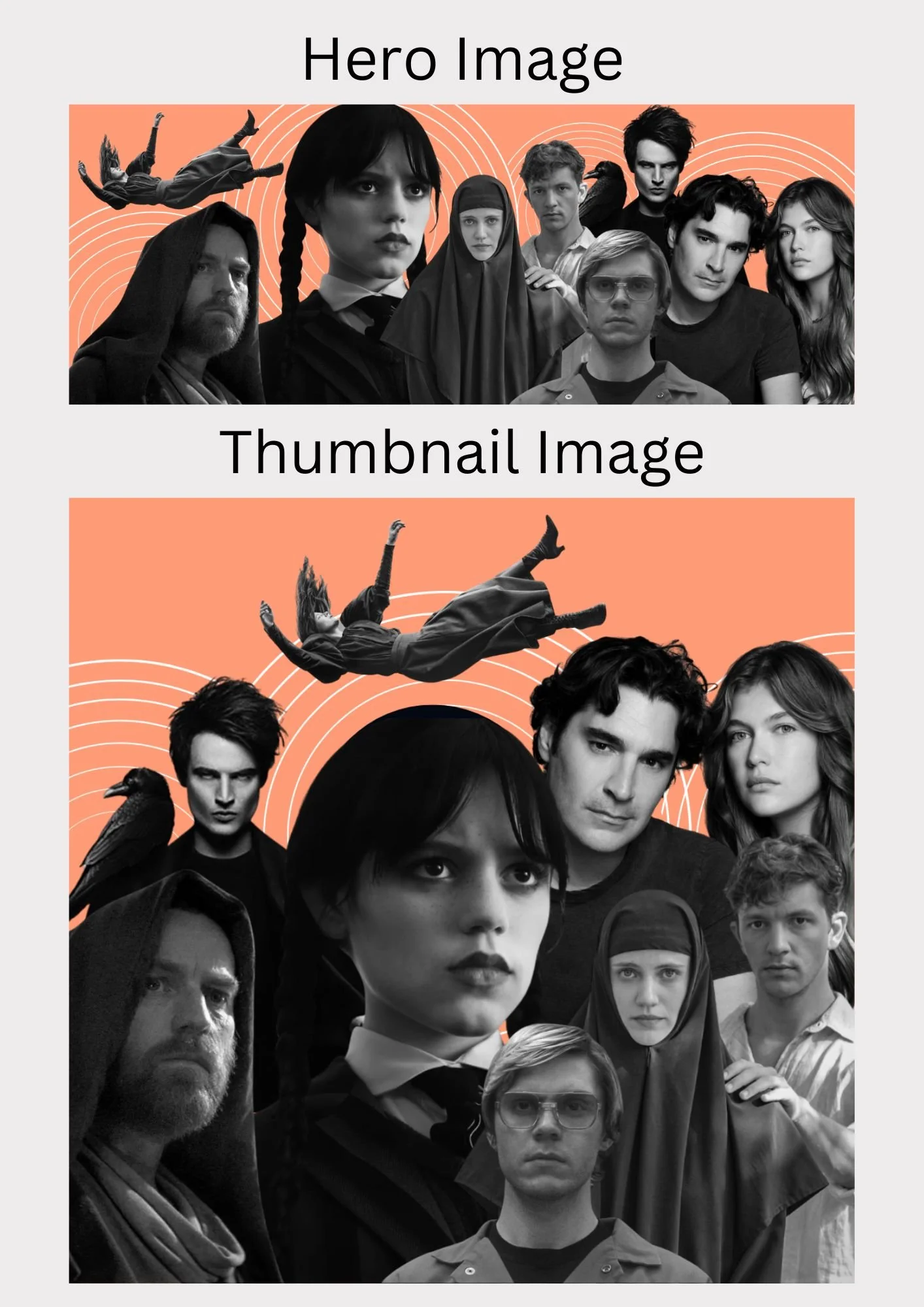
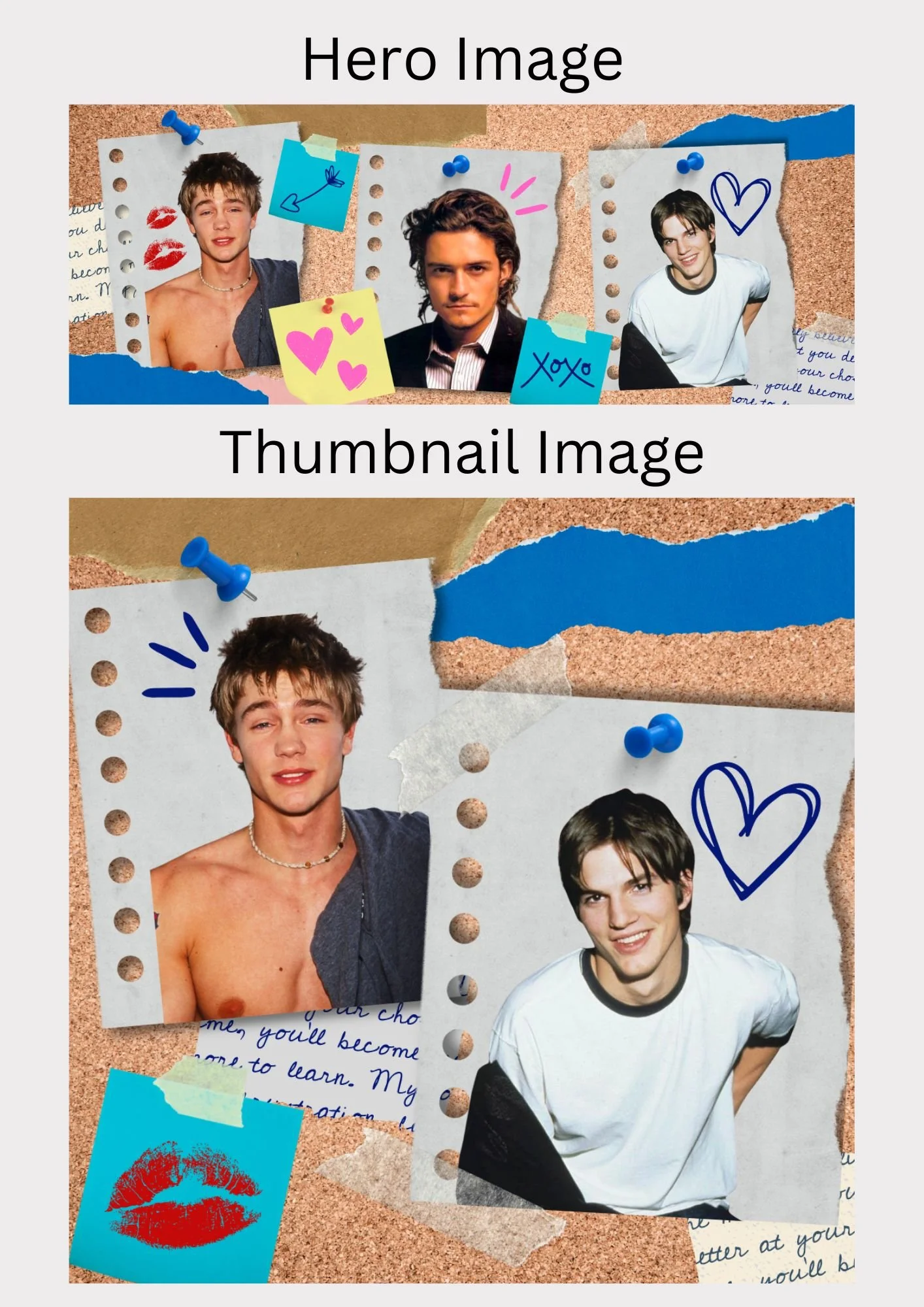
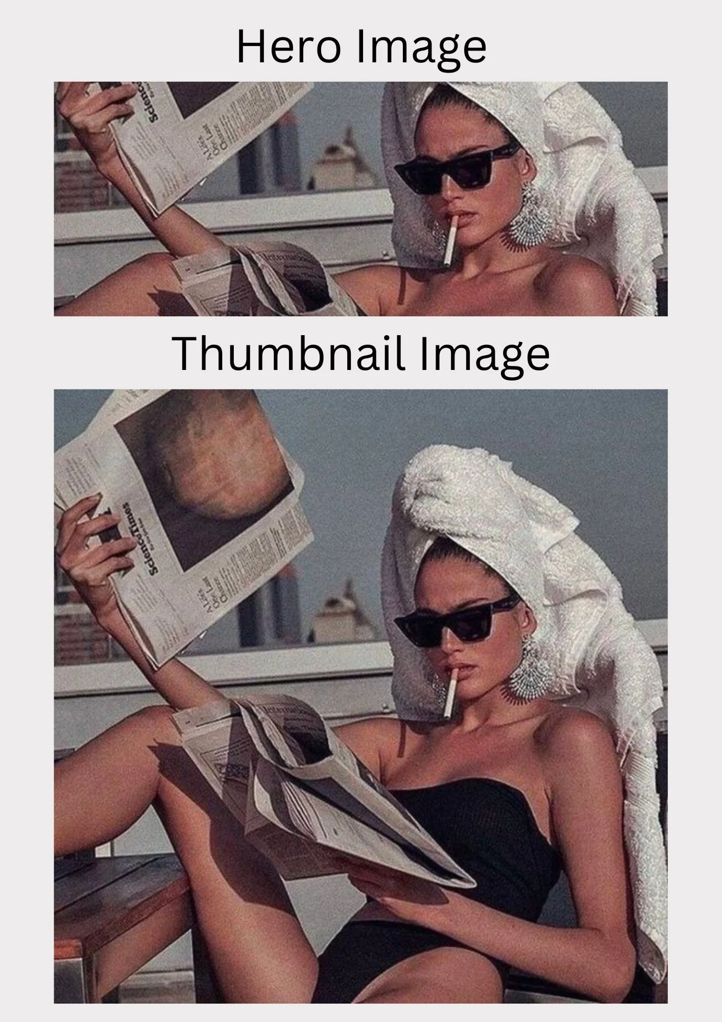
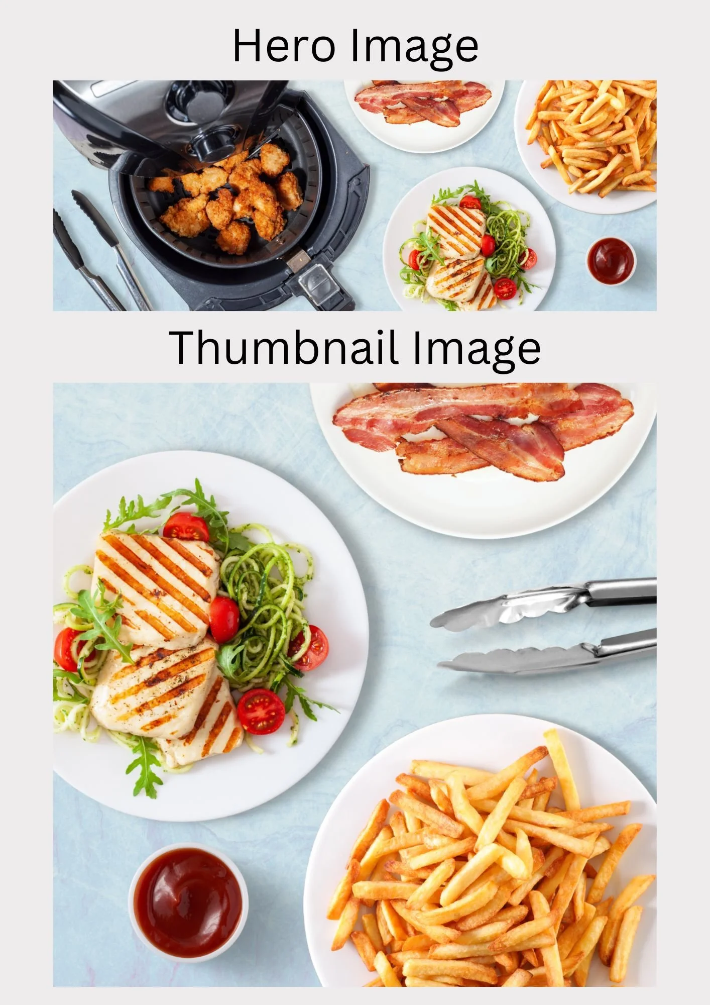
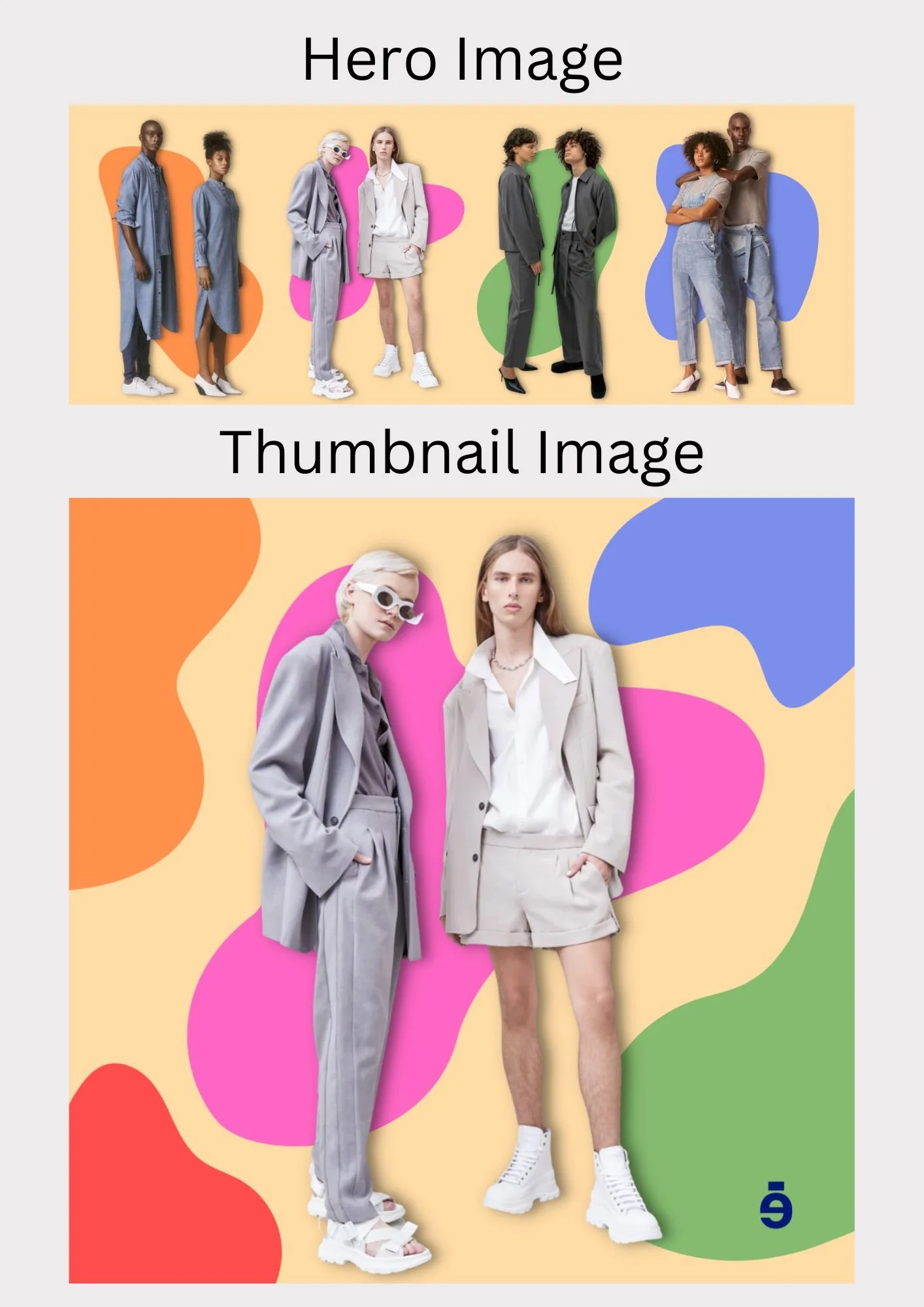
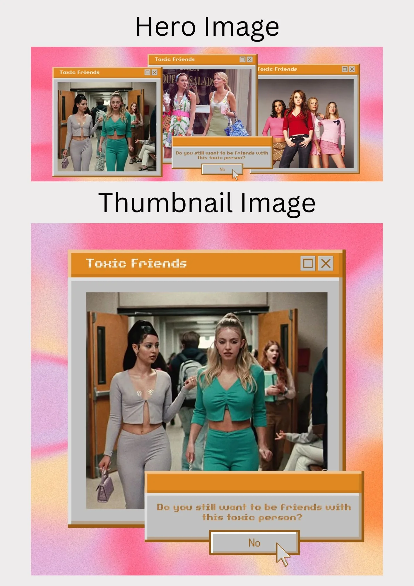
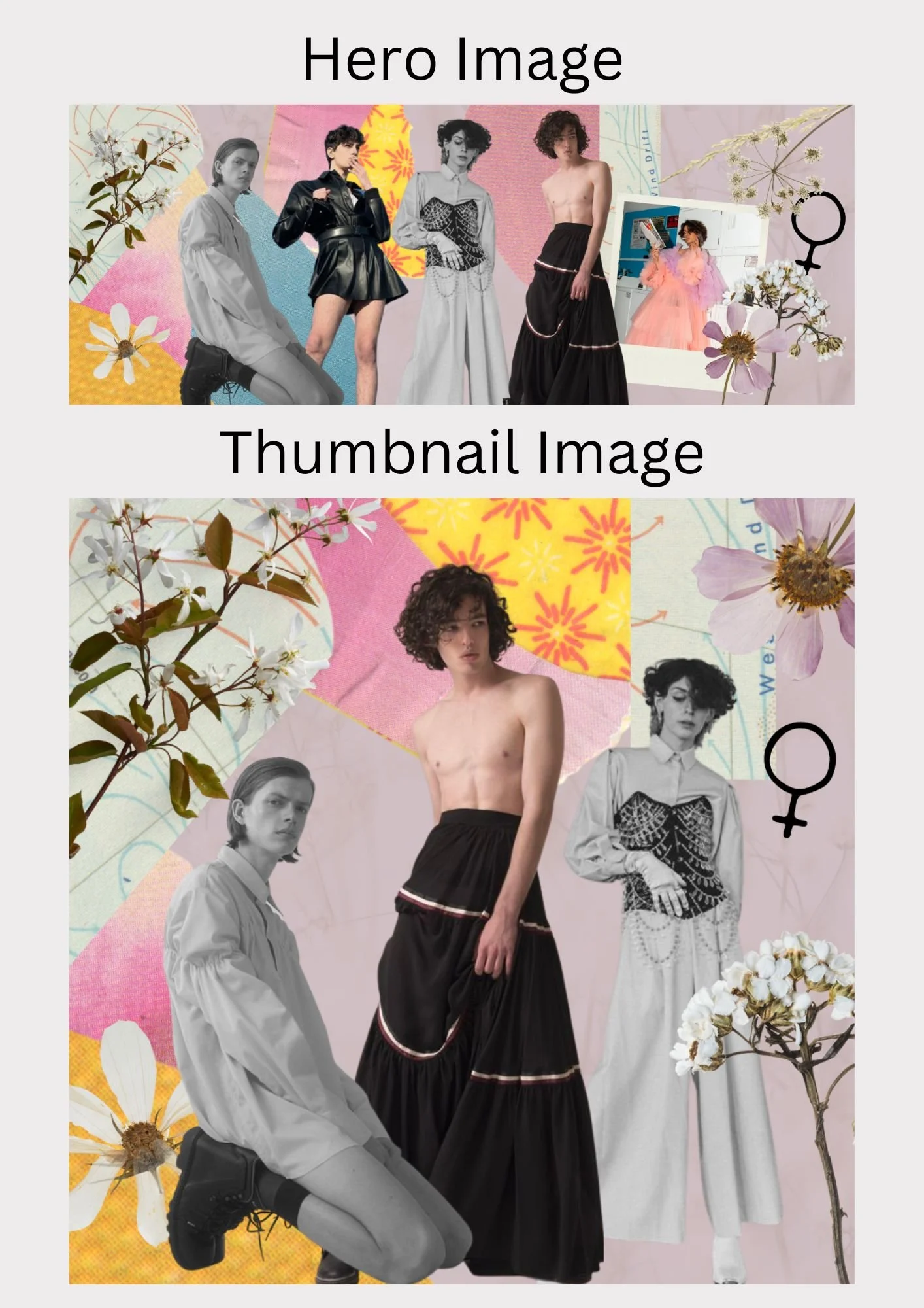
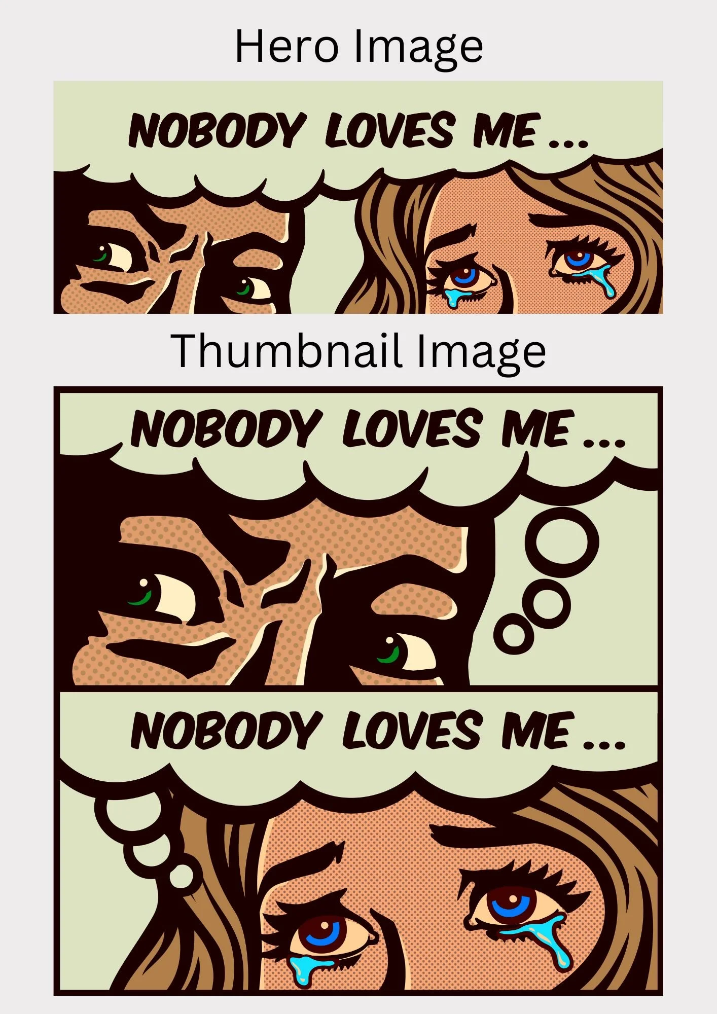
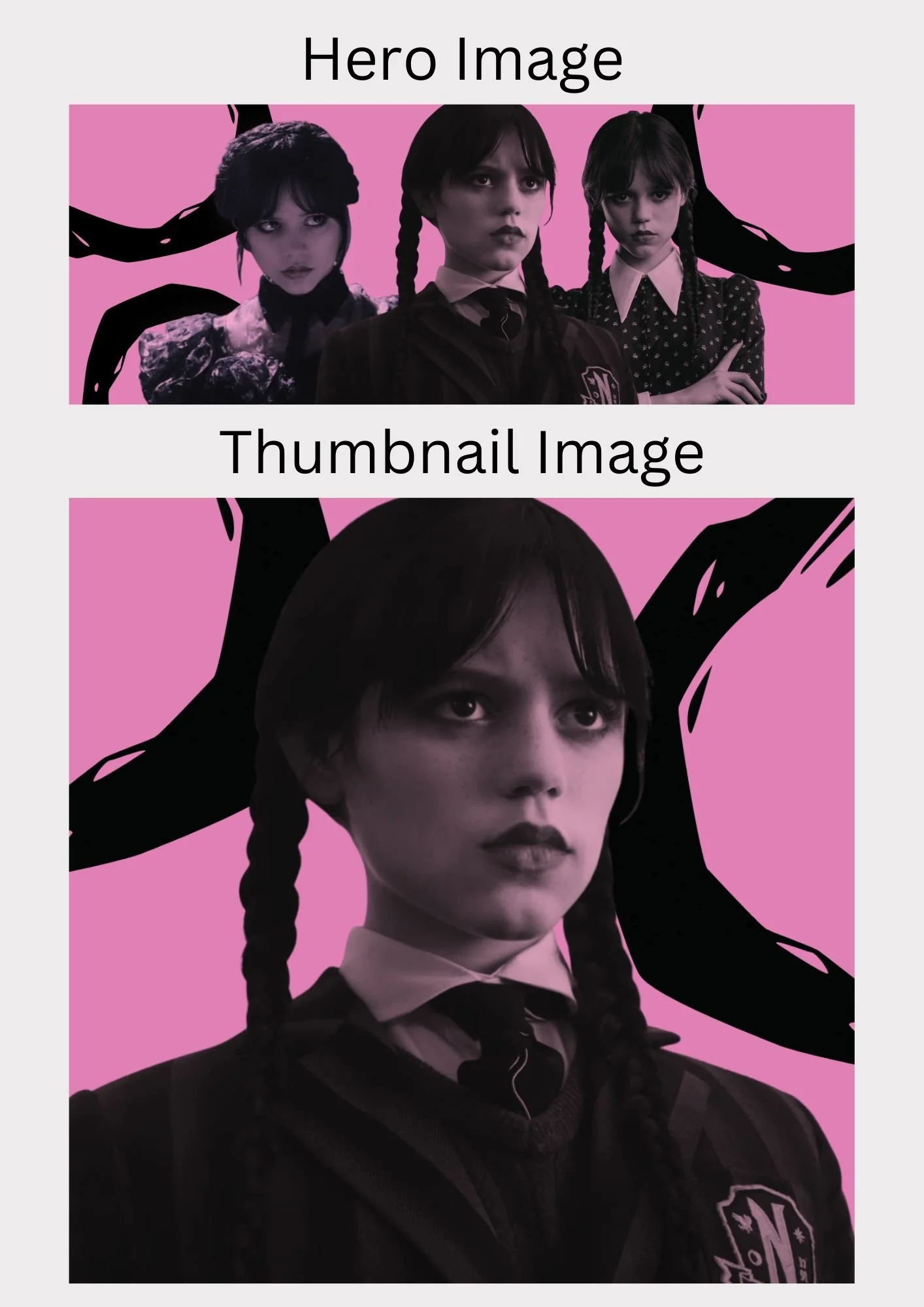
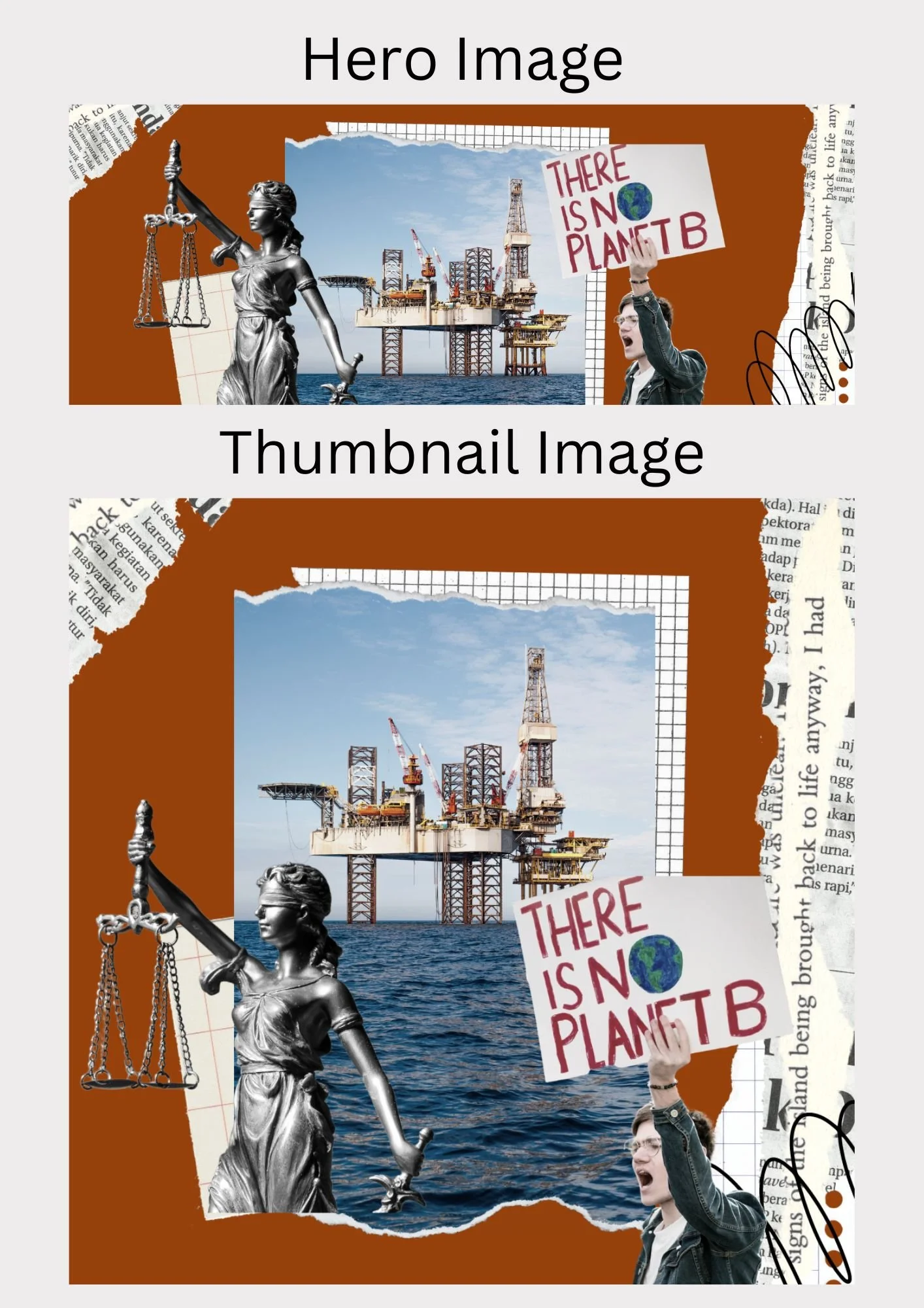
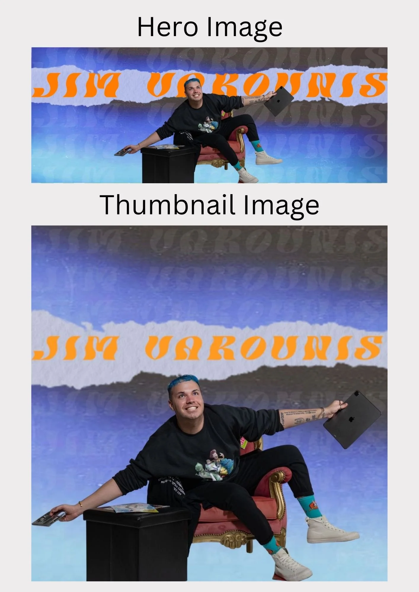
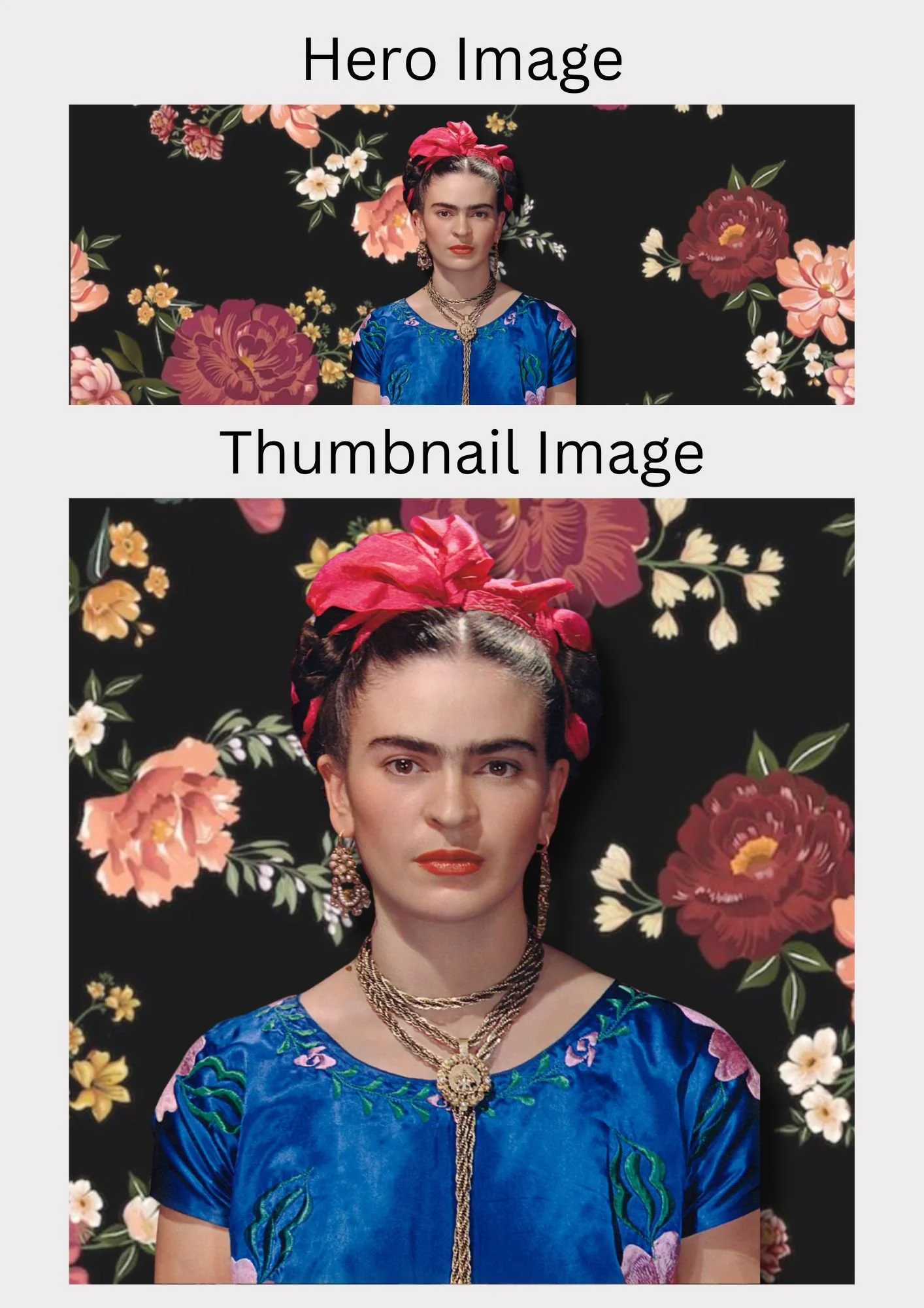
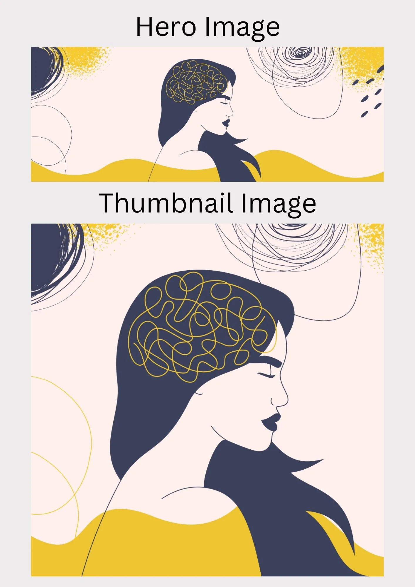
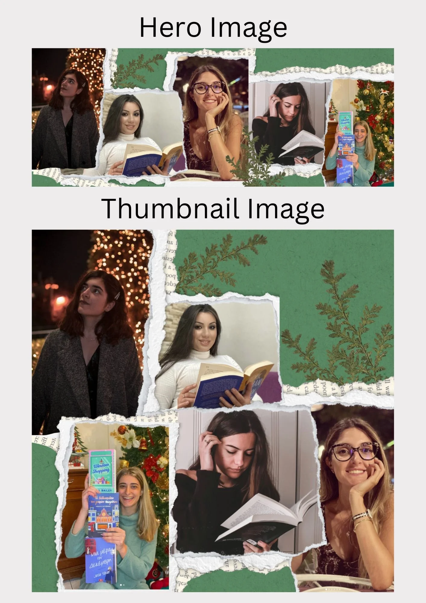
Perhaps the biggest and most time-consuming part of my job at Estella is creating the hero and thumbnail images for every article that is published on the website.
Since every single article is different there is not much research that goes into preparing the hero images other than looking up the topic of the article to get a better understanding and even inspiration for the hero and thumbnail.
I typically create 5-6 hero and thumbnail images per day. Due to the high quantity I create and the limited time I have to create them, my process usually involves me immediately starting to digitally create it. I don’t have the opportunity to sketch out my ideas or do thorough research on every single article topic. The most I can do is read the article, or ask our editor for a summary and key points.
I was not given any specific aesthetic or colour palette for the hero and thumbnail images as it was more important that I made them relevant to the content and vibe of the article. However, I did make a personal choice to make as many hero and thumbnail images as colourful and fun as possible as long as they were still relevant to the content of the article. I wanted them to fit with the aesthetic of the website and the brand in general. Unfortunately, not all articles permit fun and bold colours so I did have to compromise, especially for the articles discussing more serious topics.
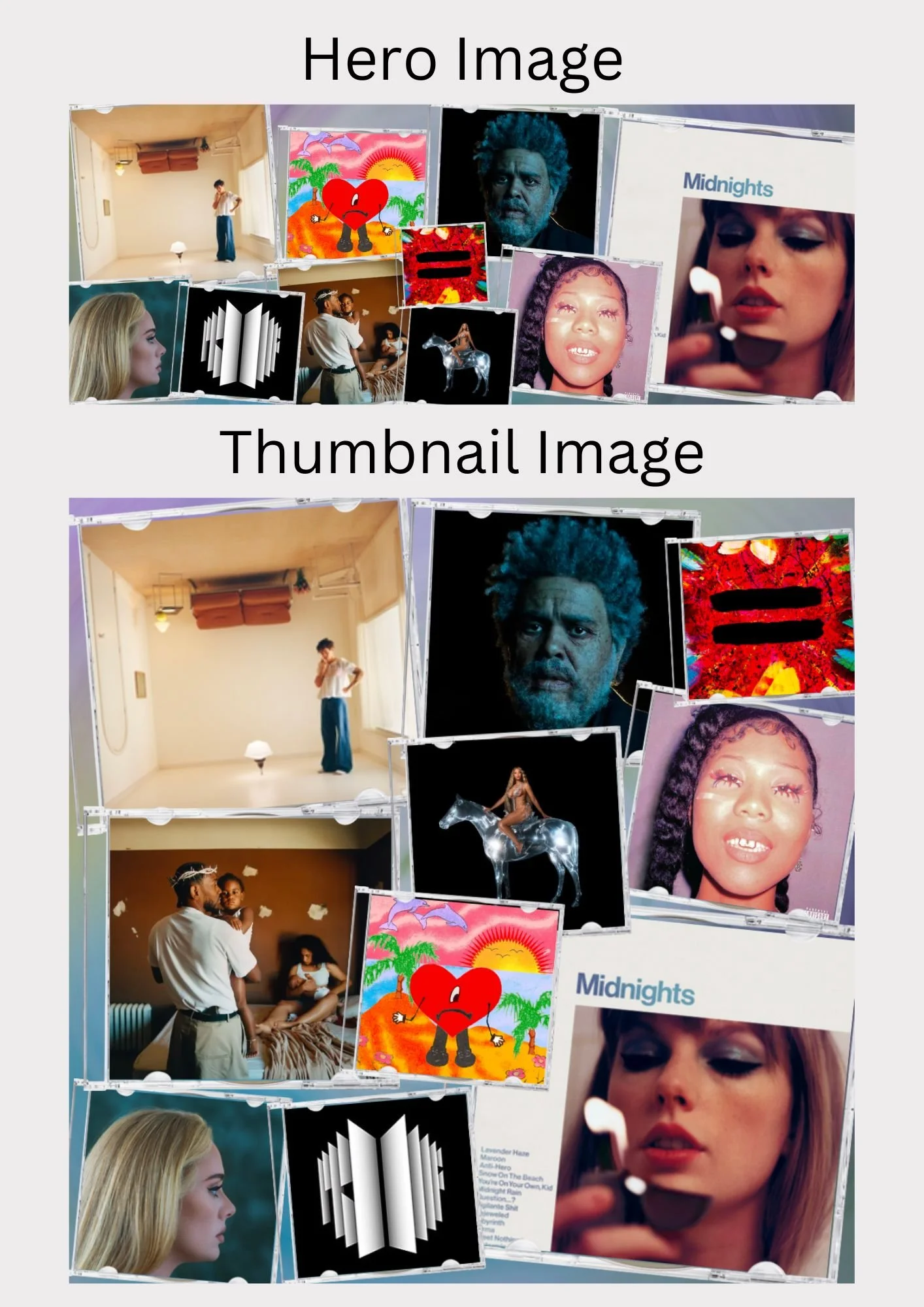
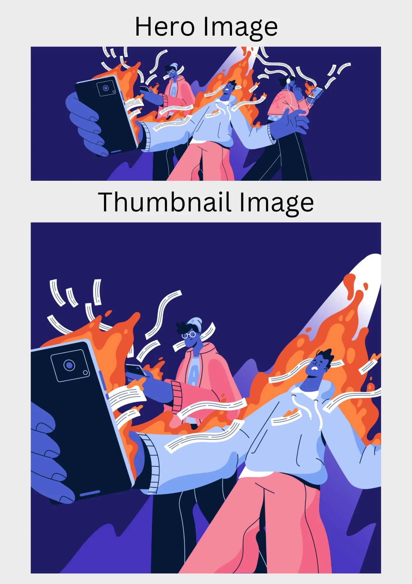
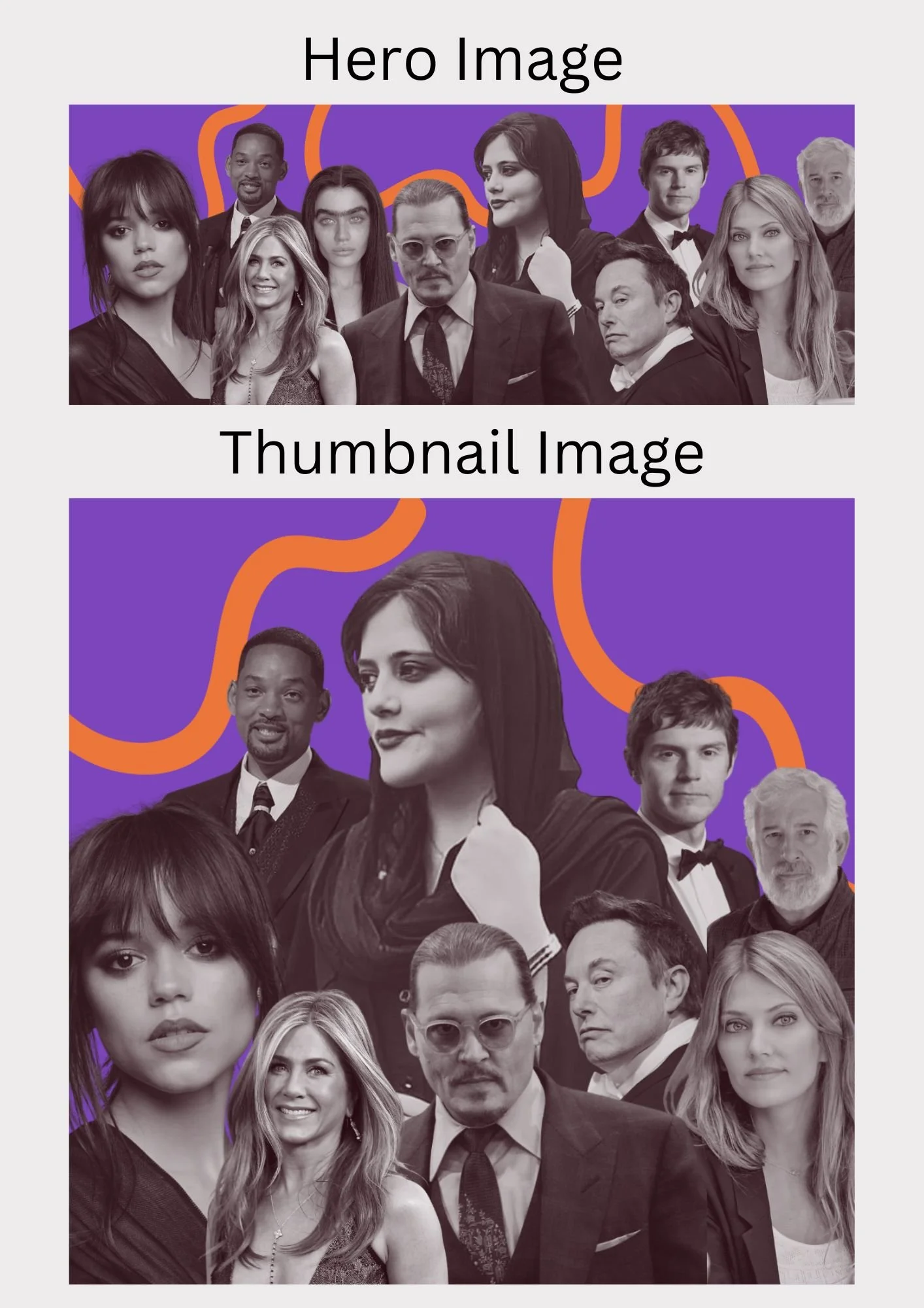
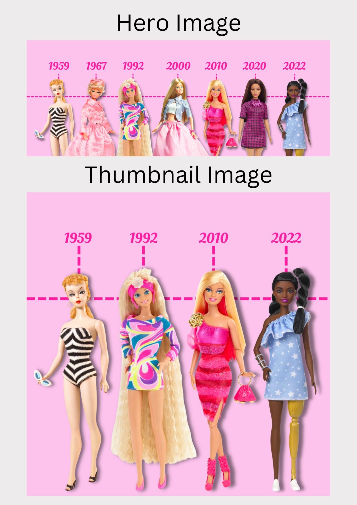
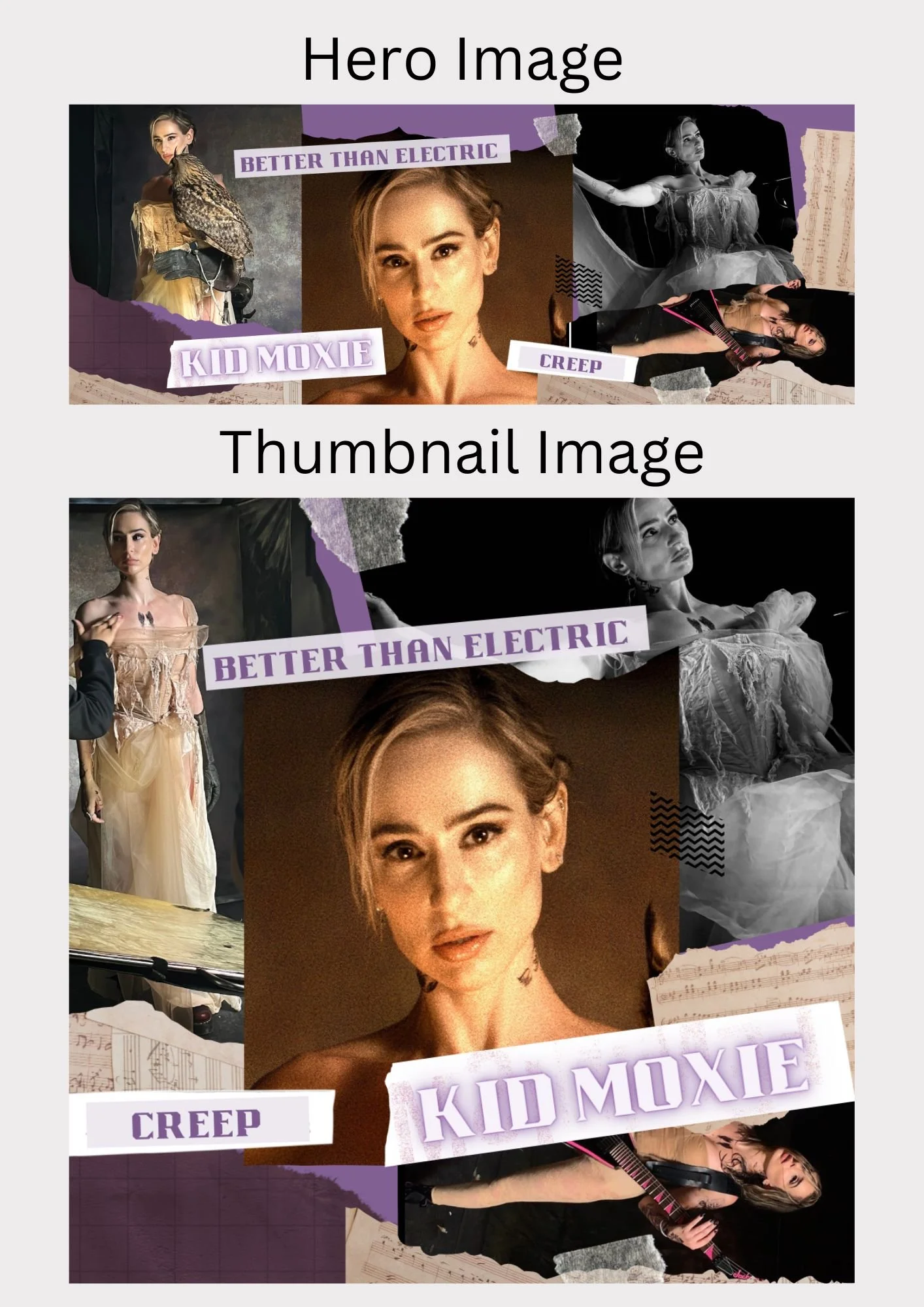
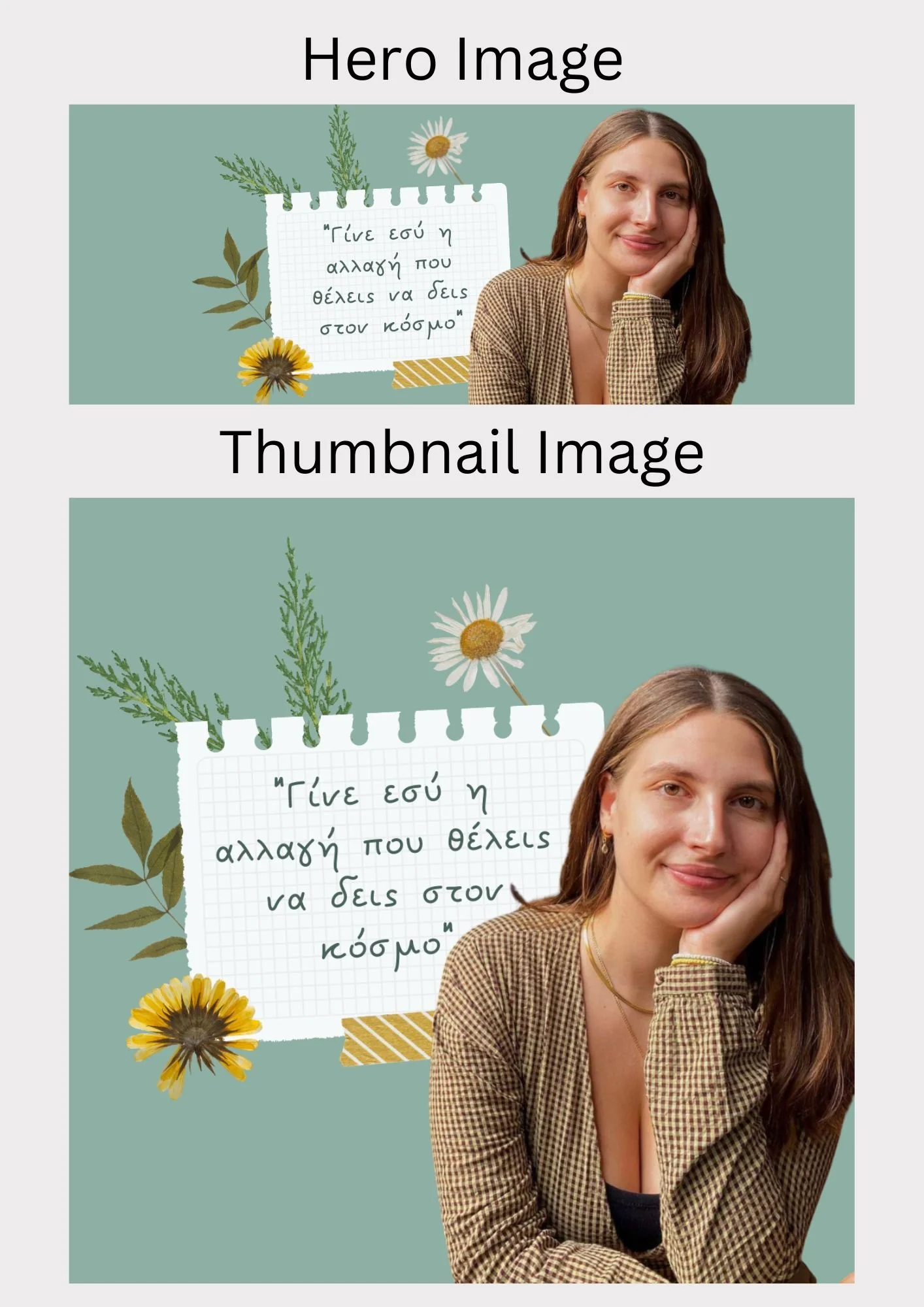
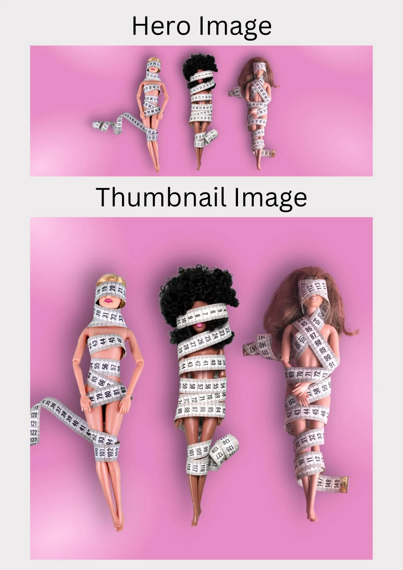
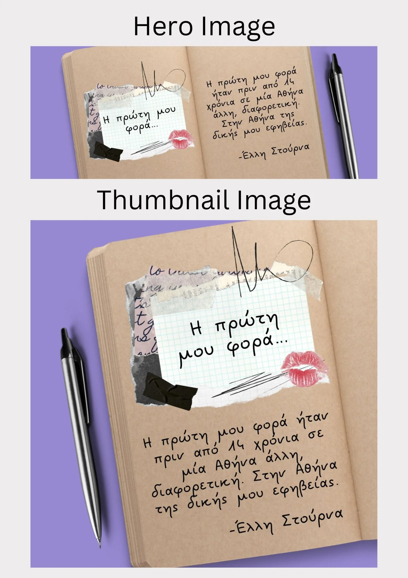
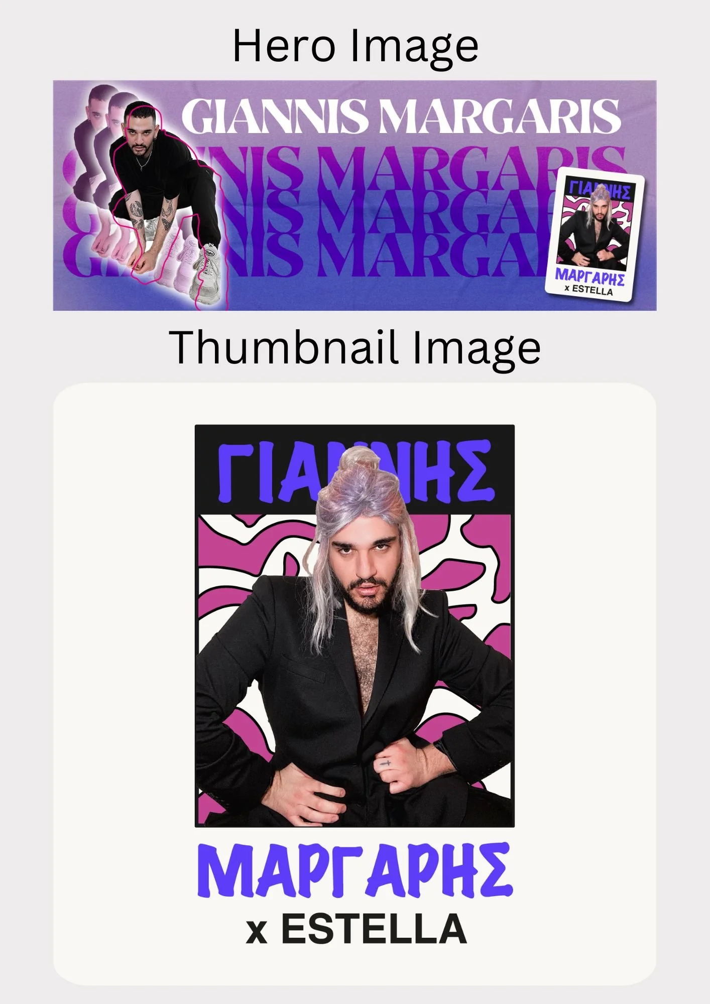
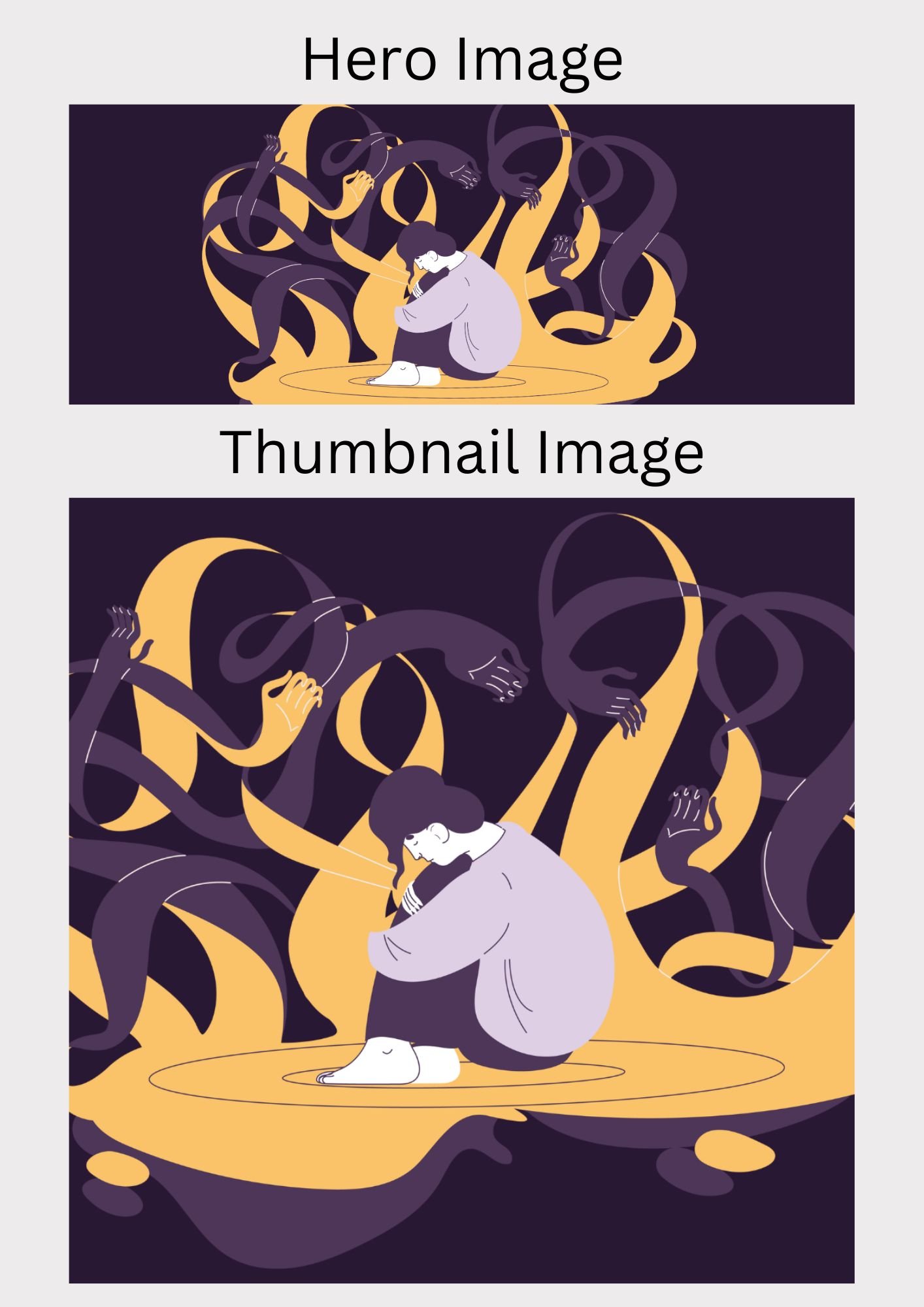
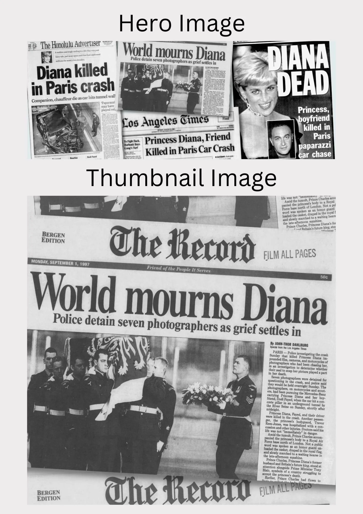
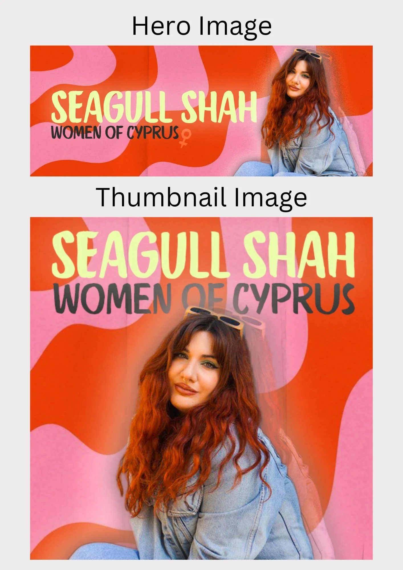
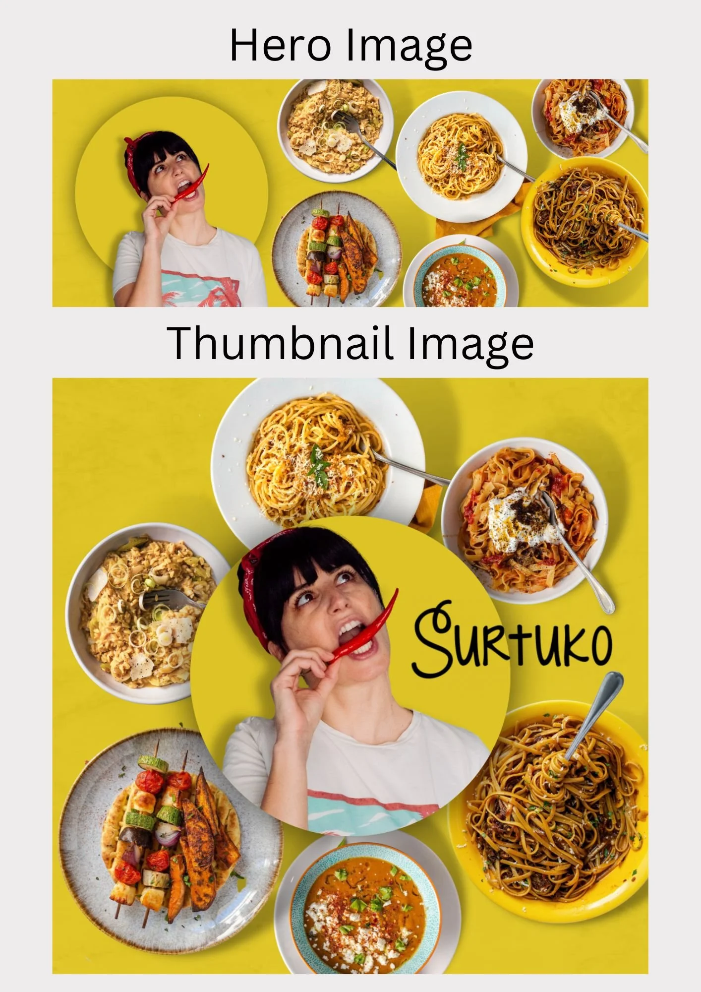
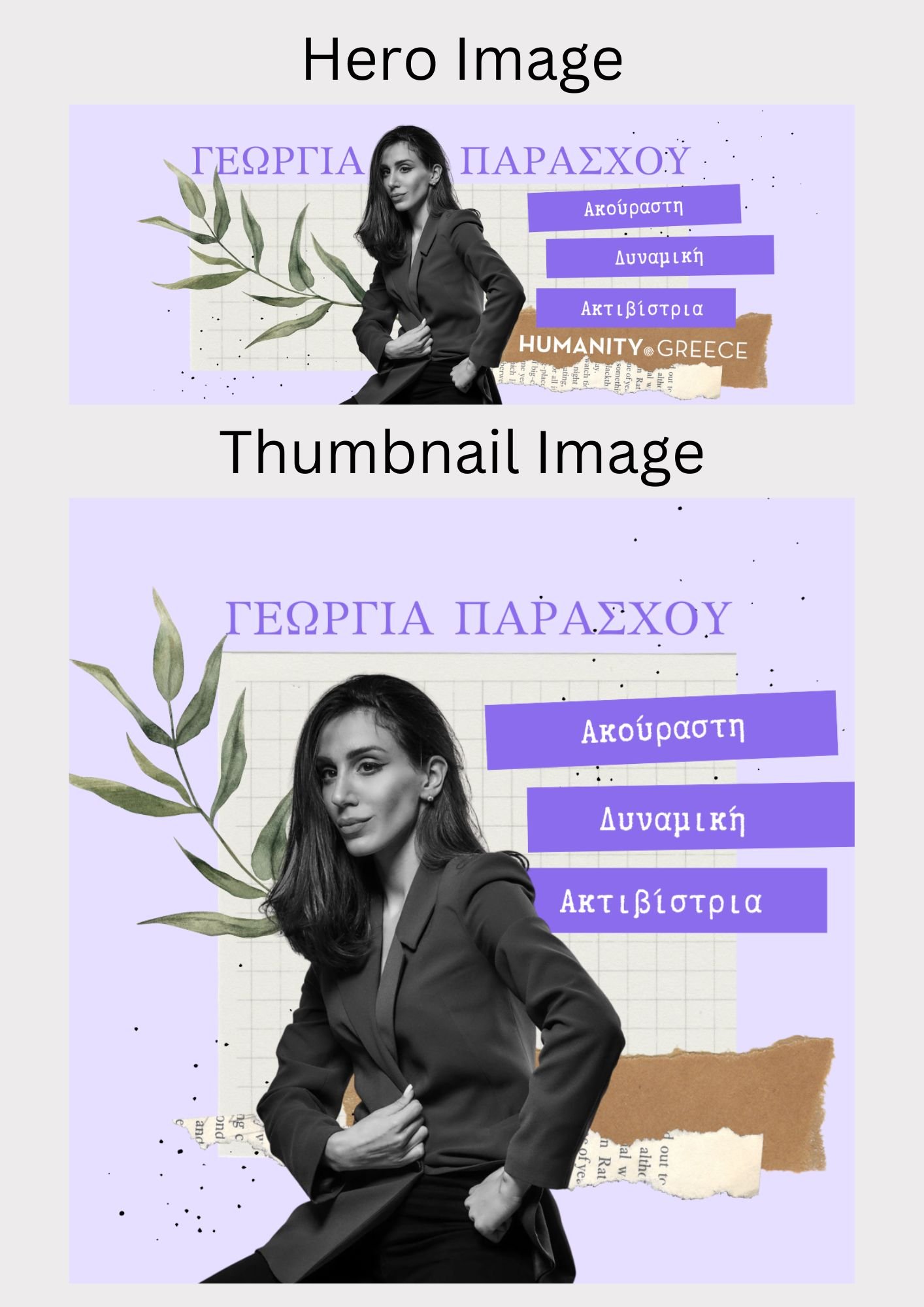
Since I started my placement at Estella, I have created over 500 hero and thumbnail images, so understandably I cannot present every single one of them here. In saying so, I have chosen a few of my favourite ones from each category to show an overview of my work.
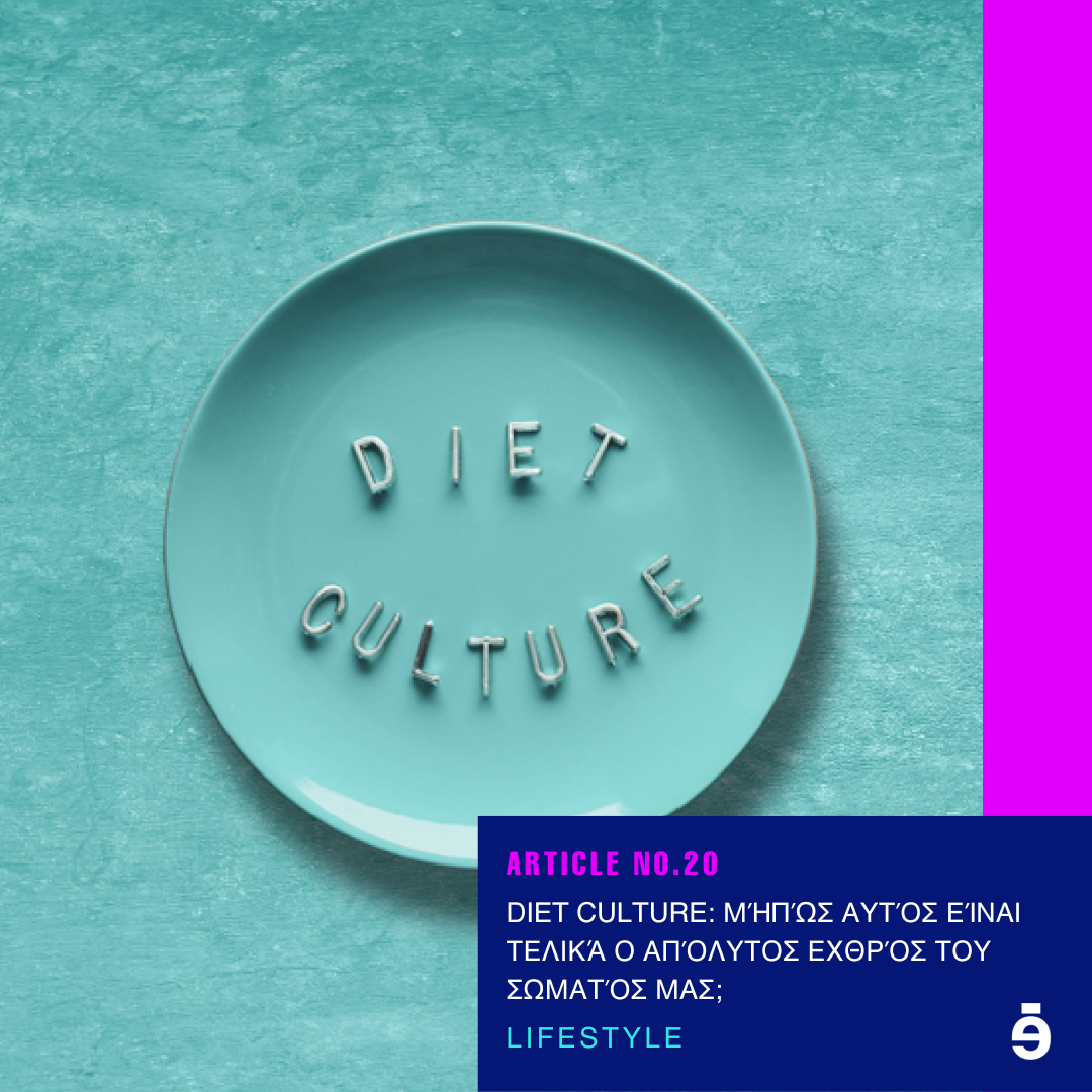
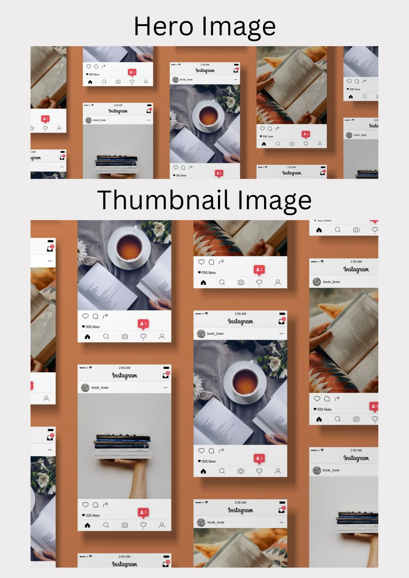
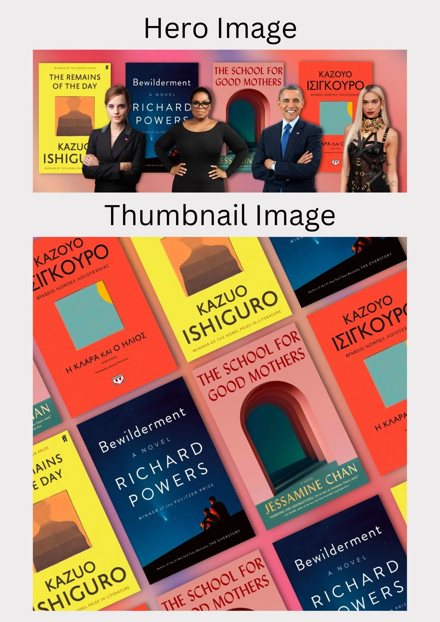
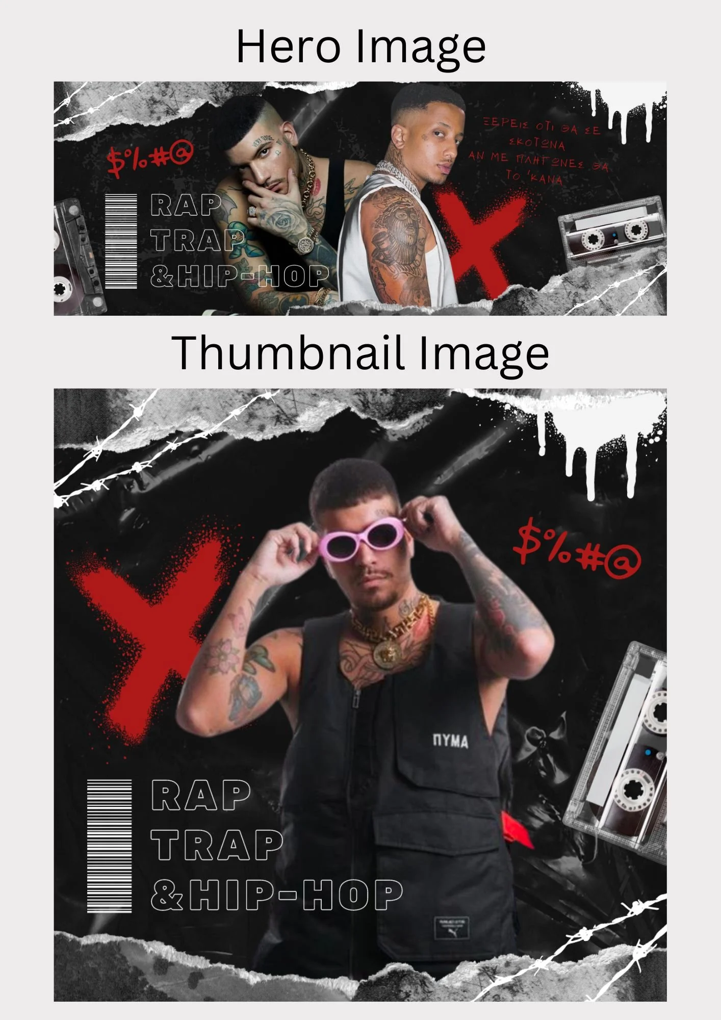
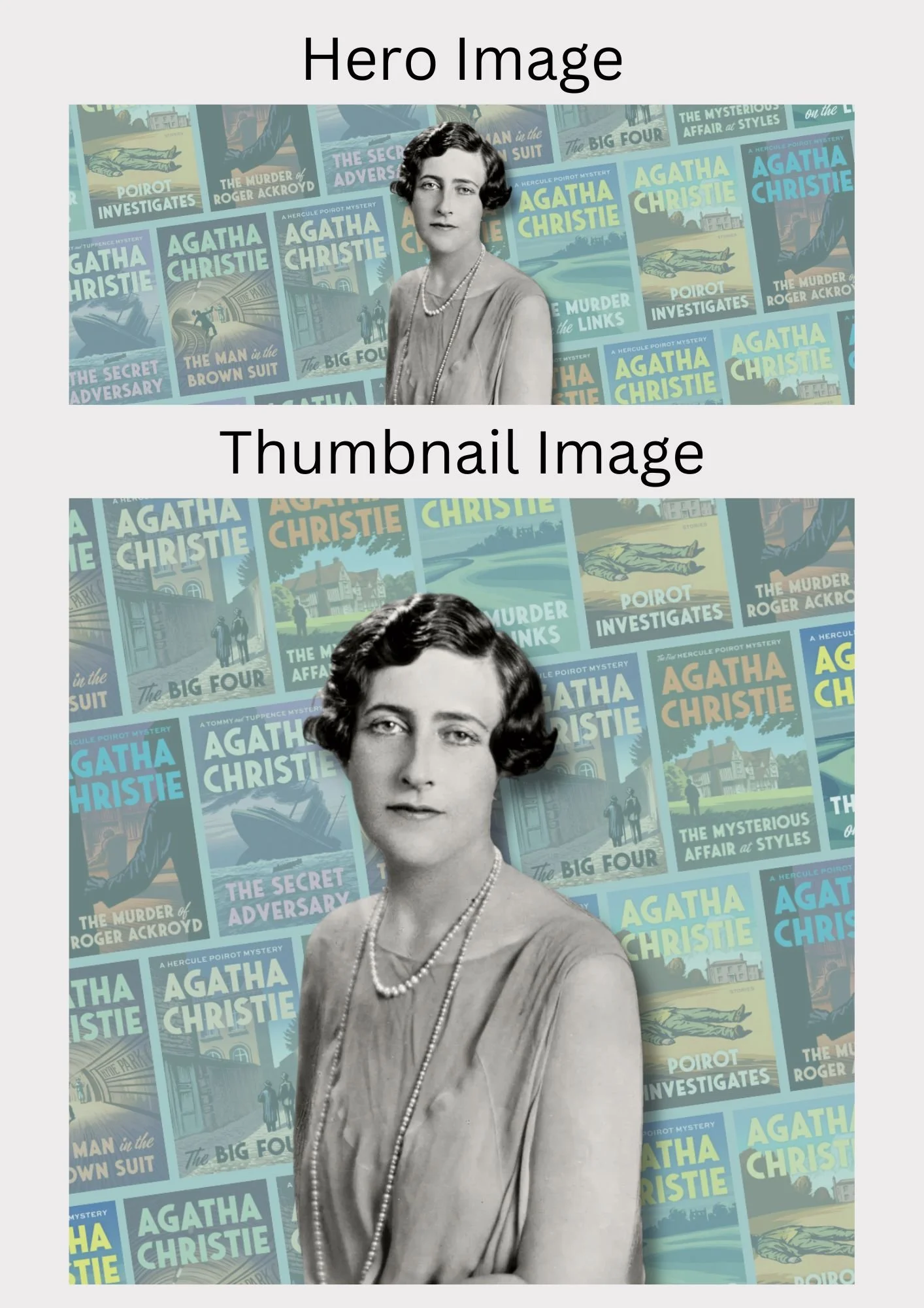
Estella has 4 main article categories and multiple subcategories for each one. The first category is Entertainment. This category includes articles discussing music, movies and series, pop culture & trends as well as books.
Below are a few chosen hero and thumbnail images I created for articles in the Entertainment category.
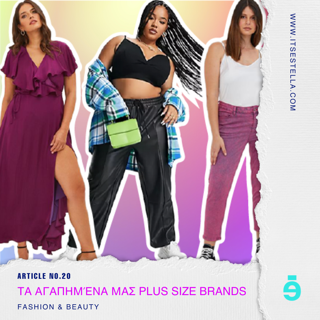
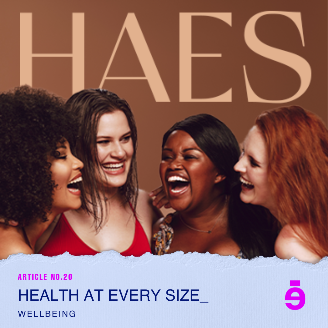
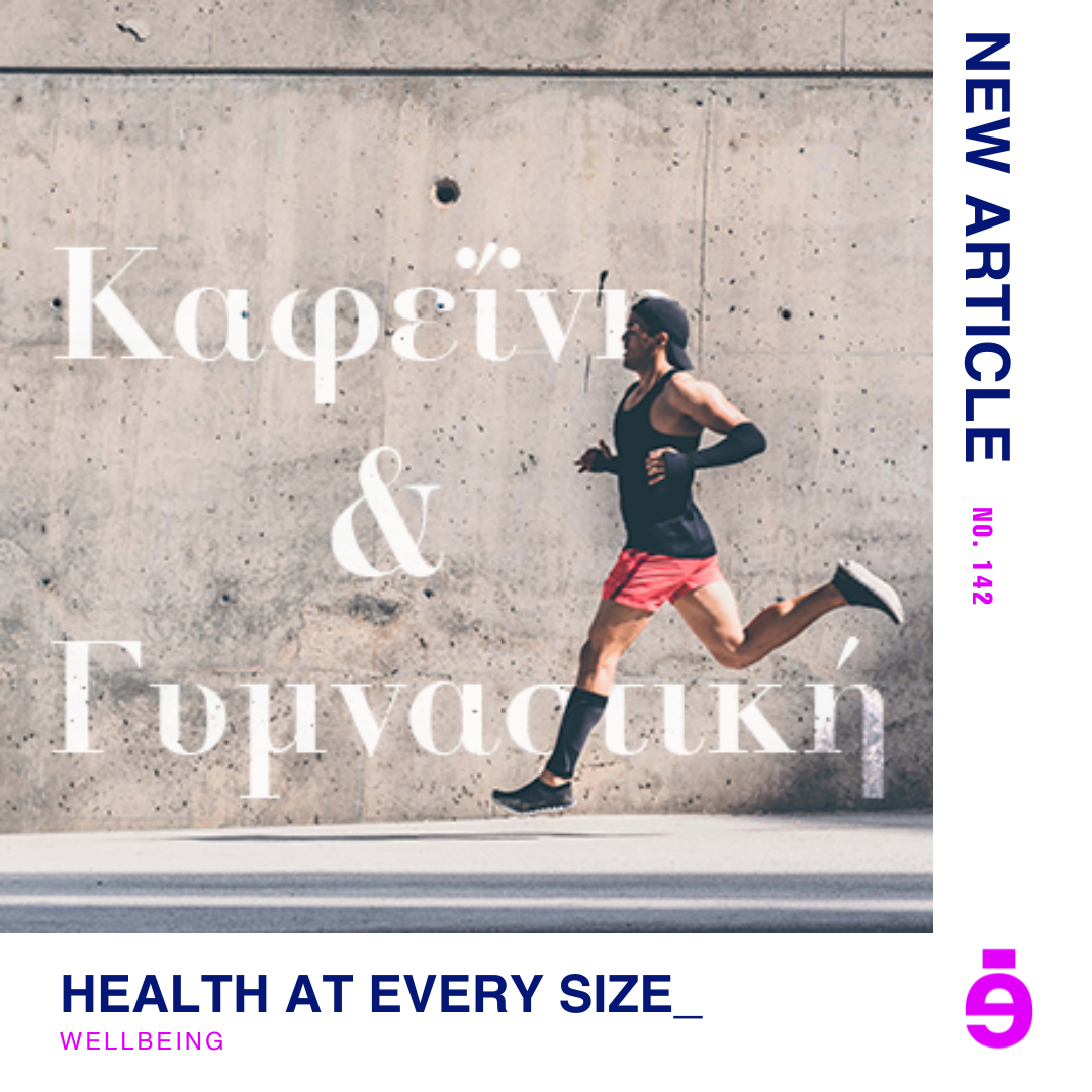
The next category is Lifestyle and this category has three subcategories: fashion & beauty, well-being and the shop.
Below are a few chosen hero and thumbnail images I created for articles in the Lifestyle category.
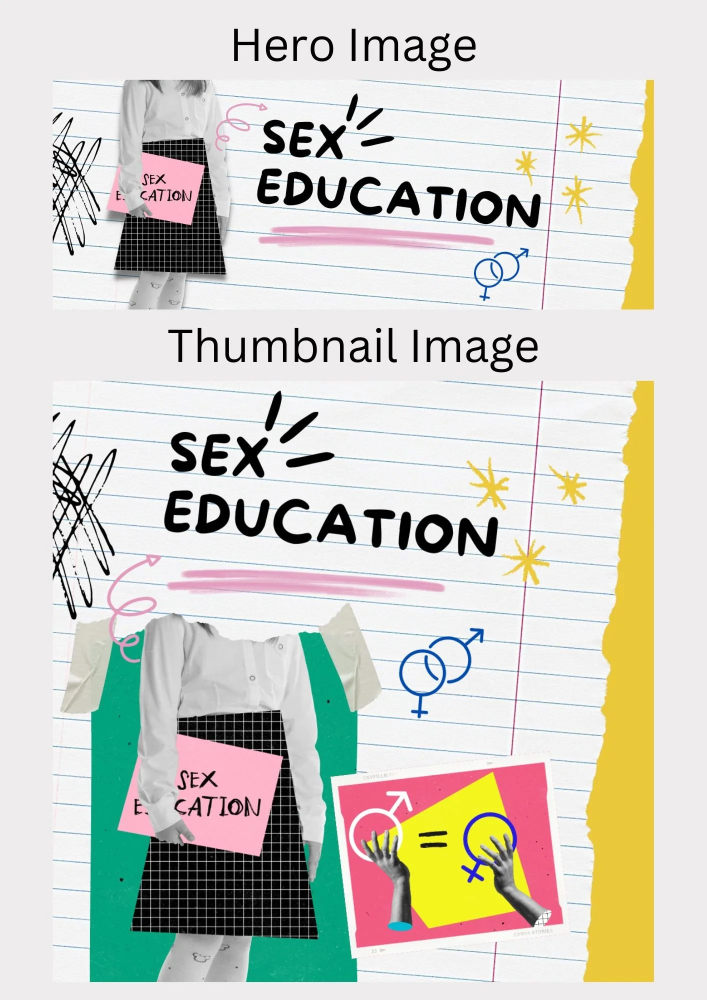
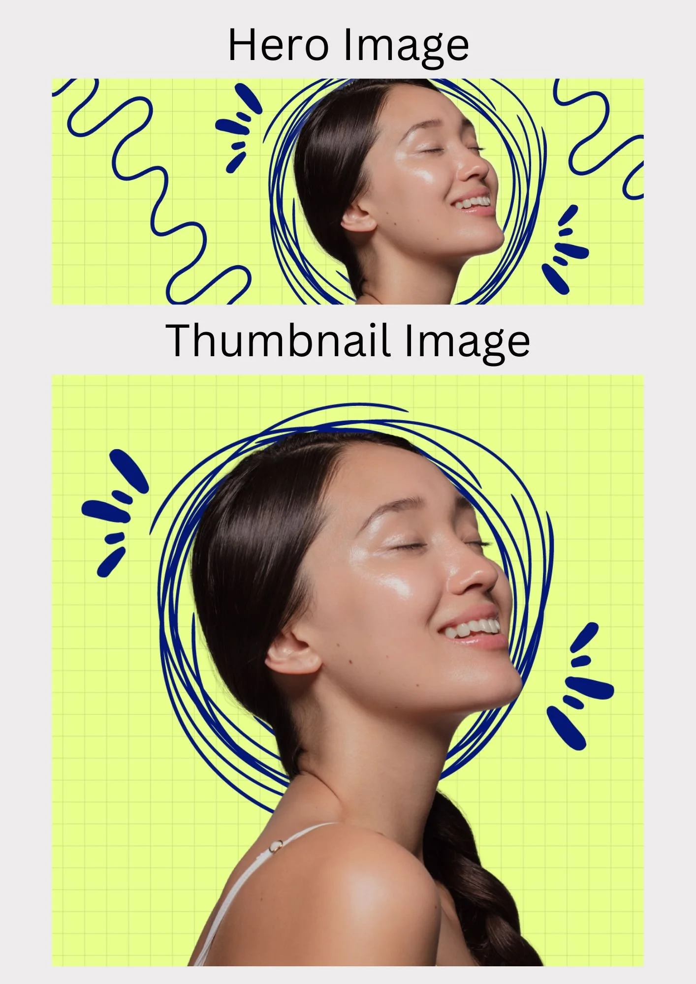
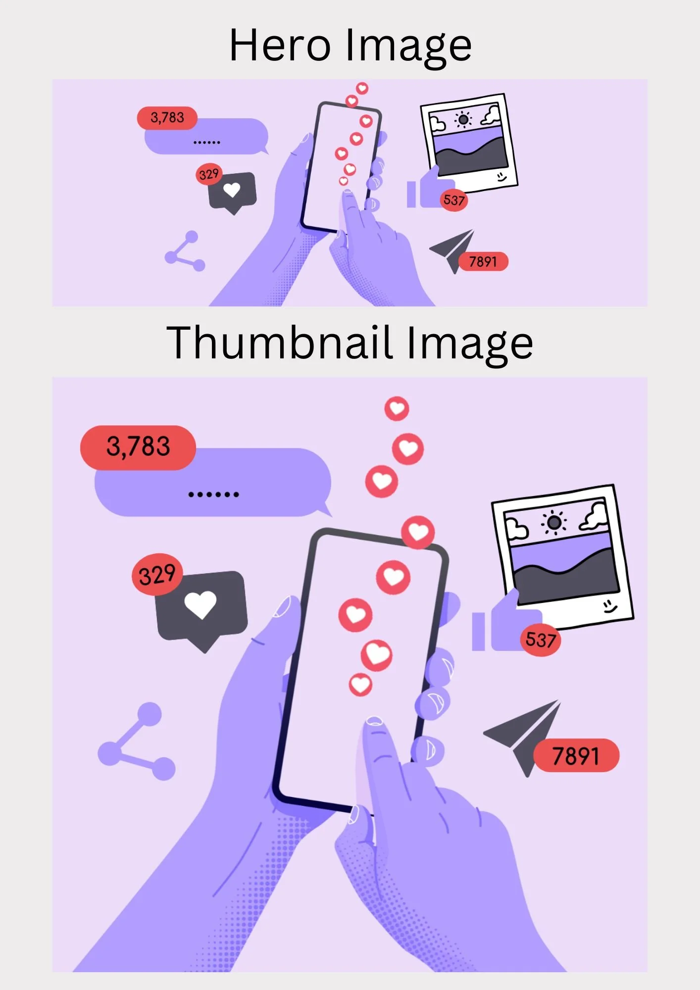
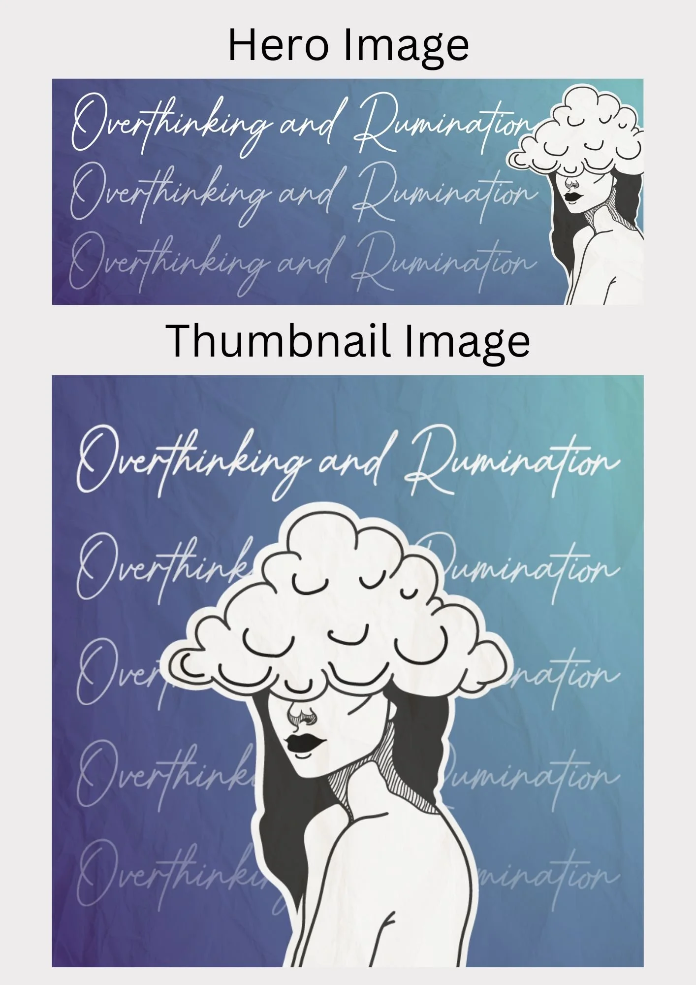
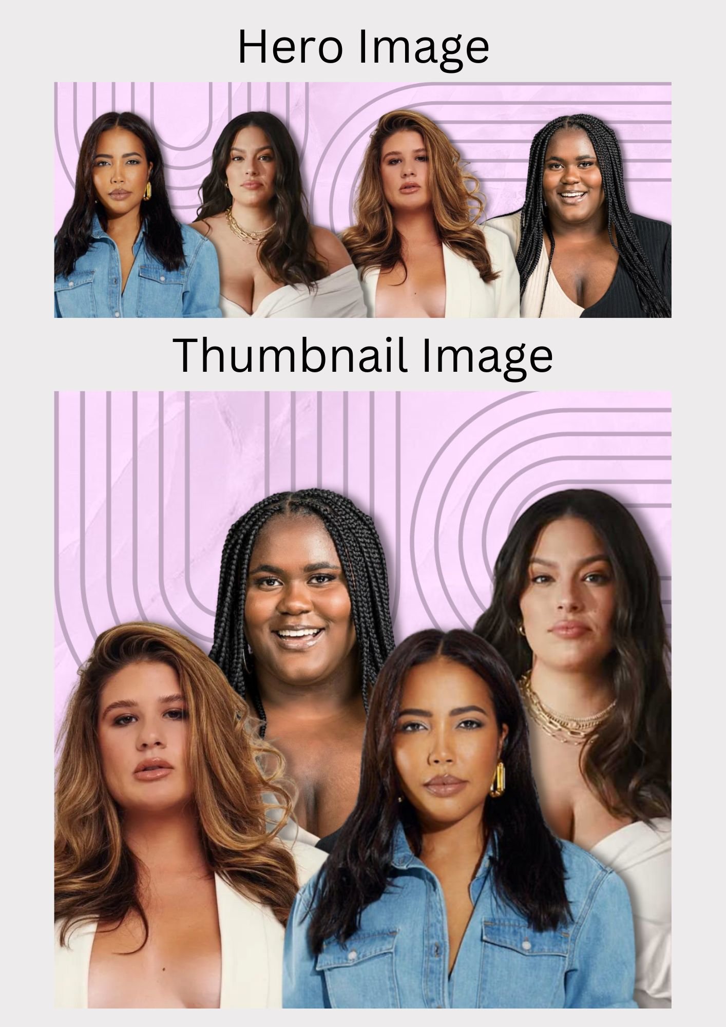
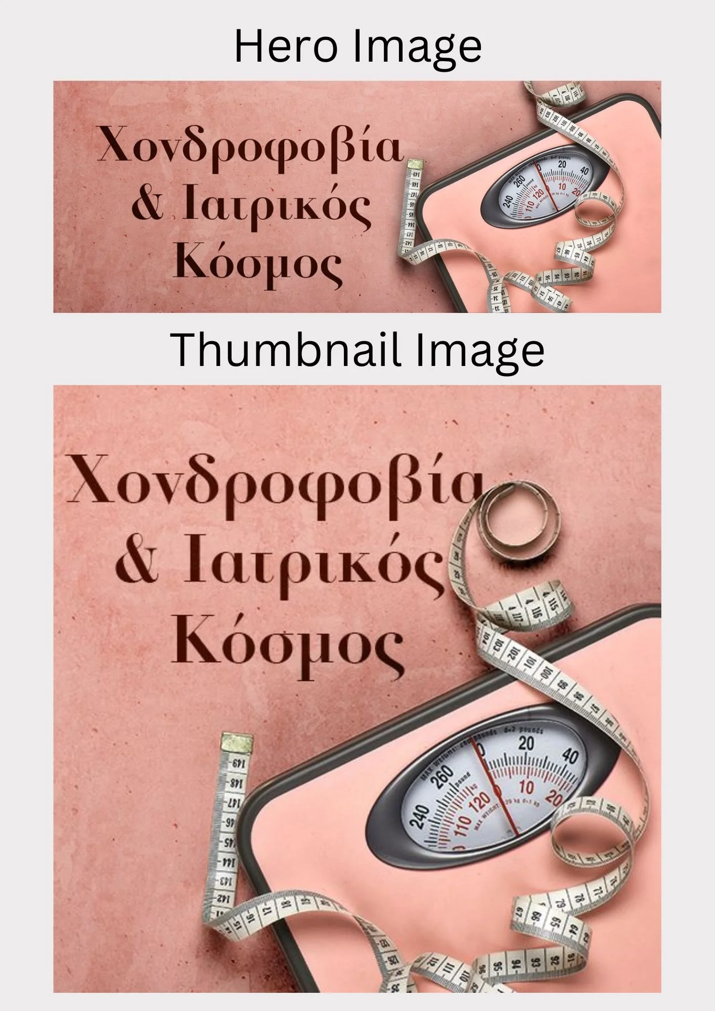
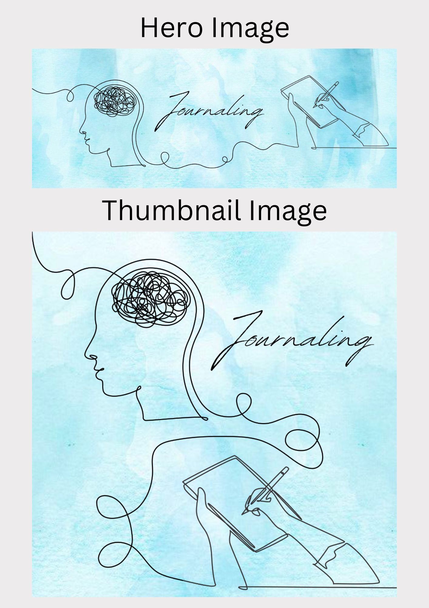
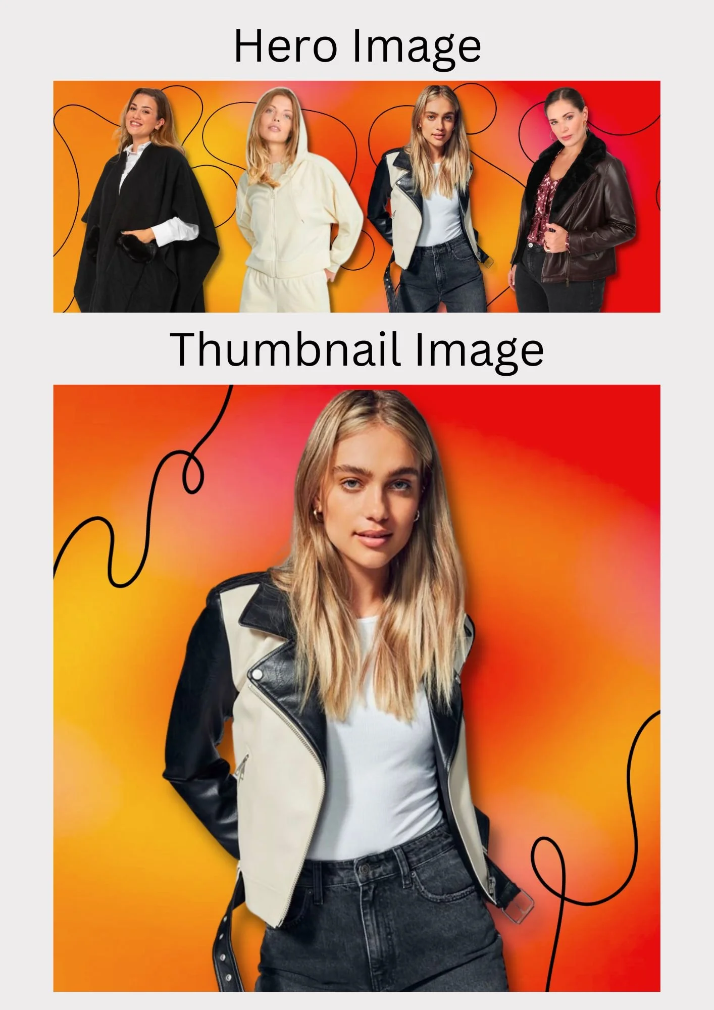
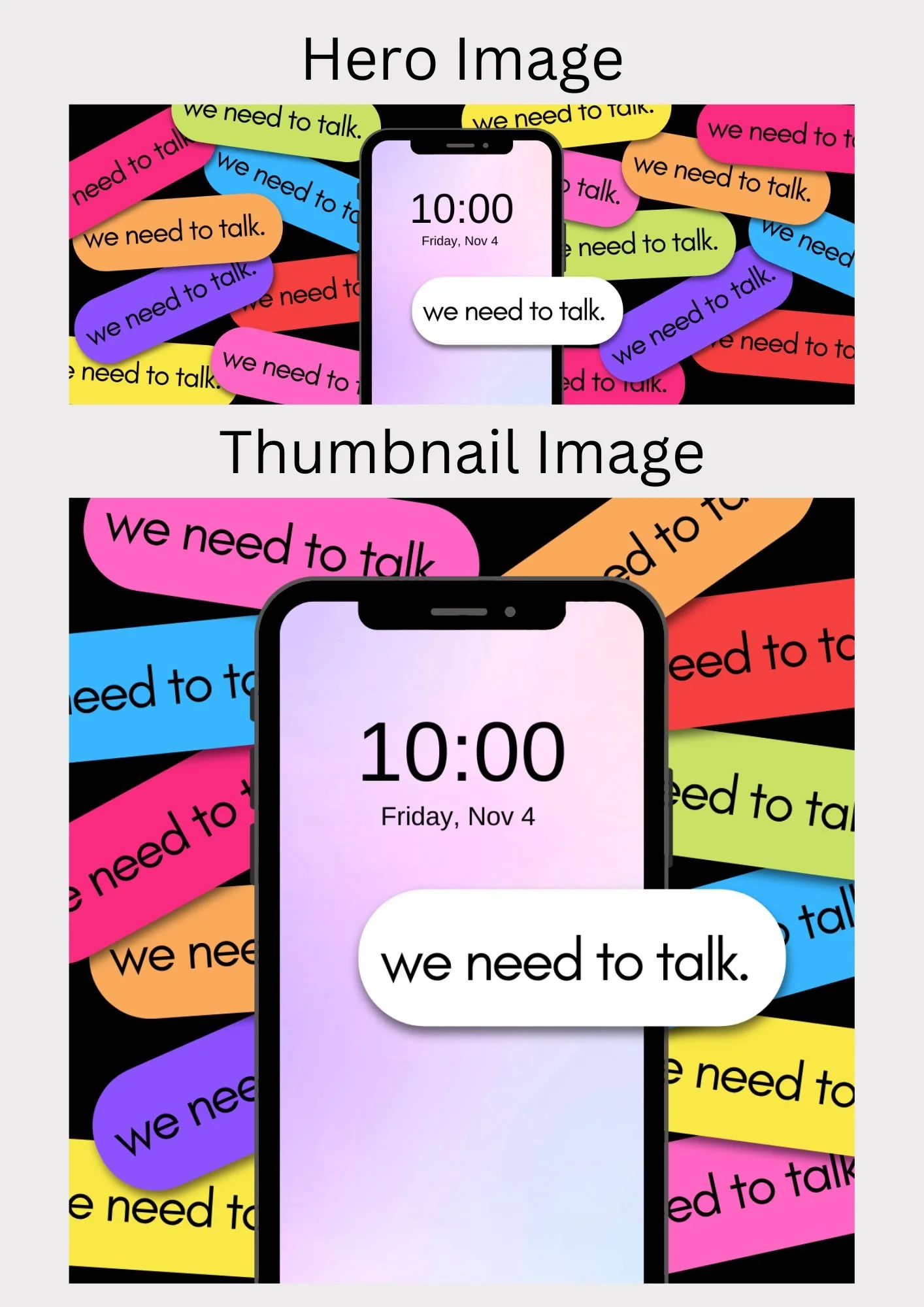
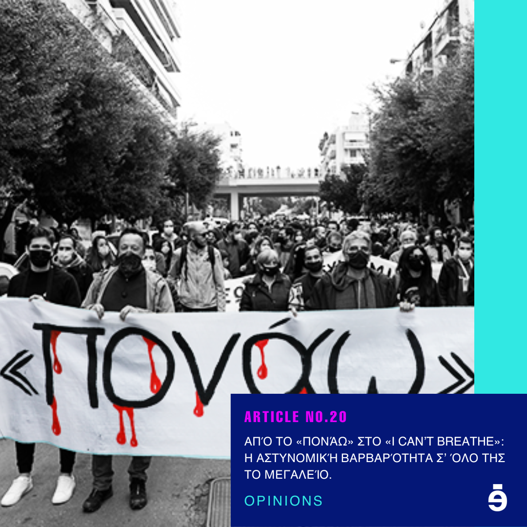
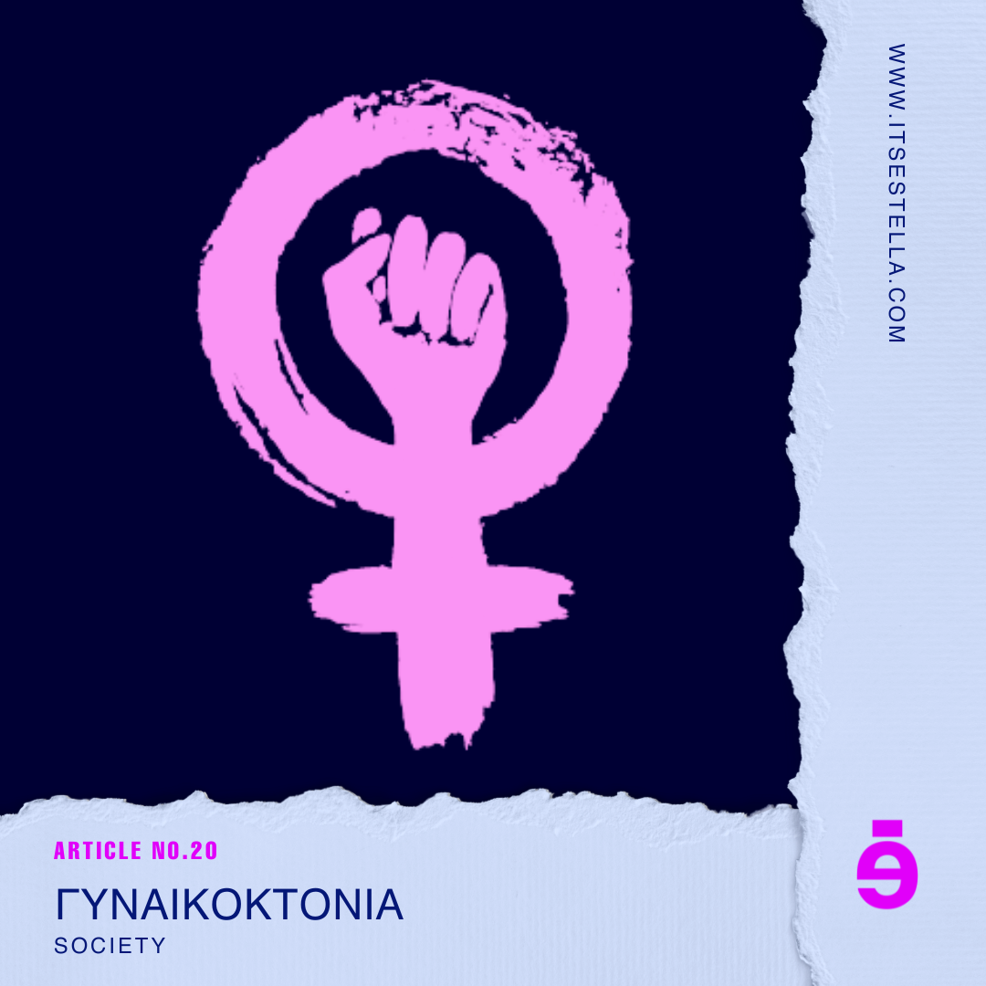
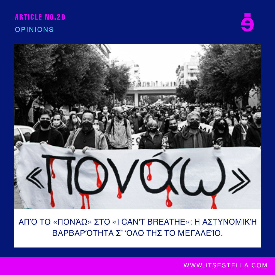
The third category is Opinions which has two subcategories: society and politics & more.
Below are a few chosen hero and thumbnail images I created for articles in the Opinions category.
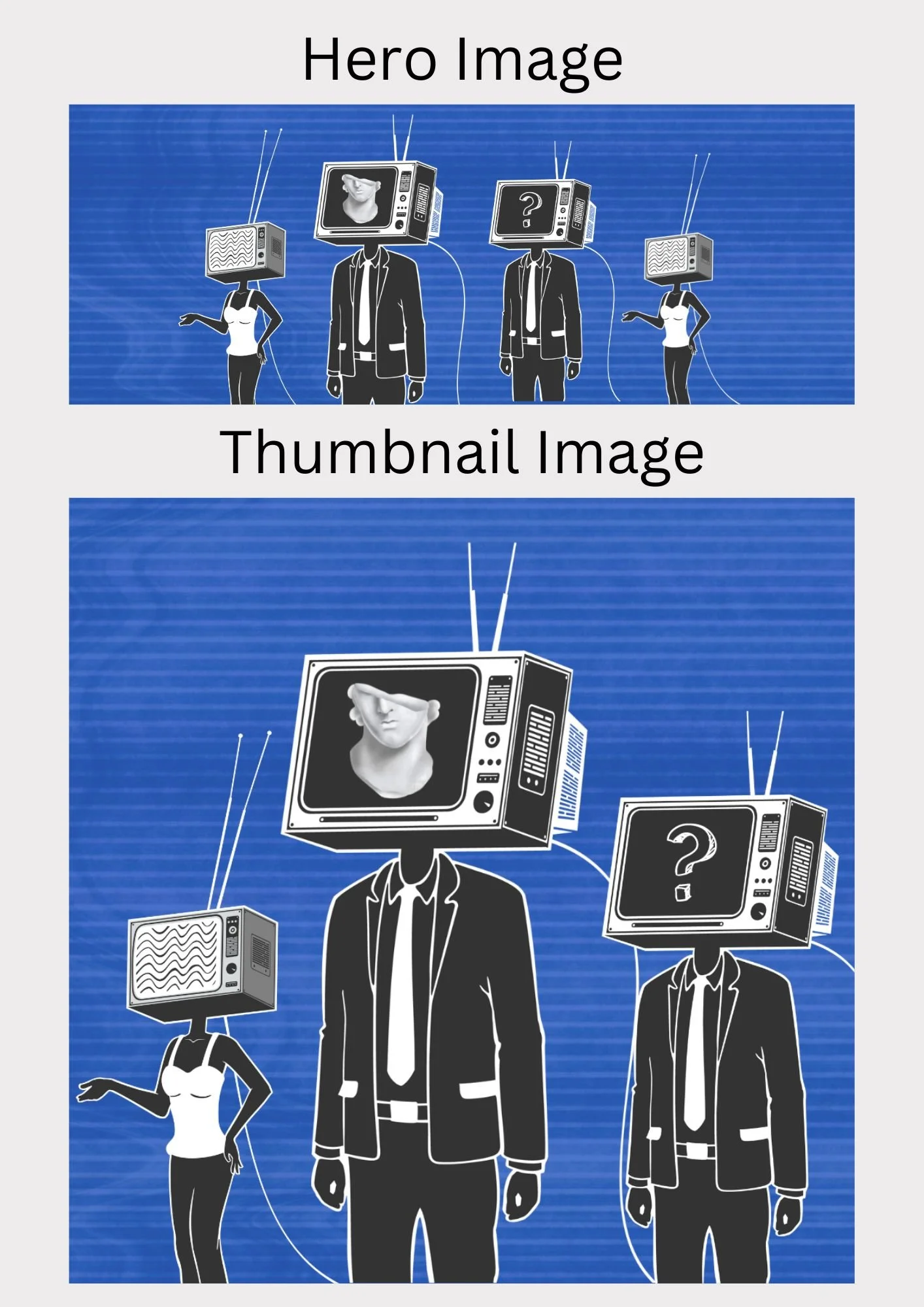
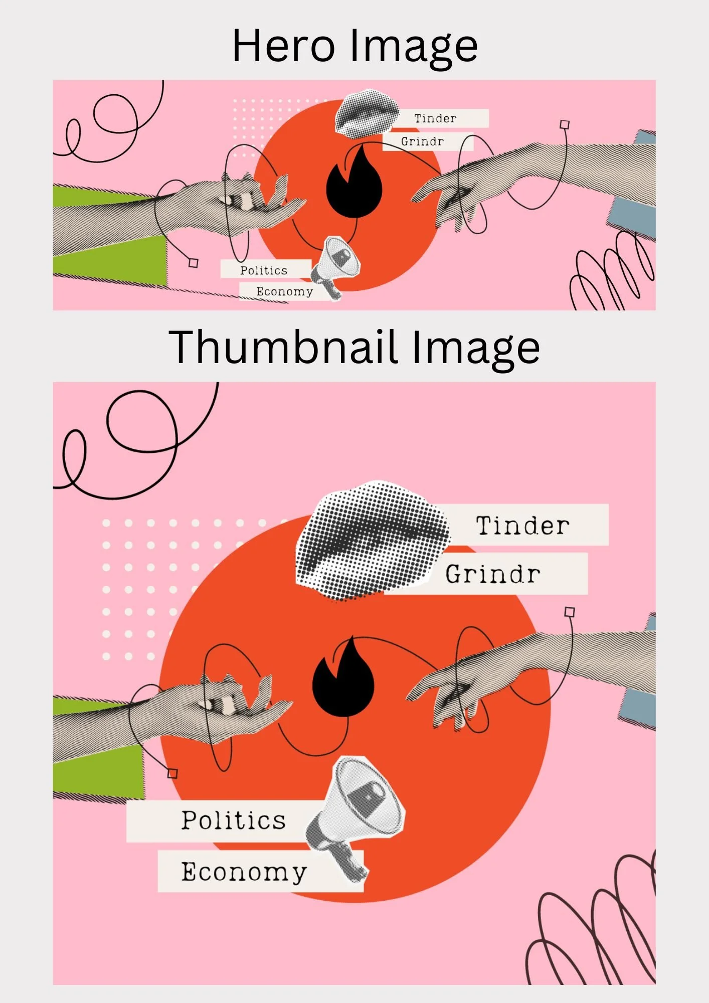
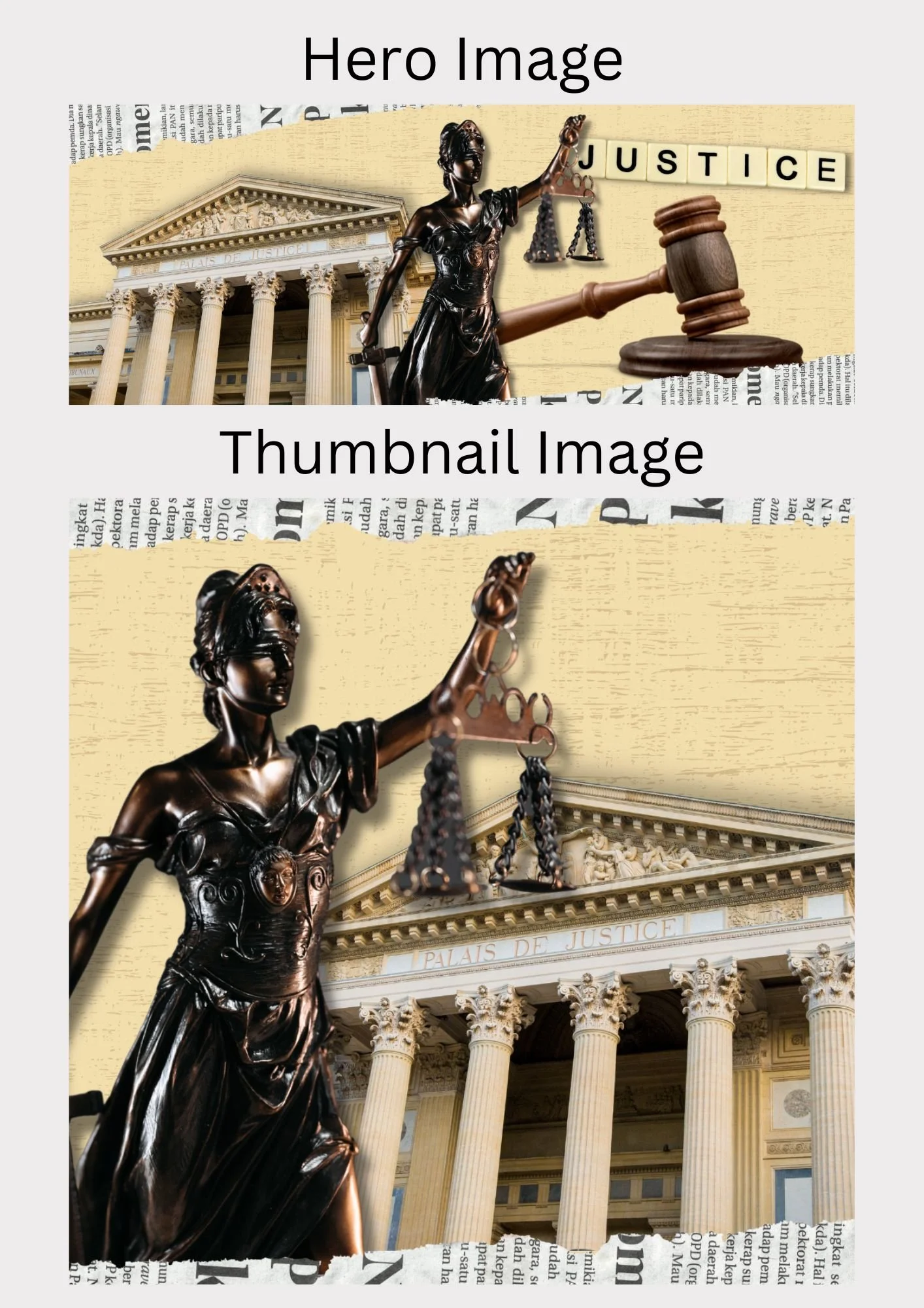
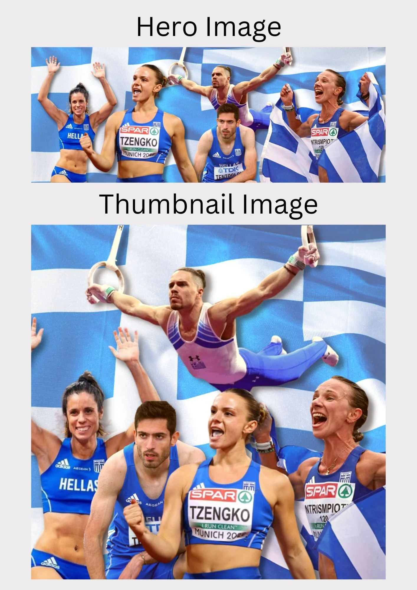
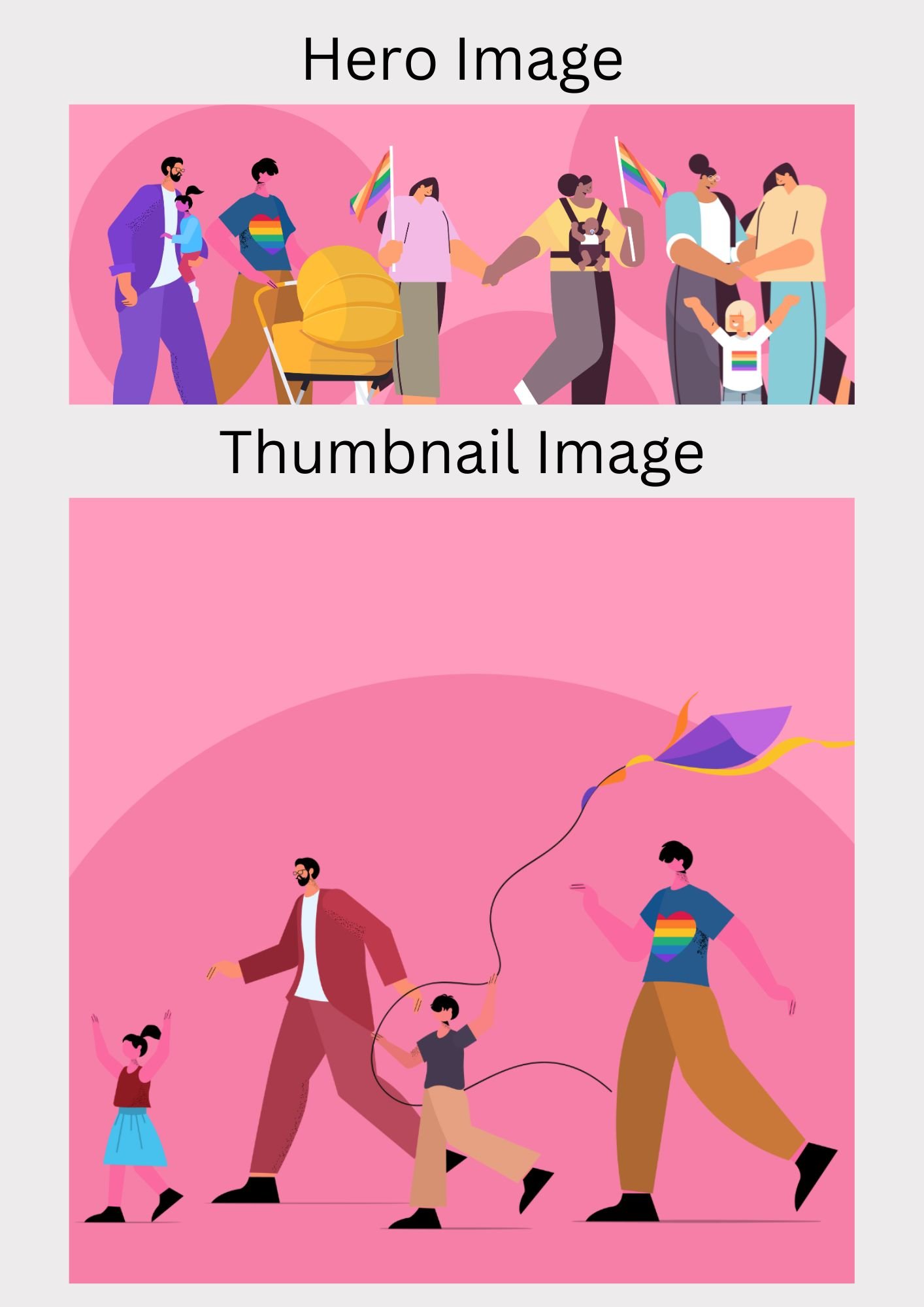
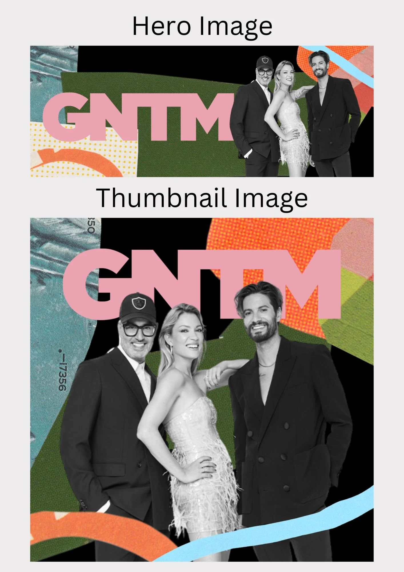
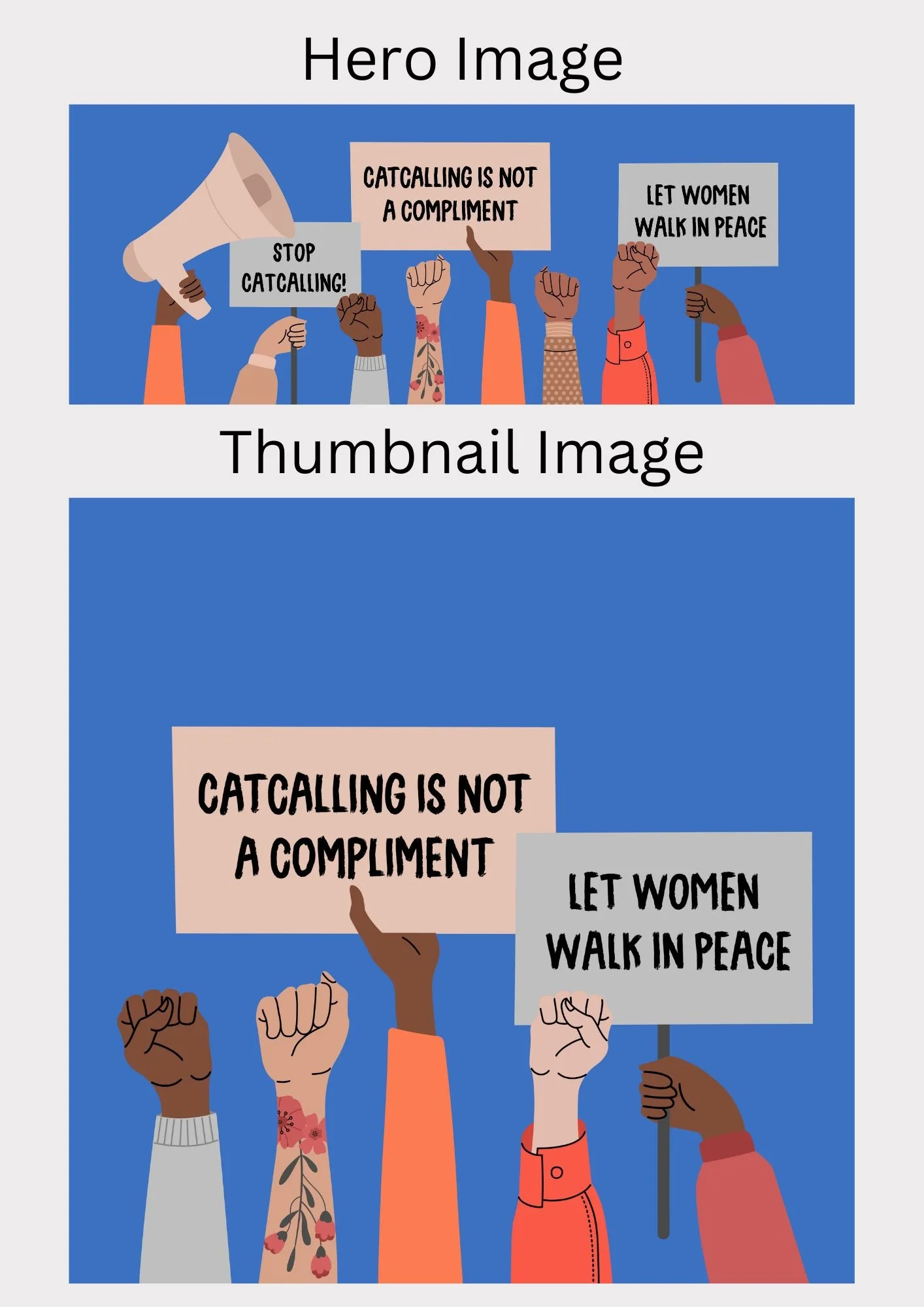
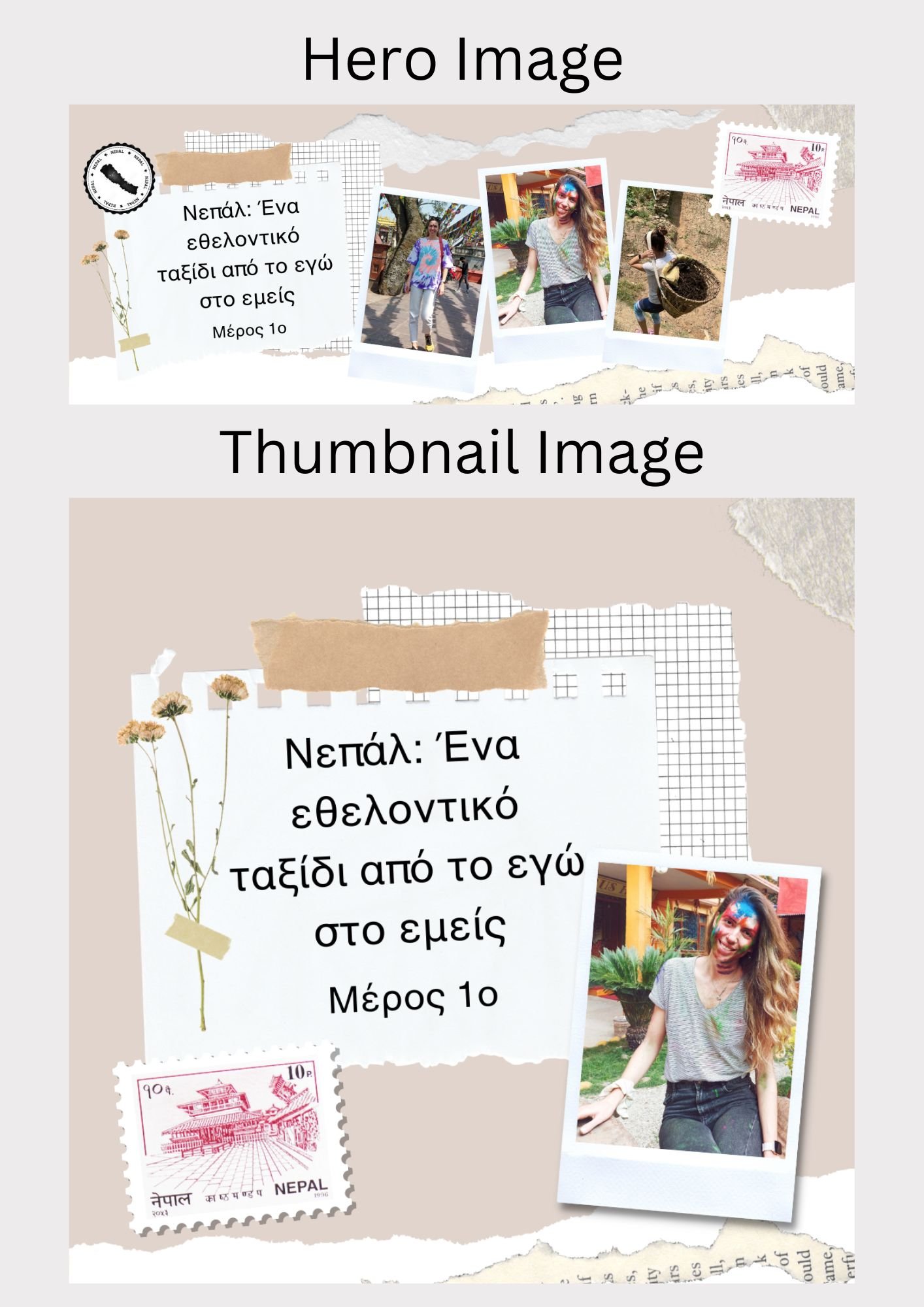
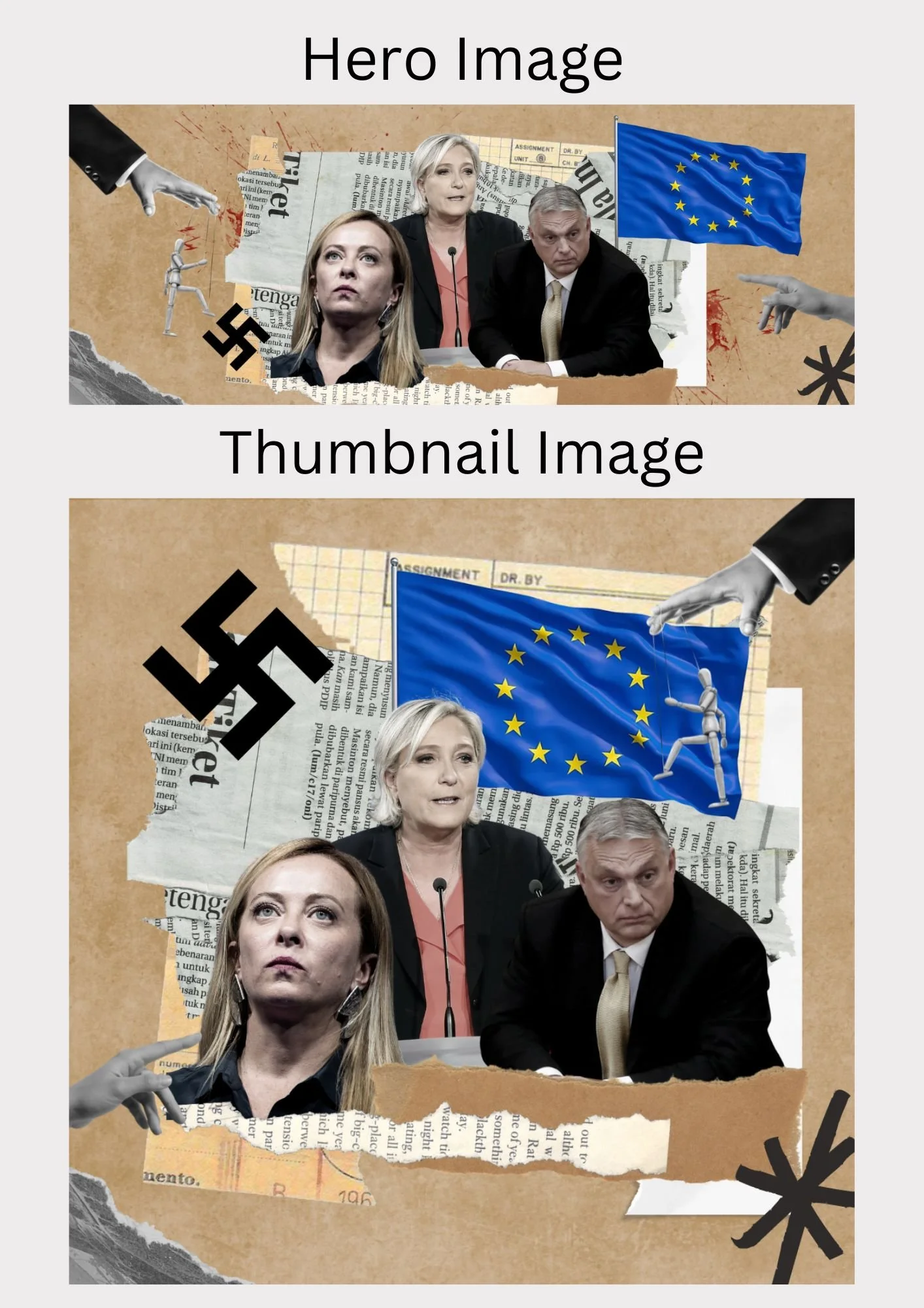
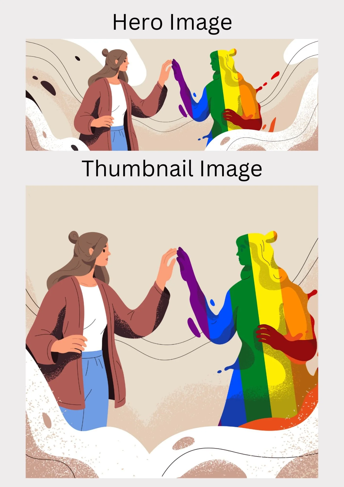
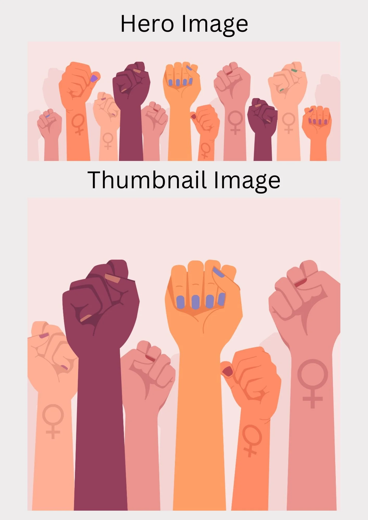
The final category is called People and this is where we publish Interviews and Profiles/Stories.
Below are a few chosen hero and thumbnail images I created for articles in the People category.
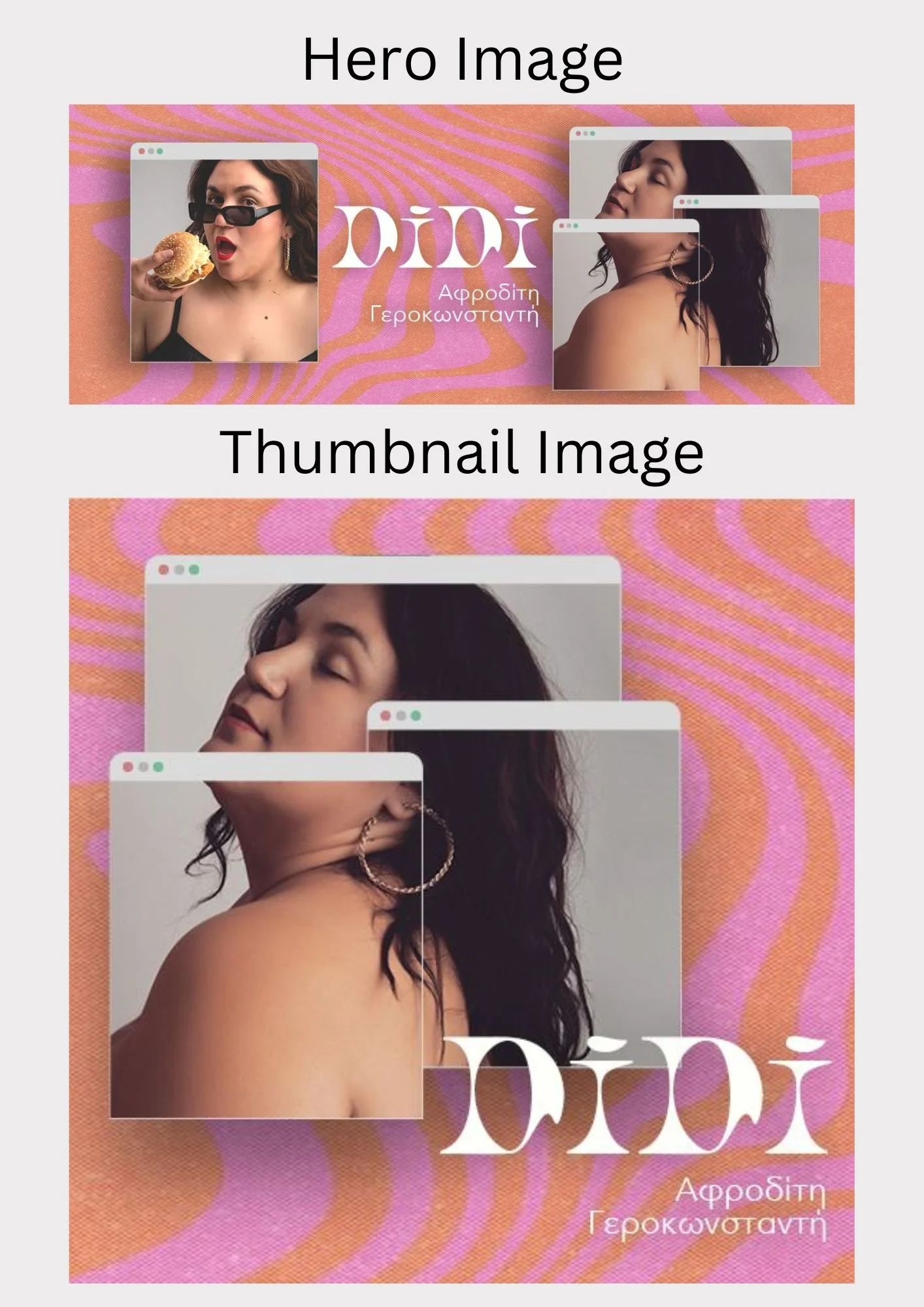
Publishing
Since Estella is an online magazine the Publish stage of the design process is perhaps the most important one. In this stage of the process, I explain of publishing schedule, describe what a typical day at Estella looks like for me and link the two main publishing platforms for Estella, their website and their Instagram.
Publishing Schedule
Since Estella is an online magazine that publishes 2-3 articles per day, all of the team members need to be adaptable to any changes and work efficiently every day in order to keep up with the workload. Below is a screenshot from our publishing schedule from a week in December, as a way to show the number of articles we need to prepare for every week.
What a typical day at Estella looks like
Since Estella is an online magazine posting two to three new articles a day, the timeframe I have for working on creating content is much shorter than expected, with new content having to be created every day.
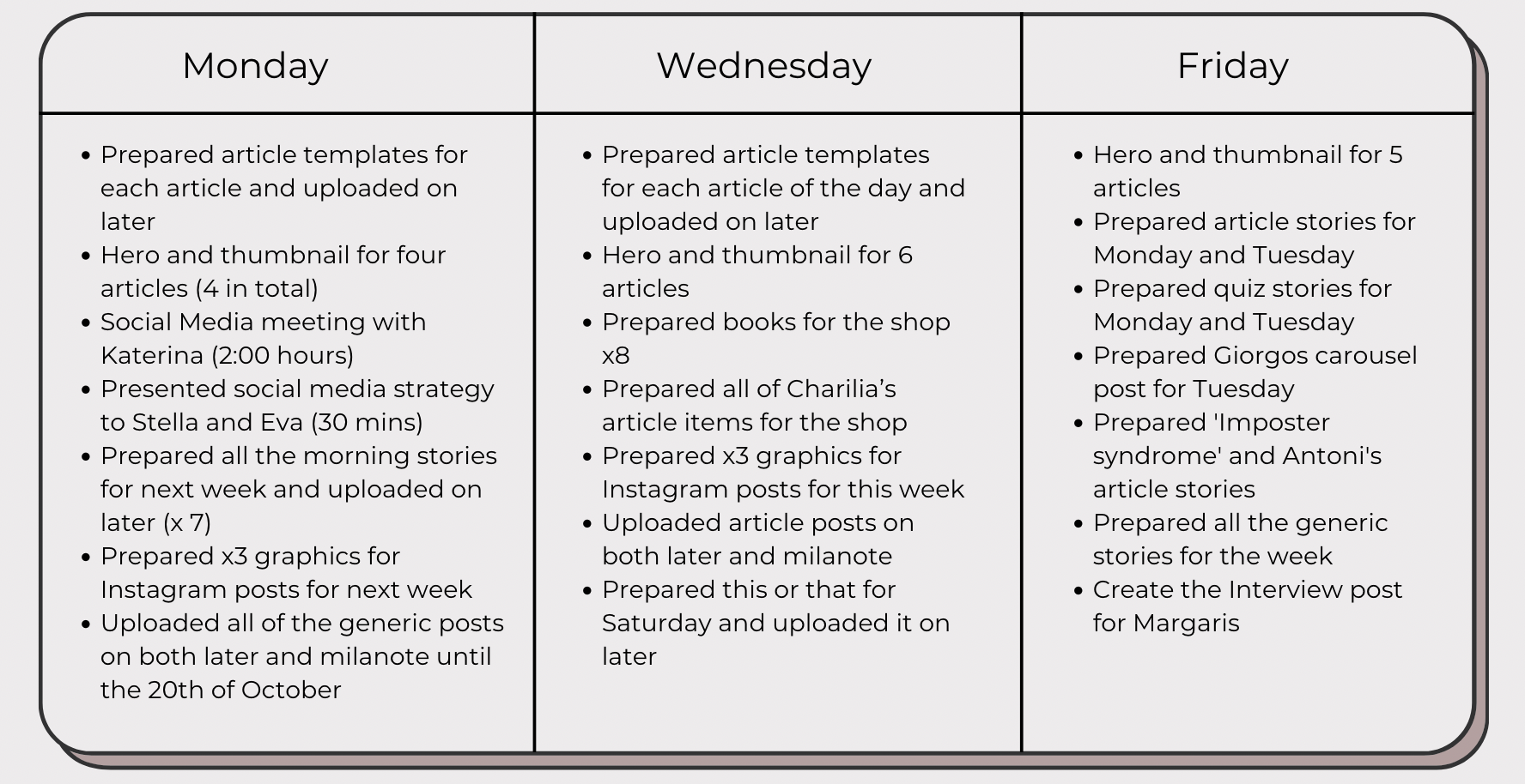
This is why a traditional Gantt chart or timeline would not be a sufficient way to present my time management skills as those are more suitable for long-term projects. Instead, I have been keeping a timesheet along with the rest of the team to keep track of what we work on each day. Since this is a shared document with other employees, I am not able to share the full timesheet but I have chosen to share a week that I feel best represents the quantity of work I typically produce as a way to show what a typical day at Estella looks like for me.
Estella’s Website
Estella’s Instagram
Feedback & Reflection
The final stage of the design process was collecting feedback from my co-workers on my perforce and reflecting on my time at Estella by looking back at what I learned, the challenges I faced and how sustainable my design process was.
Reflection
In the ten-plus months of working at Estella, I have gained invaluable skills that have shaped me as a designer and co-worker.
This was my first job where I had to communicate daily with a team and rely on that communication to get my job done. This was due to the fact that I had to be in constant contact with our editors to keep up to date with new articles and any changes that might occur in our publishing schedule. I also relied on them to brief me every morning on the articles and what each one of them was, as I did not have time throughout my day to read the articles, prepare the hero and thumbnails for each one and create and post our social media content. This led to me developing really good communication skills, as without good communication, I would not be able to design what I need to the best of my capabilities.
Another skill I am happy to have developed during my time at Estella is streamlining my design process, making it more efficient and less time-consuming. When working in such a fast-paced and constantly changing work environment with new projects to complete every day, you subconsciously learn to pick up the pace of your design process and work at a faster pace in order to keep up.
This was quite difficult for me to wrap my head around the first few weeks at the job, as I found myself being quite frustrated with how little time I had to come up with multiple designs and executed them all in one day. Eventually, once I got up to pace with the rest of the team and realised how quickly I would have to work if I wanted to finish everything I had to do in a day, I stopped overthinking all of my decisions and trust my design instinct.
Additionally, I vastly improved my graphic design skills and enhanced my photoshop and illustrator knowledge. When I started my work placement, I was comfortable with both programs but now I feel much more well-versed in them. Learning these programs even more also helped streamline my design process as I started learning and remembering how to do specific effects or edits, whereas before I would always rely on online tutorials to guide me through the process.
All my time at Estella also helped me develop a much larger selection to choose from for my graphic design portfolio and provided me with great work experience that I could add to my CV.
Looking back at my time so far at Estella, there is not much I would have done differently. I feel proud and accomplished to have kept up and stuck with such an ever-changing and fast pace work environment that was completely new to me. I had my challenges at the begging with keeping up with the workload, but once I got the hang of it, I not only started to enjoy the work but the people I worked with.
I owe a big thank you to the amazing, smart and hardworking women at Estella who always supported me and encouraged me thought out my time there. They helped me with everything they could, always answered my questions and were always a pleasure to interact with. They were my biggest supporters and for that, I will always be grateful to them.
Feedback from my coworkers
It was important to me that I got feedback from my co-workers as this would show a true reflection on my work at Estella. Below is the feedback I received from the CEO of Estella as well as the editor and writer for Estella.
Stella Papachristoforou- CEO of Estella
“Since day 1, Rodothea has been an absolute pleasure to work with. She’s always very accepting in every note she’s given, she is always willing to work more in order to deliver great work in any last minute jobs that may emerge, she is punctual and delivers her best performance every day.
Working in such a fast-paced and ever-changing work field as a publishing website demands a person who is receptive and acceptive, who works well under pressure and who always sees the bigger picture. Although she is only 21 years old, and this is her first time working in such a demanding work field, Rodothea showcased all the aforementioned qualities since the day her first day on the job. She has been an invaluable asset to our team and a valuable member.
Her new and fresh ideas, her creative spirit and her amazing talent were the reason Rodothea was hired. But Rodothea is much more than that. She is the person who helped my company through many crises, a co-worker who always puts the team's needs above hers and someone the whole team trusts and depends on.”
Eva Karolidou- Editor and Writer for Estella
“Rodothea Papachristoforou is probably the best co-worker I have ever had so far. She is really creative, and she always comes up with great ideas. Furthermore, she has a very special talent for graphic design, as her work always comes with a beautiful aesthetic. Apart from that, she has an amazing sense of humour, she is flexible, easy-going, really cooperative and fun to work with. From the bottom of my heart, I highly recommend her as an exquisite team member.”
Sustainable Design
As time goes on, sustainability in design grows more and more important as consumer consumption and production patterns can be seriously hard not only for the world around us but the people around us too. It is a designer’s responsibility to ensure that the products they create are safe for the environment of or earth.
But it's not just the physical product that will make a change, but our own consumer behaviours, wants and needs. We need to ensure we are promoting and participating in a sustainable design process, encouraging ego-friendly design and reducing waste consumption.
Reflecting back on my own design process so far during my time at Estella, I am satisfied with my own consumer behaviours, as no physical product has been created, leaving no environmental footprint. All my work at Estella has been digital content making it sustainable.
Working for a magazine that publishes articles about society and politics, one would imagine that there might be an ethical issue with the publications of those articles. However, I do not write the articles nor publicly speak out on their topics but rather create a hero and thumbnail image that demonstrates the topic being discussed, in the least possible offensive way.
Moving Forward
Moving forward, I will continue to work at Estella as their graphic designer and content creator for the foreseeable future. The skills I have developed throughout my work placement have been invaluable to me, not just in the sense of design skills, but in soft skills as well.
My co-workers are all friendly, hard-working and enjoyable to work with creating a pleasant work environment, something that I really learned to value and am sure I will be seeking in any future job I apply for.


